
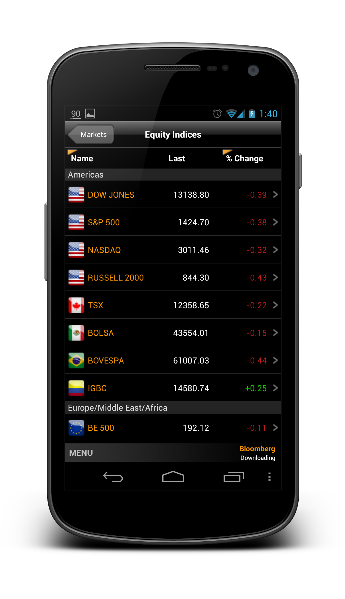
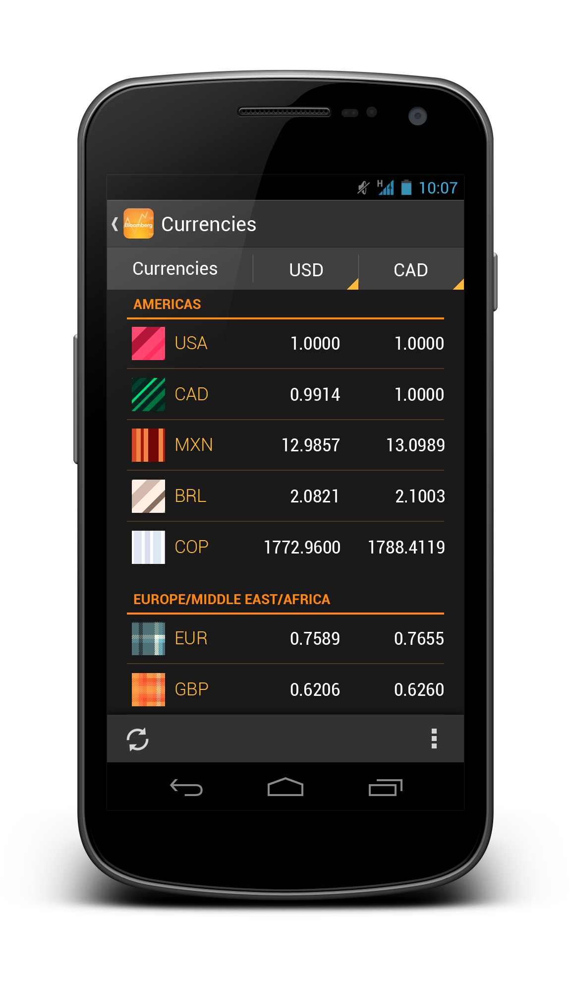
Bloomberg – another app that I wanted to redesign so long, because the app is pretty badly designed ever since day one. It is almost an exact port of the iOS version, with a really strange ‘MENU’ button at the bottom of the app, and the deadly legacy menu button. Below show some shots from the current version for comparison:


So what if the app is redesigned with the Holo UI approaches and full Android experience? Below are some shots that I have redesigned:


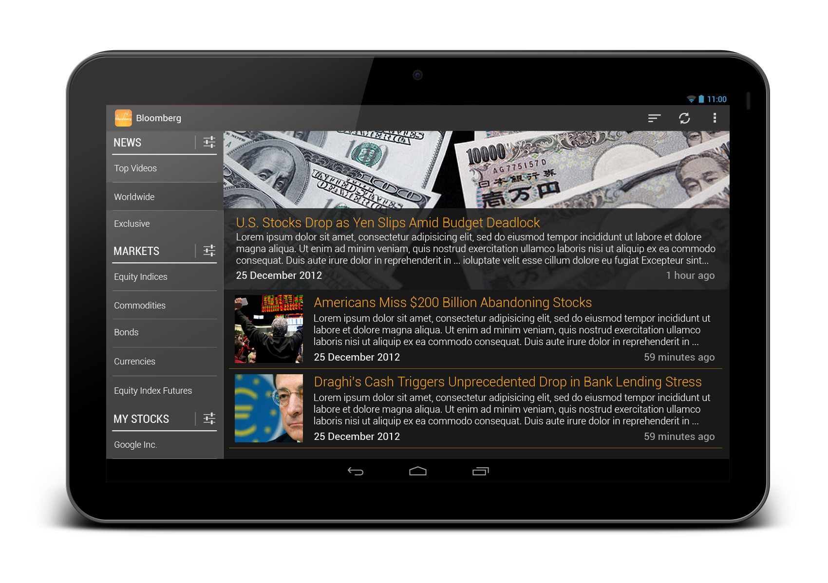
And also some redesigns for tablet version:
 What do you think? Do you like the redesigns? Don’t hesitate to shot in the comment box!

I don’t usually think of stock pickers with an “icon”. I don’t know if they would have a default one. Would that be a problem? Otherwise, I like it!
Hey Keren,
I don’t particularly understand your doubt, which ‘icon’ you are referring to? 🙂
Rgds,
Taylor
ah, sorry. Bad eye. I meant the icon next to the currencies.
Hey Keren,
No worry. Those are actually national flag, similar to the current Bloomberg app. I just didn’t spend more time to get each flag for all currencies. 😛
Rgds,
Taylor Ling
One word: WOW
Hey there,
Thank you thank you!
Rgds,
Taylor Ling
Great redesign again Taylor. Maybe one thing only. On phone version u slide out menu moves action bar while on tablet action bar doesn’t move.
Hey,
Thanks! Great eyes! Sure, the tablet version drawer is actually always open for quick access, therefore the action bar doesn’t move.
Rgds,
Taylor Ling
I am doing this small thing on my tablet design. I am dealing all the things manually. I wish there is a menu drawer implementation that does this automatically.
I think that on phone, action bar don”t move 🙂
Excellent! Are the font used in ListView is Robotto Thin? I love the slide in menu. Sometimes, I have a mixed feeling on slide in menu. Especially the “<" symbol. I afraid some users will confuse "<" with "back" action, instead of "show me slide in menu" action.
Hey Cheok,
The font used is actually Roboto Condensed, this font is great for long text in a constrained space. Don’t worry about the drawer indicator and Up caret, if you really want to try something different, use SlidingMenu by Jeremy, it has some of my custom indicators for drawer that make the user less confused.
Rgds,
Taylor Ling
From my point of view, it seemed like this needed some great effort to redesign. It did not gave away the possible solutions so easily. So, great job, again !
Hey Miroslav,
Thank you! Really appreciate your comment 🙂
Rgds,
Taylor Ling
Also, I love you use thin orange line, to as a separator for ListView. It makes the app truly “orange theme” 😀 Btw, may I know, what UI component you use as ListView header? ( Is this the correct question should be thrown to designer? :p ) Also, I know having a tiny rectangle on ListView header means the column is toggle-able. But, does a new user knows that? Is there any other obvious design to indicate the column is toggle-able?
Hey,
The listview header is a custom header, I don’t think there is such UI element in native code, but it still stays true to Holo UI. The tiny triangle (spinner) should be able to tell that it is toggle-able, so no worry, just go ahead and use it. If it doesn’t work for your users, there is always way and time for changes.
Rgds,
Taylor Ling
Hi friend. I really appreciate your works my friend 🙂 All the best (Y)
Hey,
Thanks for the appreciation! 🙂
Rgds,
Taylor Ling
Simply amazing
Hey,
Thank you!
Rgds,
Taylor Ling
Hi, This really is a great piece of work. I’ve always hated the design on the Bloomberg app on Android and I’m happy to see someone facing the challenge of redesigning some parts of it.
I really love the tablet version, have you thought about a 7″ version ?
I also love the direct access to the settings on News, Market, .. on the left.
However, I would probably have made the search a bit more accessible, maybe on the top of the left navigation view.
Hey Totor,
Thank you! For 7″ tablet version, most likely it will have a drawer similarly on the phone while having tablet design (the 10″ drawer actually always open in my redesign).
Thanks for the suggestion on the search option, I will see if it is something feasible to do 🙂
Rgds,
Taylor Ling
Gorgeous! Is that the sliding menu on the tablet or is that just a static list?
Hey there,
Thanks! On the tablet, it is a static list to fully utilize the screen estate.
Rgds,
Taylor Ling
Good work, man!
Hey Victor,
Thank you so much!
Rgds,
Taylor Ling
Really Really Good Amazing ! 🙂
Really nice design. Clean, elegant, with nice use of fonts and colors. Really impressive work Taylor.
I would be grateful if I could get some help with your design skills 🙂
Would something like that be possible ?
Hey,
Thanks!
Should be possible, although not within this two weeks due to other paid projects.
Shot me an email to taylorling [at] outlook.com and see how we can work out 🙂
Taylor
Hi, I am a android developer in pursuit of giving my applications a world class feel. You redesigns is an awesome insight even to a developer like me who have no experience in design of UX.
Hey Suhas,
Nice to know that! Looking forward to your app with world class quality! 🙂
Rgds,
Taylor Ling
Looking great!!:)
Nice redesign …, I’m new on mobile ui design, thanks for your android building blocks mockup, really useful. About this redesign, I hope Bloomberg see this and hire you 🙂
Great designs, I am definitely following your blog from now on =)
Thanks Victor! 😉