
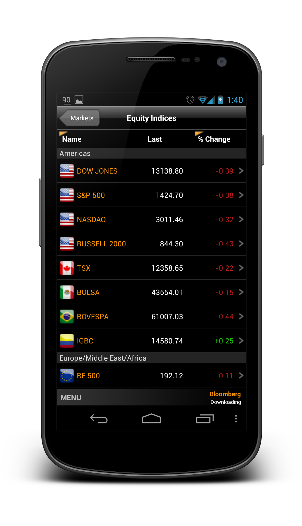
Bloomberg – another app that I wanted to redesign so long, because the app is pretty badly designed ever since day one. It is almost an exact port of the iOS version, with a really strange ‘MENU’ button at the bottom of the app, and the deadly legacy menu button. Below show some shots from the current version for comparison:


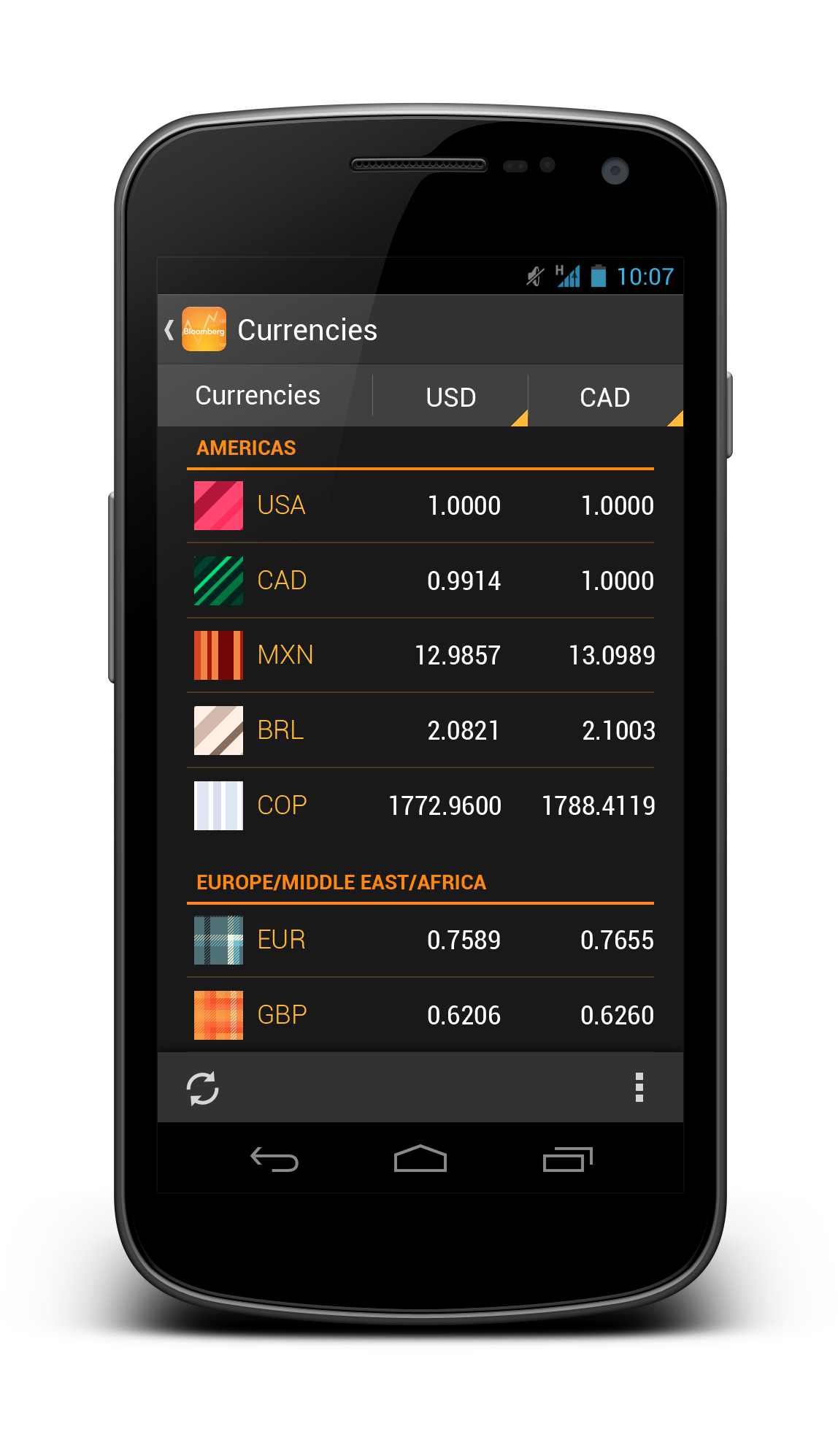
So what if the app is redesigned with the Holo UI approaches and full Android experience? Below are some shots that I have redesigned:


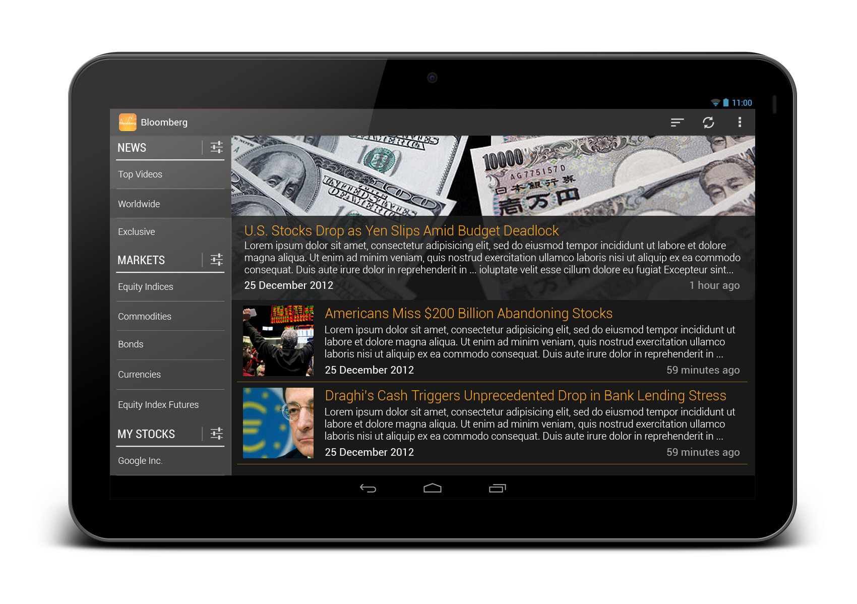
And also some redesigns for tablet version:
 What do you think? Do you like the redesigns? Don’t hesitate to shot in the comment box!
