Crafting the Unclouded experience

Unclouded

Unclouded by Christian Göllner, an app that helps to analyse and clean your cloud storage (Dropbox and Google Drive, for now) has just recently out of beta, and I have the honor to work together with Christian on the design for this app. I was really impressed by the app quality when I first received the early build of the app – without hesitation, I told him that I wanted to work together to bring this app to the level of awesomeness. It is super amazing that the app has been featured by Android Police, TechCrunch, CNET, Lifehacker, and xda-developers, and these boosted our confidence about the design and development direction of the app.

In this post, I would love to talk about some design details that we have worked hard to fine tune in order to craft the ‘Unclouded’ experience that we have visioned.

Continue reading

Unoptimized tablet experience is a missed opportunity

Tablet

It is first started as a simple Google+ post after I saw the refreshed UI of Bank of America app which probably looks OK on the phone, but terribly on the tablet device, and I thought this topic actually worth a short blog post. Well, let’s first have a look on some screenshots of the refreshed UI of the mentioned app:

Navigation Drawer
Navigation Drawer
Details Screen of an Account

There are obviously many UI/UX improvements that I can suggest, for example:

  • Misuse of available screen estateNavigation drawer is not done right and taking away too much of the core experience of the app – navigation drawer is meant to be transient. Also everything looks stretched-out and blown-up which make readability and glanceability become really bad.
  • Lack of Pure Android Experience – It’s 100% iOS experience – Tabs at the bottom, right caret, iOS top bar etc. There are certain UI and interactions elements really unique to Android to provide the user the best and pure Android experience, and this shouldn’t be taken lightly if you care about the user.
  • Lack of attention to details – Even for an untrained eye, it’s pretty obvious that the icon and text wasn’t aligned in a proper way – Mind the gap.
  • Terrible tablet experience – Rather than a blown-up version, a multi-pane layout should be already considered if tablet is meant to be supported.

Unoptimized tablet experience is a missed opportunity

We are currently living in a multi-screen world that we are no longer performing daily activities only on the computer, but also on the smartphone, tablet and TV. Of course, this does not apply to every single activity, but most of your digital activities can be done on any devices, and thus, there is always a chance that your user will try to accomplish a task using your app/service with any screen at any time. Unoptimized tablet experience would mean a missed opportunity – for the brand, for the customer experience, and for the customer loyalty.

And with the huge market share by Android tablet, it is probably no-brainer to pour in a little bit more efforts to optimize the tablet experience (unless your app/service does not make sense on the tablet at all) because tablet has penetrated in many users’ live faster than you could imagined.

What’s make a good tablet experience?

Make full use of available screen estate

Gmail in Tablet
Gmail in Tablet

Gmail app is a great example showing that multi-pane layout works really well for tablet, especially for apps that have a list/grid view and a detail view. This will enable the content navigation for the user while still provide the full experience on the content details.

Optimize the content density

Google+ in Tablet
Google+ in Tablet (Optimized Content Density)
Facebook in Tablet
Facebook in Tablet (not-optimized content density)

With the available screen estate, especially the horizontal screen estate in Landscape mode, it is crucial to optimize the content density to show the user more information on screen at one time. Of course, this doesn’t mean that you have to show the information as dense as possible – finding that balanced density is very important (and tricky) – and this optimization must be able to enhance the content consumption experience (the user consume more information with the same amount of effort compared to small screen devices), and if it’s not, it is probably mean that the content density optimization doesn’t work. It is important to design the app with great tablet experience for the user to appreciate the screen estate available on the tablet, not just treating it as an enlarged phone. Compared to the Facebook app, Google+ able to show more information at the same time, fully utilize the available screen estate.

Cares about content consumption quality

Newsstand in Tablet
Newsstand in Tablet

If you look at the screenshots of the Bank of America app, you will find that you will have some difficult time to connect the information on the left and the one on the right, because the readability is not optimized due to the stretched layout, causing the severe disconnection between the information on both sides. In the above screenshot, it is a good example showing why you should not fit the content (especially texts) as much as possible because you would also want to make sure that the readability is great (here, of course, we talk about the optimal line length), so the user can have great experience during the reading (or content consumption).

Tablet experience should not be an afterthought

If you app will be used by tablet users, always design the app with tablet experience in mind (as shown above) and make full use of responsive design. Besides that, Android team has written a nice checklist for tablet app quality, so you definitely need to go through it to ensure that you are providing the best quality and experience for both phone and tablet devices.

I hope this post is able to inspire and motivate Android developers and designers to optimize the tablet experience and it should not be an afterthought in app development. If you have any comment or question, feel free to leave it at the Comments section, and I should be able to respond accordingly.

More high quality tablet app!

Yes Life for Android Redesigned

It’s been a long time since my last blog entry, but definitely I am still working on tons of Android Design (in private) and they are often very inspiring, which I hope I can share them in the near future if it’s possible.

Today I would just like to share some redesigns for an app that is local to my home country. The app called Yes Life, which basically an app that allows the user to call and send SMS to any local number from anywhere around the world with internet connection. Below are some screens from the current app:

Yes_Old_Dialer

Yes_Old_SMS

There are few things in the app motivated the redesign:

  • Almost 90% iOS UI Style (and ugly)
  • (Very) Bad navigation system
  • Usability issue (For example, online/offline status only in the Dialer page)
  • Buggy (which unfortunately cannot be solved by a redesign)
  • Missed the opportunity to enhance the branding 

To address these few issues that I see, I did some redesign on some screens with Holo UI approach (of course!) with the following changes:

  • Designed with Holo UI approach
  • Used (swipe-able) tab navigation
  • Used Action Bar (for better context actions and navigation)
  • Show connection status in every screens (which is important for such app)
  • Used light/white theme (for branding enhancement)

Below shows a few redesigned screens:

DialerSMSsSMS Detail

What do you think?

I hope this gives some idea on the importance of the app design in branding enhancement. If you have excellent solutions and branding, but decided to give your user bad products, it doesn’t do good on anything except getting rejected by the users.

Design is not just what it looks like and feels like. Design is how it works.

Bloomberg Redesigned

Bloomberg – another app that I wanted to redesign so long, because the app is pretty badly designed ever since day one. It is almost an exact port of the iOS version, with a really strange ‘MENU’ button at the bottom of the app,  and the deadly legacy menu button. Below show some shots from the current version for comparison:

Old_News

Old_Equity

Old_Stock Details

So what if the app is redesigned with the Holo UI approaches and full Android experience? Below are some shots that I have redesigned:

Worldwide News

framed_Slide In Menu

Equity Indices

Currencies

Bonds

My Stocks

Stock Details

And also some redesigns for tablet version:

Tablet - News

Tablet - MarketsWhat do you think? Do you like the redesigns? Don’t hesitate to shot in the comment box!

LinkedIn Redesigned

LinkedIn app is one of the app that I wanted to redesign so badly that I hate it when I am using it (only for accepting request and replying message). It might looks good 2-3 years back, but not anymore today.

There are a few reasons that I think this app deserve a complete redesign:

  • Resemble iOS version almost completely 
  • Lack of navigation in the app
  • Unnecessary skeuomorphism
  • Legacy menu button
  • Badly designed UI (for example, the dashboard give really limited information)

Below I included some screenshots from the current app:

Old_Profile Old_Updates Old_Dashboard

Using the Holo UI approaches, I have redesigned a few screens that fit nicely in today’s Android devices. I have replaced the dashboard UI with the Sliding Menu due to the huge number of sections available in the app. Check them out below:

Linked In - Slide Menu

Linked In - Updates

Linked In - Profile

Linked In - Profile 2

Linked In - Shared Item

Linked In - Other Profile

Update 28/12/2012: After taking some feedback from my G+ post, I have decided to give it another revision for better LinkedIn branding, and below are some updated shots. What’s changed:

  • Action Bar is in dark grey color to give a distinct UI layers
  • Added frame for photos
  • Used Card UI for details
  • Added some iconography
  • Increase the size of the sliding menu and smaller icons
  • Added Share button besides Invite to Connect button

Linked In - Profile

Linked In - Slide Menu

Linked In - Other Profile

What do you think about my redesign? Do you like them? Shot me your comments or suggestions!

Android UI/UX Tips #5

Another month, another UI/UX Tips article!  This time I looked into the swiping action between tabs, proper handling of multiple notifications, proper dialog actions, and some smart use of colors to indicate different states.

Swiping between Tabs, Please

Tab Swiping

I think this has been mentioned many times by Android Developers Team, as well as some Android Designers. If you are using tabs in your app, please please please, make sure they support the swipe gesture. It is a system-level interaction pattern, and it is clearly mentioned in the Android Design Guideline. Your users won’t be happy to realize that they can’t swipe to change tabs, which is extremely useful when the device is used with one hand.

Properly Handle Multiple Notifications

Multiple Notification

In a previous version of Google Drive, when you try to upload multiple files in a session, you will get the notification spams (shown in above image), fortunately, it has been fixed in the latest update. If your app can create multiple notifications with some user actions, please make sure that they are handled properly – group them and show the relevant information.

Proper Dialog Actions

Dialog Actions

Sometimes developers/designers tend to overlook the actions available to the user in a dialog. In this shown example, when I was shown with this dialog, I have no way to confirm my selection of font unless I press the Cancel button. This is very confusing for the user,  and definitely not designed according to the Android Design Guideline. Ensure that whenever there is such selection dialog, dismissive and affirmative action buttons are there for the user.

Smart Use of Color for State Indication

Color 1
Color 4
Color 3

Above shows some great examples from recent updates for Google Current and Google+. These are very subtle, yet informative approaches to notify the user about the state, so do consider for such approaches whenever your app requires to give the user some information/feedback regarding the state of something in the app. I really like these!

That’s it for this Android UI/UX Tips! Feel free to share around if you find these information useful, and as always, hit me with comments if you have any.

Movie Ticketing App Redesigned

Last month Roman Nurik posted a wizards pattern for complex user inputs, and I have now used it for my redesign of a local (Malaysia) movie ticketing app, which is definitely a perfect match (I think). Hopefully this redesign can inspire any developers or designers that are looking to create/redesign movie ticketing app.

Why I am redesigning this app? I have placed a few shots below to briefly show the user interface of the app to explain that. Completely implemented with iOS look and feel, legacy menu button, badly-resized images, in-app advertisement (about themselves),  bad user interaction design – everything is so wrong. Give it a try if you want to understand my frustrations.

Old_Promotion Old_Cinema

I think many will agree with me – app that just work without proper UI/UX design is no longer enough to stand out and compete with thousands of other apps in the market.

Completely redesigned with Holo UI approach, the movie ticketing app is aimed to provide great and easy ticketing service with sufficient information about cinemas and movies. Here’s my take (It’s a long page!):

Promotion Cinema List

Cinema - Show Date

Cinema - MoviesCinema - Show Time

Cinema - Tickets

Cinema - Seat Selection

Cinema - Review

Cinema - Payment

Fast Ticket

Purchased Ticket

What do you think about my redesign? Shot me in the comments if you have any suggestions/feedback/critique!

Outlook.com App Redesign – Tablet Version

Last week I have published a redesign of outlook.com app after the disappointing official release, and since then I have also started to look into the tablet version. The redesigned phone version has been a shared around Android Google+ community during that day, and it was also mentioned in latest episode of Android Design in Action – big thanks to everyone who re-shared and commented on the redesign.

Below are my take on the tablet version, probably not much surprise for some (Before anyone say it, yes, it looks like Gmail/Email app, since it’s an Email client):

Sign In

Outlook Tablet First RunOutlook Tablet - Open EmailOutlook Tablet - Open Email - Full View

What do you think?

Outlook.com App Redesigned

Over 25 million active Outlook.com users and they said they are ready for Gmail user to switch – with this low quality app.

I really disappointed with this surprising move since they did a really great job in SkyDrive app in Android. Seriously, it’s not rocket science to craft a beautiful and usable email app with Microsoft identity. They invested heavily in UI/UX for their new product lines, but yet they failed to understand the importance of Aesthetic-Usability Effect.

What I really hope to see when I run the outlook.com app:

But what I see today with the current app (usually I don’t post these):

What do you think? Just feed me with any idea or suggestion you have!

Android UI/UX Tips #4

It has been a while since the last Android UI/UX Tips, but I still continue looking for things that can be improved whenever I have some time to find them or actually experiencing them myself.

I am not sure if I can say I am happy with the release of Android 4.2 in terms of UX, especially with the decision to include the Quick Settings panel that isn’t much useful, and a strange bug on the date picker for Contacts app which should be fairly simple to detect if the testing is done thoroughly.

In any case, let’s look at some UI/UX tips that I would like to share.

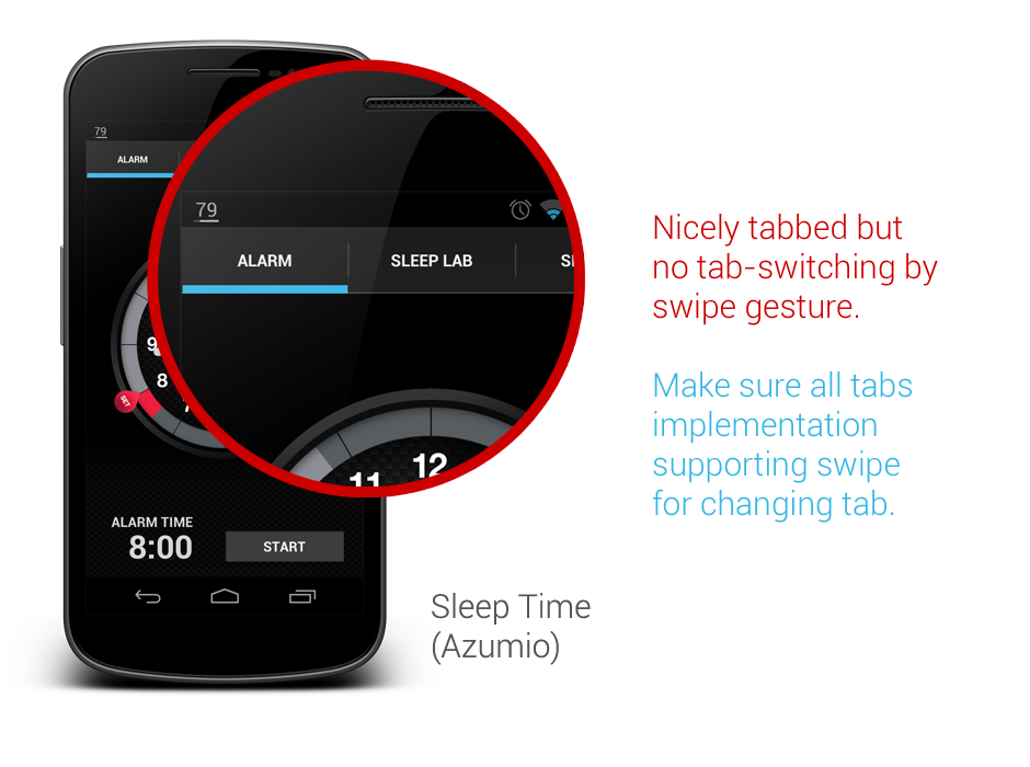
Tabs should be placed on top

In Android Design Guidelines, it has clearly suggested that tabs should not be placed at the bottom, since it is a very iOS UI element and doesn’t fit in too nicely in Android interaction behavior.

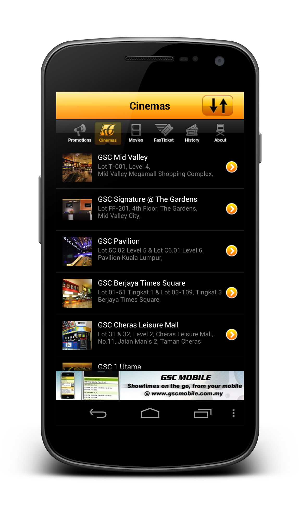
However, looking at the recently released Beta build of Echofon – there you can find the ignorance from the development team.

One of the main justification for placing the tabs at the top is that the user will have hard time to see which tabs he/she is currently in while swiping across the tabs (try it on a phone device). Juhani also written a great article few months back to justify the placement of the tabs should be at the top.

So my advice, try not to ignore the guideline and do not invent new UI element that doesn’t help in enhancing the UX.

Use Simple but Precise Words

Sometimes it is unavoidable for developers/designers to add some words to explain certain things in the app, like instructional guides or options in Settings page. However, it is not hard to find some bad examples in the apps world, either they used long but unclear explanations, or some simple words that simply can’t explain clearly for certain options/features in the app.

One example that I would like to show here is the new Gmail app that comes together with Android 4.2. If you are an early adopter of Gmail app version 4.2, most probably you are aware that it finally has a pinch-to-zoom feature for the email content. However, it is not turned on by default. And what’s really surprising here is that even the option to activate that feature is in the Settings page, many (including myself) have overlooked the existence of this option. Some might blame themselves for the overlook, but really this is actually an UX related issue.

The words that they used to explain the option isn’t something really straight to the point – especially the word ‘auto-fit’, I am not really sure if there is anyone familiar with it. The further explanation might clear the confusion a little bit, but definitely it can be improved. I am sure if it change to Pinch-to-Zoom Content with the explanation Automatically fit the message to the screen and allow zooming, 90% of the people who overlooked this will be able to turn on this feature without having a doubt, and it is also clearer to any new users, I supposed.

Therefore, simple but precise wordings/messages to the user is the key to avoid miscommunication or feature overlooks.

Ensure proper UI presentation

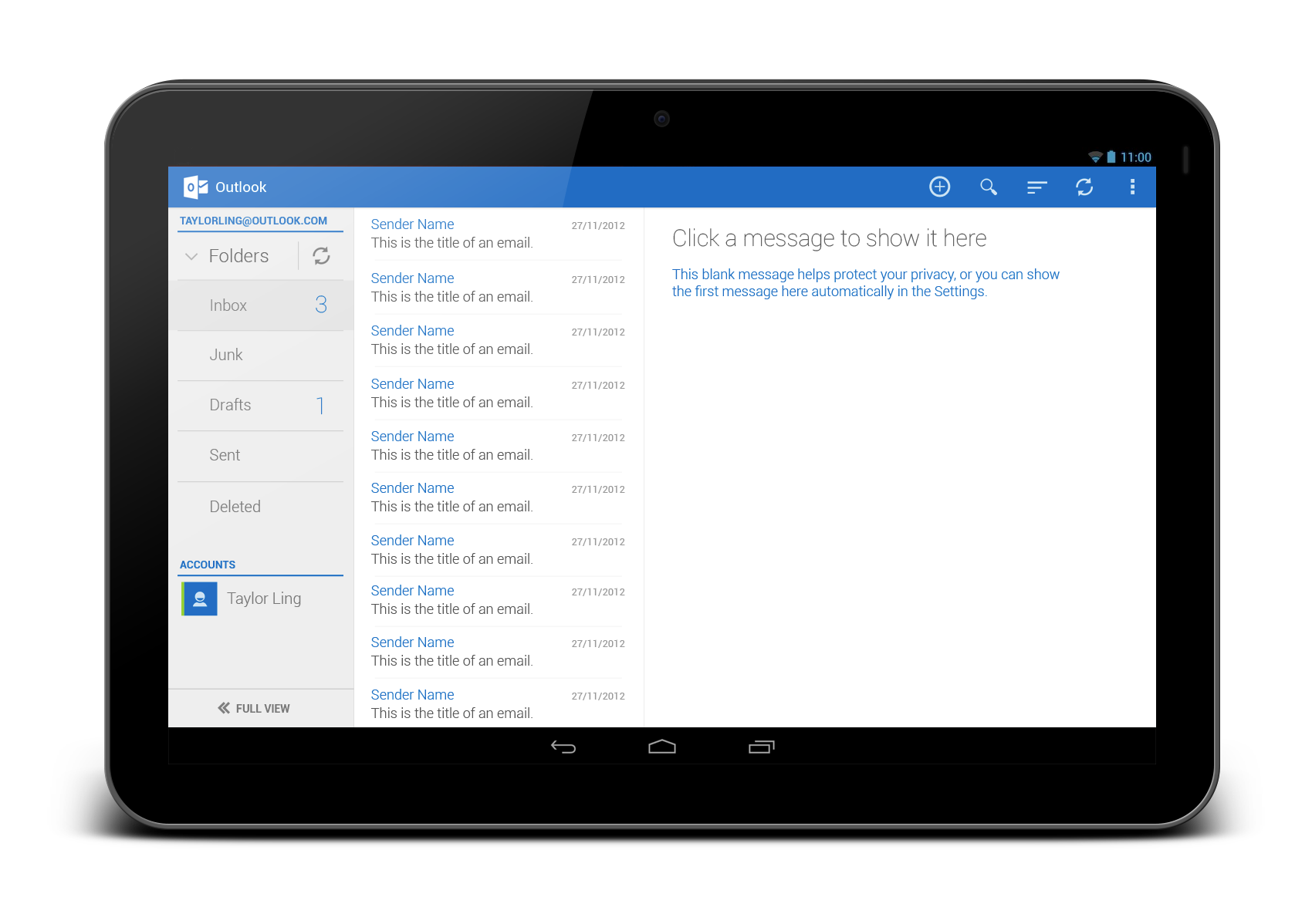
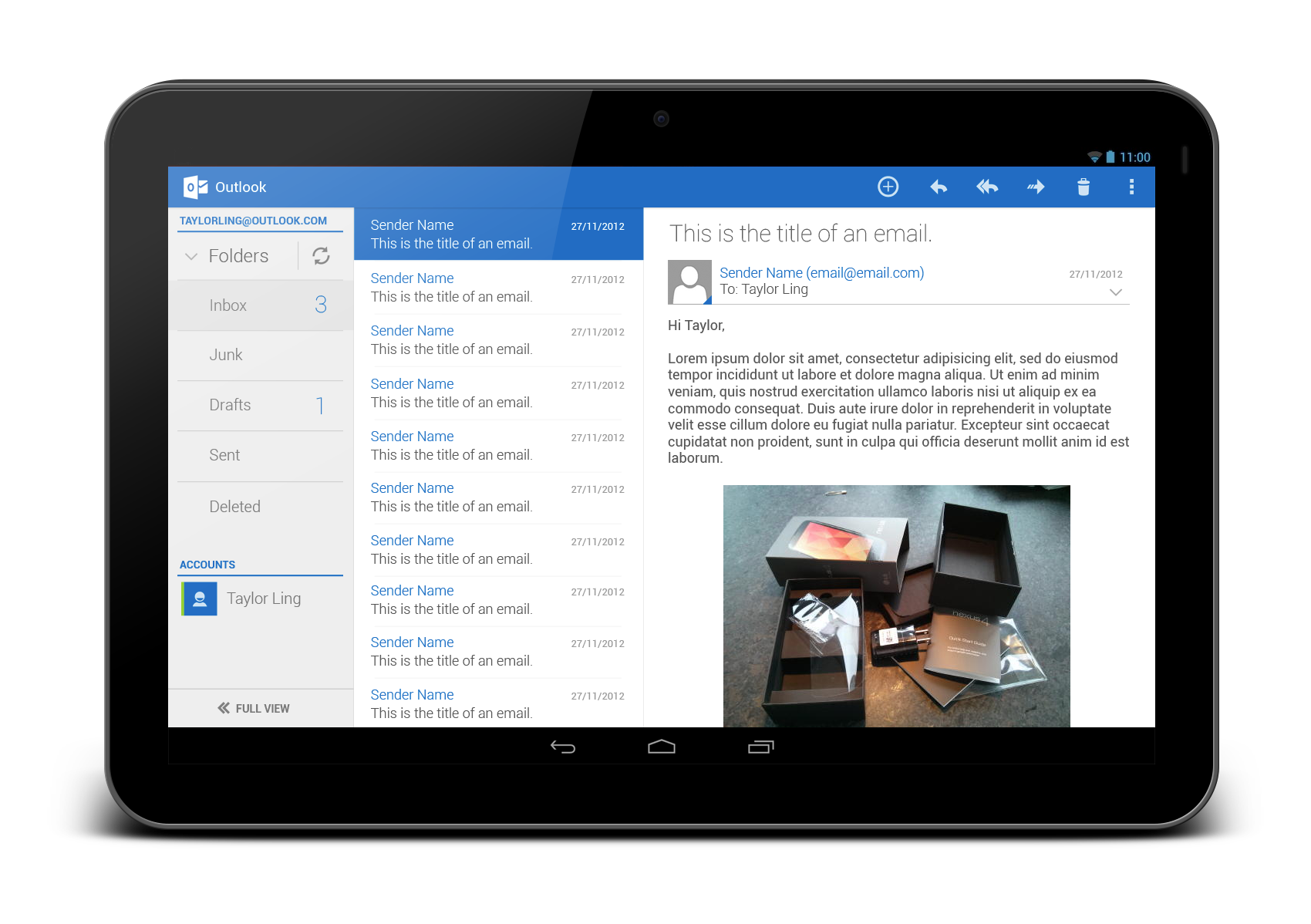
It’s a pity that the stock Email app doesn’t get any updates ever since ICS (at least I am not aware any of them). In Android UI/UX Tips #1, I have questioned on the navigation buttons in the app, and now I have found more things that can be improved during my daily usage.

If you need a borderless button in the middle of UI (in this case the Email app), please make sure that the user should be able to press it anywhere along the entire button area, otherwise if you would like to make it work only on a specific area, remember to use a vertical separator. Gmail app is doing this absolutely right.


Ensure Action Hints are working properly

While it doesn’t seems to be a crucial feature, but I would really make sure that the Action Hints are always working correctly, showing the helpful hint to the user about the iconized buttons.

In Email app, when you long press on the navigation button, it actually show the Action Hint toast box without any text in it. This should be avoided – it doesn’t provide any helpful hint to the user and it doesn’t give any good impression on the app quality either.

That’s all for this Android UI/UX Tips! As usual, hit me with comments if you have any.