Result for Android UI/UX (Re)Design Challenge 2.0

android-design-challenge - result

After taking some times, we finally have the 10 winners from all 42 entries! Congratulations!

No, it wasn’t an easy task to pick the winners – it won’t happen without the judges involved that basically spent hours to look through all the entries and place their scores and comments on them – Thank you! And to those who doesn’t make it to the winner list this time, don’t be disappointed – it doesn’t mean that your entry is bad – go on, apply some tweaks and make it happen!

The 10 Winning Entries

Below are the 10 winning entries, together with the selected comment from the judges (not in any order):

Chris Basha – Dribbble

Awesome stuff. Great work wielding Android design language with some unique taste that feels completely at home. Using an Instagram-esque presentation of content makes sense (I’d do some recon on whether this is true) and the suggestions stream is epic – all about the content. The app has a good balance that caters to Prospects and Players alike – perfecting this experience is crucial.

Only things I can call out are the crowding of content on the Item view. The image is the most important piece of the screen and shouldn’t be covered by anything. At the very least the AB should disappear as soon as the view is loaded.

Besides that and some tight text on the Designers view, this is a great v1 and should be started immediately 🙂

Elad Izak – My Battery Saver

Sweet. While this is taking quite some inspiration from Timely, it’s a joy to just look at those colors. The app’s purpose seems simple enough, to use the visual layer for clean beauty. Make it a reality.

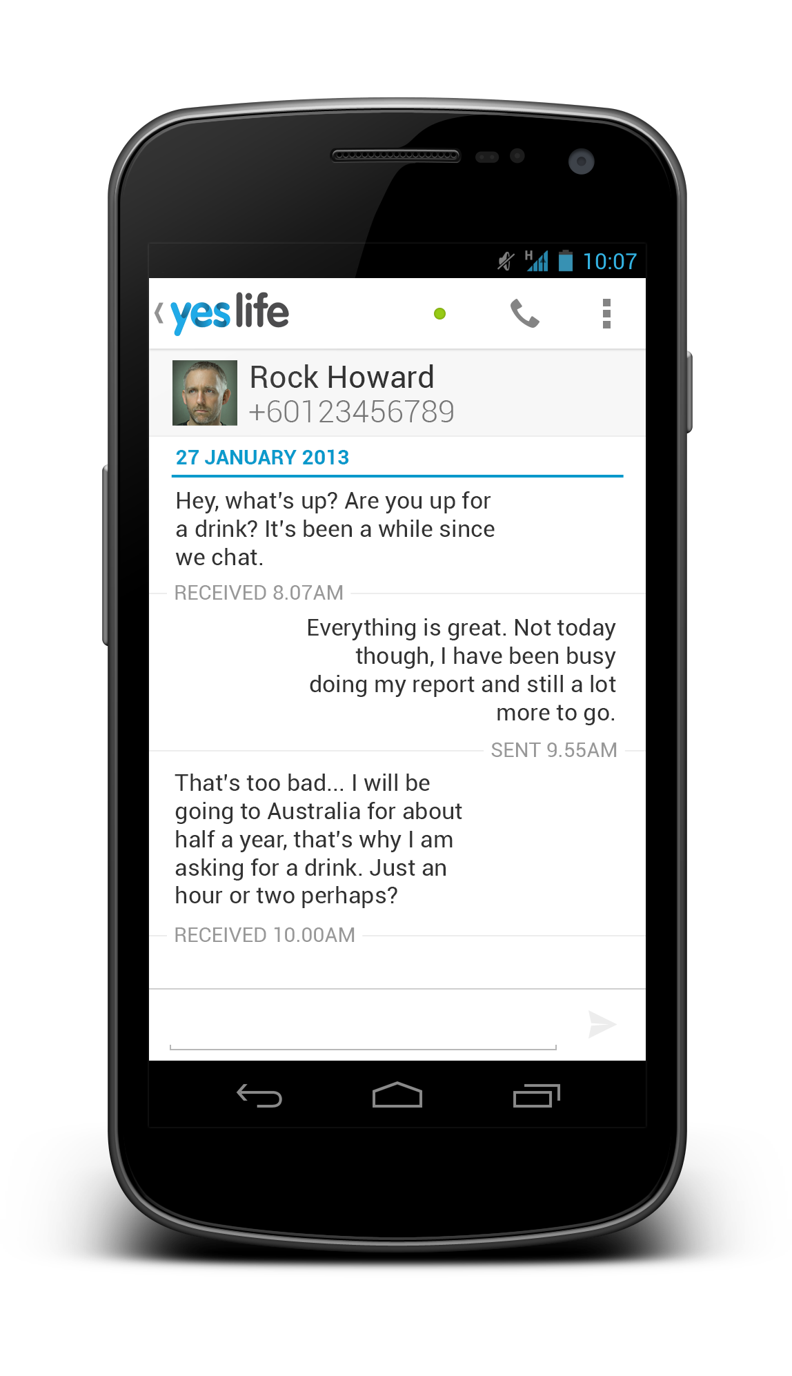
Andre Goersch – RunPee

The app design is clear and clean. Developers will be happy to see this design. I have concerns about scalability of this design though. Going to larger screens will take a lot of rethinking with some screens but would probably be possible. 

Brand and Android UX blend together nicely as well.

Cole Chamberlin – Eve Music Player

First off, great presentation of thought through the deck. This is really important because it helps relay meaning but also forces you to really consider the reasons for your choices.

Overall, this is a fresh presentation that balances native patterns with unique layouts and interactions. I think gestures are a great idea. They can be a double-edged sword however – the next step for this would be some user testing to make sure things are clear and fit the app’s desired use scenario (sitting on the couch vs running, etc.)

Polished to a near-shine – I’d fiddle with the action bar a bit more. GREAT WORK.

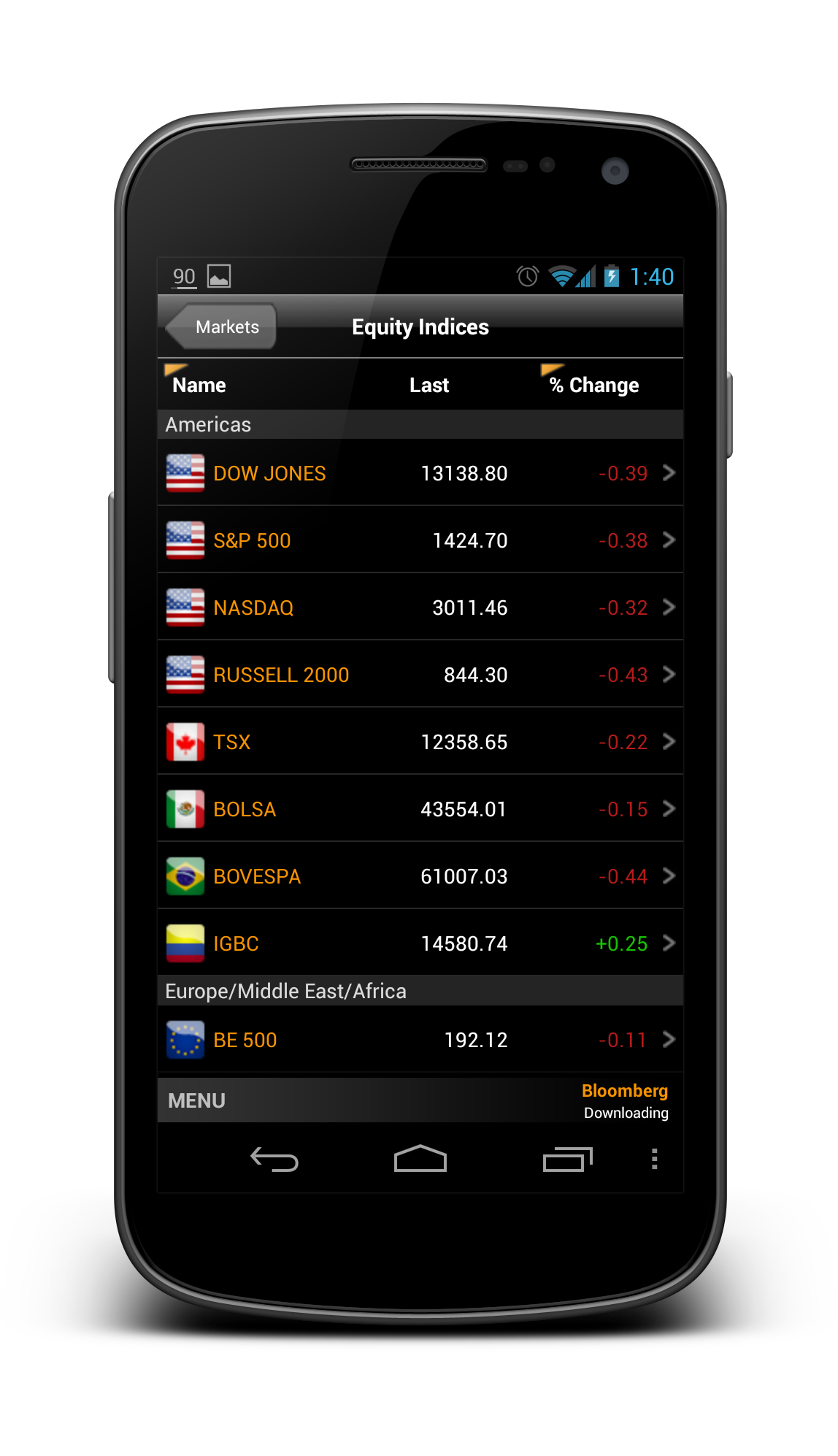
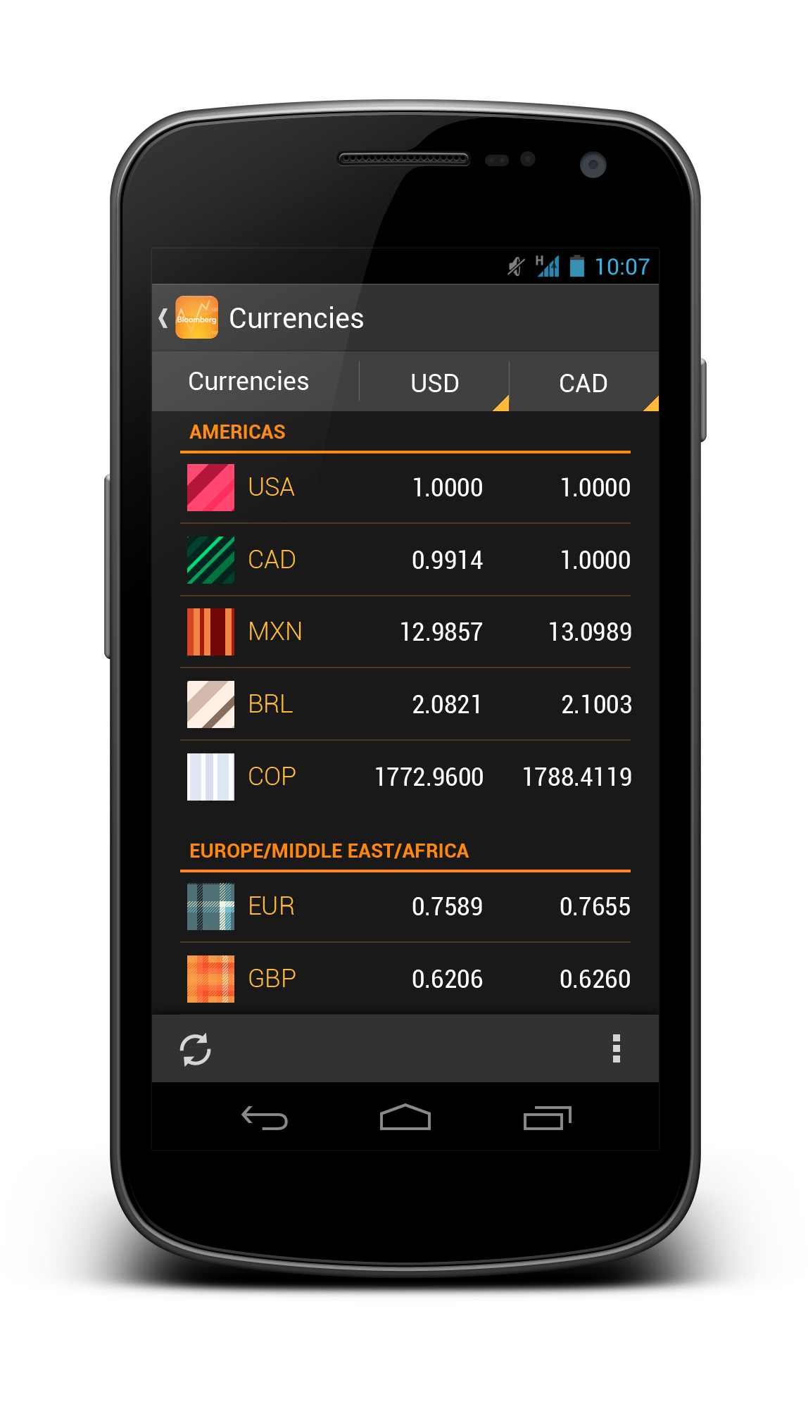
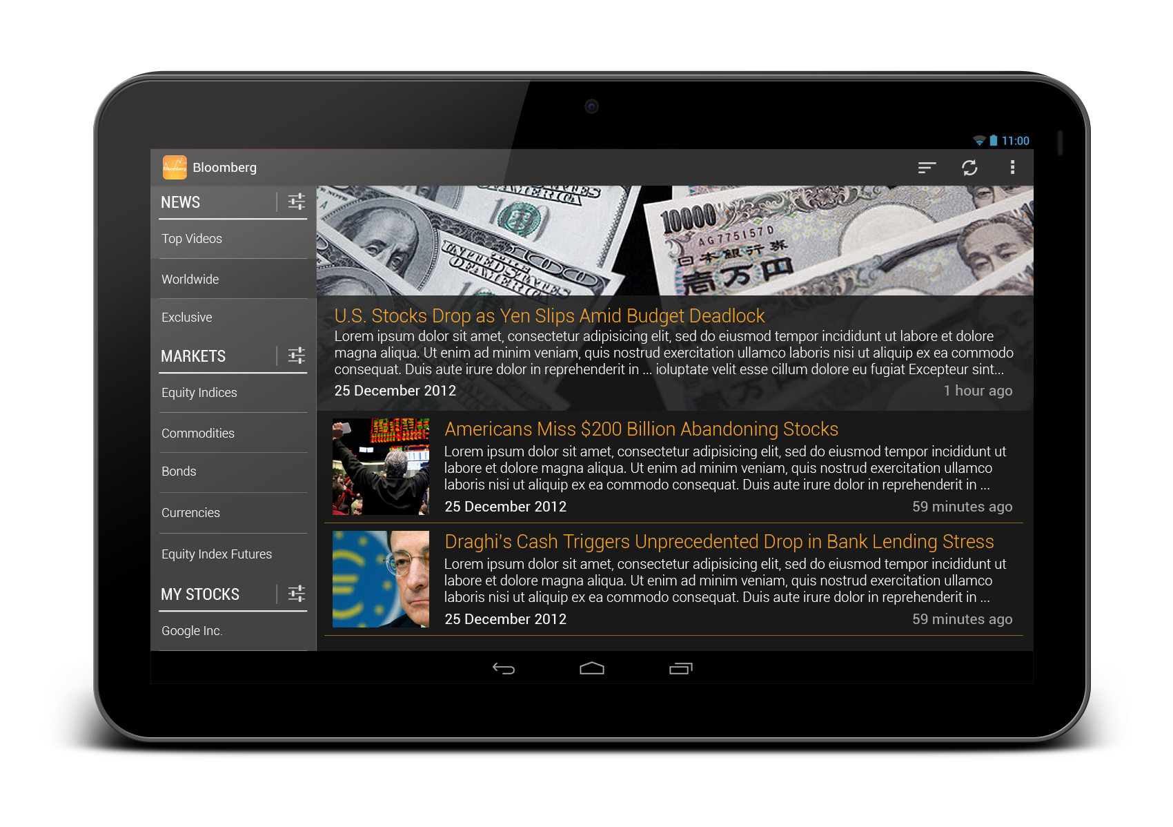
Alexander Karpilovich – Kinopoisk.ru

Great Androidy update to the original UI while keeping the brand. The design also looks very scalable to larger screens.

I’d reconsider transparent navigation bar and status bar use though. In this app there’s no added value of using them.

Evgeny Belyaev – Evernote

Great redesign. Evernote feels a lot clumsy on the current version, I would use it again if it looks like this work. I would considerate to not use Roboto Slab everywhere, but it’s a better look and feel, definitely a improvement over the current app.

Swapnil Chitnis – Project Throne

I like this a lot. Finally someone who adds some unique branding to the mix, without sticking too hard to the guidelines. It’s clean, it’s clear, it’s fun and it’s Android.

Paul Forgione – Kho

Any experience that helps manage my medical needs without bringing the “serious medical issue” aura to light is a winner in my book. This presentation is simple and follows the guidelines while staying unique. It feels more “human” than analytical which is especially important for a daily use app.

Only a tad more polish on things like the graph labels and scrolling blocks/buttons at the bottom and you’ll have something realllllly great.

Sean Smith – HBO Go

Then we have (finally) a great use of KitKat immersive features here, you can see the ActionBar but the opacity trick make it beautiful, specially the home screen with pictures and stuff. Love the animations to show UX interactions, great presentation!

James Jun – TweetLane

Great work simplifying the app. Some apps try to be everything and that doesn’t always work out. The focus on content and getting everything else out of the way is a good goal.

The little flourishes like the bird moving with refresh is great – these bits of polish differentiate and delight.

Two points:
The tweet button is nice, although it gets a little lost and covers content. Consider making it the prominent blue and hide on scrolling down. The compose view could have a tad more queue that it is the input box and not just an expanded button.

I’m a little concerned the menu view will be difficult to find, so some user testing and feedback will be needed to confirm its placement.

Nice, simple, and clean!

General Impression on the Entries

I received a lot of great feedback from the judges and sponsors for the design challenge this time – below is the general impression of the entries:

  • General quality of the entries are satisfying (though it can be better!)
  • The Android Design Community show signs of maturation
  • Scalability (read: responsiveness) of the design, most of the time, is not considered
  • Lack of tablet-centric design
  • Entry need to be a complete story/flow to capture the overall UX rather than just a few screens

These feedback are great for me to prepare for the next one (if there is one).

Prizes for the Winners

As promised, each winner will walk away with a Domo Arigato Mr. Roboto T-Shirt at the selected size, and a 10 USD Play Store Gift Card (or 10 USD Paypal cash). The T-shirt has been ordered and it will be shipped once it is printed, and I will email the winners for the Play Store Gift Card.

Thank you and I hope everyone able to grab something from the design challenge, and if it’s all possible, I will definitely make the third one next year!

Minna, Domo Arigato! 

Yes Life for Android Redesigned

It’s been a long time since my last blog entry, but definitely I am still working on tons of Android Design (in private) and they are often very inspiring, which I hope I can share them in the near future if it’s possible.

Today I would just like to share some redesigns for an app that is local to my home country. The app called Yes Life, which basically an app that allows the user to call and send SMS to any local number from anywhere around the world with internet connection. Below are some screens from the current app:

Yes_Old_Dialer

Yes_Old_SMS

There are few things in the app motivated the redesign:

  • Almost 90% iOS UI Style (and ugly)
  • (Very) Bad navigation system
  • Usability issue (For example, online/offline status only in the Dialer page)
  • Buggy (which unfortunately cannot be solved by a redesign)
  • Missed the opportunity to enhance the branding 

To address these few issues that I see, I did some redesign on some screens with Holo UI approach (of course!) with the following changes:

  • Designed with Holo UI approach
  • Used (swipe-able) tab navigation
  • Used Action Bar (for better context actions and navigation)
  • Show connection status in every screens (which is important for such app)
  • Used light/white theme (for branding enhancement)

Below shows a few redesigned screens:

DialerSMSsSMS Detail

What do you think?

I hope this gives some idea on the importance of the app design in branding enhancement. If you have excellent solutions and branding, but decided to give your user bad products, it doesn’t do good on anything except getting rejected by the users.

Design is not just what it looks like and feels like. Design is how it works.

Bloomberg Redesigned

Bloomberg – another app that I wanted to redesign so long, because the app is pretty badly designed ever since day one. It is almost an exact port of the iOS version, with a really strange ‘MENU’ button at the bottom of the app,  and the deadly legacy menu button. Below show some shots from the current version for comparison:

Old_News

Old_Equity

Old_Stock Details

So what if the app is redesigned with the Holo UI approaches and full Android experience? Below are some shots that I have redesigned:

Worldwide News

framed_Slide In Menu

Equity Indices

Currencies

Bonds

My Stocks

Stock Details

And also some redesigns for tablet version:

Tablet - News

Tablet - MarketsWhat do you think? Do you like the redesigns? Don’t hesitate to shot in the comment box!

LinkedIn Redesigned

LinkedIn app is one of the app that I wanted to redesign so badly that I hate it when I am using it (only for accepting request and replying message). It might looks good 2-3 years back, but not anymore today.

There are a few reasons that I think this app deserve a complete redesign:

  • Resemble iOS version almost completely 
  • Lack of navigation in the app
  • Unnecessary skeuomorphism
  • Legacy menu button
  • Badly designed UI (for example, the dashboard give really limited information)

Below I included some screenshots from the current app:

Old_Profile Old_Updates Old_Dashboard

Using the Holo UI approaches, I have redesigned a few screens that fit nicely in today’s Android devices. I have replaced the dashboard UI with the Sliding Menu due to the huge number of sections available in the app. Check them out below:

Linked In - Slide Menu

Linked In - Updates

Linked In - Profile

Linked In - Profile 2

Linked In - Shared Item

Linked In - Other Profile

Update 28/12/2012: After taking some feedback from my G+ post, I have decided to give it another revision for better LinkedIn branding, and below are some updated shots. What’s changed:

  • Action Bar is in dark grey color to give a distinct UI layers
  • Added frame for photos
  • Used Card UI for details
  • Added some iconography
  • Increase the size of the sliding menu and smaller icons
  • Added Share button besides Invite to Connect button

Linked In - Profile

Linked In - Slide Menu

Linked In - Other Profile

What do you think about my redesign? Do you like them? Shot me your comments or suggestions!

Movie Ticketing App Redesigned

Last month Roman Nurik posted a wizards pattern for complex user inputs, and I have now used it for my redesign of a local (Malaysia) movie ticketing app, which is definitely a perfect match (I think). Hopefully this redesign can inspire any developers or designers that are looking to create/redesign movie ticketing app.

Why I am redesigning this app? I have placed a few shots below to briefly show the user interface of the app to explain that. Completely implemented with iOS look and feel, legacy menu button, badly-resized images, in-app advertisement (about themselves),  bad user interaction design – everything is so wrong. Give it a try if you want to understand my frustrations.

Old_Promotion Old_Cinema

I think many will agree with me – app that just work without proper UI/UX design is no longer enough to stand out and compete with thousands of other apps in the market.

Completely redesigned with Holo UI approach, the movie ticketing app is aimed to provide great and easy ticketing service with sufficient information about cinemas and movies. Here’s my take (It’s a long page!):

Promotion Cinema List

Cinema - Show Date

Cinema - MoviesCinema - Show Time

Cinema - Tickets

Cinema - Seat Selection

Cinema - Review

Cinema - Payment

Fast Ticket

Purchased Ticket

What do you think about my redesign? Shot me in the comments if you have any suggestions/feedback/critique!

Outlook.com App Redesign – Tablet Version

Last week I have published a redesign of outlook.com app after the disappointing official release, and since then I have also started to look into the tablet version. The redesigned phone version has been a shared around Android Google+ community during that day, and it was also mentioned in latest episode of Android Design in Action – big thanks to everyone who re-shared and commented on the redesign.

Below are my take on the tablet version, probably not much surprise for some (Before anyone say it, yes, it looks like Gmail/Email app, since it’s an Email client):

Sign In

Outlook Tablet First RunOutlook Tablet - Open EmailOutlook Tablet - Open Email - Full View

What do you think?

Outlook.com App Redesigned

Over 25 million active Outlook.com users and they said they are ready for Gmail user to switch – with this low quality app.

I really disappointed with this surprising move since they did a really great job in SkyDrive app in Android. Seriously, it’s not rocket science to craft a beautiful and usable email app with Microsoft identity. They invested heavily in UI/UX for their new product lines, but yet they failed to understand the importance of Aesthetic-Usability Effect.

What I really hope to see when I run the outlook.com app:

But what I see today with the current app (usually I don’t post these):

What do you think? Just feed me with any idea or suggestion you have!

Google Finance Redesigned

I have been thinking to redesign Google Finance app for a quite some time since I think all Google apps should have at least adapted to Holo Style UI, and I think there are still quite some number of users for the app (unfortunately not me because it doesn’t support share market of Malaysia), but I didn’t quite find the time for it. However, last Android Design in Action episode has put up a challenge to all Android developers/designers for some redesigned screens of any current apps, and that motivated me to continue working on this redesign despite of the really packed schedule.

The current Google Finance app is really ugly, which looks like a web-app rather than a native app. The graph is not loaded at the proper size, old Android UI elements are still there, and the ugly legacy action overflow. Therefore a redesign is definitely required.  And the objective is pretty straight forward: Make it a clean and nice app to be used by every user levels. Therefore I tried to preserve the familiarity so the existing user will not have to re-learn the new UI while still providing a refreshed UI compliant to Android Design Guideline. Here’s my take:

What do you think? Shot me in the comment box 🙂

If you want to see some comparison shots between the current version and my redesigned version, I have posted them in my G+, feel free to comment there as well!