Android Wear UI Design Kit for Photoshop 0.1 [Free Download]

Haze Watch on Moto 360

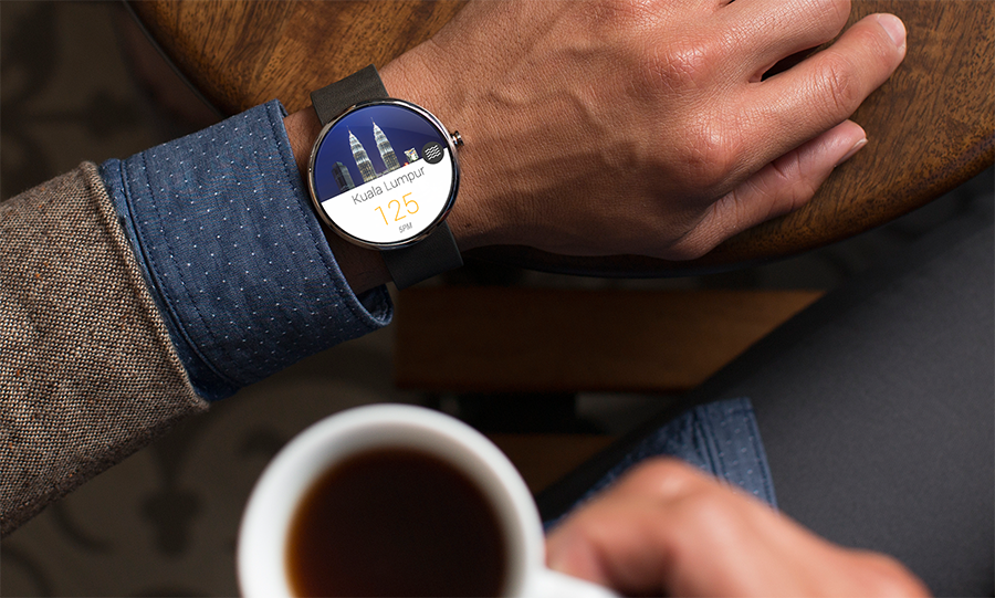
As you might have aware, Google has announced Android Wear specifically designed for wearables, and I am really excited about it – new form factor and new UI/UX to explore (and the sexy Moto 360).

I was playing around with mock up on a small app called Haze Watch (to monitor Haze condition in Malaysia), and it’s really fun – with that very limited screen estate, it’s really important to only show crucial information that is meant for a glance, not read – and this design principle is well explained in the official Design Guideline. I am really looking forward to see how Android Wear change the very new wearables market, I guess exciting time ahead?

Android Wear UI Design Kit for Photoshop 0.1

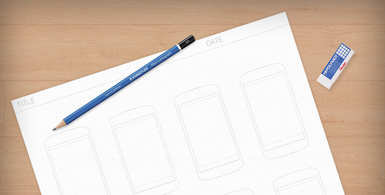
Then I was thinking, why not a simple design kit for those who want to play around with this new form factor which has a very small screen estate? So I decided to make one very simple Android Wear UI Design Kit for Photoshop. What you can expect from it:

  • 2 Adobe Photoshop files – Square (280×280) and Round (320×320)
  • A few different layout like Incoming Notification, Notification Stack, Contextual Card etc.

That’s it! It’s not meant for accurate mock up as of now since I don’t have the design specs, but it’s good enough to play around and get prepared for the next wave.

Download

You can download it from my Mediafire account Android Wear UI Design Kit for Photoshop 0.1. For the round one, it goes really well with Spiderfly Studio Moto 360 Mock Up tool for Photoshop (though you might have to do a little bit of resizing)!

Result for Android UI/UX (Re)Design Challenge

Early this month I have organized a design challenge which welcomed anyone that are interested in design/redesign an Android app to participate, and I am really thrilled by the huge responses from the community! There are in total 25 qualified entries which is really challenging for the judges to pick the best 5 entries that deserve the 10$ Google Play Store Gift Card. Speaking about judges, these awesome people formed the judgment team: Asher SimondsGuenther BeyerLucas Rocha, Juhani Lehtimäki, and Walmyr Carvalho. Huge thanks to these guys for helping me out voluntarily! And yes, I am not part of the judgment team for maximum fairness in the result.

Result

And the final result are as below. Congratulations to these people! In the upcoming weeks, I will publish posts for these 5 entries to discuss about the comments from the judges, and my point of view about them.

Result

Prize(s)

As promised, the best 5 entries above will win away a 10$ Google Play Store Gift Card. For all other entries that are not in the chosen 5, you guys rock too! This is why I have decided to give away 10 pieces of Android UI Design Kit Logo sticker (measured at approximately 4.5cm x 5.5cm) to all other participants to show my appreciation for your entries. Isn’t that awesome?

Android UI/UX Brand

So everyone that participated in this (Re)design Challenge, please do the following to claim your prize:

  1. Send an email to androiduiux [at] gmail.com with the title Android UI/UX (Re)design Challenge Prize Claim
  2. In the email content, please include your full name, your entry title, full international mailing address and full phone number (with international codes)

That’s all! I will send out the prizes as soon as I can. Again, thank you very much for your entries and I hope to see more awesome design/redesign from you in the community! Till next time!

Android UI/UX (Re)Design Challenge

Android Design Challenge

Taking cue from Android Design in Action Challenge happened last year, I just feel like making another similar Design Challenge for everyone, hence this Android UI/UX (Re)Design Challenge. The aim is to create more awareness towards the importance of Android Design, and a (hopefully) rewarding experience for those who try their hand at Android Design.

Really simple rules

  1. Anyone can participate!
  2. Design a brand new app or redesign an existing app (any app) before 16th June 2013 (I like to see high quality works thus the longer design period)
  3. The (re)design should use Android Design Guideline as a reference. The use of new UI elements like Navigation Drawer and Fading Action Bar are encouraged only if they fit into the app design.
  4. At least five screens are required (in order to tell an app flow/structure). It will be awesome if explanation/justification is provided for each screen. One good example on how you can document your (re)design is the m-Indicator redesign by Swapnil360.
  5. Optional: Feel free to post your design to any G+ Android Design Community (including Android Designers) to get feedback and further improve your app (re)design before your final entry. It’s always encouraging to see such design iterations which involved communities.
  6. Post your design entry in G+ publicly, and remember to use these hashtags:

#androiduiux #androiddesign #ADiA

Design Tools

  1. Feel free to use any design tools that you are comfortable with, as long as the final result are high-fidelity mock up screens.
  2. If you are looking for some design resources to start, check out the Free Design Resources page.

Winner announcement

  1. Five best entries will be announced via my G+ account and androiduiux.com within a week after the deadline (before 23rd of June).
  2. All entries will be judged by professional android designers in order to pick the winners.
  3. I will make some posts in my blog for all best entries (and probably some interesting entries) after the design challenge.

Prize

  1. Five 10$ Play Store Gift Cards for five best entries only (from my own pocket!)
  2. I reserved the right in prize management based on the quality of the entries.

That’s all! If you are interested, start (re)designing and submit your design entry before 16th June 2013! Waiting for your awesome entry!

Yes Life for Android Redesigned

It’s been a long time since my last blog entry, but definitely I am still working on tons of Android Design (in private) and they are often very inspiring, which I hope I can share them in the near future if it’s possible.

Today I would just like to share some redesigns for an app that is local to my home country. The app called Yes Life, which basically an app that allows the user to call and send SMS to any local number from anywhere around the world with internet connection. Below are some screens from the current app:

Yes_Old_Dialer

Yes_Old_SMS

There are few things in the app motivated the redesign:

  • Almost 90% iOS UI Style (and ugly)
  • (Very) Bad navigation system
  • Usability issue (For example, online/offline status only in the Dialer page)
  • Buggy (which unfortunately cannot be solved by a redesign)
  • Missed the opportunity to enhance the branding 

To address these few issues that I see, I did some redesign on some screens with Holo UI approach (of course!) with the following changes:

  • Designed with Holo UI approach
  • Used (swipe-able) tab navigation
  • Used Action Bar (for better context actions and navigation)
  • Show connection status in every screens (which is important for such app)
  • Used light/white theme (for branding enhancement)

Below shows a few redesigned screens:

DialerSMSsSMS Detail

What do you think?

I hope this gives some idea on the importance of the app design in branding enhancement. If you have excellent solutions and branding, but decided to give your user bad products, it doesn’t do good on anything except getting rejected by the users.

Design is not just what it looks like and feels like. Design is how it works.

Bloomberg Redesigned

Bloomberg – another app that I wanted to redesign so long, because the app is pretty badly designed ever since day one. It is almost an exact port of the iOS version, with a really strange ‘MENU’ button at the bottom of the app,  and the deadly legacy menu button. Below show some shots from the current version for comparison:

Old_News

Old_Equity

Old_Stock Details

So what if the app is redesigned with the Holo UI approaches and full Android experience? Below are some shots that I have redesigned:

Worldwide News

framed_Slide In Menu

Equity Indices

Currencies

Bonds

My Stocks

Stock Details

And also some redesigns for tablet version:

Tablet - News

Tablet - MarketsWhat do you think? Do you like the redesigns? Don’t hesitate to shot in the comment box!

Printable A4 Screen Flow Sketch Template [Free Download]

Featured

Update 07 January 2013: Added Screen Flow Sketch Template for Tablet (Nexus 10). Download link below.

During the new year of 2013, I have released a PSD template for wireframe/mock up screen flow, which I hope can help a little bit in creating an app screen flow easily in digital format. And today, considering there are still many people love to do sketching for wireframe/mock up, I have created a Printable A4 Screen Flow Sketch Template in PDF Format, so you can easily sketch the screen flow on the paper, and because each screen is considerably small, you only need to focus on the main interaction area for the flow, so details are not needed.

I strongly recommended to use this one to sketch out your app idea before going into details since the navigation/screen flow will be there when you are expanding your idea, eliminating some confused/undetermined navigation between screen.

Printing Tips

  • Use Fit option to print (Don’t use exact size)
  • Print in Black and White
  • Use High Quality (This won’t use much ink)

Download

I have placed it in my Mediafire account and it’s free to download:

If you have any issue downloading it, let me know and I will send you a copy.

Wireframe Screen Flow Template [Free Download]

Update: I’ve updated the template to 1.0.1 to fix an issue that all screens will be using the same content. Have to blame myself for the lazy duplication. At the same time, Wireframe Screen Flow Template using Nexus 4 is also available now.

Inspired by a question from the group member within a private G+ community – Android Designers, I decided to spend some time to create a Wireframe Screen Flow Template for Adobe Photoshop that can help Android Developers/Designers to create a complete screen flow for wireframes or mockups. Below is the preview of the template that I have made:

Wireframe Screen Flow Template 1.0

What’s inside

  • 12 mock up screens (They are smart objects so it’s very easy to drag-and-drop your mock ups)
  • Gestures
  • Screen flow arrows (One level down/up and two levels down/up)

How to use

  1. Create all your mock ups or wireframes in 1280×720 or 1280×768 (Photoshop GUI Design Kit recommended) including the Nav Bar and Status Bar. Save them as png.
  2. In the template, select one of the mock up screen folder. Look for Mock Up Screen (EDIT CONTENT). Right click on it then select Edit Contents.
  3. In the new screen, drag-and-drop your mock up. It should fit nicely. Ctrl+S to save, then close it. You should see the mock up appears in the screen flow template.
  4. Select your preferred gestures and screen flow arrows within those folders for a complete screen flow mock up.

Download

I have placed it to Mediafire and it is free to download:

If you have any issue downloading it, let me know and I will send you a copy.

This work is licensed under the Creative Commons Attribution-ShareAlike 3.0 Unported License. To view a copy of this license, visit http://creativecommons.org/licenses/by-sa/3.0/ or send a letter to Creative Commons, 444 Castro Street, Suite 900, Mountain View, California, 94041, USA.

LinkedIn Redesigned

LinkedIn app is one of the app that I wanted to redesign so badly that I hate it when I am using it (only for accepting request and replying message). It might looks good 2-3 years back, but not anymore today.

There are a few reasons that I think this app deserve a complete redesign:

  • Resemble iOS version almost completely 
  • Lack of navigation in the app
  • Unnecessary skeuomorphism
  • Legacy menu button
  • Badly designed UI (for example, the dashboard give really limited information)

Below I included some screenshots from the current app:

Old_Profile Old_Updates Old_Dashboard

Using the Holo UI approaches, I have redesigned a few screens that fit nicely in today’s Android devices. I have replaced the dashboard UI with the Sliding Menu due to the huge number of sections available in the app. Check them out below:

Linked In - Slide Menu

Linked In - Updates

Linked In - Profile

Linked In - Profile 2

Linked In - Shared Item

Linked In - Other Profile

Update 28/12/2012: After taking some feedback from my G+ post, I have decided to give it another revision for better LinkedIn branding, and below are some updated shots. What’s changed:

  • Action Bar is in dark grey color to give a distinct UI layers
  • Added frame for photos
  • Used Card UI for details
  • Added some iconography
  • Increase the size of the sliding menu and smaller icons
  • Added Share button besides Invite to Connect button

Linked In - Profile

Linked In - Slide Menu

Linked In - Other Profile

What do you think about my redesign? Do you like them? Shot me your comments or suggestions!

uTorrent Redesigned

Early this month, BitTorrent Inc. decided to release the native µTorrent app to the Play Store, and I must say I am pretty shocked by the app design. It’s horrible. Immediately after that, Holo There looked into it and did a quick redesign of the app and it looks quite nice.

I was thinking to do a redesign of it after their official release, and now I finally did the redesign after playing around with it for some time to understand most, if not all, of the features in the app. Below shots are my redesigned µTorrent app (5 shots):

My redesigned µTorrent app has a pure Android Design and Holo themed with the heavy use of its’ brand color. It make full use of the notification center of Jelly Bean which allows quick actions and individual torrent control (Resume, Pause, Stop) is possible in the main screen.

What do you think of my redesigned µTorrent? Feel free to let me know 🙂

Android UI/UX Tips #2

After publishing the 1st Android UI/UX Tips, it seems that I am able to find more UI/UX mistakes in various apps (perhaps I become ultra-sensitive now?), so here it is, Android UI/UX Tips #2 to inspire Android Designers/Developers in developing app with awesome UI and UX.

Don’t Make it Hard for The User

If your app have some awesome features that simplify user interaction, think thoroughly when to/not to remove it from your app.

One example that I would like to show is the Update button in Play Store app. When there are more than one apps require update, the Update button is very useful. Updating all the apps will only take one touch. But, when there is only one app having update, the Update button mysteriously disappeared. The problem is, now to update that particular one app, three touches are required (Select the app > Click Update > Click Accept & Download). I personally do not see any use case requires such interaction design – if you can do the same for multiple items, you should be able to do it for a single item.

Consistent with Android Design

In Google Drive app, most of the dialog in the app are using the basic button, which looks really ugly and inconsistent with Android Design. The buttons in default dialog in Android should be (I am not sure) already using the borderless buttons, so I am just feel like asking the Google Drive developers:

Why make the dialog looks like a Microsoft Windows dialog?

No Double Up Combo, Please

Astro File Manager has a new update with refreshed UI, and it comes with a double Up combo! As I mentioned in my Google+ post, it is definitely unnecessary and downright ugly. Just use the app icon for better identity establishment. Perhaps the app designer want to help enhancing the Up affordance?

Consistent with Icon for User Interaction

Again, it’s Google Drive. In the Detail View of a file/folder, you can see there is a Done button (Tick icon) in the Action Bar, and a Cross icon near the file name. You might think that the Cross icon is meant for the file/folder itself, perhaps for deletion or discarding changes? Nope. It behaves exactly the same as the Done button, and this is really a confusing design. In Android, the Cross icon usually meant remove, discard, or cancel. This is not Microsoft Windows. Just stick with the Done button at the Action Bar and it will be just nice.

That’s all for Android UI/UX Tips #2! Hope it is inspiring!