#DesignProtip – Keyline Pushing app + Layout Bound

Designprotip.png

I often got asked how do I inspect an app from design perspective, especially on the layout, alignment, keylines etc., so I thought to share this in my blog. Sometimes we are able to spot some issues by just looking at it, but with some nifty tools, the design inspection can be done much easier.

Below screenshot is what I usually see when I do a design pass on the static design implementation. It’s an IMDb app screenshot with keyline grid + layout bound shown, which is very useful to spot misaligned elements and incorrect paddings.

IMDb in Keyline Pushing and Layout Bound

Tools

  1. Keyline Pushing app by Faiz Malkani – This awesome free app will print the 8dp gridlines on your screen which have the proper keylines recommended in Material Design. It also has some other gridlines like 4dp typographic grid which can be very useful sometimes. (Update: Another new app called Material Cue can do the same thing as well)
  2. Show Layout Bound option in Developer Options –  This will show the bound of each element in blue lines (clip bounds), red lines (optical bounds) and pink area (margins). This helps a lot to spot unnecessary padding or misaligned bound. To access this option, turn on developer mode in Android. Then Settings > Developer options > Show layout bounds.

How this can help Android developers?

Few months back I introduced these 2 tools to my developer friends, and below are their comments on this tip:

It is useful to see the view paddings and margins, and immediately understand which view is causing the keyline misalignment. However, for standard views, paddings and margins have an expected behaviour so you can fix the issues without the layout bounds. Layout bound option can be really useful for custom views and custom groupviews. For these views, you can do whatever you want with the paddings, so having the layout bounds visible helps understand how your view occupy the space, which is useful to have the correct keylines.

It helped me mostly to check that clip to children works to prevent shadow, animation, and ripple effect cut-off. Also I am able to quickly check that all cards/pictures are correctly aligned based on the key line and the left/right edge of the layout bound. For layout bound, it helps to check that the touch target of images has been extended and is not only limited to the image edges. It also helps ensuring that some views ‘visibility’ are gone and not just set to invisible. With keyline pushing app, it is mainly to ensure that the Material Design spec has been fulfilled.

Happy designing and developing!


Android Design – Think Adaptive

Adaptive Design

Designing for Android devices can be challenging sometimes due to the availability of the Android-powered devices with different screen sizes, however, it is certainly not an issue if adaptive design is considered during the design phase of the app. Some developer/company chose to complain about this, but this likely won’t change anything because it is a deliberate direction that Android meant to go and move forward. The way forward? It’s Adaptive Android Design1.

Continue reading

#AndroidDev Interview Series – Ryan Harter

Interview No 1

Why #AndroidDev Interview Series?

I think it’s no secret that my aim being a GDE is to help to close the gap between designer and developer in order to make awesome products, and as a designer, I always enjoy talking to Android Developer to get insights from them, especially indie developers since most of the time, they pretty much have to wear many different hats themselves in making their app a success in the Play Store.

Thus the idea making a series of interview with awesome Android Developers (especially indie developers) to peek inside their world, and their thoughts on design and designers (which is the insights that I truly appreciate), because I believe I will be able to learn something new from everyone of them with their unique experiences in Android development.

So for the first interview of the series, I proudly present Ryan Harter. I haven’t met Ryan until the recent GDE Summit (yes, he is an Android GDE!), and I definitely love talking to him and appreciate his passion towards Android development. Below is the quick and short email interview with him:

Continue reading

An example of really bad mobile app design – Maybank2u

mbb

Disclaimer: This post is mainly about the author rant about bad mobile app design from the largest bank in Malaysia, but it is also a great example of don’ts in mobile app design.

It’s September 2014. Material Design was introduced few months ago during Google I/O 2014. The predecessor – Holo Design was introduced late 2011 together with the launch of Ice Cream Sandwich (Android 4.0), which is about 2-3 years ago, and it’s getting matured as time goes. It’s probably not wrong to expect any Android apps published in the year 2014 embraced with all the lessons that we have learnt in Holo Design and craft the best Android experiences for the user.

Except it’s not for Maybank, the largest bank in Malaysia, and one of the world’s top 100 banks.

Last week, they have officially launched their revamped mobile banking app, claiming that it has the best mobile banking experience compared to the previous version. It does seems to have a refreshed design – except it’s probably one of the worst and most unacceptable mobile design that I ever seen. And it’s 2014.

Continue reading

Crafting the Unclouded experience

Unclouded

Unclouded by Christian Göllner, an app that helps to analyse and clean your cloud storage (Dropbox and Google Drive, for now) has just recently out of beta, and I have the honor to work together with Christian on the design for this app. I was really impressed by the app quality when I first received the early build of the app – without hesitation, I told him that I wanted to work together to bring this app to the level of awesomeness. It is super amazing that the app has been featured by Android Police, TechCrunch, CNET, Lifehacker, and xda-developers, and these boosted our confidence about the design and development direction of the app.

In this post, I would love to talk about some design details that we have worked hard to fine tune in order to craft the ‘Unclouded’ experience that we have visioned.

Continue reading

How I would further improve TuneIn Radio app

TuneIn

While this blog post titled ‘How would I further improve TuneIn Radio app’, but I thought I would also like to take this opportunity to touch on the topic about consistency in visual design for mobile apps. No, this isn’t a fight between flat, skeuomorphism, gradient etc. – this is about embracing the consistency of visual design for better aesthetic integrity of a product regardless of the visual styling you opt for.

Visual Consistency is for better aesthetic integrity

One of the graphic design principles that I found here fit the context very well:

While creating rhythms and variations from page to page, one must also remember to maintain an overall aesthetic integrity. The purpose of graphic design is to communicate, not dazzle, and an inconsistent design will result in decreased user effectiveness. This means keeping individual visual and typographic elements simple and clear. It also means applying them uniformly, so that the connotations of a particular type style, or the results of interaction with a particular graphic element, are independent of their context. There should be an overall visual system to the text, carefully considered in the first stages of design, that brings together the elements into a coherent whole.

And of course in Android Design Guideline about branding:

If you take this approach, make sure your (brand) styling is applied to every single icon in your app.

Keep it Consistent

Let’s have a look at the things that I would improve on this app (most of them are about visual consistency):

  • Remove the useless splash/loading screen
  • Need design consistency on Android UI elements (Nav Drawer indicator has inner shadow, overflow icon doesn’t have it, and both of them are in dark colors)
  • Use tabs instead of Nav Drawer. Here’s why
  • Use larger text size in general
  • Make full use of space for interaction rather than using hyperlinked/underlined text
  • Use appropriate (touch-friendly) size for interact-able elements
  • Need design consistency on similar items for maximum familiarity and predictability
  • Show hint if the horizontal list is scrollable
  • Avoid unnecessary paddings
  • Need consistency on font type used in the app
  • Need design consistency on icons (some are flat, some have an outer bevel effect, some have inner shadow)
  • Avoid truncated texts if it’s possible
  • Use blurred background in a proper way
  • Slider that can’t slide? Not needed.
  • Be aware of the bad readability caused by font color choice and background
  • Gradient Now Playing bar? Looks old and just out of place.
  • Use animations to correlate between the full mode and minimize mode of Now Playing
  • Car mode doesn’t have to look THAT bad

1

2

3

4

5

6

7

8

9

TuneIn


What do you think? Do you like the redesigned version of TuneIn?


Unoptimized tablet experience is a missed opportunity

Tablet

It is first started as a simple Google+ post after I saw the refreshed UI of Bank of America app which probably looks OK on the phone, but terribly on the tablet device, and I thought this topic actually worth a short blog post. Well, let’s first have a look on some screenshots of the refreshed UI of the mentioned app:

Navigation Drawer
Navigation Drawer
Details Screen of an Account

There are obviously many UI/UX improvements that I can suggest, for example:

  • Misuse of available screen estateNavigation drawer is not done right and taking away too much of the core experience of the app – navigation drawer is meant to be transient. Also everything looks stretched-out and blown-up which make readability and glanceability become really bad.
  • Lack of Pure Android Experience – It’s 100% iOS experience – Tabs at the bottom, right caret, iOS top bar etc. There are certain UI and interactions elements really unique to Android to provide the user the best and pure Android experience, and this shouldn’t be taken lightly if you care about the user.
  • Lack of attention to details – Even for an untrained eye, it’s pretty obvious that the icon and text wasn’t aligned in a proper way – Mind the gap.
  • Terrible tablet experience – Rather than a blown-up version, a multi-pane layout should be already considered if tablet is meant to be supported.

Unoptimized tablet experience is a missed opportunity

We are currently living in a multi-screen world that we are no longer performing daily activities only on the computer, but also on the smartphone, tablet and TV. Of course, this does not apply to every single activity, but most of your digital activities can be done on any devices, and thus, there is always a chance that your user will try to accomplish a task using your app/service with any screen at any time. Unoptimized tablet experience would mean a missed opportunity – for the brand, for the customer experience, and for the customer loyalty.

And with the huge market share by Android tablet, it is probably no-brainer to pour in a little bit more efforts to optimize the tablet experience (unless your app/service does not make sense on the tablet at all) because tablet has penetrated in many users’ live faster than you could imagined.

What’s make a good tablet experience?

Make full use of available screen estate

Gmail in Tablet
Gmail in Tablet

Gmail app is a great example showing that multi-pane layout works really well for tablet, especially for apps that have a list/grid view and a detail view. This will enable the content navigation for the user while still provide the full experience on the content details.

Optimize the content density

Google+ in Tablet
Google+ in Tablet (Optimized Content Density)
Facebook in Tablet
Facebook in Tablet (not-optimized content density)

With the available screen estate, especially the horizontal screen estate in Landscape mode, it is crucial to optimize the content density to show the user more information on screen at one time. Of course, this doesn’t mean that you have to show the information as dense as possible – finding that balanced density is very important (and tricky) – and this optimization must be able to enhance the content consumption experience (the user consume more information with the same amount of effort compared to small screen devices), and if it’s not, it is probably mean that the content density optimization doesn’t work. It is important to design the app with great tablet experience for the user to appreciate the screen estate available on the tablet, not just treating it as an enlarged phone. Compared to the Facebook app, Google+ able to show more information at the same time, fully utilize the available screen estate.

Cares about content consumption quality

Newsstand in Tablet
Newsstand in Tablet

If you look at the screenshots of the Bank of America app, you will find that you will have some difficult time to connect the information on the left and the one on the right, because the readability is not optimized due to the stretched layout, causing the severe disconnection between the information on both sides. In the above screenshot, it is a good example showing why you should not fit the content (especially texts) as much as possible because you would also want to make sure that the readability is great (here, of course, we talk about the optimal line length), so the user can have great experience during the reading (or content consumption).

Tablet experience should not be an afterthought

If you app will be used by tablet users, always design the app with tablet experience in mind (as shown above) and make full use of responsive design. Besides that, Android team has written a nice checklist for tablet app quality, so you definitely need to go through it to ensure that you are providing the best quality and experience for both phone and tablet devices.

I hope this post is able to inspire and motivate Android developers and designers to optimize the tablet experience and it should not be an afterthought in app development. If you have any comment or question, feel free to leave it at the Comments section, and I should be able to respond accordingly.

More high quality tablet app!

Navigation Drawer Done Right

navdrawer

With Google+ on Android just updated with new navigation menu and ditched navigation drawer, this article might not be applicable anymore in the near future for Android Design, though I don’t think navigation drawer will be phased out very soon.

Finally, Gmail on Android has been recently updated with the proper Navigation Drawer interaction pattern (the lower-level edge-swipe drawer access, as well as the Settings/Help/Feedback placement), and I am pretty happy about it because we can finally talk about consistency for this design pattern (I am aware that Google+ and YouTube on Android have yet to change).

I am sure you have (if you always look around for UI/UX articles) come across this article about how navigation drawer reduces half of the user engagements or why or how to avoid hamburger menu – if you are not, I would suggest you to read them – these are some interest reads. Although for the Zeebox case, I couldn’t fully understand the decision to go for navigation drawer – it was pretty obvious that navigation drawer is not needed, and I would probably go for the QuickReturnTabs (in the current Twitter app) to regain some of the screen estate – though it’s appreciable that their A/B testing indicates that obvious helps.

These articles (and I think there are more in the wild) suggest that side menu is a bad design pattern and avoid it at all cost, but I say – in Android Design, you can absolutely use it, but only if it’s really necessary and it’s an informed design decision.

Understand Navigation Drawer in Android

In iOS, particularly iOS7, the side menu does clashed with the navigation element (back button) at the top left, as well as the edge-swipe that will act as back (which is not consistently implemented in all Apple apps if I am not mistaken, correct me if I am wrong), however, this is not the case with Android. The navigation drawer for Android is much more sophisticated where the edge-swipe is reserved for accessing the navigation drawer at any lower-level screens (discoverability could a problem here I know), making the top level navigations slightly easier and more accessible even though you are at the deeper level in the app structure. This potentially eliminates the Platform Navigation Pattern Clash mentioned in Luis Abreu’s post (of course he meant in the iOS7).

Information Architecture (IA) optimization

I do agree with Luis Abreu about Information Architecture optimization when you are tempted to use Navigation Drawer for your app – Navigation Drawer isn’t simply an answer for every navigation need. It is always good to rethink from a high level perspective about the app structure to find out whether the navigation can be made a little bit shallower by removing any unnecessary level/information that doesn’t help exposing the important content to the user – in Android Design Guideline, there is a pretty nicely written recommendations for app structure.

Do it right

Example

However, if it’s really necessary to use the navigation drawer as the top-level navigation pattern after careful consideration, just do it, and do it right. It’s not that I do not encourage variations (which is great for a platform), but for UI elements that involved heavily with interactions, it will be always good to stick with the one that is recommended in the design guideline for consistency, familiarity and predictability. We always want the user to ‘learn once, applied everywhere’, especially from an Operating System point of view – I hate to say this but it’s part of the responsibility of the Android developers and designers to help pushing this established* consistency so the user will have less interaction friction when they are shown with a specific UI element. The faster the user able to operate the app and achieve what they want to do = happy user.

*I know some of the Google apps are still yet to be consistent with the latest changes in navigation drawer, but I am sure they are working on it. Mind you that navigation drawer has come a long way and it takes time to get things right (I wrote about this back in 2012)!

“What’s out of sight, is out of mind.”

In Anthony Rose’s article about Navigation Drawer and a tweet by Luke Wroblewski below shows that when the navigation pattern is less obvious, the user engagements reduced (although I am not sure what’s the parameters in Luke’s chart).

Sure, for some, these statistics seem worrying – but I don’t think we have yet to see the whole picture in these examples. What does the reduced user engagement means? Does it mean they don’t explore the app anymore or it simply means the first screen (home screen) is already sufficient? Does it mean that the user accomplished what they want to do with the app much faster (with lesser distractions) and thus less engagements? I would probably see this as an achievement if my app is meant to help in productivity because it might means that my app helps the user achieve thing faster.

While I fully agree that we should keep “what’s out of sight, is out of mind” as one of the design principle, but it doesn’t mean that we have to show everything as long as we can, because every UI elements play different role during the user interactions and each of them have it’s own unique importance.

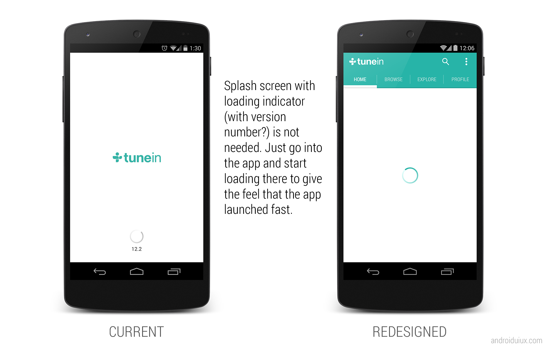
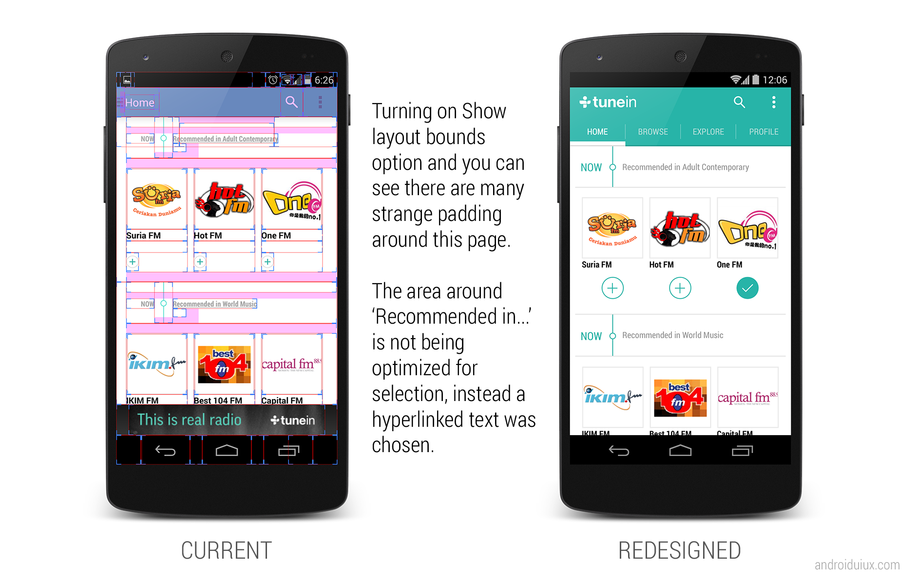
So next time when you come across the use of navigation drawer, make sure it is really necessary to do that – and the new Google+ app just show that Navigation Drawer is not really needed sometimes.

Result for Android UI/UX (Re)Design Challenge 2.0

android-design-challenge - result

After taking some times, we finally have the 10 winners from all 42 entries! Congratulations!

No, it wasn’t an easy task to pick the winners – it won’t happen without the judges involved that basically spent hours to look through all the entries and place their scores and comments on them – Thank you! And to those who doesn’t make it to the winner list this time, don’t be disappointed – it doesn’t mean that your entry is bad – go on, apply some tweaks and make it happen!

The 10 Winning Entries

Below are the 10 winning entries, together with the selected comment from the judges (not in any order):

Chris Basha – Dribbble

Awesome stuff. Great work wielding Android design language with some unique taste that feels completely at home. Using an Instagram-esque presentation of content makes sense (I’d do some recon on whether this is true) and the suggestions stream is epic – all about the content. The app has a good balance that caters to Prospects and Players alike – perfecting this experience is crucial.

Only things I can call out are the crowding of content on the Item view. The image is the most important piece of the screen and shouldn’t be covered by anything. At the very least the AB should disappear as soon as the view is loaded.

Besides that and some tight text on the Designers view, this is a great v1 and should be started immediately 🙂

Elad Izak – My Battery Saver

Sweet. While this is taking quite some inspiration from Timely, it’s a joy to just look at those colors. The app’s purpose seems simple enough, to use the visual layer for clean beauty. Make it a reality.

Andre Goersch – RunPee

The app design is clear and clean. Developers will be happy to see this design. I have concerns about scalability of this design though. Going to larger screens will take a lot of rethinking with some screens but would probably be possible. 

Brand and Android UX blend together nicely as well.

Cole Chamberlin – Eve Music Player

First off, great presentation of thought through the deck. This is really important because it helps relay meaning but also forces you to really consider the reasons for your choices.

Overall, this is a fresh presentation that balances native patterns with unique layouts and interactions. I think gestures are a great idea. They can be a double-edged sword however – the next step for this would be some user testing to make sure things are clear and fit the app’s desired use scenario (sitting on the couch vs running, etc.)

Polished to a near-shine – I’d fiddle with the action bar a bit more. GREAT WORK.

Alexander Karpilovich – Kinopoisk.ru

Great Androidy update to the original UI while keeping the brand. The design also looks very scalable to larger screens.

I’d reconsider transparent navigation bar and status bar use though. In this app there’s no added value of using them.

Evgeny Belyaev – Evernote

Great redesign. Evernote feels a lot clumsy on the current version, I would use it again if it looks like this work. I would considerate to not use Roboto Slab everywhere, but it’s a better look and feel, definitely a improvement over the current app.

Swapnil Chitnis – Project Throne

I like this a lot. Finally someone who adds some unique branding to the mix, without sticking too hard to the guidelines. It’s clean, it’s clear, it’s fun and it’s Android.

Paul Forgione – Kho

Any experience that helps manage my medical needs without bringing the “serious medical issue” aura to light is a winner in my book. This presentation is simple and follows the guidelines while staying unique. It feels more “human” than analytical which is especially important for a daily use app.

Only a tad more polish on things like the graph labels and scrolling blocks/buttons at the bottom and you’ll have something realllllly great.

Sean Smith – HBO Go

Then we have (finally) a great use of KitKat immersive features here, you can see the ActionBar but the opacity trick make it beautiful, specially the home screen with pictures and stuff. Love the animations to show UX interactions, great presentation!

James Jun – TweetLane

Great work simplifying the app. Some apps try to be everything and that doesn’t always work out. The focus on content and getting everything else out of the way is a good goal.

The little flourishes like the bird moving with refresh is great – these bits of polish differentiate and delight.

Two points:
The tweet button is nice, although it gets a little lost and covers content. Consider making it the prominent blue and hide on scrolling down. The compose view could have a tad more queue that it is the input box and not just an expanded button.

I’m a little concerned the menu view will be difficult to find, so some user testing and feedback will be needed to confirm its placement.

Nice, simple, and clean!

General Impression on the Entries

I received a lot of great feedback from the judges and sponsors for the design challenge this time – below is the general impression of the entries:

  • General quality of the entries are satisfying (though it can be better!)
  • The Android Design Community show signs of maturation
  • Scalability (read: responsiveness) of the design, most of the time, is not considered
  • Lack of tablet-centric design
  • Entry need to be a complete story/flow to capture the overall UX rather than just a few screens

These feedback are great for me to prepare for the next one (if there is one).

Prizes for the Winners

As promised, each winner will walk away with a Domo Arigato Mr. Roboto T-Shirt at the selected size, and a 10 USD Play Store Gift Card (or 10 USD Paypal cash). The T-shirt has been ordered and it will be shipped once it is printed, and I will email the winners for the Play Store Gift Card.

Thank you and I hope everyone able to grab something from the design challenge, and if it’s all possible, I will definitely make the third one next year!

Minna, Domo Arigato! 

How I would Further Improve Mailbox App

Mailbox

The famous Mailbox app in iOS has finally arrived for Android users, and again it’s a very disappointing move from a company under Dropbox. It’s fine (actually not) to have the Android platform as the second thought of your app/services, but why some of these companies doesn’t just show some Android love by making things familiar and easy for Android users?

I am sure I will hear ‘Taylor, it’s about consistency. Our PdM requested to make it looks all the same across platform, so people gets familiar instantly! And it also provide consistency in the branding and marketing!’. My ass.

My Redesign Suggestions

  • Go consistent with Android UI patterns and building blocks. You can keep some of the unique elements while not breaking the Android Design Guideline.
    • The user of navigation drawer indicator (change color depending on the page)
    • Use the tab style in Android
    • DON’T block the notification bar by your syncing/refresh/whatever you call bar. Just use crouton to display the progress in-app.
    • May be use path-tracing for the loading indicator?

Inbox

  • The color of the elements can be consistent to the different screens, so it keep that uniqueness in mailbox.

Later

  • Check Confirming and Acknowledgement page in Android Design Guideline. Positive (Delete in this case) action should be always on the right side.
  • Why control the user behavior? So now I can’t write a draft when I have some free time? Why the force of deletion?

Delete Cancel

  • Being a mailbox app that encourages users to organize their mails in different categories (read, dismiss, list, later), I find it really strange to place those actions on the top. Once you finish reading the mail (most of the time), you focus will be at the bottom part of the screen, and it’s way easier and natural for the user to reach the buttons at the bottom for organizing the mail.

In Mail

Since they have hacked around to make certain things work differently from what Android has to offer (like the notification bar on top of your notification bar), why not spend a little bit more time to polish it up for Android users?

What do you think?