
After 264 emails with tons of exchanges, 200+ mock screens, 30+ interaction prototypes, 9 months+, 17156 times of revisions (OK, I made this up) – we finally have The Fabulous app with Material Design pushed to the public on the early September, and we are happy that we reaches our first milestone for the redesign – an honourable feature in Google Play Store under New + Updated Apps category.

You probably have not heard about The Fabulous – It’s a Health and Fitness app uses scientific-based approaches to help people in reaching their health goal through a carefully crafted step-by-step program. We purposefully crafted the journey based on the user goal by slowly showing them relevant information and motivates them during the process, and hopefully get them to form some healthy habits at the end of the journey.
Why Material?
We launched the app on early 2014, and it was still the #holoyolo era for Android Design. During that time, I decided that we can make use of bold colours to help the primary elements stand out from the rest of the UI, hence the sections with different bold colours, as well as the striking pink-coloured bottom action bar (can I call it a BAB?) which houses some of the important actions. There is also an Action Bar (toolbar in Material Design) with left-aligned tabs, which was a pretty popular tab design during that time.
The interface is working out quite OK – it wasn’t the best, but it was our first attempt creating a bold app that can both entertain and help the users.  Then, of course, Material Design was launched and announced during Google I/O 2014, and I was super excited about the possibility in adapting the app to it. After a few months, with the admittedly very slow growth in the user base, and we had quite a lot of new contents generated which no longer fits into the previous design – we then decided to go Material for the app on the late 2014.
And now, after a long 9 months+ of grinding, we are glad that we managed to ship the app with Material Design adaptation (there is still many things to tweak and add) – it’s both satisfying and relieving for us.
The Fabulous
We set out to craft one of the most beautiful health and fitness app in the Play Store catalog, and it wasn’t trivial (as you can imagined). Tons of researches was done on other awesome apps, and a lot of discussions going on to see what’s fit and what’s not.
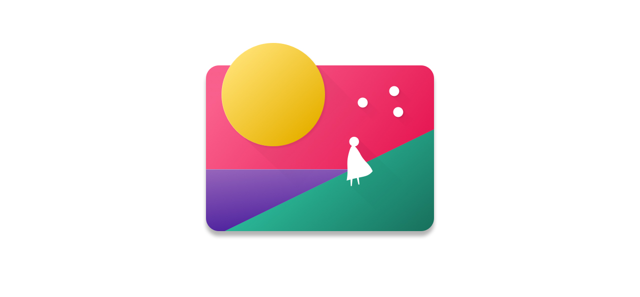
For the icon, we eventually settled on the one that have the best balance between mysterious and familiarity – each colour are deliberately picked to induce the both the familiarity (the moon, the grass) and the unknown (the purple sea, the pink sky). I also wanted to have a mysterious character in the app icon as well to represent the user who is looking forward to the mysterious journey, and thus the character which is heavily inspired by both awesome games – Monument Valley and Journey.
Material Design
The redesign of The Fabulous isn’t just a simple visual refresh, but also a complete rethink on the functionalities. ‘How should we ensure the user know what’s coming next in a day?’, ‘How should we make the user feel delight and relevant when they are executing the habit?’ – these are just a few questions that we keep asking ourselves during the redesign phase.
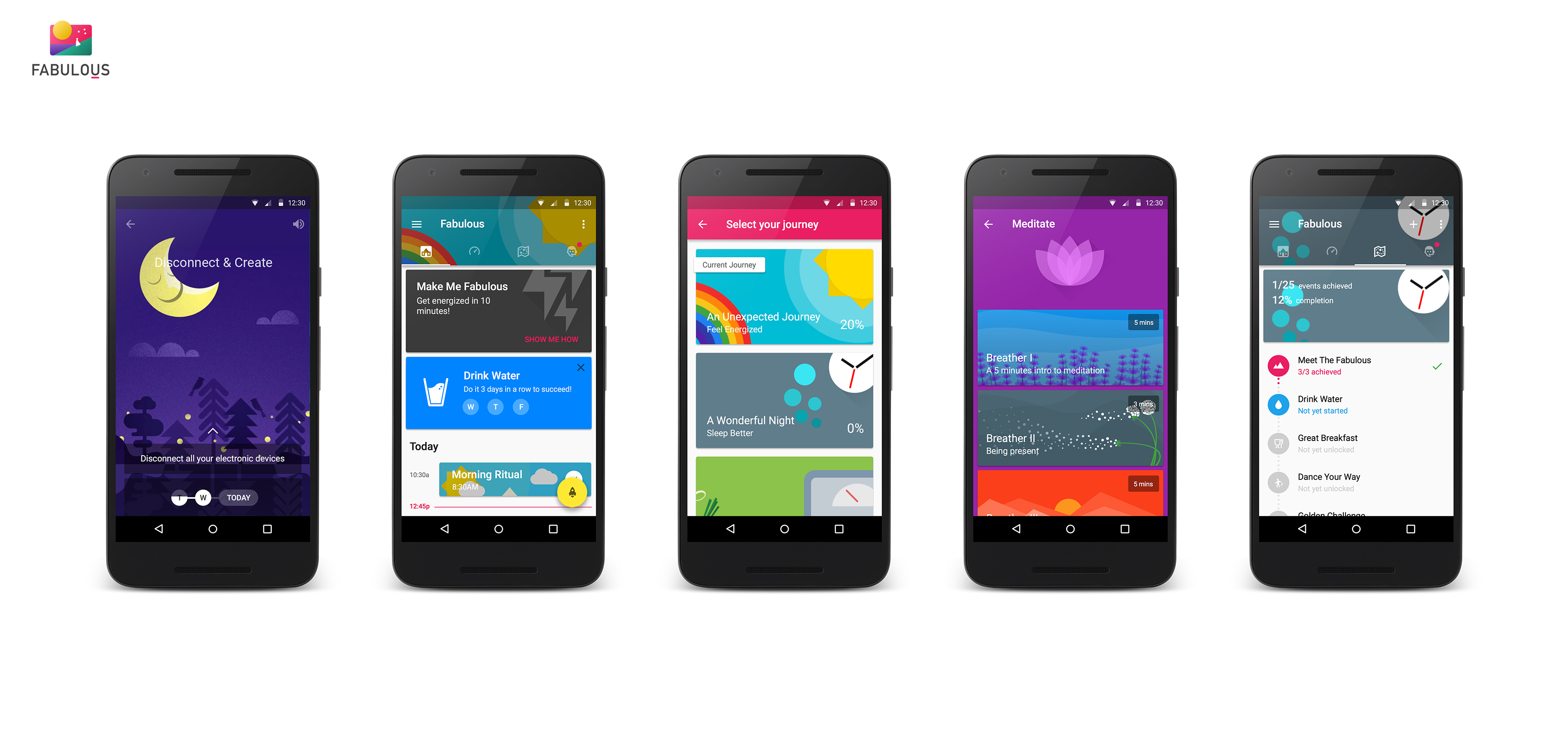
With the Material Design guideline, we are able to pull every screens that are designed at different time to create an app with consistent experiences in every screens. The keylines, the elevations, preset typography styles etc. does not only help making the design consistent, it also helps shorten the time to put every single pieces together on a screen.
And as you can see, imagery plays a very important role in the app, which does not just act as decoration, but as part of the deliberate communication to the user, which intend to surprise them, give them the context, as well as the immersive experience. We still have a lot to do on this one (there is quite a lot of illustrations required), but we will slowly roll them out with subsequent updates.
Design-Development Communication
To ensure the app is implemented as designed, there is a lot of communication going on between the design and development team. We used Invision for screen-to-screen linking. For design specs (or redline), we rely on Zeplin to hand-off the design to the dev team. For final design inspection, I uses app like Keyline Pushing and also Layout Bounds in developer options to ensure every elements are arranged as intended.
In Material Design, meaningful animation that communicates is also part of the experience, thus we also tried to include subtle and meaningful animations into the app. For animation, I uses Photoshop and Principle for the animated mock up, but often, such animated mock up does not help much in the implementation – if you want the implemented animation as close as what you have created, describe the animation in words, which you should include details like the distance, easing used, time, effects etc. If you can’t describe an animation in words, don’t expect the developer to implement it.
Also, it’s important to always explain to the dev team for some design decisions if they have doubt on them. Often the developers able to raise up a design issue that sometimes a designer failed to realise, so healthy communication between the teams helps in creating great product.
What’s Next?
We are definitely not going to stop here, and there is so much more to do. We will continue to update the app with even more refinement and details, and hopefully I will have enough things to share next time.
Stay Fabulous!

Thank you very much for sharing these insights. I never heard of The Fabulous before, but now I’m already in love with it. It really is a great app and it really shines in the Play Store. It’s the most beautiful app with Material Design I have seen so far.
Keep up the good work!
Thanks a lot! 😉
Taylor
This is truly fabulous 🙂