#DesignProtip – Keyline Pushing app + Layout Bound

Designprotip.png

I often got asked how do I inspect an app from design perspective, especially on the layout, alignment, keylines etc., so I thought to share this in my blog. Sometimes we are able to spot some issues by just looking at it, but with some nifty tools, the design inspection can be done much easier.

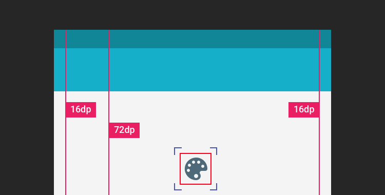
Below screenshot is what I usually see when I do a design pass on the static design implementation. It’s an IMDb app screenshot with keyline grid + layout bound shown, which is very useful to spot misaligned elements and incorrect paddings.

IMDb in Keyline Pushing and Layout Bound

Tools

  1. Keyline Pushing app by Faiz Malkani – This awesome free app will print the 8dp gridlines on your screen which have the proper keylines recommended in Material Design. It also has some other gridlines like 4dp typographic grid which can be very useful sometimes. (Update: Another new app called Material Cue can do the same thing as well)
  2. Show Layout Bound option in Developer Options –  This will show the bound of each element in blue lines (clip bounds), red lines (optical bounds) and pink area (margins). This helps a lot to spot unnecessary padding or misaligned bound. To access this option, turn on developer mode in Android. Then Settings > Developer options > Show layout bounds.

How this can help Android developers?

Few months back I introduced these 2 tools to my developer friends, and below are their comments on this tip:

It is useful to see the view paddings and margins, and immediately understand which view is causing the keyline misalignment. However, for standard views, paddings and margins have an expected behaviour so you can fix the issues without the layout bounds. Layout bound option can be really useful for custom views and custom groupviews. For these views, you can do whatever you want with the paddings, so having the layout bounds visible helps understand how your view occupy the space, which is useful to have the correct keylines.

It helped me mostly to check that clip to children works to prevent shadow, animation, and ripple effect cut-off. Also I am able to quickly check that all cards/pictures are correctly aligned based on the key line and the left/right edge of the layout bound. For layout bound, it helps to check that the touch target of images has been extended and is not only limited to the image edges. It also helps ensuring that some views ‘visibility’ are gone and not just set to invisible. With keyline pushing app, it is mainly to ensure that the Material Design spec has been fulfilled.

Happy designing and developing!


No Detail Is Too Small

Design Details

It is still pretty surprising that with the Material Design guidelines available for quite some time (close to 2 years!), there are still many Android apps ignoring the basics of Material Design. Sure, the guideline isn’t meant as a complete design checklist, but many basic design details (keylines, elevation, UI elements etc.) and common interaction patterns (Nav Drawer, Bottom Sheet etc.) shouldn’t be ignored if the app is using Material Design as the design language.

Today the victim is the new (?) IMDb app, which I will show what’s wrong with the app in terms of design (they need to work on performance as well, by the way) and which part of the design guideline is meant to address the mentioned issue. Continue reading

The Fabulous Goes Material

After 264 emails with tons of exchanges, 200+ mock screens, 30+ interaction prototypes, 9 months+, 17156 times of revisions (OK, I made this up) – we finally have The Fabulous app with Material Design pushed to the public on the early September, and we are happy that we reaches our first milestone for the redesign – an honourable feature in Google Play Store under New + Updated Apps category.

Feature in Play Store

You probably have not heard about The Fabulous – It’s a Health and Fitness app uses scientific-based approaches to help people in reaching their health goal through a carefully crafted step-by-step program. We purposefully crafted the journey based on the user goal by slowly showing them relevant information and motivates them during the process, and hopefully get them to form some healthy habits at the end of the journey.

Continue reading

Make the right FAB

Make the right FAB

Floating Action Button, or, in short, FAB, is one of the unique UI element in Material Design for primary/promoted action for a particular screen. Since it is a frequently accessed UI element in a given screen, I think it’s important to make the FAB right in every details. However, there are a number of apps doesn’t have the right FAB as specced in the Material Design Guideline, which also included some of the Google apps (I know!).

Continue reading

UI Animation in Photoshop – Tutorial #2

Blog-Pic

In the first UI Animation in Photoshop tutorial, I have shown the way to do simple animations in Photoshop like moving, scaling and style changing – if you are new to this and haven’t check that out yet, I recommend you to look into Tutorial #1 before this.

In this second tutorial, I will share my experiences in applying easing into the animation made with Photoshop. Special thanks to Jovie Brett Bardoles for sharing his manual way of applying easing in his animations, which inspire me to explore and dig into the Timeline feature in Photoshop.

Continue reading

Android Design – Think Adaptive

Adaptive Design

Designing for Android devices can be challenging sometimes due to the availability of the Android-powered devices with different screen sizes, however, it is certainly not an issue if adaptive design is considered during the design phase of the app. Some developer/company chose to complain about this, but this likely won’t change anything because it is a deliberate direction that Android meant to go and move forward. The way forward? It’s Adaptive Android Design1.

Continue reading

Papercrafting the Unclouded Launcher Icon

With the latest update in Material Design guideline, Google Design team has shared their design approaches on the product icon design – it’s a comprehensive and pretty complete icon design guideline (at least for me) and I believe many Android Designers are excited about it, that’s, of course, including me.

Explore

After reading through the guideline, I wanted to try something out of it, and Unclouded (a Cloud Storage Management app developed by Christian Gollner and partially designed by me) came into my mind. So I looked at the current icon, and start imagining how it will look like in Material-style. And of course, to make sure the icon is properly sized, I first looked into the 4 suggested keyline shapes and determined that the horizontal rectangle is the right keyline shape to go. This is important because it will help to standardise all the launcher icons at the right size to achieve consistency in terms of visual alignment for the platform, yet unique with their silhouette.

Unclouded - Size Study

Continue reading

An example of really bad mobile app design – Maybank2u

mbb

Disclaimer: This post is mainly about the author rant about bad mobile app design from the largest bank in Malaysia, but it is also a great example of don’ts in mobile app design.

It’s September 2014. Material Design was introduced few months ago during Google I/O 2014. The predecessor – Holo Design was introduced late 2011 together with the launch of Ice Cream Sandwich (Android 4.0), which is about 2-3 years ago, and it’s getting matured as time goes. It’s probably not wrong to expect any Android apps published in the year 2014 embraced with all the lessons that we have learnt in Holo Design and craft the best Android experiences for the user.

Except it’s not for Maybank, the largest bank in Malaysia, and one of the world’s top 100 banks.

Last week, they have officially launched their revamped mobile banking app, claiming that it has the best mobile banking experience compared to the previous version. It does seems to have a refreshed design – except it’s probably one of the worst and most unacceptable mobile design that I ever seen. And it’s 2014.

Continue reading

UI Animation in Photoshop – Tutorial #1

ResultI have been using Photoshop to make UI animations for my work and it works surprisingly well (at least for me). Of course, Adobe After Effect is still the best tool to create complex and awesome animations, but with Photoshop, you can still create some simple and high quality UI animations to preview the animation idea to others. With some combination of animation properties, you can definitely create some rich animations that is sufficient for discussion. There are certain limitations in Photoshop compared to After Effects (of course!), but for someone who wanted to just use one tool for UI Design + simple UI Animations, Photoshop is one of the best tool that you can get (even if it’s not really designed for UI design).

This tutorial #1 will cover some basic procedures to create simple animations using the Timeline feature in Photoshop CS6+ (no GIMP or older Photoshop), so if you are totally new to this, I hope you will find this tutorial helpful for your first step in making UI animation using Photoshop. Let’s begin!

Continue reading