How I would further improve TuneIn Radio app

TuneIn

While this blog post titled ‘How would I further improve TuneIn Radio app’, but I thought I would also like to take this opportunity to touch on the topic about consistency in visual design for mobile apps. No, this isn’t a fight between flat, skeuomorphism, gradient etc. – this is about embracing the consistency of visual design for better aesthetic integrity of a product regardless of the visual styling you opt for.

Visual Consistency is for better aesthetic integrity

One of the graphic design principles that I found here fit the context very well:

While creating rhythms and variations from page to page, one must also remember to maintain an overall aesthetic integrity. The purpose of graphic design is to communicate, not dazzle, and an inconsistent design will result in decreased user effectiveness. This means keeping individual visual and typographic elements simple and clear. It also means applying them uniformly, so that the connotations of a particular type style, or the results of interaction with a particular graphic element, are independent of their context. There should be an overall visual system to the text, carefully considered in the first stages of design, that brings together the elements into a coherent whole.

And of course in Android Design Guideline about branding:

If you take this approach, make sure your (brand) styling is applied to every single icon in your app.

Keep it Consistent

Let’s have a look at the things that I would improve on this app (most of them are about visual consistency):

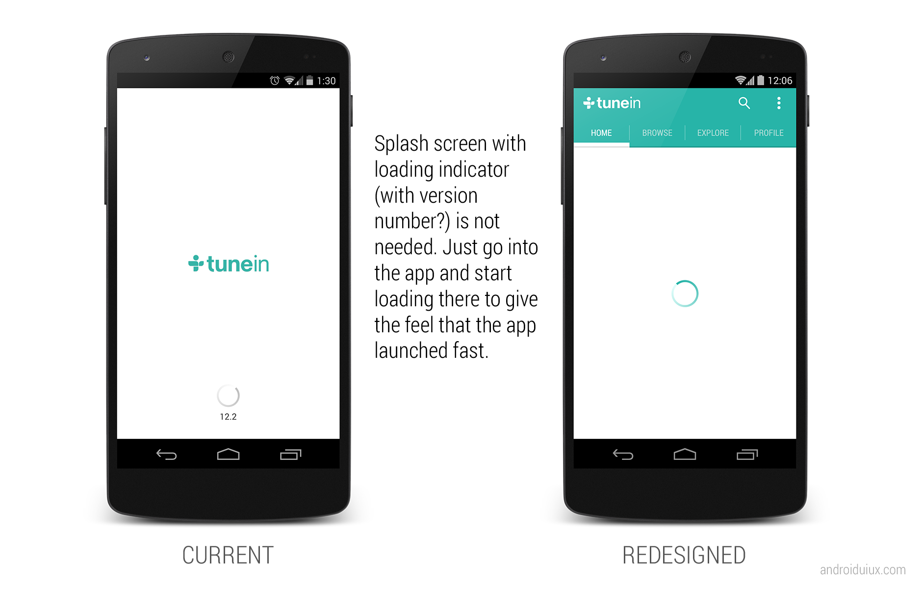
  • Remove the useless splash/loading screen
  • Need design consistency on Android UI elements (Nav Drawer indicator has inner shadow, overflow icon doesn’t have it, and both of them are in dark colors)
  • Use tabs instead of Nav Drawer. Here’s why
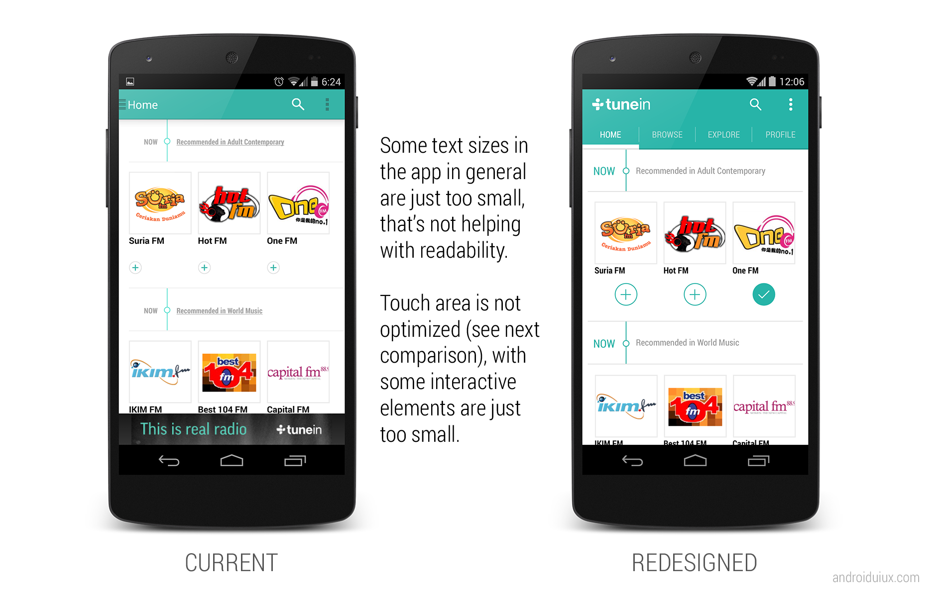
  • Use larger text size in general
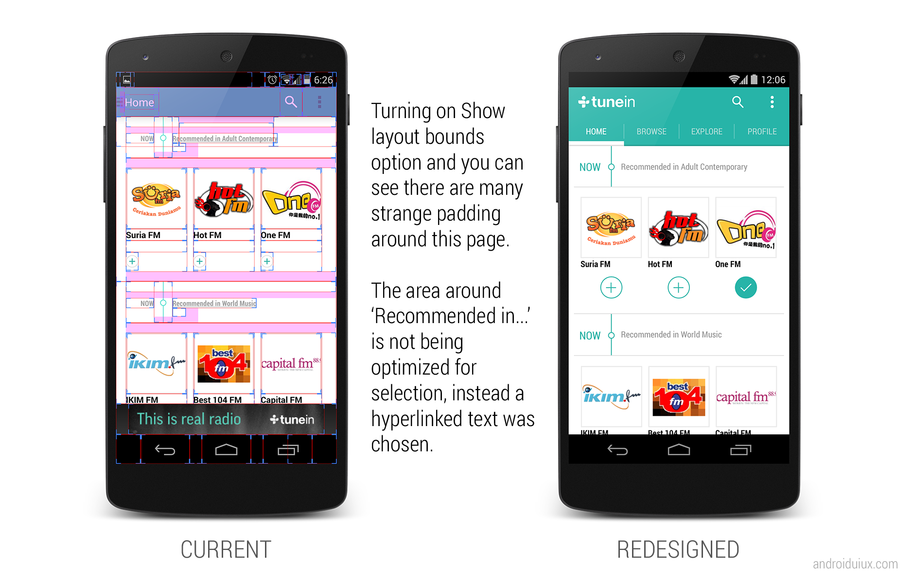
  • Make full use of space for interaction rather than using hyperlinked/underlined text
  • Use appropriate (touch-friendly) size for interact-able elements
  • Need design consistency on similar items for maximum familiarity and predictability
  • Show hint if the horizontal list is scrollable
  • Avoid unnecessary paddings
  • Need consistency on font type used in the app
  • Need design consistency on icons (some are flat, some have an outer bevel effect, some have inner shadow)
  • Avoid truncated texts if it’s possible
  • Use blurred background in a proper way
  • Slider that can’t slide? Not needed.
  • Be aware of the bad readability caused by font color choice and background
  • Gradient Now Playing bar? Looks old and just out of place.
  • Use animations to correlate between the full mode and minimize mode of Now Playing
  • Car mode doesn’t have to look THAT bad

1

2

3

4

5

6

7

8

9

TuneIn


What do you think? Do you like the redesigned version of TuneIn?


Advertisement

How I would Further Improve Mailbox App

Mailbox

The famous Mailbox app in iOS has finally arrived for Android users, and again it’s a very disappointing move from a company under Dropbox. It’s fine (actually not) to have the Android platform as the second thought of your app/services, but why some of these companies doesn’t just show some Android love by making things familiar and easy for Android users?

I am sure I will hear ‘Taylor, it’s about consistency. Our PdM requested to make it looks all the same across platform, so people gets familiar instantly! And it also provide consistency in the branding and marketing!’. My ass.

My Redesign Suggestions

  • Go consistent with Android UI patterns and building blocks. You can keep some of the unique elements while not breaking the Android Design Guideline.
    • The user of navigation drawer indicator (change color depending on the page)
    • Use the tab style in Android
    • DON’T block the notification bar by your syncing/refresh/whatever you call bar. Just use crouton to display the progress in-app.
    • May be use path-tracing for the loading indicator?

Inbox

  • The color of the elements can be consistent to the different screens, so it keep that uniqueness in mailbox.

Later

  • Check Confirming and Acknowledgement page in Android Design Guideline. Positive (Delete in this case) action should be always on the right side.
  • Why control the user behavior? So now I can’t write a draft when I have some free time? Why the force of deletion?

Delete Cancel

  • Being a mailbox app that encourages users to organize their mails in different categories (read, dismiss, list, later), I find it really strange to place those actions on the top. Once you finish reading the mail (most of the time), you focus will be at the bottom part of the screen, and it’s way easier and natural for the user to reach the buttons at the bottom for organizing the mail.

In Mail

Since they have hacked around to make certain things work differently from what Android has to offer (like the notification bar on top of your notification bar), why not spend a little bit more time to polish it up for Android users?

What do you think?

Yes Life for Android Redesigned

It’s been a long time since my last blog entry, but definitely I am still working on tons of Android Design (in private) and they are often very inspiring, which I hope I can share them in the near future if it’s possible.

Today I would just like to share some redesigns for an app that is local to my home country. The app called Yes Life, which basically an app that allows the user to call and send SMS to any local number from anywhere around the world with internet connection. Below are some screens from the current app:

Yes_Old_Dialer

Yes_Old_SMS

There are few things in the app motivated the redesign:

  • Almost 90% iOS UI Style (and ugly)
  • (Very) Bad navigation system
  • Usability issue (For example, online/offline status only in the Dialer page)
  • Buggy (which unfortunately cannot be solved by a redesign)
  • Missed the opportunity to enhance the branding 

To address these few issues that I see, I did some redesign on some screens with Holo UI approach (of course!) with the following changes:

  • Designed with Holo UI approach
  • Used (swipe-able) tab navigation
  • Used Action Bar (for better context actions and navigation)
  • Show connection status in every screens (which is important for such app)
  • Used light/white theme (for branding enhancement)

Below shows a few redesigned screens:

DialerSMSsSMS Detail

What do you think?

I hope this gives some idea on the importance of the app design in branding enhancement. If you have excellent solutions and branding, but decided to give your user bad products, it doesn’t do good on anything except getting rejected by the users.

Design is not just what it looks like and feels like. Design is how it works.

Bloomberg Redesigned

Bloomberg – another app that I wanted to redesign so long, because the app is pretty badly designed ever since day one. It is almost an exact port of the iOS version, with a really strange ‘MENU’ button at the bottom of the app,  and the deadly legacy menu button. Below show some shots from the current version for comparison:

Old_News

Old_Equity

Old_Stock Details

So what if the app is redesigned with the Holo UI approaches and full Android experience? Below are some shots that I have redesigned:

Worldwide News

framed_Slide In Menu

Equity Indices

Currencies

Bonds

My Stocks

Stock Details

And also some redesigns for tablet version:

Tablet - News

Tablet - MarketsWhat do you think? Do you like the redesigns? Don’t hesitate to shot in the comment box!

LinkedIn Redesigned

LinkedIn app is one of the app that I wanted to redesign so badly that I hate it when I am using it (only for accepting request and replying message). It might looks good 2-3 years back, but not anymore today.

There are a few reasons that I think this app deserve a complete redesign:

  • Resemble iOS version almost completely 
  • Lack of navigation in the app
  • Unnecessary skeuomorphism
  • Legacy menu button
  • Badly designed UI (for example, the dashboard give really limited information)

Below I included some screenshots from the current app:

Old_Profile Old_Updates Old_Dashboard

Using the Holo UI approaches, I have redesigned a few screens that fit nicely in today’s Android devices. I have replaced the dashboard UI with the Sliding Menu due to the huge number of sections available in the app. Check them out below:

Linked In - Slide Menu

Linked In - Updates

Linked In - Profile

Linked In - Profile 2

Linked In - Shared Item

Linked In - Other Profile

Update 28/12/2012: After taking some feedback from my G+ post, I have decided to give it another revision for better LinkedIn branding, and below are some updated shots. What’s changed:

  • Action Bar is in dark grey color to give a distinct UI layers
  • Added frame for photos
  • Used Card UI for details
  • Added some iconography
  • Increase the size of the sliding menu and smaller icons
  • Added Share button besides Invite to Connect button

Linked In - Profile

Linked In - Slide Menu

Linked In - Other Profile

What do you think about my redesign? Do you like them? Shot me your comments or suggestions!

Movie Ticketing App Redesigned

Last month Roman Nurik posted a wizards pattern for complex user inputs, and I have now used it for my redesign of a local (Malaysia) movie ticketing app, which is definitely a perfect match (I think). Hopefully this redesign can inspire any developers or designers that are looking to create/redesign movie ticketing app.

Why I am redesigning this app? I have placed a few shots below to briefly show the user interface of the app to explain that. Completely implemented with iOS look and feel, legacy menu button, badly-resized images, in-app advertisement (about themselves),  bad user interaction design – everything is so wrong. Give it a try if you want to understand my frustrations.

Old_Promotion Old_Cinema

I think many will agree with me – app that just work without proper UI/UX design is no longer enough to stand out and compete with thousands of other apps in the market.

Completely redesigned with Holo UI approach, the movie ticketing app is aimed to provide great and easy ticketing service with sufficient information about cinemas and movies. Here’s my take (It’s a long page!):

Promotion Cinema List

Cinema - Show Date

Cinema - MoviesCinema - Show Time

Cinema - Tickets

Cinema - Seat Selection

Cinema - Review

Cinema - Payment

Fast Ticket

Purchased Ticket

What do you think about my redesign? Shot me in the comments if you have any suggestions/feedback/critique!

Outlook.com App Redesign – Tablet Version

Last week I have published a redesign of outlook.com app after the disappointing official release, and since then I have also started to look into the tablet version. The redesigned phone version has been a shared around Android Google+ community during that day, and it was also mentioned in latest episode of Android Design in Action – big thanks to everyone who re-shared and commented on the redesign.

Below are my take on the tablet version, probably not much surprise for some (Before anyone say it, yes, it looks like Gmail/Email app, since it’s an Email client):

Sign In

Outlook Tablet First RunOutlook Tablet - Open EmailOutlook Tablet - Open Email - Full View

What do you think?

Outlook.com App Redesigned

Over 25 million active Outlook.com users and they said they are ready for Gmail user to switch – with this low quality app.

I really disappointed with this surprising move since they did a really great job in SkyDrive app in Android. Seriously, it’s not rocket science to craft a beautiful and usable email app with Microsoft identity. They invested heavily in UI/UX for their new product lines, but yet they failed to understand the importance of Aesthetic-Usability Effect.

What I really hope to see when I run the outlook.com app:

But what I see today with the current app (usually I don’t post these):

What do you think? Just feed me with any idea or suggestion you have!

Google Finance Redesigned

I have been thinking to redesign Google Finance app for a quite some time since I think all Google apps should have at least adapted to Holo Style UI, and I think there are still quite some number of users for the app (unfortunately not me because it doesn’t support share market of Malaysia), but I didn’t quite find the time for it. However, last Android Design in Action episode has put up a challenge to all Android developers/designers for some redesigned screens of any current apps, and that motivated me to continue working on this redesign despite of the really packed schedule.

The current Google Finance app is really ugly, which looks like a web-app rather than a native app. The graph is not loaded at the proper size, old Android UI elements are still there, and the ugly legacy action overflow. Therefore a redesign is definitely required.  And the objective is pretty straight forward: Make it a clean and nice app to be used by every user levels. Therefore I tried to preserve the familiarity so the existing user will not have to re-learn the new UI while still providing a refreshed UI compliant to Android Design Guideline. Here’s my take:

What do you think? Shot me in the comment box 🙂

If you want to see some comparison shots between the current version and my redesigned version, I have posted them in my G+, feel free to comment there as well!

Password Manager Redesigned

During the 25 billion app downloads celebration at Google Play Store, I noticed mSecure – Password Manager was in the 25 cents list, and after I reviewed the screenshots, I immediately buy it – not to use it (at this moment), but to redesign it. It really surprised me when I found out the app is actually selling at $9.99 with this pretty dated and ugly user interface (and possibly bad user experience).

So I started to play around with the app, and as expected, I got really frustrated using the app even though I am just trying to do some simple stuffs – a redesign is definitely required. I start sketching using my GUI Sketching Kit and transfer my sketching to the digital version, and it was pretty fun! It turns out to be pretty inspiring, and I am actually thinking to work with some great developers to make this design a real working app (Any taker? Let me know if there is such possibility!).

Anyway, below are all the mock ups for the redesign:

What do you think? Do you like this redesign? Hit me with your comments/suggestions/critiques!