Unoptimized tablet experience is a missed opportunity

Tablet

It is first started as a simple Google+ post after I saw the refreshed UI of Bank of America app which probably looks OK on the phone, but terribly on the tablet device, and I thought this topic actually worth a short blog post. Well, let’s first have a look on some screenshots of the refreshed UI of the mentioned app:

Navigation Drawer
Navigation Drawer
Details Screen of an Account

There are obviously many UI/UX improvements that I can suggest, for example:
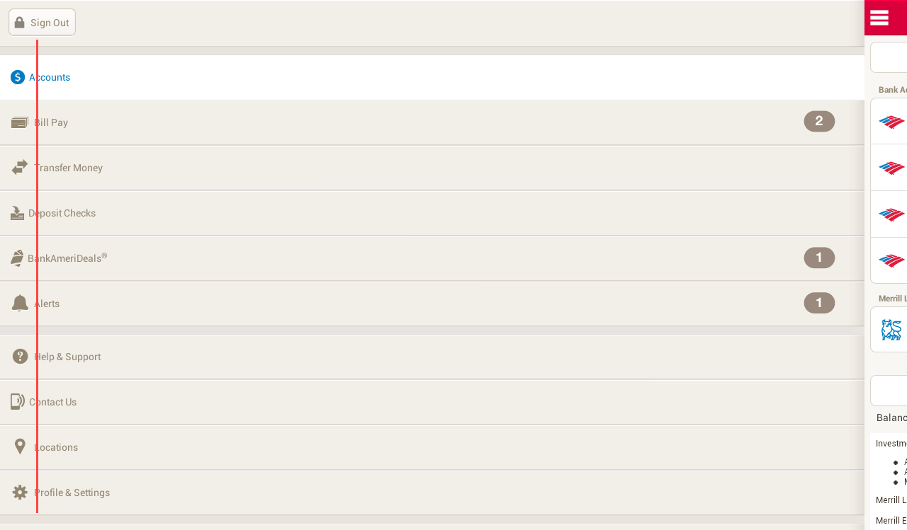
  • Misuse of available screen estateNavigation drawer is not done right and taking away too much of the core experience of the app – navigation drawer is meant to be transient. Also everything looks stretched-out and blown-up which make readability and glanceability become really bad.
  • Lack of Pure Android Experience – It’s 100% iOS experience – Tabs at the bottom, right caret, iOS top bar etc. There are certain UI and interactions elements really unique to Android to provide the user the best and pure Android experience, and this shouldn’t be taken lightly if you care about the user.
  • Lack of attention to details – Even for an untrained eye, it’s pretty obvious that the icon and text wasn’t aligned in a proper way – Mind the gap.
  • Terrible tablet experience – Rather than a blown-up version, a multi-pane layout should be already considered if tablet is meant to be supported.

Unoptimized tablet experience is a missed opportunity

We are currently living in a multi-screen world that we are no longer performing daily activities only on the computer, but also on the smartphone, tablet and TV. Of course, this does not apply to every single activity, but most of your digital activities can be done on any devices, and thus, there is always a chance that your user will try to accomplish a task using your app/service with any screen at any time. Unoptimized tablet experience would mean a missed opportunity – for the brand, for the customer experience, and for the customer loyalty.

And with the huge market share by Android tablet, it is probably no-brainer to pour in a little bit more efforts to optimize the tablet experience (unless your app/service does not make sense on the tablet at all) because tablet has penetrated in many users’ live faster than you could imagined.

What’s make a good tablet experience?

Make full use of available screen estate

Gmail in Tablet
Gmail in Tablet

Gmail app is a great example showing that multi-pane layout works really well for tablet, especially for apps that have a list/grid view and a detail view. This will enable the content navigation for the user while still provide the full experience on the content details.

Optimize the content density

Google+ in Tablet
Google+ in Tablet (Optimized Content Density)
Facebook in Tablet
Facebook in Tablet (not-optimized content density)

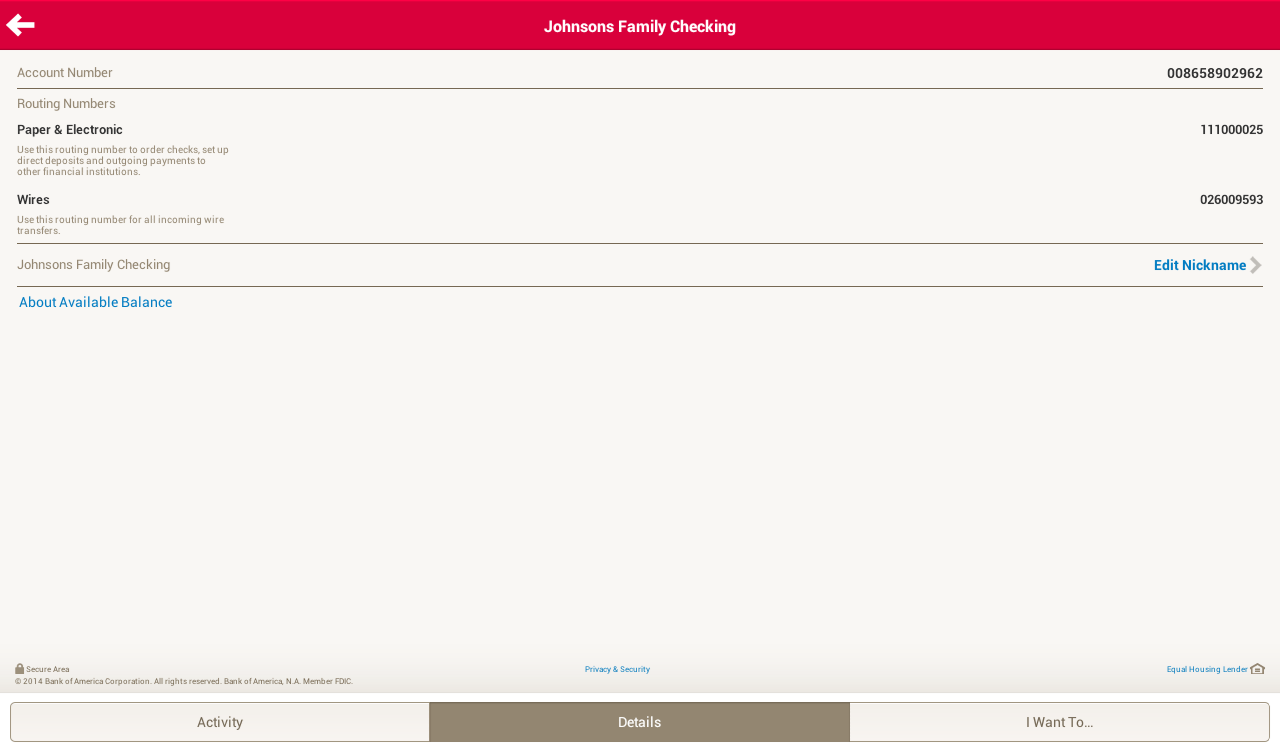
With the available screen estate, especially the horizontal screen estate in Landscape mode, it is crucial to optimize the content density to show the user more information on screen at one time. Of course, this doesn’t mean that you have to show the information as dense as possible – finding that balanced density is very important (and tricky) – and this optimization must be able to enhance the content consumption experience (the user consume more information with the same amount of effort compared to small screen devices), and if it’s not, it is probably mean that the content density optimization doesn’t work. It is important to design the app with great tablet experience for the user to appreciate the screen estate available on the tablet, not just treating it as an enlarged phone. Compared to the Facebook app, Google+ able to show more information at the same time, fully utilize the available screen estate.

Cares about content consumption quality

Newsstand in Tablet
Newsstand in Tablet

If you look at the screenshots of the Bank of America app, you will find that you will have some difficult time to connect the information on the left and the one on the right, because the readability is not optimized due to the stretched layout, causing the severe disconnection between the information on both sides. In the above screenshot, it is a good example showing why you should not fit the content (especially texts) as much as possible because you would also want to make sure that the readability is great (here, of course, we talk about the optimal line length), so the user can have great experience during the reading (or content consumption).

Tablet experience should not be an afterthought

If you app will be used by tablet users, always design the app with tablet experience in mind (as shown above) and make full use of responsive design. Besides that, Android team has written a nice checklist for tablet app quality, so you definitely need to go through it to ensure that you are providing the best quality and experience for both phone and tablet devices.

I hope this post is able to inspire and motivate Android developers and designers to optimize the tablet experience and it should not be an afterthought in app development. If you have any comment or question, feel free to leave it at the Comments section, and I should be able to respond accordingly.

More high quality tablet app!

Navigation Drawer Done Right

navdrawer

With Google+ on Android just updated with new navigation menu and ditched navigation drawer, this article might not be applicable anymore in the near future for Android Design, though I don’t think navigation drawer will be phased out very soon.

Finally, Gmail on Android has been recently updated with the proper Navigation Drawer interaction pattern (the lower-level edge-swipe drawer access, as well as the Settings/Help/Feedback placement), and I am pretty happy about it because we can finally talk about consistency for this design pattern (I am aware that Google+ and YouTube on Android have yet to change).

I am sure you have (if you always look around for UI/UX articles) come across this article about how navigation drawer reduces half of the user engagements or why or how to avoid hamburger menu – if you are not, I would suggest you to read them – these are some interest reads. Although for the Zeebox case, I couldn’t fully understand the decision to go for navigation drawer – it was pretty obvious that navigation drawer is not needed, and I would probably go for the QuickReturnTabs (in the current Twitter app) to regain some of the screen estate – though it’s appreciable that their A/B testing indicates that obvious helps.

These articles (and I think there are more in the wild) suggest that side menu is a bad design pattern and avoid it at all cost, but I say – in Android Design, you can absolutely use it, but only if it’s really necessary and it’s an informed design decision.

Understand Navigation Drawer in Android

In iOS, particularly iOS7, the side menu does clashed with the navigation element (back button) at the top left, as well as the edge-swipe that will act as back (which is not consistently implemented in all Apple apps if I am not mistaken, correct me if I am wrong), however, this is not the case with Android. The navigation drawer for Android is much more sophisticated where the edge-swipe is reserved for accessing the navigation drawer at any lower-level screens (discoverability could a problem here I know), making the top level navigations slightly easier and more accessible even though you are at the deeper level in the app structure. This potentially eliminates the Platform Navigation Pattern Clash mentioned in Luis Abreu’s post (of course he meant in the iOS7).

Information Architecture (IA) optimization

I do agree with Luis Abreu about Information Architecture optimization when you are tempted to use Navigation Drawer for your app – Navigation Drawer isn’t simply an answer for every navigation need. It is always good to rethink from a high level perspective about the app structure to find out whether the navigation can be made a little bit shallower by removing any unnecessary level/information that doesn’t help exposing the important content to the user – in Android Design Guideline, there is a pretty nicely written recommendations for app structure.

Do it right

Example

However, if it’s really necessary to use the navigation drawer as the top-level navigation pattern after careful consideration, just do it, and do it right. It’s not that I do not encourage variations (which is great for a platform), but for UI elements that involved heavily with interactions, it will be always good to stick with the one that is recommended in the design guideline for consistency, familiarity and predictability. We always want the user to ‘learn once, applied everywhere’, especially from an Operating System point of view – I hate to say this but it’s part of the responsibility of the Android developers and designers to help pushing this established* consistency so the user will have less interaction friction when they are shown with a specific UI element. The faster the user able to operate the app and achieve what they want to do = happy user.

*I know some of the Google apps are still yet to be consistent with the latest changes in navigation drawer, but I am sure they are working on it. Mind you that navigation drawer has come a long way and it takes time to get things right (I wrote about this back in 2012)!

“What’s out of sight, is out of mind.”

In Anthony Rose’s article about Navigation Drawer and a tweet by Luke Wroblewski below shows that when the navigation pattern is less obvious, the user engagements reduced (although I am not sure what’s the parameters in Luke’s chart).

Sure, for some, these statistics seem worrying – but I don’t think we have yet to see the whole picture in these examples. What does the reduced user engagement means? Does it mean they don’t explore the app anymore or it simply means the first screen (home screen) is already sufficient? Does it mean that the user accomplished what they want to do with the app much faster (with lesser distractions) and thus less engagements? I would probably see this as an achievement if my app is meant to help in productivity because it might means that my app helps the user achieve thing faster.

While I fully agree that we should keep “what’s out of sight, is out of mind” as one of the design principle, but it doesn’t mean that we have to show everything as long as we can, because every UI elements play different role during the user interactions and each of them have it’s own unique importance.

So next time when you come across the use of navigation drawer, make sure it is really necessary to do that – and the new Google+ app just show that Navigation Drawer is not really needed sometimes.

Result for Android UI/UX (Re)Design Challenge 2.0

android-design-challenge - result

After taking some times, we finally have the 10 winners from all 42 entries! Congratulations!

No, it wasn’t an easy task to pick the winners – it won’t happen without the judges involved that basically spent hours to look through all the entries and place their scores and comments on them – Thank you! And to those who doesn’t make it to the winner list this time, don’t be disappointed – it doesn’t mean that your entry is bad – go on, apply some tweaks and make it happen!

The 10 Winning Entries

Below are the 10 winning entries, together with the selected comment from the judges (not in any order):

Chris Basha – Dribbble

Awesome stuff. Great work wielding Android design language with some unique taste that feels completely at home. Using an Instagram-esque presentation of content makes sense (I’d do some recon on whether this is true) and the suggestions stream is epic – all about the content. The app has a good balance that caters to Prospects and Players alike – perfecting this experience is crucial.

Only things I can call out are the crowding of content on the Item view. The image is the most important piece of the screen and shouldn’t be covered by anything. At the very least the AB should disappear as soon as the view is loaded.

Besides that and some tight text on the Designers view, this is a great v1 and should be started immediately 🙂

Elad Izak – My Battery Saver

Sweet. While this is taking quite some inspiration from Timely, it’s a joy to just look at those colors. The app’s purpose seems simple enough, to use the visual layer for clean beauty. Make it a reality.

Andre Goersch – RunPee

The app design is clear and clean. Developers will be happy to see this design. I have concerns about scalability of this design though. Going to larger screens will take a lot of rethinking with some screens but would probably be possible. 

Brand and Android UX blend together nicely as well.

Cole Chamberlin – Eve Music Player

First off, great presentation of thought through the deck. This is really important because it helps relay meaning but also forces you to really consider the reasons for your choices.

Overall, this is a fresh presentation that balances native patterns with unique layouts and interactions. I think gestures are a great idea. They can be a double-edged sword however – the next step for this would be some user testing to make sure things are clear and fit the app’s desired use scenario (sitting on the couch vs running, etc.)

Polished to a near-shine – I’d fiddle with the action bar a bit more. GREAT WORK.

Alexander Karpilovich – Kinopoisk.ru

Great Androidy update to the original UI while keeping the brand. The design also looks very scalable to larger screens.

I’d reconsider transparent navigation bar and status bar use though. In this app there’s no added value of using them.

Evgeny Belyaev – Evernote

Great redesign. Evernote feels a lot clumsy on the current version, I would use it again if it looks like this work. I would considerate to not use Roboto Slab everywhere, but it’s a better look and feel, definitely a improvement over the current app.

Swapnil Chitnis – Project Throne

I like this a lot. Finally someone who adds some unique branding to the mix, without sticking too hard to the guidelines. It’s clean, it’s clear, it’s fun and it’s Android.

Paul Forgione – Kho

Any experience that helps manage my medical needs without bringing the “serious medical issue” aura to light is a winner in my book. This presentation is simple and follows the guidelines while staying unique. It feels more “human” than analytical which is especially important for a daily use app.

Only a tad more polish on things like the graph labels and scrolling blocks/buttons at the bottom and you’ll have something realllllly great.

Sean Smith – HBO Go

Then we have (finally) a great use of KitKat immersive features here, you can see the ActionBar but the opacity trick make it beautiful, specially the home screen with pictures and stuff. Love the animations to show UX interactions, great presentation!

James Jun – TweetLane

Great work simplifying the app. Some apps try to be everything and that doesn’t always work out. The focus on content and getting everything else out of the way is a good goal.

The little flourishes like the bird moving with refresh is great – these bits of polish differentiate and delight.

Two points:
The tweet button is nice, although it gets a little lost and covers content. Consider making it the prominent blue and hide on scrolling down. The compose view could have a tad more queue that it is the input box and not just an expanded button.

I’m a little concerned the menu view will be difficult to find, so some user testing and feedback will be needed to confirm its placement.

Nice, simple, and clean!

General Impression on the Entries

I received a lot of great feedback from the judges and sponsors for the design challenge this time – below is the general impression of the entries:

  • General quality of the entries are satisfying (though it can be better!)
  • The Android Design Community show signs of maturation
  • Scalability (read: responsiveness) of the design, most of the time, is not considered
  • Lack of tablet-centric design
  • Entry need to be a complete story/flow to capture the overall UX rather than just a few screens

These feedback are great for me to prepare for the next one (if there is one).

Prizes for the Winners

As promised, each winner will walk away with a Domo Arigato Mr. Roboto T-Shirt at the selected size, and a 10 USD Play Store Gift Card (or 10 USD Paypal cash). The T-shirt has been ordered and it will be shipped once it is printed, and I will email the winners for the Play Store Gift Card.

Thank you and I hope everyone able to grab something from the design challenge, and if it’s all possible, I will definitely make the third one next year!

Minna, Domo Arigato! 

Android UI/UX (Re)Design Challenge 2.0

Android Design Challenge 2.0

After a successful Android UI/UX (Re)Design Challenge last year in June, I have been occasionally received inquiries on the second one, as well as some industrial feedback on such design challenge. This is one of the feedback I got:

I ended up hiring one of the finalists in last years competition.  I hired him to do a bit of freelance work on an app I’m building – so it would be good to give similar encouragement to upcoming designers.

Frankly, I didn’t expect that. The aim to make such design challenge is always meant to create awareness towards the importance of Android Design, and it seems to go beyond that – it’s totally awesome! This is why I decided to make the second one, namely Android UI/UX (Re)Design Challenge 2.0.

But first, I have to apologize to all the participants last year for the undelivered Android UI Design Kit Logo stickers – there has been some issues with the sticker quality and hence I decided not to ship any of them. I will look into options this year to make good quality sticker (any suggestions?) and I will send them out again.

Really simple rules

  1. Anyone can participate!
  2. Design a brand new app or redesign any existing app by 18th April 2014
  3. The (re)design should use Android Design Guideline as a reference. Only use appropriate UI patterns and building blocks for your design.
  4. At least 5 screens are required (in order to tell the app flow/structure). Please provide comparison/explanation/justification for each screen. A good example of the design entryDon’t let us guess! I repeat, don’t let us guess! 
  5. App icon can be redesigned to match with the new UI (re)design.
  6. Optional: You can design for the Android Wear version if it meet these design principles. If it’s not, don’t do it!
  7. Optional: Making animated UI design (in animated gif or video) is encouraged, but it will not have huge advantage in the judging system.
  8. Optional: Feel free to post your design to any Google+ Android Design Community (including Android Designers) to get feedback and further improve your app (re)design before your final entry. It’s always encouraging to see such design iterations which involved communities.
  9. Post your design entry in Google+ publicly, and remember to use these hashtags:

#androiduiux #androiddesign #ADiA

Submission

  1. Submission of the final entry must be sent to the email address androiduiux [at] gmail [dot] com (so I know which is the final entry if you have multiple revisions)
  2. The title of the email should be Entry for Android UI/UX (Re)Design Challenge 2.0
  3. Send me the link to the final entry in a public Google+ post (or any link that can be viewed publicly)
  4. I will then send you the confirmation email to acknowledge your design entry

Design Tools

  1. Feel free to use any design tools that you are comfortable with, as long as the final result are high-fidelity mock up screens.
  2. If you are looking for some design resources to start, check out the Free Design Resources page

Winner announcement

  1. Five best entries will be announced via my Google+ account and androiduiux.com after the deadline. They will be also informed via email.
  2. All entries will be judged by awesome android designers in order to pick the winners.

Prize

The 5 best entries will walk away with:

  1. Domo Arigato Mr. Roboto T-shirt. This is a new T-shirt campaign that I just launched for Android fans. If the Teespring campaign is not successful, I will print these T-shirt myself and ship them accordingly.
  2. 10 USD Google Play Store Gift Cards. You can request to make it a Paypal transfer if the Google Play Store Gift Card in USD is not usable due to the difference in region/currency.
  3. I reserved the right in prize management based on the quality of the entries.

Credit

I would like to thank these people for their awesome support:

That’s all! If you are interested, start (re)designing and submit your awesome design entry by 18th April 2014!

Android UI Design Kit for Photoshop and GIMP 4.3 [Free Download]

Android UI Design Kit 4.3

Today I am happy to announce that Android UI Design Kit has been updated to 4.3, and this is my most complete design kit for Android Designers/Developers to date. And awesome thing always comes in pairs:

  • Supports Adobe Photoshop and GIMP
  • Nexus 4 and Nexus 7 (Basic) Design Kits
  • Both Nexus 4 and Nexus 7 have Portrait and Landscape Templates

Other than that, there are also two new files in the Design Kit: An Android Holo Color Collection swatch (complete with all different levels), and a document containing link to some libraries for development. One of the reason to include such document is to introduce the Android UI Design Kit users about some nifty libraries that the developers can use to achieve the design in the mock up — which hopefully can easily synchronize the design idea between the designer and the developer.

What’s new in 4.3?

  • Building Blocks (Nexus 4 version only)
    • Settings Page
    • Font Size Reference to Developer
    • Empty State Examples
    • Showcase View (Works only on Photoshop version)
    • Random Text List Styling
    • New Date, Time, Color Pickers
    • About Page
    • Cards Library
    • New Stacked Tabs (Similar to Google Play)
    • Glass Action Bar (Photoshop only)
    • Contextual Action Bar
    • Search Action Bar
    • Wizard Pager
  • Files
    • Photoshop PSD (or XCF for GIMP) of Nexus 4 Quick Start (Landscape and Portrait)
    • Photoshop PSD (or XCF for GIMP) of Nexus 4 Building Blocks
    • Photoshop PSD (or XCF for GIMP) of Nexus 7 Quick Start (Landscape and Portrait)
    • Photoshop PSD (or XCF for GIMP) of Gestures
    • PDF of Link to Libraries
    • Holo Color Swatch (Photoshop only)

Tips

  • You must first install both Roboto and Roboto Slab fonts before using the Design Kit.
  • The recommended way to start designing is to use the Quick Start file, then Shift+Drag the required UI elements from the Building Block file
  • Since both Nexus 4 and Nexus 7 template are now in xhdpi, some of the UI elements can be easily reuse with minor adjustment
  • You can only create awesome mock up from this Android UI Design Kit

Price

Initially I was very tempted to charge for this new update since it does taken up part of my free time, however, I changed my mind eventually — I wanted this to be used by everyone that is designing Android app using Adobe Photoshop (and now GIMP), either professionally or as a hobby – so charging a price might be able to grab me a cup of coffee or two, but I am more obsessed with the download number (can you believe that?) and the social connections I made from providing this download. So it will be remain as a Free Download.

However, if you think I deserve to have a cup of coffee from the work that I have done, you can always support me via Paypal, so that I can maintain the energy to produce awesome stuffs for the community.

Support via Paypal

Download

As usual, I have made this new Design Kit available at my MediaFire account. File size is larger this time around, but I can’t seems to compress all the awesomeness to a smaller archive size.

Android UI Design Kit for Photoshop 4.3 (~30MB)

Android UI Design Kit for GIMP 4.3 (~20MB)

There is also an updated Android UI Design Kit for Photoshop 4.4 at Nexus 5 resolution (1080×1920), so if you prefer to design in a larger size with latest UI elements, grab that as well!

Android UI Design Kit for Photoshop 4.4

Android UI Design Kit for Photoshop 4.2.1 [Free Download]

Nexus 4 Tilted Left

Since there are some new UI elements in Android after Google I/O, I have decided to spend some time to update (and optimize) the Android UI Design Kit. There are some new UI elements added into it (and I removed some most-likely-unused UI elements). Besides that, I have also added some Quick Start PSD file that contains some main UI elements like Action Bar, Tabs, and Navigation Drawer, so the user able to choose not to start the design with the PSD file with all Building Blocks. And yeah, it finally come with Landscape orientation as well!

What’s inside for 4.2.1

  • UI Elements
    • Added new Navigation Drawer
    • Added Fading Action Bar
    • Added Numpad-style Time Picker
    • Removed Grid Lists
    • Removed Disabled/Focused/Disabled Focused Radio Button and Checkbox
    • Removed Quick Control
    • Removed some unnecessary Tabs elements
    • Removed Gestures
  • PSD Files
    • Gestures
    • Quick Start – Portrait
    • Quick Start – Landscape (Yes, finally!)
    • Portrait with all building blocks
  • Misc
    • Loading speed should be improved slightly after removed some unused UI elements
    • New Login Page with Romain Guy’s awesome photo
    • New Android UI Design Kit Logo
    • Changed time 😉

Download

Android UI Design Kit 4.3 for Photoshop and GIMP is here!

Android UI Design Kit for Google Slides 1.0 [Free Template]

Google Slides UI Design Kit 1.0

After I published Android UI Design Kit for Microsoft Powerpoint last month, I have gotten some really nice feedback about the usefulness of the design kit in a tool that they are easily familiar with, and some of them show interest in a Google Slides version. I had a look into Google Slides back then, and I was decided not to do a Slides version due to the lack of Roboto font available in Google Slides (perhaps I missed it back then, but I didn’t see any other extra fonts).

After the Google I/O, I discovered that it is possible to use Roboto font (only Regular and Condensed, but they are already sufficient for mock up purpose) in Google Slides, therefore I went ahead and try to convert my PPTX Design Kit to Google Slides, thinking that it will be just a 10 minutes work – turn out it wasn’t that trivial.

Apart from missing UI elements and text misalignment which can be easily fixed, the main issue is about the output. When I export a mock up screen from Google Slides to PNG format, it always seems to be slightly off from the ideal resolution (768×1280), and in Google Slides, there is no option for the user to change the slide size. So I ended up spending the whole morning doing micro-adjustment on the slide size in Microsoft Office, then upload to Google Drive and convert it to Slides, in order to find the best fit size that can export the screen at perfect resolution.

What’s inside?

Similar to the Powerpoint version, most of the building blocks (Action Bar, Buttons, Radio Buttons, Progress Bar etc.) are inside this Design Kit, including the new Navigation Drawer indicator. This Design Kit is highly optimized for Google Slides in order to have a proper output of image resolution. It has been tested with offline mode, so you can work on some app design mock ups whenever you want!

Download

I have uploaded it to Google Docs Template so you can immediately use the template in Google Slides (Please access the template on desktop browser, or if you are on mobile, request a desktop site. Apparently Google Docs Template page doesn’t work with Mobile Browser Agent): Android UI Design Kit for Google Slides. Don’t forget to rate and share it if you find it useful!

Alternative link without Sign In: Android UI Design Kit for Google Slides Preview

Android UI Design Kit PPTX 1.0 [Free Download]

Last month I published Android UI Design Kit PSD 4.2 that can be used as a base for Android Designers/Developers to design Android app in Photoshop, and since then it has been accumulated a total of 8,100+ downloads within a month. It shows that there are more and more people interested in Android Design, which is something that I am really excited to see.

Nexus 4

Nevertheless, for quite some time, I have been thinking to have an alternative to allow even more people to experience Android Design, and today, I am happy to announce an Android UI Design Kit in Powerpoint format has been released, which is created using Microsoft Powerpoint 2013 (Windows).

Why Microsoft Powerpoint?

Microsoft Powerpoint, of course, doesn’t meant to be an UI design tool, but surprisingly there are many people using it to create nice UI mock up (and they can be interactive too), due to the fact that it supports layering and grouping, plus it has vector shapes, which are sufficient to create some nice mock up. Obviously, it is still pretty limited comparing to Adobe Photoshop (or any other advanced design applications), but heck, I am pretty sure there are more people owning Microsoft Powerpoint compared to Adobe Photoshop, so designing Android app is probably just a click away.

I understand that the Apple Keynote seems to be a better tool for such UI design task, but due to the fact that I am using Windows primarily, so I created the design kit in Microsoft Powerpoint.

Layers

What’s inside?

Most of the building blocks (Action Bar, Buttons, Radio Buttons, Progress Bar etc.) should have been included in this PPTX Design Kit. Do let me know if you notice otherwise.

I have also included a slide of Google Now made (almost) entirely with Microsoft Powerpoint to show some awesome things that can be done without needing any advanced tools.

How to use it?

Really simple. Just extract the downloaded archive, then open the .pptx file, and you can start designing right away. It might take some time to see how’s the layering and grouping works, but they should be pretty simple to learn.  Don’t hesitate to leave a comment if you need some help in achieving some elements that you saw in the design template.

Remember to install the Roboto Font before using this design template. Almost all of the texts in the design template used fonts in Roboto Family.

This PPTX Design Kit is made with the specific dimension at 96dpi, when you export the screens to a .png file, it will be exported at the resolution of 768×1280 – the resolution of Nexus 4 screen. You can then frame the exported png file at the Device Art Generator and you are ready to impress people with your design!

Note: It is meant to be used with Windows version of Microsoft Powerpoint. Nevertheless, it is usable on Powerpoint for Mac, although the font type used have to be replaced with the proper one (due to the different font naming system). It can also be used in Apple Keynote, however, you need to change the slide size to 768×1280 manually before the design and export the screen.

Download

As always, it can be downloaded from my MediaFire account: Android UI Design Kit PPTX 1.0. If you need some Action Bar icons during the design, download Action Bar Icon Pack #1, the xhdpi icon fits perfectly with this Design Kit.

Now (almost) anyone can experience Android Design. Happy Android Designing!

Android UI Design Kit PSD 4.2 [Free Download]

In August 2012, Android ICS/JB Photoshop GUI Design Kit 3.0 was published with some new Jelly Bean UI elements, and until today, the Design Kit has been downloaded over 21,000 times since the very first version back in December 2011 – not a huge number, but it is putting a smile on my face. It’s really nice to see there are many designers interested in Android Design and used the Design Kit to kick-start their design work in Android app. A big thank you to everyone that is using the design kit and I really hope it helps in your Android app design workflow in some way.

Design Kit 4.2 Preview

And today, I have finally updated the Android UI Design Kit PSD to version 4.2, with the size of Nexus 4 screen resolution (768×1280), as requested by many supporters. Besides the resolution update, I have also added a few new UI elements into the Design Kit:

  • Cards (Google Now)
  • Crouton
  • Drawer Menu
  • Quick Return
  • Undo Bar
  • Gestures

Other than that, all the UI elements in the Design Kit are now made pixel-perfect (I hope I didn’t miss any of them), along with some corrections on the font size and UI element. I have removed the Application Design Templates (ADT) PSD file that is included in 3.0 because I think it might not as useful as I think, but do let me know if you are using it and you wish to see an update for that as well.

Download

Android UI Design Kit 4.3 for Photoshop and GIMP is here!

Yes Life for Android Redesigned

It’s been a long time since my last blog entry, but definitely I am still working on tons of Android Design (in private) and they are often very inspiring, which I hope I can share them in the near future if it’s possible.

Today I would just like to share some redesigns for an app that is local to my home country. The app called Yes Life, which basically an app that allows the user to call and send SMS to any local number from anywhere around the world with internet connection. Below are some screens from the current app:

Yes_Old_Dialer

Yes_Old_SMS

There are few things in the app motivated the redesign:

  • Almost 90% iOS UI Style (and ugly)
  • (Very) Bad navigation system
  • Usability issue (For example, online/offline status only in the Dialer page)
  • Buggy (which unfortunately cannot be solved by a redesign)
  • Missed the opportunity to enhance the branding 

To address these few issues that I see, I did some redesign on some screens with Holo UI approach (of course!) with the following changes:

  • Designed with Holo UI approach
  • Used (swipe-able) tab navigation
  • Used Action Bar (for better context actions and navigation)
  • Show connection status in every screens (which is important for such app)
  • Used light/white theme (for branding enhancement)

Below shows a few redesigned screens:

DialerSMSsSMS Detail

What do you think?

I hope this gives some idea on the importance of the app design in branding enhancement. If you have excellent solutions and branding, but decided to give your user bad products, it doesn’t do good on anything except getting rejected by the users.

Design is not just what it looks like and feels like. Design is how it works.