
It’s been a long time since my last blog entry, but definitely I am still working on tons of Android Design (in private) and they are often very inspiring, which I hope I can share them in the near future if it’s possible.
Today I would just like to share some redesigns for an app that is local to my home country. The app called Yes Life, which basically an app that allows the user to call and send SMS to any local number from anywhere around the world with internet connection. Below are some screens from the current app:


There are few things in the app motivated the redesign:
- Almost 90% iOS UI Style (and ugly)
- (Very) Bad navigation system
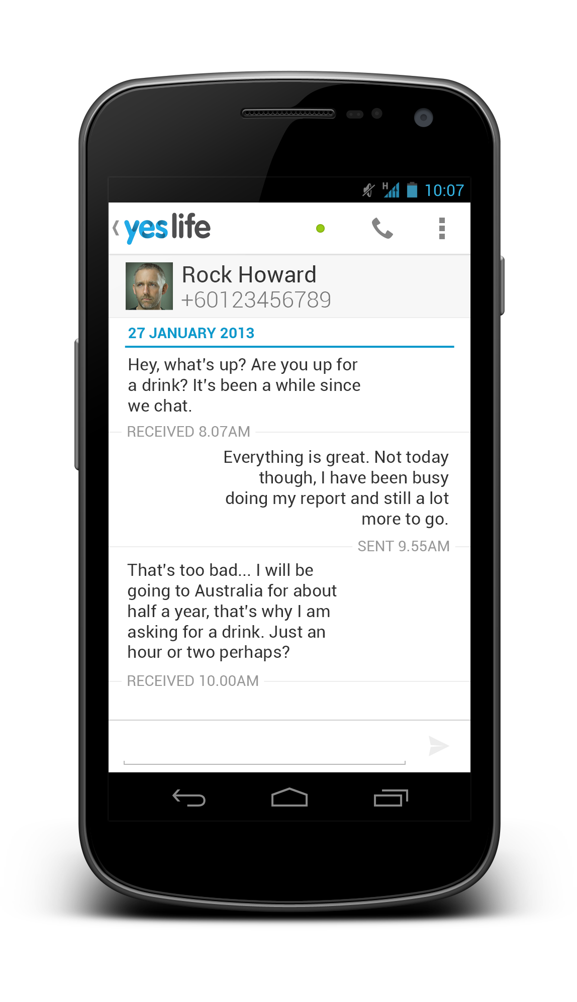
- Usability issue (For example, online/offline status only in the Dialer page)
- Buggy (which unfortunately cannot be solved by a redesign)
- Missed the opportunity to enhance the branding
To address these few issues that I see, I did some redesign on some screens with Holo UI approach (of course!) with the following changes:
- Designed with Holo UI approach
- Used (swipe-able) tab navigation
- Used Action Bar (for better context actions and navigation)
- Show connection status in every screens (which is important for such app)
- Used light/white theme (for branding enhancement)
Below shows a few redesigned screens:


What do you think?
I hope this gives some idea on the importance of the app design in branding enhancement. If you have excellent solutions and branding, but decided to give your user bad products, it doesn’t do good on anything except getting rejected by the users.
Design is not just what it looks like and feels like. Design is how it works.

Neat and clean. Simply Awesome !
It looks pretty good Taylor, the only thing I would say would be to maybe add a small triangle over the contact photos like what’s in the stock SMS messaging application. This shows that you can open the quick card. The other thing I thought of was making the text messaging thread stand out a little more. Right now it’s sort of hard to follow, maybe adding some colours to each message would help.
u are Awesome !
Old design was really out of date. And you made it look fresh and clean!)
But I think it looks too native and lacks some individual visual touch or branding ID..
Also small comment about ‘messaging’ screen: may be would be better to give different color/ tone for text which user sent and received. So that it is visually easier to distinguish messages.
But in general, great job Taylor! as always)
I would try Talk’s approach to the SMS stream.using the contact image next to the messages, makes it easier to distinguish who said what. And similarly, dropping the “Received” and “Sent” text and just leaving the times. It’s hard to tell in the screenshot, but does the list align with the bottom? There’s a bit of white space at the bottom.
Curious: the screenshot doesn’t show a hint text in the SMS input field. Intentional?
I am not using picture in the SMS stream with a purpose – I don’t want the stream to get overwhelmed with photos and leave more space for texts. Sure, the alignment is a bit off from the bottom, my mistake there,
Nope, a hint text should be there, I forgot to place it in the mock up. 😛