After publishing the 1st Android UI/UX Tips, it seems that I am able to find more UI/UX mistakes in various apps (perhaps I become ultra-sensitive now?), so here it is, Android UI/UX Tips #2 to inspire Android Designers/Developers in developing app with awesome UI and UX.
Don’t Make it Hard for The User
If your app have some awesome features that simplify user interaction, think thoroughly when to/not to remove it from your app.
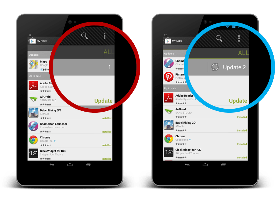
One example that I would like to show is the Update button in Play Store app. When there are more than one apps require update, the Update button is very useful. Updating all the apps will only take one touch. But, when there is only one app having update, the Update button mysteriously disappeared. The problem is, now to update that particular one app, three touches are required (Select the app > Click Update > Click Accept & Download). I personally do not see any use case requires such interaction design – if you can do the same for multiple items, you should be able to do it for a single item.
Consistent with Android Design
In Google Drive app, most of the dialog in the app are using the basic button, which looks really ugly and inconsistent with Android Design. The buttons in default dialog in Android should be (I am not sure) already using the borderless buttons, so I am just feel like asking the Google Drive developers:
Why make the dialog looks like a Microsoft Windows dialog?
No Double Up Combo, Please
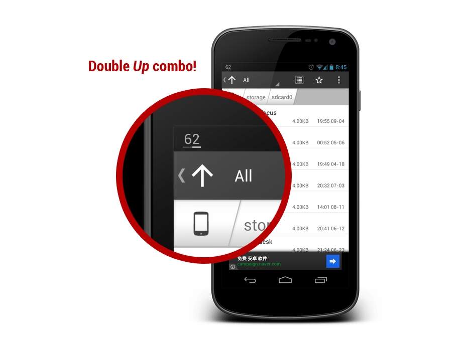
Astro File Manager has a new update with refreshed UI, and it comes with a double Up combo! As I mentioned in my Google+ post, it is definitely unnecessary and downright ugly. Just use the app icon for better identity establishment. Perhaps the app designer want to help enhancing the Up affordance?
Consistent with Icon for User Interaction
Again, it’s Google Drive. In the Detail View of a file/folder, you can see there is a Done button (Tick icon) in the Action Bar, and a Cross icon near the file name. You might think that the Cross icon is meant for the file/folder itself, perhaps for deletion or discarding changes? Nope. It behaves exactly the same as the Done button, and this is really a confusing design. In Android, the Cross icon usually meant remove, discard, or cancel. This is not Microsoft Windows. Just stick with the Done button at the Action Bar and it will be just nice.
That’s all for Android UI/UX Tips #2! Hope it is inspiring!


I have to mention more annoyance about the first one. When you first publish an update to your app, it takes some time to fully appear on google play. When I open the app page, the buttons show “open” and “uninstall”. And then I open “My apps” section and see the update. After that if I were lucky, I have more than “1” apps to update and press update all button and my app will be updated too. But if i were unlucky and the only update is that app, it opens the page of the app and I simply couldnt update it. Damn!
I had already noticed the first one you mentioned about the Update in case of only 1 App needed updating.. Spot On.. Something so simple, and mind cracking!
the thing in the play store with updating only one app disappoints me too. Everytime there is an update notification I just hope that there is more than one app to update ,-)