Realizing that it is almost impossible to write a post for each of the UI/UX tips that I have in mind (except those worth a discussion), I have decided to occasionally come out with Android UI/UX Tips.
So in the 1st Android UI/UX Tips, I will look into some official Android apps by Google (Google+, Google Drive, Email), as well as TED app, and talk about some UI/UX mistakes in them and their possible UI/UX improvements.
Avoid Using Confusing/Inappropriate Color
Color, especially when it is related to interface elements, is an important factor in designing great UX. When it is used correctly, it can provide immediate feedback or information to the user and create confidence in user interaction.
Google+ Send Button
I am not sure if it is a bug, but the Send button in Google+ app doesn’t change color (or the grey level) to indicate the button state. This is definitely one bad UX example. Due to the nature of touch interface (there is not mouse over or tooltip), users will have to rely on the visual clue for the state of user interface element. Change the color of the Send button to a darker grey when there is some text entry should already solve the confusion.
Action Bar Icons in TED App
The Action Bar icons in TED app are designed well for their action (although they seem to be a little bit ‘fatter’), but they have an inappropriate grey color – they looked too much like disabled buttons, or in other words, the grey color is very unfamiliar. Sure, you can argue that the color choice is due to the pure white Action Bar in the app, but the app doesn’t use the suggested Action Bar icon color for light theme. Using the color scheme meant for Holo Light (#333333, 60% Opacity), they will definitely give more confidence and familiarity to the user, as well as consistent with Android Design Guideline on Iconography.
Deleting Message in Google Drive
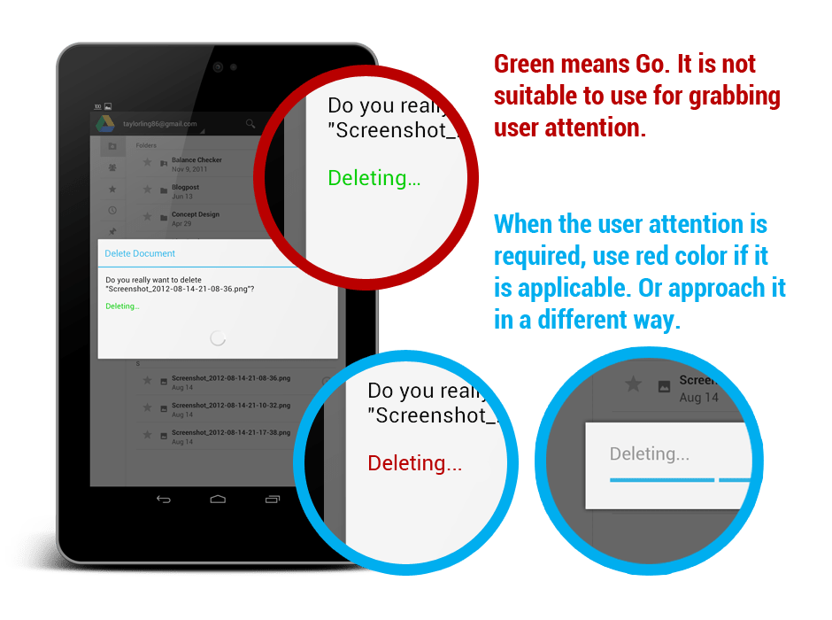
Even though Google Drive is a pretty unpolished app, I still would like use it as an example. In Google Drive app, when you confirm a file deletion, the Deleting… wording is in a welcoming green color. For this case, I would prefer not to ignore the language of color. Every color has their own associated meaning – Red means Stop/Attention, Green means Go, Orange indicates Warm and Blue indicates Cool. Therefore, it probably make more sense if the message is in red color to grab the user attention about the file deletion. It will be even better if those dialogs in Google Drive get a revision.
Avoid Unnecessary (And Ugly) Navigation
Navigation, one of the most important part of touch interaction, can cause serious user frustration if it’s not done right. Fortunately with the official Android Design Guideline for Navigation, it should not be a difficult task to do it right. But if you want to know how to do it wrong? Check out the stock Email app.
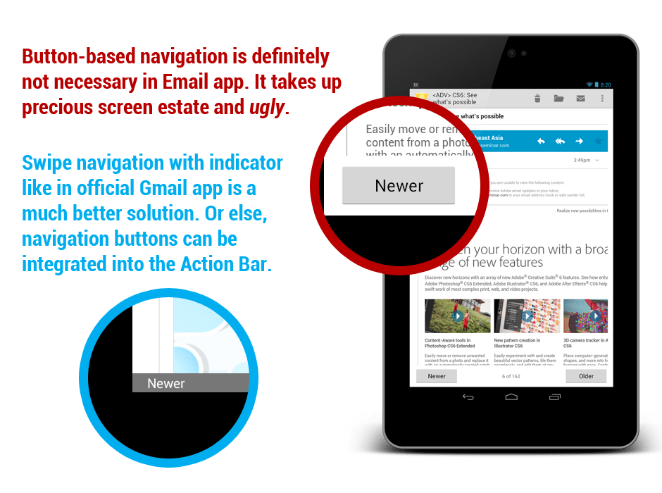
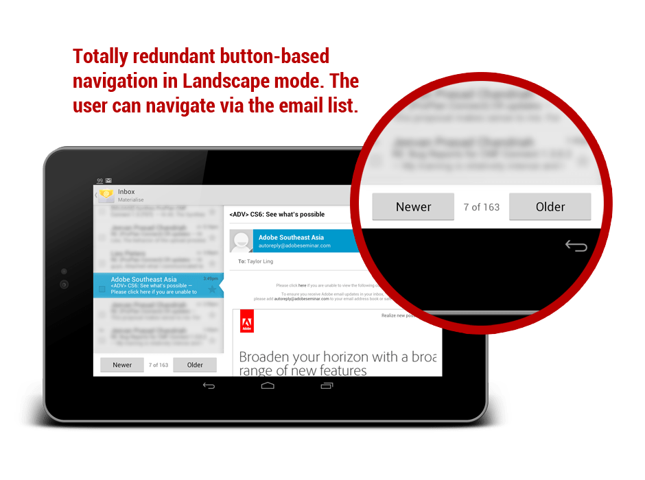
It’s a surprise to see the stock Email app doesn’t have that swipe navigation system found in official Gmail app. In the stock Email app, a button-based navigation is used in Detail Views. It does not only take up some precious screen estate, but it is also destroying the aesthetic of the app, especially in Landscape mode. Swipe navigation and the thin indicator in Gmail app is already a much better solution for this. Otherwise, integrating the navigation buttons into the Action Bar is also a feasible solution (Just to be fair, the Phone version of Email app does have the navigation buttons integrated in Action Bar, and I am not sure why it doesn’t do the same on Tablet version).
Hope these tips help in crafting awesome app with great UI/UX elements. More tips coming in the very near future (if I have any)!


Nice tips taylor, awesome for the start. But one thing to add upon the “send” in gmail app. I found the design of the send button itself quiet mis-leading at first. A cute rocket icon! lol… If google could use self labeled button for “newer” or “older”, a button with “Send” is worth.
Rock solid info there Taylor! Thank you for sharing.
Amazing post, Taylor, it’s helps a lot people that started now at Android development, keep it up, your blog is very great!
Thanks for writing these posts up… they are great and hopefully will inspire developers to write nicer apps! 🙂
Hi Alex,
Thank you! Indeed, my aim is to help making Android a better mobile OS with great design and usability!
Rgds,
Taylor