I often got asked how do I inspect an app from design perspective, especially on the layout, alignment, keylines etc., so I thought to share this in my blog. Sometimes we are able to spot some issues by just looking at it, but with some nifty tools, the design inspection can be done much easier.
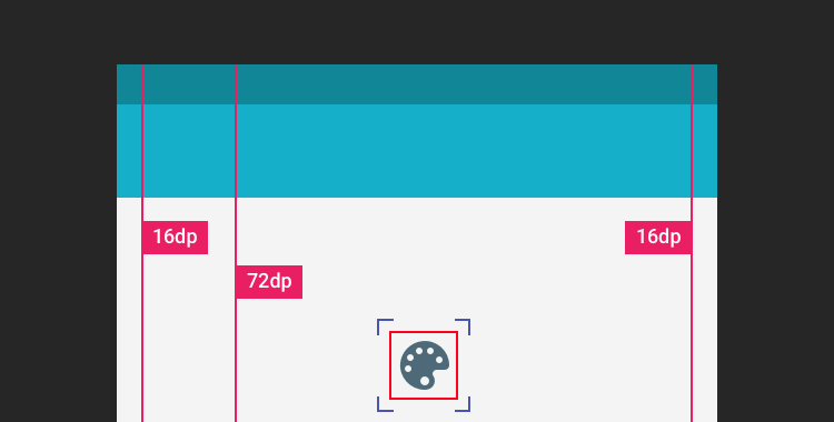
Below screenshot is what I usually see when I do a design pass on the static design implementation. It’s an IMDb app screenshot with keyline grid + layout bound shown, which is very useful to spot misaligned elements and incorrect paddings.
Tools
Keyline Pushing app by Faiz Malkani – This awesome free app will print the 8dp gridlines on your screen which have the proper keylines recommended in Material Design. It also has some other gridlines like 4dp typographic grid which can be very useful sometimes. (Update: Another new app called Material Cue can do the same thing as well)
Show Layout Bound option in Developer Options – This will show the bound of each element in blue lines (clip bounds), red lines (optical bounds) and pink area (margins). This helps a lot to spot unnecessary padding or misaligned bound. To access this option, turn on developer mode in Android. Then Settings > Developer options > Show layout bounds.
How this can help Android developers?
Few months back I introduced these 2 tools to my developer friends, and below are their comments on this tip:
It is useful to see the view paddings and margins, and immediately understand which view is causing the keyline misalignment. However, for standard views, paddings and margins have an expected behaviour so you can fix the issues without the layout bounds. Layout bound option can be really useful for custom views and custom groupviews. For these views, you can do whatever you want with the paddings, so having the layout bounds visible helps understand how your view occupy the space, which is useful to have the correct keylines.
It helped me mostly to check that clip to children works to prevent shadow, animation, and ripple effect cut-off. Also I am able to quickly check that all cards/pictures are correctly aligned based on the key line and the left/right edge of the layout bound. For layout bound, it helps to check that the touch target of images has been extended and is not only limited to the image edges. It also helps ensuring that some views ‘visibility’ are gone and not just set to invisible. With keyline pushing app, it is mainly to ensure that the Material Design spec has been fulfilled.
Just a quick post to rant about an usability issue I experienced today.
In software development, there are always tons of hidden rules and logics that we made internally for better usability (or may be worse?) and minimizing potential information overload for the user, but if it’s something involved with certain level of user expectation (e.g. user reasonably expecting things should work a certain way), it is always a good idea to ensure that the hidden rules of ours are sufficiently communicated to the user through feedforward or feedback, depending on the situation.
Out of Sight, Out of Mind (and Out of Reach)
Case in point – the funny (may be not so funny) logic in Dashlane that no user can understand (or realize). Continue reading →
Floating Action Button, or, in short, FAB, is one of the unique UI element in Material Design for primary/promoted action for a particular screen. Since it is a frequently accessed UI element in a given screen, I think it’s important to make the FAB right in every details. However, there are a number of apps doesn’t have the right FAB as specced in the Material Design Guideline, which also included some of the Google apps (I know!).
Todoist recently have their major redesign using Material Design and I thought it was actually quite nicely done! Though I found one minor design issue that might worth a mention – did you manage to figure it out at the screenshot below?
Just a quick entry for the day. Developers/designers etc., be on the lookout for design details/idea coming out from UX torturer. Every design details/decisions matter and most of them likely meant to handle certain user expectations, and if it’s done wrong, it can probably turn a good user experience into an unpleasant one.
In the first UI Animation in Photoshop tutorial, I have shown the way to do simple animations in Photoshop like moving, scaling and style changing – if you are new to this and haven’t check that out yet, I recommend you to look into Tutorial #1 before this.
In this second tutorial, I will share my experiences in applying easing into the animation made with Photoshop. Special thanks to Jovie Brett Bardoles for sharing his manual way of applying easing in his animations, which inspire me to explore and dig into the Timeline feature in Photoshop.
Designing for Android devices can be challenging sometimes due to the availability of the Android-powered devices with different screen sizes, however, it is certainly not an issue if adaptive design is considered during the design phase of the app. Some developer/company chose to complain about this, but this likely won’t change anything because it is a deliberate direction that Android meant to go and move forward. The way forward? It’s Adaptive Android Design1.
I have been using Photoshop to make UI animations for my work and it works surprisingly well (at least for me). Of course, Adobe After Effect is still the best tool to create complex and awesome animations, but with Photoshop, you can still create some simple and high quality UI animations to preview the animation idea to others. With some combination of animation properties, you can definitely create some rich animations that is sufficient for discussion. There are certain limitations in Photoshop compared to After Effects (of course!), but for someone who wanted to just use one tool for UI Design + simple UI Animations, Photoshop is one of the best tool that you can get (even if it’s not really designed for UI design).
This tutorial #1 will cover some basic procedures to create simple animations using the Timeline feature in Photoshop CS6+ (no GIMP or older Photoshop), so if you are totally new to this, I hope you will find this tutorial helpful for your first step in making UI animation using Photoshop. Let’s begin!
Unclouded by Christian Göllner, an app that helps to analyse and clean your cloud storage (Dropbox and Google Drive, for now) has just recently out of beta, and I have the honor to work together with Christian on the design for this app. I was really impressed by the app quality when I first received the early build of the app – without hesitation, I told him that I wanted to work together to bring this app to the level of awesomeness. It is super amazing that the app has been featured by Android Police, TechCrunch, CNET, Lifehacker, and xda-developers, and these boosted our confidence about the design and development direction of the app.
In this post, I would love to talk about some design details that we have worked hard to fine tune in order to craft the ‘Unclouded’ experience that we have visioned.
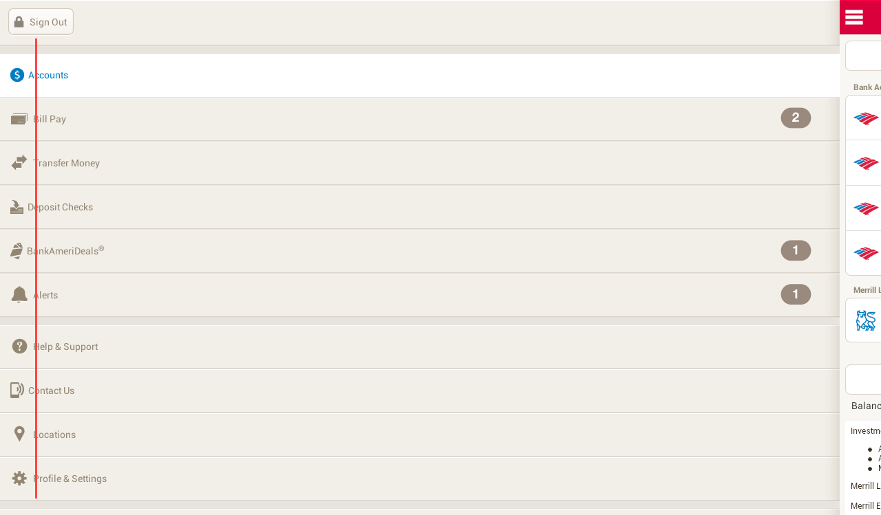
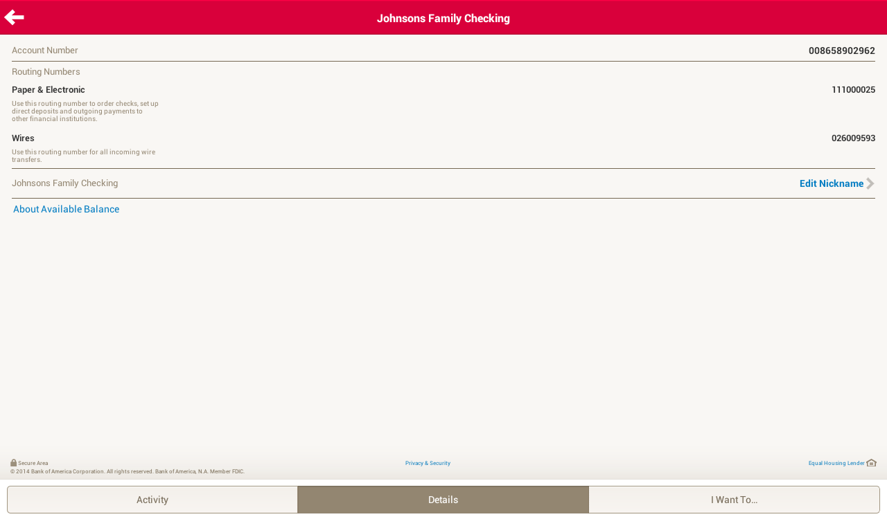
It is first started as a simple Google+ post after I saw the refreshed UI of Bank of America app which probably looks OK on the phone, but terribly on the tablet device, and I thought this topic actually worth a short blog post. Well, let’s first have a look on some screenshots of the refreshed UI of the mentioned app:
Navigation DrawerDetails Screen of an Account
There are obviously many UI/UX improvements that I can suggest, for example:
Misuse of available screen estate – Navigation drawer is not done right and taking away too much of the core experience of the app – navigation drawer is meant to be transient. Also everything looks stretched-out and blown-up which make readability and glanceability become really bad.
Lack of Pure Android Experience – It’s 100% iOS experience – Tabs at the bottom, right caret, iOS top bar etc. There are certain UI and interactions elements really unique to Android to provide the user the best and pure Android experience, and this shouldn’t be taken lightly if you care about the user.
Lack of attention to details – Even for an untrained eye, it’s pretty obvious that the icon and text wasn’t aligned in a proper way – Mind the gap.
Terrible tablet experience – Rather than a blown-up version, a multi-pane layout should be already considered if tablet is meant to be supported.
Unoptimized tablet experience is a missed opportunity
We are currently living in a multi-screen world that we are no longer performing daily activities only on the computer, but also on the smartphone, tablet and TV. Of course, this does not apply to every single activity, but most of your digital activities can be done on any devices, and thus, there is always a chance that your user will try to accomplish a task using your app/service with any screen at any time. Unoptimized tablet experience would mean a missed opportunity – for the brand, for the customer experience, and for the customer loyalty.
And with the huge market share by Android tablet, it is probably no-brainer to pour in a little bit more efforts to optimize the tablet experience (unless your app/service does not make sense on the tablet at all) because tablet has penetrated in many users’ live faster than you could imagined.
What’s make a good tablet experience?
Make full use of available screen estate
Gmail in Tablet
Gmail app is a great example showing that multi-pane layout works really well for tablet, especially for apps that have a list/grid view and a detail view. This will enable the content navigation for the user while still provide the full experience on the content details.
Optimize the content density
Google+ in Tablet (Optimized Content Density)Facebook in Tablet (not-optimized content density)
With the available screen estate, especially the horizontal screen estate in Landscape mode, it is crucial to optimize the content density to show the user more information on screen at one time. Of course, this doesn’t mean that you have to show the information as dense as possible – finding that balanced density is very important (and tricky) – and this optimization must be able to enhance the content consumption experience (the user consume more information with the same amount of effort compared to small screen devices), and if it’s not, it is probably mean that the content density optimization doesn’t work. It is important to design the app with great tablet experience for the user to appreciatethe screen estate available on the tablet, not just treating it as an enlarged phone. Compared to the Facebook app, Google+ able to show more information at the same time, fully utilize the available screen estate.
Cares about content consumption quality
Newsstand in Tablet
If you look at the screenshots of the Bank of America app, you will find that you will have some difficult time to connect the information on the left and the one on the right, because the readability is not optimized due to the stretched layout, causing the severe disconnection between the information on both sides. In the above screenshot, it is a good example showing why you should not fit the content (especially texts) as much as possible because you would also want to make sure that the readability is great (here, of course, we talk about the optimal line length), so the user can have great experience during the reading (or content consumption).
Tablet experience should not be an afterthought
If you app will be used by tablet users, always design the app with tablet experience in mind (as shown above) and make full use of responsive design. Besides that, Android team has written a nice checklist for tablet app quality, so you definitely need to go through it to ensure that you are providing the best quality and experience for both phone and tablet devices.
I hope this post is able to inspire and motivate Android developers and designers to optimize the tablet experience and it should not be an afterthought in app development. If you have any comment or question, feel free to leave it at the Comments section, and I should be able to respond accordingly.


 #androiduiux