
It’s been a long time since my last blog entry, but definitely I am still working on tons of Android Design (in private) and they are often very inspiring, which I hope I can share them in the near future if it’s possible.
Today I would just like to share some redesigns for an app that is local to my home country. The app called Yes Life, which basically an app that allows the user to call and send SMS to any local number from anywhere around the world with internet connection. Below are some screens from the current app:


There are few things in the app motivated the redesign:
- Almost 90% iOS UI Style (and ugly)
- (Very) Bad navigation system
- Usability issue (For example, online/offline status only in the Dialer page)
- Buggy (which unfortunately cannot be solved by a redesign)
- Missed the opportunity to enhance the branding
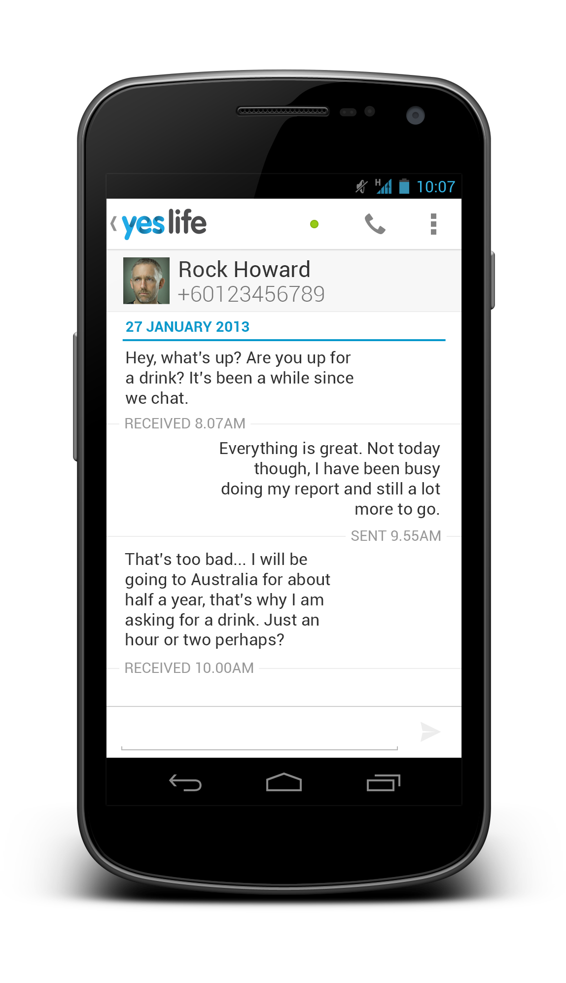
To address these few issues that I see, I did some redesign on some screens with Holo UI approach (of course!) with the following changes:
- Designed with Holo UI approach
- Used (swipe-able) tab navigation
- Used Action Bar (for better context actions and navigation)
- Show connection status in every screens (which is important for such app)
- Used light/white theme (for branding enhancement)
Below shows a few redesigned screens:


What do you think?
I hope this gives some idea on the importance of the app design in branding enhancement. If you have excellent solutions and branding, but decided to give your user bad products, it doesn’t do good on anything except getting rejected by the users.
Design is not just what it looks like and feels like. Design is how it works.
