Over 25 million active Outlook.com users and they said they are ready for Gmail user to switch – with this low quality app.
I really disappointed with this surprising move since they did a really great job in SkyDrive app in Android. Seriously, it’s not rocket science to craft a beautiful and usable email app with Microsoft identity. They invested heavily in UI/UX for their new product lines, but yet they failed to understand the importance of Aesthetic-Usability Effect.
What I really hope to see when I run the outlook.com app:
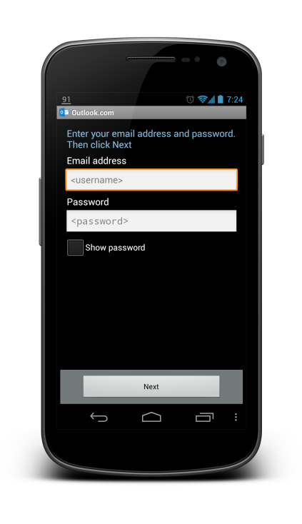
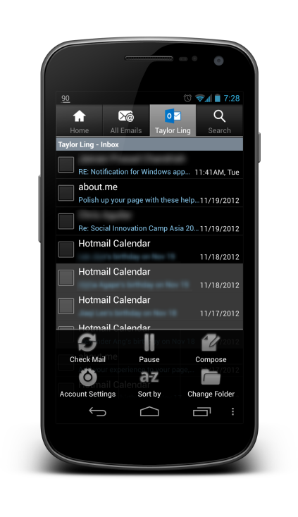
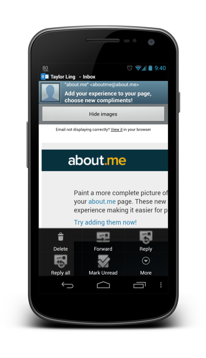
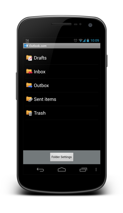
But what I see today with the current app (usually I don’t post these):
What do you think? Just feed me with any idea or suggestion you have!
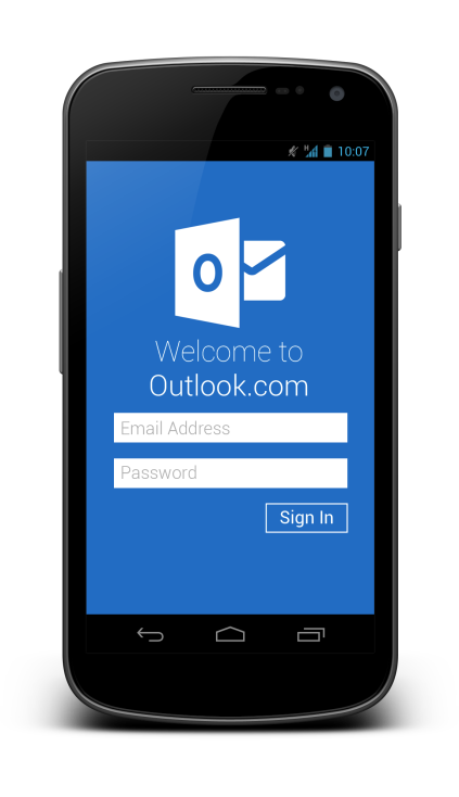
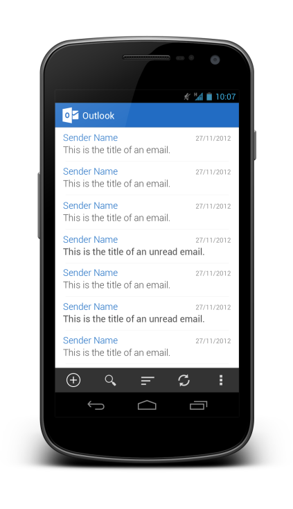
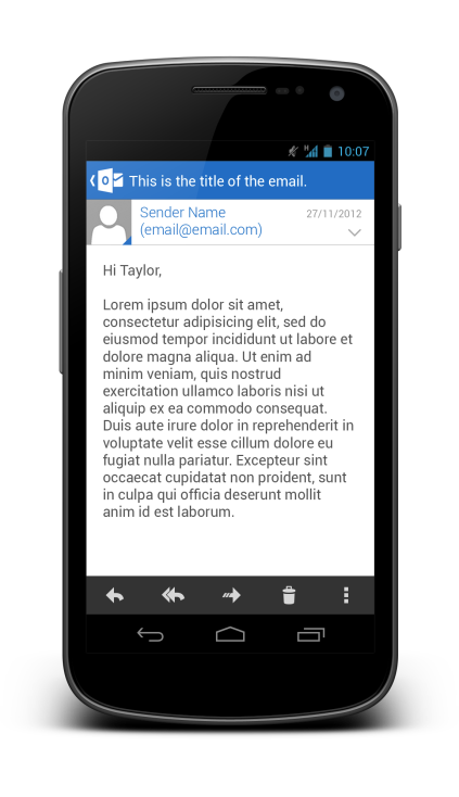
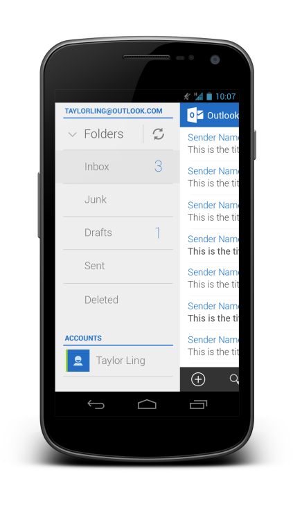
Wow that was fast! Now this is how the app should look; well done.
Thanks Gyuri! 🙂
Nice redesign! I’d go for the Gmail ActionBar spinner rather than the slide-in menu, as it has the additional benefit of showing you the current account and label or folder.
Hey David,
Thanks! As for the spinner, I still think slide-in menu is the best. I should change the app title to label/folder name, that will be more usable. As for knowing the account, I don’t think it’s that important, and it just a bezel swipe to know which is the active account, so spinner in this case won’t be as useful I think. 🙂
Rgds,
Taylor Ling
As usual I can see awesomeness inside your article. Great job Taylor.
But I m literally unhappy and shocked when I had downloaded and looked into the first screen. Unistalled !!
I am expecting from Microsoft that they will think over your design and put it in action.
I would change a few things, like the app icon when the slide-in menu is used as so the users know that you can slide it out and probably make the differentiation between unread/read much more clearer (Gmail does this with background colours and I really find it useful)
Hi Joe,
Thanks for the suggestions! Indeed, I should have place my indicator there for the slide in menu, so there’s definitely something to improve. As for the unread indicator, I am designing this from Microsoft language point of view, so highlight effect in Gmail app is not in. 🙂
Rgds,
Taylor
These are well done and it’s what people were expecting
Awesome as always! Loving the use of sans-thin font
The coolest thing about what you’ve done is that it fits with Holo and Microsoft’s Metro.
Great job! I love it but still, I can’t believe Microsoft did that ugly UI!
Hahaha
I don’t why Microsoft make impact on their bullshit UI pretty disappointing. Anyway awesome work.
Hi Taylor,
i just stumbled upon your blog. I have to admit you are really talented.
Could you please make some suggestion about K9? I think it’s the best mail client for android (plentiful of features), and it’s open source. But it’s interface looks ugly!
Thank you