
Last week I have published a redesign of outlook.com app after the disappointing official release, and since then I have also started to look into the tablet version. The redesigned phone version has been a shared around Android Google+ community during that day, and it was also mentioned in latest episode of Android Design in Action – big thanks to everyone who re-shared and commented on the redesign.
Below are my take on the tablet version, probably not much surprise for some (Before anyone say it, yes, it looks like Gmail/Email app, since it’s an Email client):

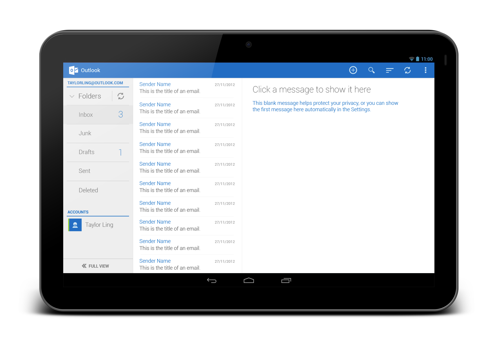
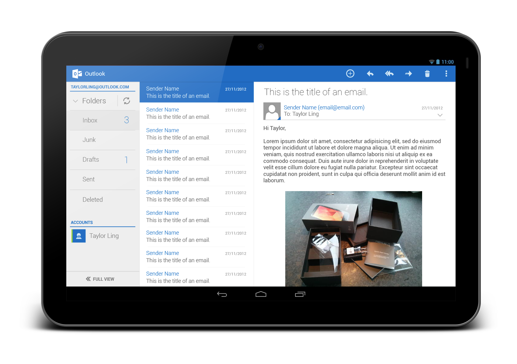

What do you think?

I think it would be a good idea that you’ll show us the original design against your (better) redesign. Regards
There is no original tablet design… the original design is a non-Holo piece of crappy old UI.
Looks beautiful!
Wow! Clean and minimal UI. Much much much better!