I have been thinking to redesign Google Finance app for a quite some time since I think all Google apps should have at least adapted to Holo Style UI, and I think there are still quite some number of users for the app (unfortunately not me because it doesn’t support share market of Malaysia), but I didn’t quite find the time for it. However, last Android Design in Action episode has put up a challenge to all Android developers/designers for some redesigned screens of any current apps, and that motivated me to continue working on this redesign despite of the really packed schedule.
The current Google Finance app is really ugly, which looks like a web-app rather than a native app. The graph is not loaded at the proper size, old Android UI elements are still there, and the ugly legacy action overflow. Therefore a redesign is definitely required. And the objective is pretty straight forward: Make it a clean and nice app to be used by every user levels. Therefore I tried to preserve the familiarity so the existing user will not have to re-learn the new UI while still providing a refreshed UI compliant to Android Design Guideline. Here’s my take:
What do you think? Shot me in the comment box 🙂
If you want to see some comparison shots between the current version and my redesigned version, I have posted them in my G+, feel free to comment there as well!
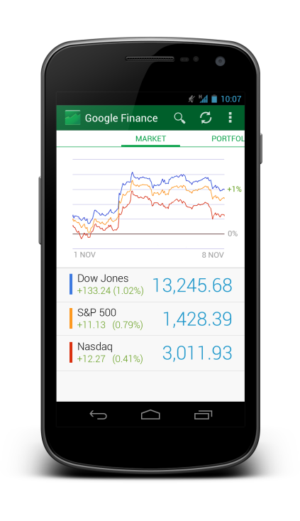
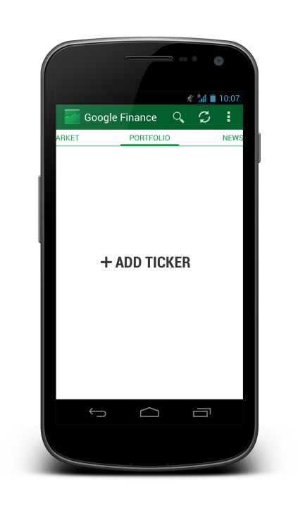
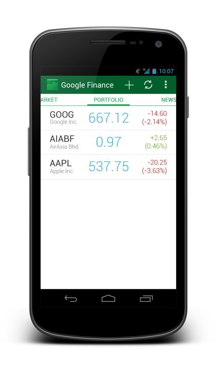
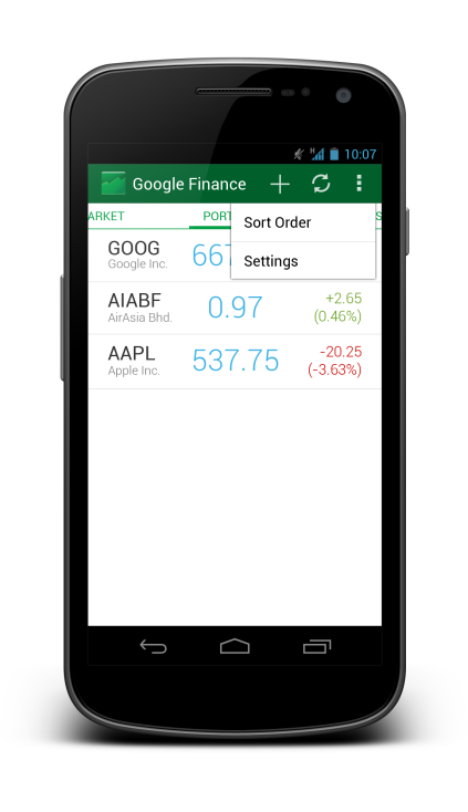
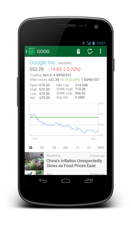
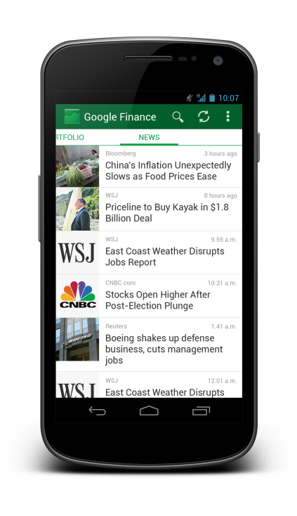
Looks great! Changing graph views by length from 1M to 1Y and so on should be changed by swiping left and right 🙂
Hey there,
Thank you! Yeap, such swiping is possible even on the current one, but I still prefer to have some buttons for graph view changing because the discoverability of the swipe can be an issue here.
Rgds,
Taylor Ling
That’s great, Taylor, congrats! Are you thinking about tablet mockups too? That’s huge work!
Love it! This app definitely could use it, glad someone is showing off its potential.
While this is quite beautiful, I think that this focuses too much on the aesthetics of the design, and not enough on the functionality.
On the portfolio view, for example, I think that it would be nice to have faded sparkline for the history of that ticker – see how Github does it with revision history bar charts (for example, https://github.com/facebook).
Secondly, on the chart view, I think that more information could be conveyed without compromising on the aesthetics – for example by highlighting the high and low water marks.
On the portfolio view, after adding a ticker, you seem to lose search functionality from the action bar – is this intended?
Hey Martin,
Thanks for your suggestions! I like the faded sparkline idea a lot!
Regarding the search functionality, yes, it is intended because the ‘Add’ functionality is more important then the ‘Search’, therefore I remove it from that particular screen. I have to admit that the interaction part of the redesign is not a complete one, so it’s a good question from your side. 😉
Rgds,
Taylor
Hello,
Great work. you kept the original Google finance spirit and colors and made it much more “Android like” in the same time.