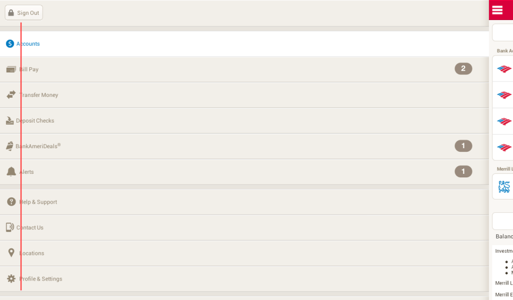
It is first started as a simple Google+ post after I saw the refreshed UI of Bank of America app which probably looks OK on the phone, but terribly on the tablet device, and I thought this topic actually worth a short blog post. Well, let’s first have a look on some screenshots of the refreshed UI of the mentioned app:


There are obviously many UI/UX improvements that I can suggest, for example:
- Misuse of available screen estate – Navigation drawer is not done right and taking away too much of the core experience of the app – navigation drawer is meant to be transient. Also everything looks stretched-out and blown-up which make readability and glanceability become really bad.
- Lack of Pure Android Experience – It’s 100% iOS experience – Tabs at the bottom, right caret, iOS top bar etc. There are certain UI and interactions elements really unique to Android to provide the user the best and pure Android experience, and this shouldn’t be taken lightly if you care about the user.
- Lack of attention to details – Even for an untrained eye, it’s pretty obvious that the icon and text wasn’t aligned in a proper way – Mind the gap.
- Terrible tablet experience – Rather than a blown-up version, a multi-pane layout should be already considered if tablet is meant to be supported.
Unoptimized tablet experience is a missed opportunity
We are currently living in a multi-screen world that we are no longer performing daily activities only on the computer, but also on the smartphone, tablet and TV. Of course, this does not apply to every single activity, but most of your digital activities can be done on any devices, and thus, there is always a chance that your user will try to accomplish a task using your app/service with any screen at any time. Unoptimized tablet experience would mean a missed opportunity – for the brand, for the customer experience, and for the customer loyalty.
And with the huge market share by Android tablet, it is probably no-brainer to pour in a little bit more efforts to optimize the tablet experience (unless your app/service does not make sense on the tablet at all) because tablet has penetrated in many users’ live faster than you could imagined.
What’s make a good tablet experience?
Make full use of available screen estate

Gmail app is a great example showing that multi-pane layout works really well for tablet, especially for apps that have a list/grid view and a detail view. This will enable the content navigation for the user while still provide the full experience on the content details.
Optimize the content density


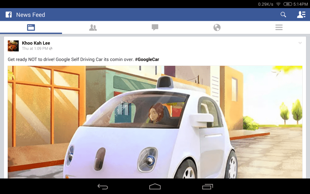
With the available screen estate, especially the horizontal screen estate in Landscape mode, it is crucial to optimize the content density to show the user more information on screen at one time. Of course, this doesn’t mean that you have to show the information as dense as possible – finding that balanced density is very important (and tricky) – and this optimization must be able to enhance the content consumption experience (the user consume more information with the same amount of effort compared to small screen devices), and if it’s not, it is probably mean that the content density optimization doesn’t work. It is important to design the app with great tablet experience for the user to appreciate the screen estate available on the tablet, not just treating it as an enlarged phone. Compared to the Facebook app, Google+ able to show more information at the same time, fully utilize the available screen estate.
Cares about content consumption quality

If you look at the screenshots of the Bank of America app, you will find that you will have some difficult time to connect the information on the left and the one on the right, because the readability is not optimized due to the stretched layout, causing the severe disconnection between the information on both sides. In the above screenshot, it is a good example showing why you should not fit the content (especially texts) as much as possible because you would also want to make sure that the readability is great (here, of course, we talk about the optimal line length), so the user can have great experience during the reading (or content consumption).
Tablet experience should not be an afterthought
If you app will be used by tablet users, always design the app with tablet experience in mind (as shown above) and make full use of responsive design. Besides that, Android team has written a nice checklist for tablet app quality, so you definitely need to go through it to ensure that you are providing the best quality and experience for both phone and tablet devices.
I hope this post is able to inspire and motivate Android developers and designers to optimize the tablet experience and it should not be an afterthought in app development. If you have any comment or question, feel free to leave it at the Comments section, and I should be able to respond accordingly.
More high quality tablet app!
