

While this blog post titled ‘How would I further improve TuneIn Radio app’, but I thought I would also like to take this opportunity to touch on the topic about consistency in visual design for mobile apps. No, this isn’t a fight between flat, skeuomorphism, gradient etc. – this is about embracing the consistency of visual design for better aesthetic integrity of a product regardless of the visual styling you opt for.
Visual Consistency is for better aesthetic integrity
One of the graphic design principles that I found here fit the context very well:
While creating rhythms and variations from page to page, one must also remember to maintain an overall aesthetic integrity. The purpose of graphic design is to communicate, not dazzle, and an inconsistent design will result in decreased user effectiveness. This means keeping individual visual and typographic elements simple and clear. It also means applying them uniformly, so that the connotations of a particular type style, or the results of interaction with a particular graphic element, are independent of their context. There should be an overall visual system to the text, carefully considered in the first stages of design, that brings together the elements into a coherent whole.
And of course in Android Design Guideline about branding:
If you take this approach, make sure your (brand) styling is applied to every single icon in your app.
Keep it Consistent
Let’s have a look at the things that I would improve on this app (most of them are about visual consistency):
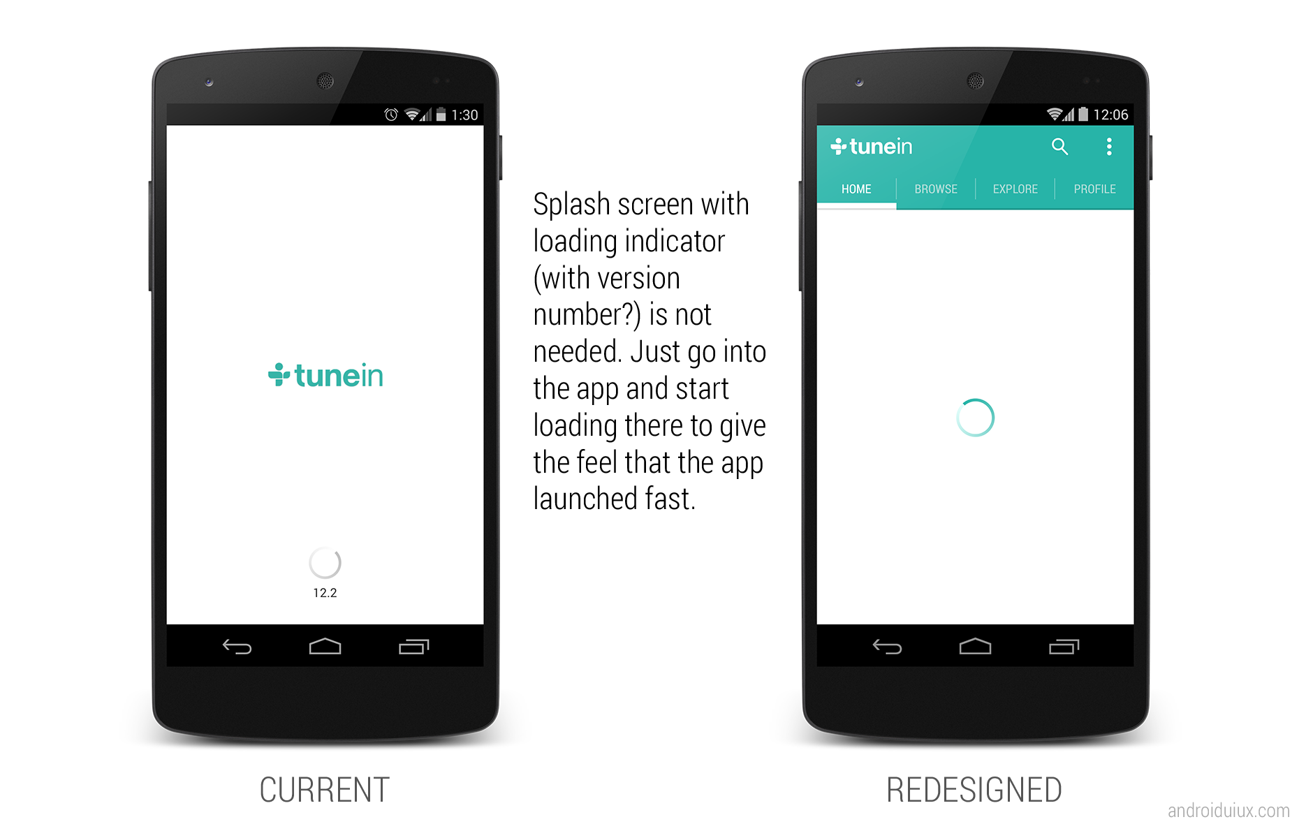
- Remove the useless splash/loading screen
- Need design consistency on Android UI elements (Nav Drawer indicator has inner shadow, overflow icon doesn’t have it, and both of them are in dark colors)
- Use tabs instead of Nav Drawer. Here’s why
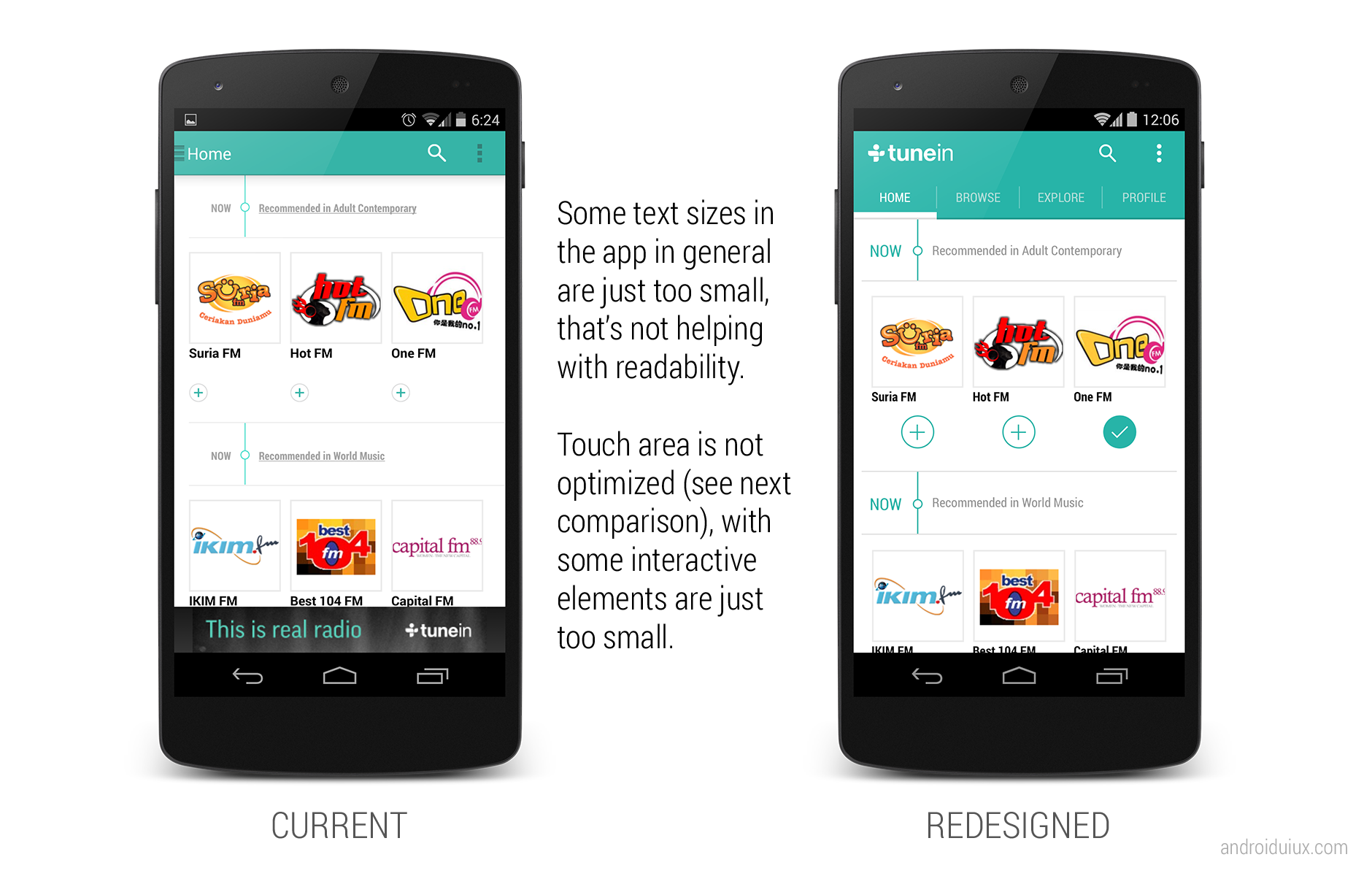
- Use larger text size in general
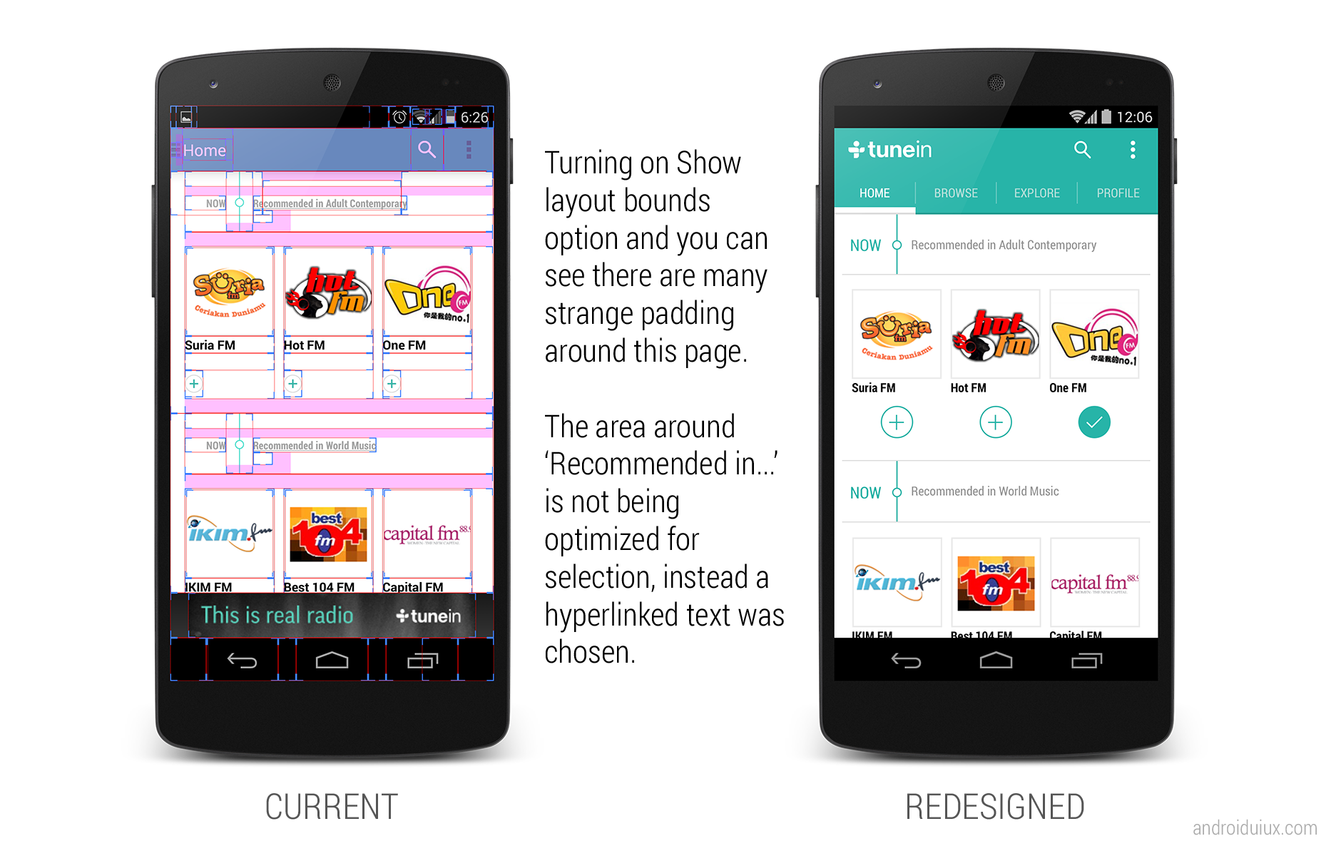
- Make full use of space for interaction rather than using hyperlinked/underlined text
- Use appropriate (touch-friendly) size for interact-able elements
- Need design consistency on similar items for maximum familiarity and predictability
- Show hint if the horizontal list is scrollable
- Avoid unnecessary paddings
- Need consistency on font type used in the app
- Need design consistency on icons (some are flat, some have an outer bevel effect, some have inner shadow)
- Avoid truncated texts if it’s possible
- Use blurred background in a proper way
- Slider that can’t slide? Not needed.
- Be aware of the bad readability caused by font color choice and background
- Gradient Now Playing bar? Looks old and just out of place.
- Use animations to correlate between the full mode and minimize mode of Now Playing
- Car mode doesn’t have to look THAT bad


What do you think? Do you like the redesigned version of TuneIn?
 #androiduiux
I couldn’t agree more with you Taylor for your specific suggestions that address the many issues that the app has.
I have been using the app since the previous design which was old-school but fully functional and consistent, but the re-design is a complete mess!
Mixing up styles from the old version with the new one, barely-readable texts, migration issues from the previous version to the one, gingerbread loaders at a phone running 4.2, and so many more.
I really don’t understand why such big companies don’t take themselves seriously and don’t deliver consistent UI and UX. It can only do them good, especially at such a competitive market.
I don’t even use this app but I agree with all your points.
Very interesting, all apps can be improved
Despite the fact that I don’t use this app, but when I first tried it, I gotta say “It’s a mess”. but you done something so great here that gave us the way to think about designing an app and knowing the differences between a bad design and a good one. thanks for the great article.
Hi Taylor,
Nice points of improvements. What tools do you use for animation mock ups of UI?
Hey Nirav,
I used Photoshop for the animation. I will probably write some tutorial for it soon.
Taylor Ling
nice work , it would be great to have some tutorials in your website , so we would see the hole process of the final redesigned app !
keep it up , tnx !
You should join the TuneIn Beta Testing community and comment there. I agree with a lot of what you say… starting with the splash screen 🙂
https://plus.google.com/u/0/communities/104004014534336880633
With material design lots of your design improvements would look fabulous. I love nice design… and I kinda hate Apple… I have hope Android will reach Apple one day 🙂
“…no reason to use navigation drawer… Tabs are super-easy…” O RLY?!
https://www.google.com/design/spec/components/tabs.html#tabs-usage
“Do. The tabs switch between equally important facets of store content.
Don’t. The tabs switch between destinations of varied importance within the store.”
Hey Captain Obvious,
Yes really. Except Profile that may be is on less important (which I think it make sense to put it at the top left toolbar as profile, or within the overflow menu), all tabs like Home, Explore and Browse are essential and have equal importance in TuneIn, which allows the user to consume the radio station in different way. Your example included is a very good one of course, with each tab has relatively huge difference in importance for a store app.
The reason that I am suggesting tabs instead of navigation drawer because it has very limited top-view (thus no reason to use navigation drawer) and helps to improve awareness of these different views in the app (out of sight, out of mind).
https://www.google.com/design/spec/patterns/app-structure.html#app-structure-top-level-navigation-strategies
Taylor