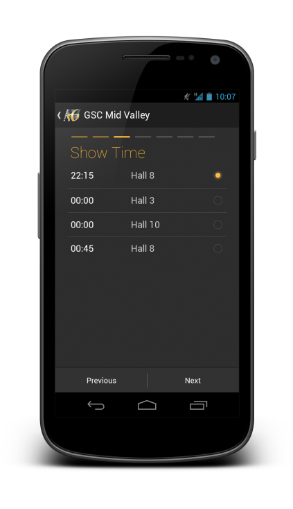
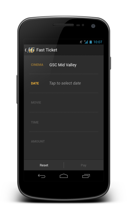
Last month Roman Nurik posted a wizards pattern for complex user inputs, and I have now used it for my redesign of a local (Malaysia) movie ticketing app, which is definitely a perfect match (I think). Hopefully this redesign can inspire any developers or designers that are looking to create/redesign movie ticketing app.
Why I am redesigning this app? I have placed a few shots below to briefly show the user interface of the app to explain that. Completely implemented with iOS look and feel, legacy menu button, badly-resized images, in-app advertisement (about themselves), bad user interaction design – everything is so wrong. Give it a try if you want to understand my frustrations.
I think many will agree with me – app that just work without proper UI/UX design is no longer enough to stand out and compete with thousands of other apps in the market.
Completely redesigned with Holo UI approach, the movie ticketing app is aimed to provide great and easy ticketing service with sufficient information about cinemas and movies. Here’s my take (It’s a long page!):
What do you think about my redesign? Shot me in the comments if you have any suggestions/feedback/critique!


Absolutely love it! 🙂
Looks great! I’m using the wizard design in the design update to the CardStar app. Stay tuned, I’ll probably post some screenshots on G+.
Fantastic design. The only issue I can see is that selecting a seat for fat-fingered users may be an issue. I think that Chrome does in this case, by automatically showing a zoomed in target would be useful
great design!
I really like the redesign you made! Just wondering about selecting a seat screen – how it should look like when you have a bit bigger screening room, e.g. 18×20 in size?
Hey,
There will be pinch-to-zoom feature to go with that screen. I am also thinking the Google Chrome like zooming feature should also useful in this case.
Rgds,
Taylor Ling
Nice redesign, Taylor. I’m not surprised to see you’re creating high-quality tools. Keep it up!
Hey Rich,
Thanks! It’s been quite some time! Hope everything is great for you 🙂
Rgds,
Taylor
Very nice work !
I love the buying steps.
Have you been approached by GSC yet 😀 ?
How you made the wizard compatible with other versions?
Hey,
I am not entirely sure if that wizard pager is compatible with older Android version, probably check the source code? I am no developer so I have no idea.
Rgds,
Taylor
Hi! I really love it. But the last screen(Tickets) along stand away from rest of the design. Is there any particular reason for that?
Hey,
Not sure if I fully understand you, but do you mean it seems the tickets screen is out of place with the rest of the design? No particular reason for that, it is still using the card-UI-like in Holo with a slight skeuomorphism applied to look like a ticket, so personally I think it is still within the design package. Design principle applied here: “Delight me in surprising ways”. 🙂
Rgds,
Taylor Ling
I like it, it looks very nice. A few points of feedback though:
1. I don’t like that the bar at the top (the page indicator) isn’t the width of the form.
2. On the movie tab, I feel like you should show the showtimes for that day below.
3. On the movie tab, there doesn’t seem to be a way to search, which seems like it would be pretty useful.
4. I don’t understand the purpose/use of the “fast ticket” screen.
5. At the end of the process, it might be nice to have some sharing features – ie. send the tickets to guests, email yourself, add to your calendar, etc.
6. What is the number in the top right on a couple of those screens? ie. the 3:59 on the review screen.
On the note of #2, one thing that could be cool might be to show to the user the times graphically by treating the width of the list view as 24 hours, and then shading the parts of the bar based on what time the movie is playing. That way, you could quickly see what movies are available and when, and get a feel for what is popular.
You might also want to take a look at the Expedia app’s flight scheduling.
That said, the wizard here seems like it’s too verbose. I feel like move and showtime could be combined into a single screen, and the purchase screen could also be more information dense.
Hi Taylor,
Long time no see. Just browsing through, and saw your new blog.
Anyways, looks good. Just one remark though, I think it is important to show the choice that the user has chosen in the previous step. So for example in the Movie page, you show which date that was chosen from the previous page. This probably will clutter up the page more, but kinda helps avoids confusion and also acts as confirmation that the user has selected the correct date time etc. Also there should be a way to jump back more than once (maybe clicking on the indicator, but it’s not clear which indicators represents which page). Just my 2 cents.
definitely better than the current one
nice redesign. btw from where i can find your payment icons? thanks
Hey,
They are just logo that I found from the internet, optimized for the dark screen.
Taylor Ling
ok!! what size must be the original icon in order to use it like the way you used it? i’m new and i;m trying to understand all this pixel,dpi, dp etc