It has been a while since the last Android UI/UX Tips, but I still continue looking for things that can be improved whenever I have some time to find them or actually experiencing them myself.
I am not sure if I can say I am happy with the release of Android 4.2 in terms of UX, especially with the decision to include the Quick Settings panel that isn’t much useful, and a strange bug on the date picker for Contacts app which should be fairly simple to detect if the testing is done thoroughly.
In any case, let’s look at some UI/UX tips that I would like to share.
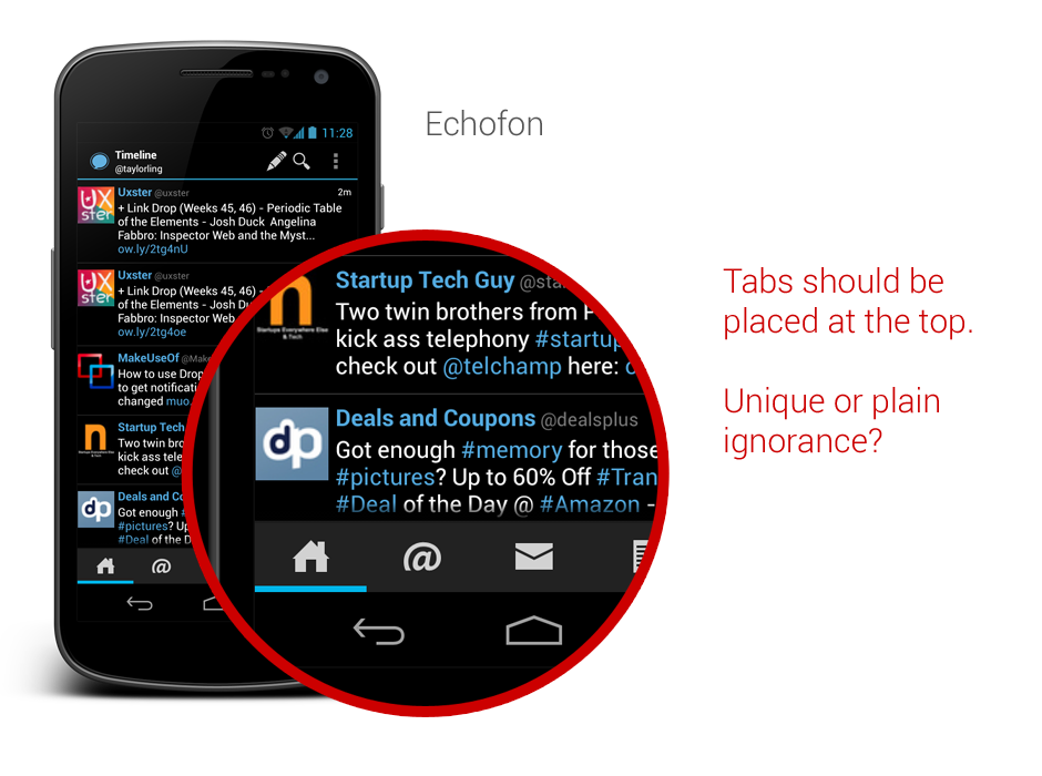
Tabs should be placed on top
In Android Design Guidelines, it has clearly suggested that tabs should not be placed at the bottom, since it is a very iOS UI element and doesn’t fit in too nicely in Android interaction behavior.
However, looking at the recently released Beta build of Echofon – there you can find the ignorance from the development team.
One of the main justification for placing the tabs at the top is that the user will have hard time to see which tabs he/she is currently in while swiping across the tabs (try it on a phone device). Juhani also written a great article few months back to justify the placement of the tabs should be at the top.
So my advice, try not to ignore the guideline and do not invent new UI element that doesn’t help in enhancing the UX.
Use Simple but Precise Words
Sometimes it is unavoidable for developers/designers to add some words to explain certain things in the app, like instructional guides or options in Settings page. However, it is not hard to find some bad examples in the apps world, either they used long but unclear explanations, or some simple words that simply can’t explain clearly for certain options/features in the app.
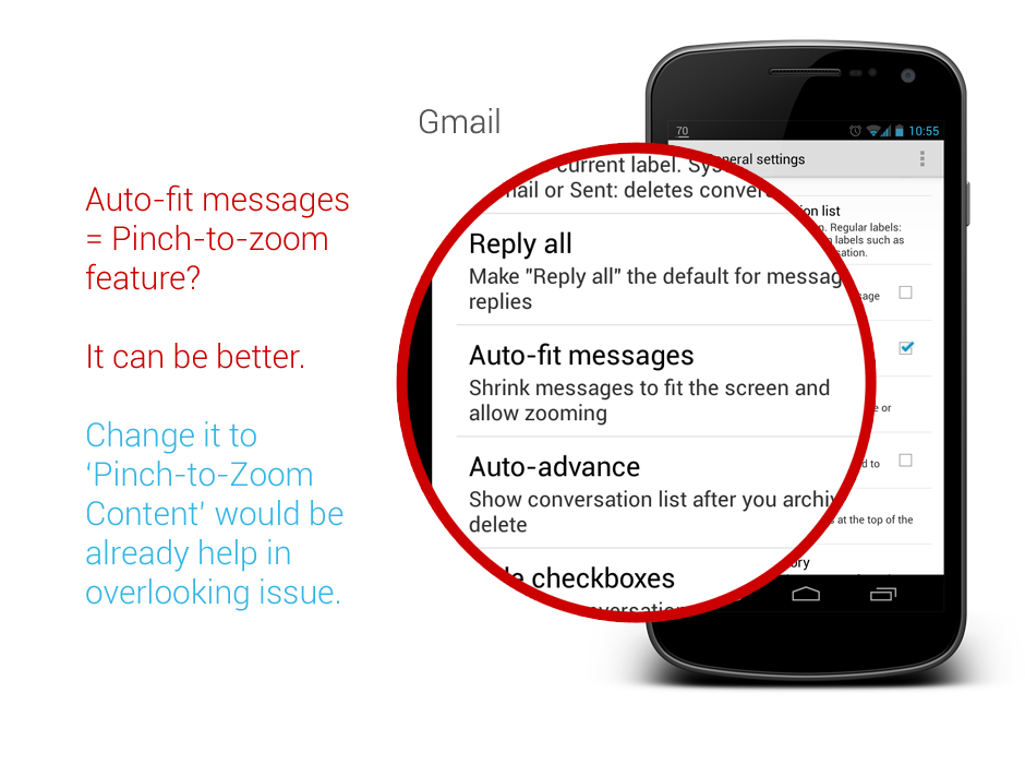
One example that I would like to show here is the new Gmail app that comes together with Android 4.2. If you are an early adopter of Gmail app version 4.2, most probably you are aware that it finally has a pinch-to-zoom feature for the email content. However, it is not turned on by default. And what’s really surprising here is that even the option to activate that feature is in the Settings page, many (including myself) have overlooked the existence of this option. Some might blame themselves for the overlook, but really this is actually an UX related issue.
The words that they used to explain the option isn’t something really straight to the point – especially the word ‘auto-fit’, I am not really sure if there is anyone familiar with it. The further explanation might clear the confusion a little bit, but definitely it can be improved. I am sure if it change to Pinch-to-Zoom Content with the explanation Automatically fit the message to the screen and allow zooming, 90% of the people who overlooked this will be able to turn on this feature without having a doubt, and it is also clearer to any new users, I supposed.
Therefore, simple but precise wordings/messages to the user is the key to avoid miscommunication or feature overlooks.
Ensure proper UI presentation
It’s a pity that the stock Email app doesn’t get any updates ever since ICS (at least I am not aware any of them). In Android UI/UX Tips #1, I have questioned on the navigation buttons in the app, and now I have found more things that can be improved during my daily usage.
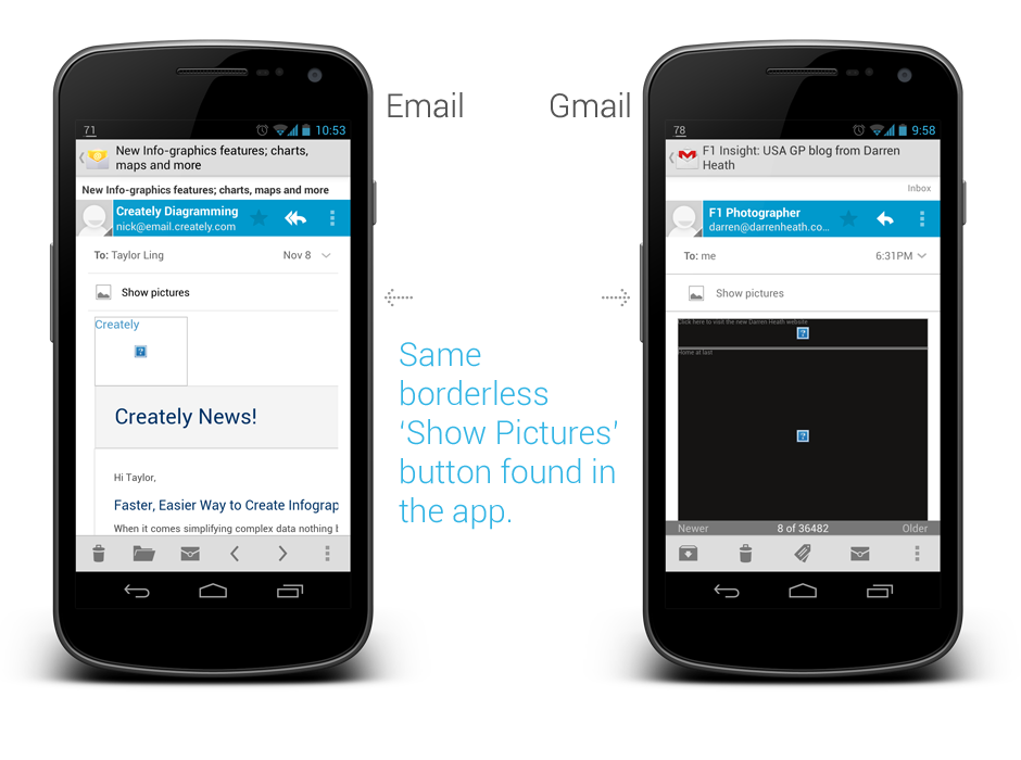
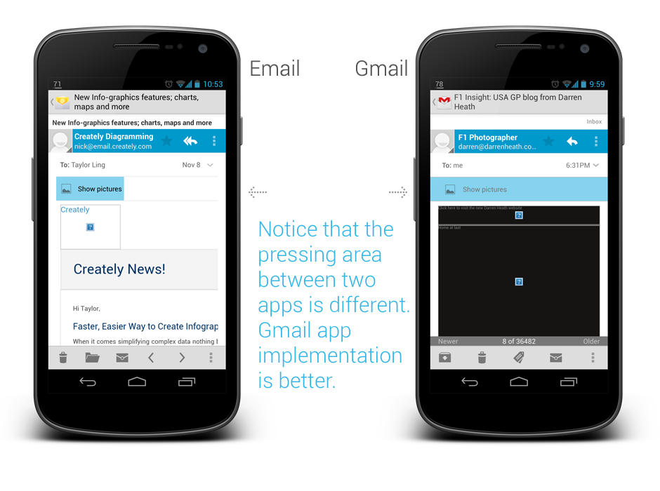
If you need a borderless button in the middle of UI (in this case the Email app), please make sure that the user should be able to press it anywhere along the entire button area, otherwise if you would like to make it work only on a specific area, remember to use a vertical separator. Gmail app is doing this absolutely right.
Ensure Action Hints are working properly
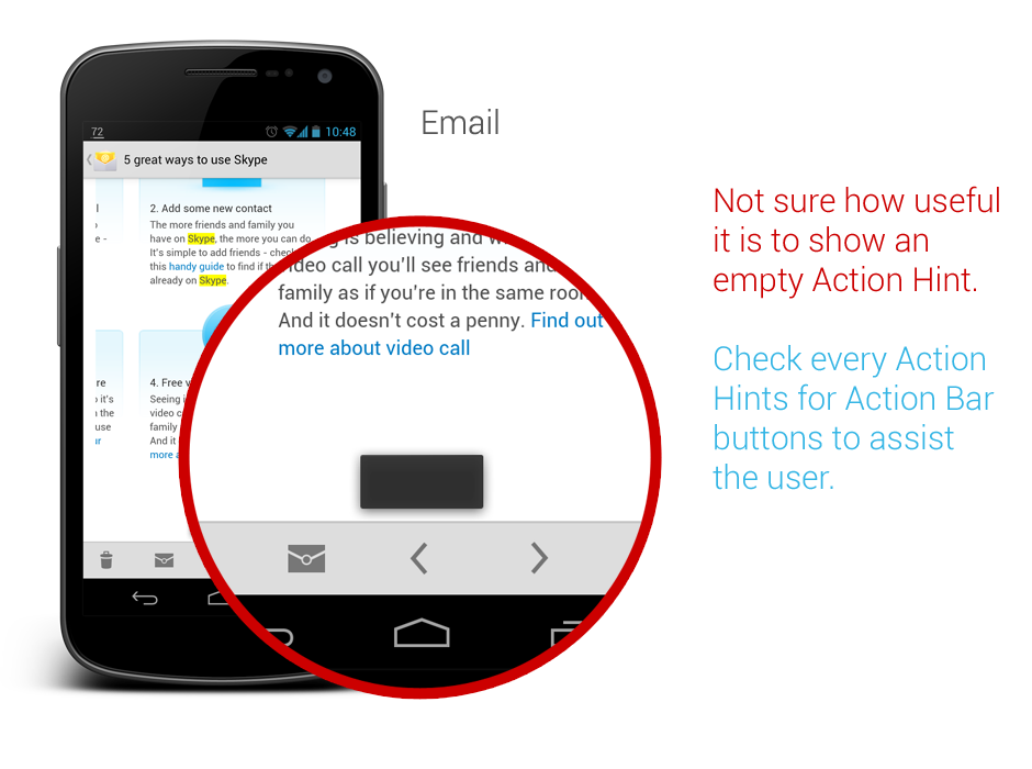
While it doesn’t seems to be a crucial feature, but I would really make sure that the Action Hints are always working correctly, showing the helpful hint to the user about the iconized buttons.
In Email app, when you long press on the navigation button, it actually show the Action Hint toast box without any text in it. This should be avoided – it doesn’t provide any helpful hint to the user and it doesn’t give any good impression on the app quality either.
That’s all for this Android UI/UX Tips! As usual, hit me with comments if you have any.
Great article! Thanks!
About the last part, the toast thing is a default behavior in android, it will show the name you give to the action button, if you haven’t set one, it will show a blank toast. I don’t think you can change this behavior (as a developer), I might be wrong though.
Hey Florian,
You’re welcome!
Indeed, the action hint is a default behavior. The point that I want to say is that make sure every action button have a proper name, so it won’t show a blank toast.
Rgds,
Taylor
I agree with you that labeling content zoom could have been done better, but I don’t think Android will ever call this “Pinch-to-zoom” because Apple patented the zooming gesture under that exact name, so using it might lead to legal issues. Android had to work around to even implement it http://www.phonearena.com/news/Jelly-Bean-already-works-around-Apples-pinch-to-zoom-patent_id33913
Hey Nikola,
Yeah, I never consider that (patent system in US :/), but either way, the ‘auto-fit messages’ doesn’t help. ‘Zoom Content’ would already help I think.
Rgds,
Taylor Ling
I have to disagree with the “tabs on top” tip, it’s a lot easier to navigate through the app if the tabs are placed at the bottom since almost all medium and high end Android phones have screens bigger than 4”. On such a screen it’s impossible to select a tab that’s placed on top while operating the device with just one hand.
We made some usability tests with two versions of our app, one had tabs on top the other one had them at the bottom. We gave the app to some test users (we selected them so that around 80% of them were already using Android). Almost all them preferred the version with tabs placed at the bottom (swiping between tabs does not seem to be very intuitive for our users). For me it’s more important to please the users than to blindly follow a design guideline. Being different than iOS seems to be the only reason to place tabs on top of the screen and this reason seems stupid.
@lazarus, Thanks for providing inputs on usabilityt studies! But I’m kind of surprised at the results – mainly because my own experience points to the contrary. In Android 4.0 phones and above, since the hardware keys have gone, having tabs at the bottom makes it inconvenient since you often end up hitting one of the buttons on the virtual navigation bar.
IIRC, this is one of the main reasons behind this design guideline. In any case it certainly doesn’t exist just in order to be different from iOS!
Hi Iazarus,
Thanks for your comment.
I should have mentioned that the situation I taken into consideration is when the user using the app with one hand, and the user knows (or aware) about tab swiping.
I really appreciate that you guys have did usability tests on this, but as we all know, usability tests can be affected by many factors, either by the methodologies used, the users, or the difference in expectation. One thing that I question an usability test sometimes is that – it is a test, and most of the time it doesn’t represent the real situation of app usage. The result can be a reference, but definitely not a hard rule that representing most of your users.
Tab swiping is already a system-level interaction since ICS (or Honeycomb?), while some might say that it is done because it is different from iOS, but really, for me it seems to be a better solution for tab changing on the touch screen devices (regardless of low-end or high-end).
Sure, user is always the most important factor in any usable design, I totally agree with that. Blindly follow a design guideline? Not so much from me and definitely not from most of the Android designers 😉
I think there are more reasons behind the tabs placement other than just being different from iOS. Platform consistency, better user experience (Note: not usability) in general, the information architectural weight in the UI, the existence of soft buttons etc. and those reasons are not ‘stupid’.
Rgds,
Taylor
Really helpful, thank you!
I’m also a big fan of tab navigation, but I’m having some trouble recently. In my app I used a view pager and a tab in the action bar to achieve tab navigation. On my Galaxy Nexus it worked pretty well, but on my MIUI device the tab indicator won’t show(if there is 3 tabs, only the 2nd will show, the same problem with Google IO 2012). I’ve looked into some apps like foursquare, and found that it used a customed way(just 3 buttons in a LinearLayout) to make the tab bar. I am wondering if they have also found the bugs as I did. Do you have any other way out? thx!
Hey,
Unfortunately I am not a developer so I have no idea any alternative for this issue. I would try to check with MIUI to see if they actually introduce this error in their ROM since they should support these native UI elements without any error.
Rgds,
Taylor
Nice work.