

Designing for Android devices can be challenging sometimes due to the availability of the Android-powered devices with different screen sizes, however, it is certainly not an issue if adaptive design is considered during the design phase of the app. Some developer/company chose to complain about this, but this likely won’t change anything because it is a deliberate direction that Android meant to go and move forward. The way forward? It’s Adaptive Android Design1.
And no, it’s not a new design strategy. It is something that we have talked/discussed/recommended for a couple of years and yet, there are tons of app designers/developers are ignoring this.
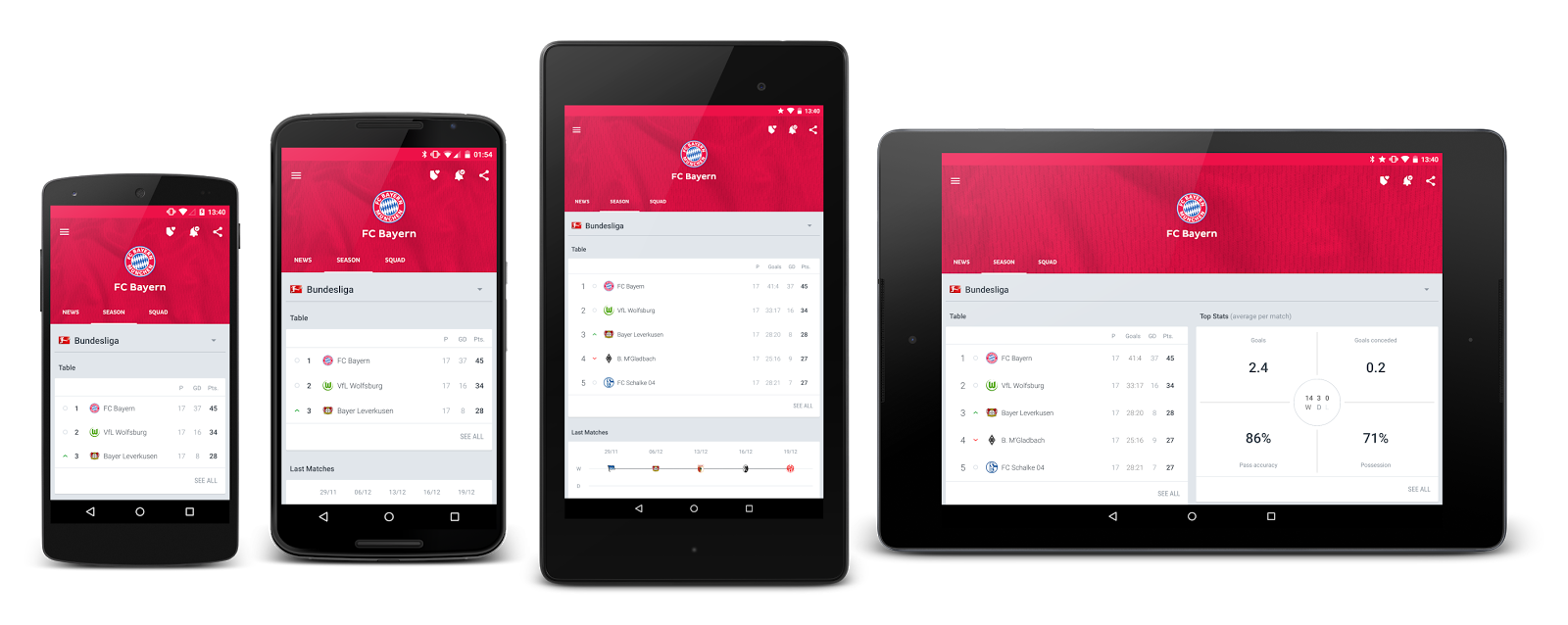
Quite often when we talk about designing an app for Android devices, we always start with the phone sizes (~4″ – 6″), which is perfectly fine as a starting point. Unless you want your app to only run on the small-sized devices (well, yeah, let’s consider them small), when you are designing the app, you have to, at the same time, start thinking how it will be adapted to bigger screen size (~ 7″ – 10″), and by adapt, it certainly doesn’t mean stretch up everything when it runs on devices with bigger screen.
Find the balance in information density and screen estate usage efficiency
Most of the time, apps designed without considering adaptive design are not efficiently (or overly efficient by squeezing everything in it) using the available screen estates or the information density is badly optimised, on the bigger screen. To ensure delightful user experience across screen sizes, it is always great to start thinking about how certain information/components should be presented at bigger screen devices.
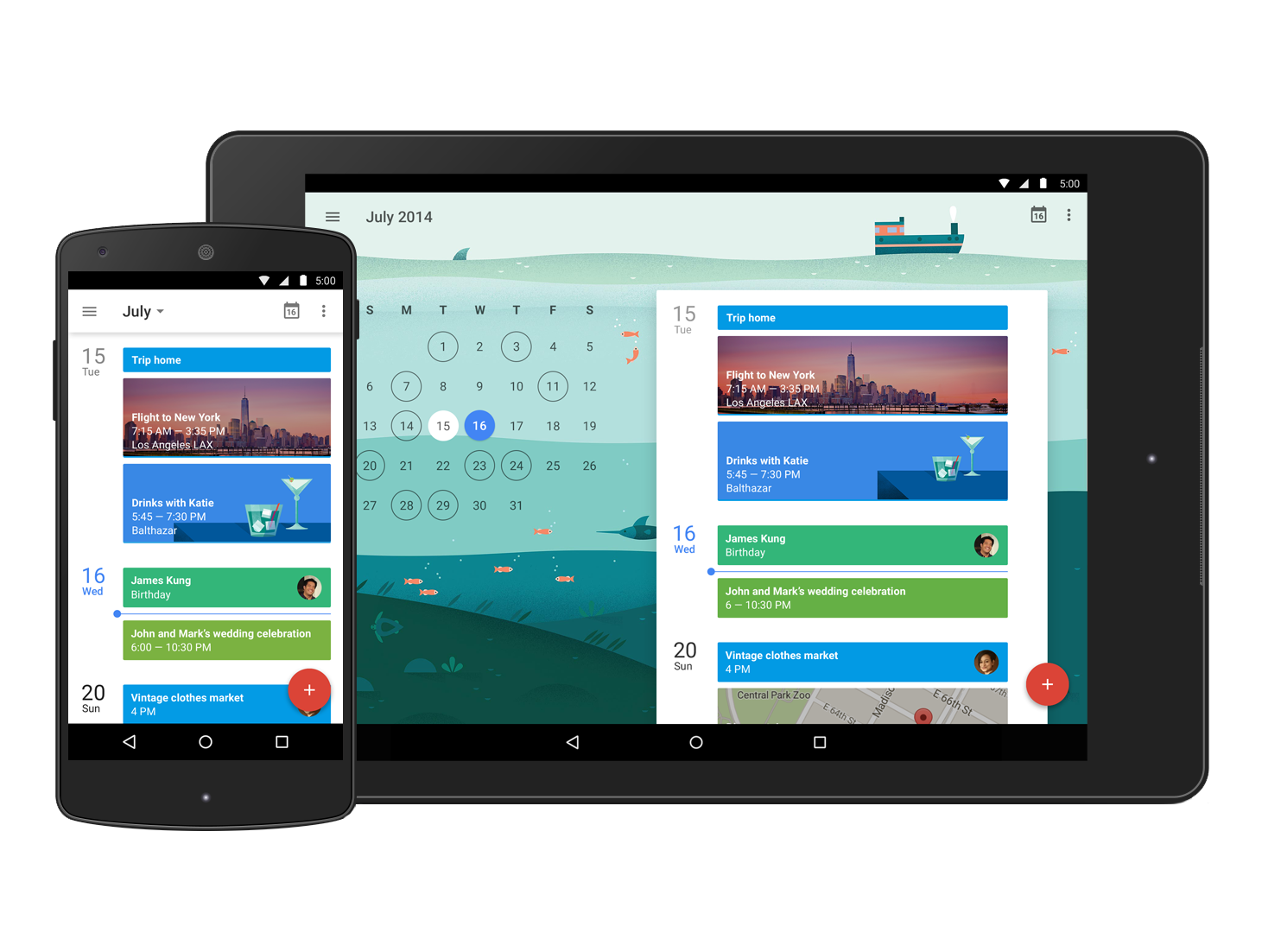
Cards UI design is popular in Android design because it is fairly flexible with the contained data and able to adapt into different layout or screen estate, if it’s done right. Though it doesn’t mean that it is the only adaptive design strategy; it is something you can start exploring with. I really love this example (image above) of Google Calendar in Lollipop release, which is carefully designed to optimise both the information density and screen estate usage efficiency, as well as retaining the consistent experience.
I have this rule of thumb when I am designing app that is intended to run on multiple screen sizes:
Don’t make the phone user feel like they are using a tablet, and don’t make the tablet user feel like they are using a phone.
Basically what it means is that when you are designing for smaller screen size, do not squeeze too many things in one screen and allow the user to focus/act on the right thing at the right time, and when you are designing for tablet, do not just duplicate the phone version (in terms of screen estate usage and information density), otherwise there is no value in having a tablet with bigger screen if there is no difference in the app experience between phone and tablet. A tablet (or bigger screen device in general) should always have an optimised, unique yet consistent experience compared to the phone (or smaller screen device) version.
Inspiring resources
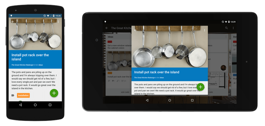
There are a couple of new blog posts recently from the folks in Android community like Juhani Lethimaki and Daniel Lew, providing some real examples in tackling Adaptive Android Design, and I really love them:
Handling Android resources with non-standard formats – Daniel Lew (Trello)
How we created Scalable UI – A Case Study – Juhani Lethimaki (Fatrobot)
And of course, some other relevant resources talking about adaptive Android Design:
Material Design in Google I/O 2014 app
Android Design in Action: Responsive Design
Final Words
Android-powered devices (phone and tablet in this context) having different screen sizes will not going to change any time soon, at least not in the next 2-3 years, therefore putting an effort in designing Android app that is adaptive to screen sizes is definitely the way forward – it doesn’t only just help in terms of development cost for the future, but it can also help handling user expectation (Android users are very demanding nowadays!) and retention.
1The reason that I use Adaptive instead of Responsive because I think when we are designing/developing Android app, a layout will be shown for the specified screen width instead of changes responsively according to screen sizes, thus adaptive and not responsive. Scalable might be right as well.
 #androiduiux