
Unclouded by Christian Göllner, an app that helps to analyse and clean your cloud storage (Dropbox and Google Drive, for now) has just recently out of beta, and I have the honor to work together with Christian on the design for this app. I was really impressed by the app quality when I first received the early build of the app – without hesitation, I told him that I wanted to work together to bring this app to the level of awesomeness. It is super amazing that the app has been featured by Android Police, TechCrunch, CNET, Lifehacker, and xda-developers, and these boosted our confidence about the design and development direction of the app.
In this post, I would love to talk about some design details that we have worked hard to fine tune in order to craft the ‘Unclouded’ experience that we have visioned.
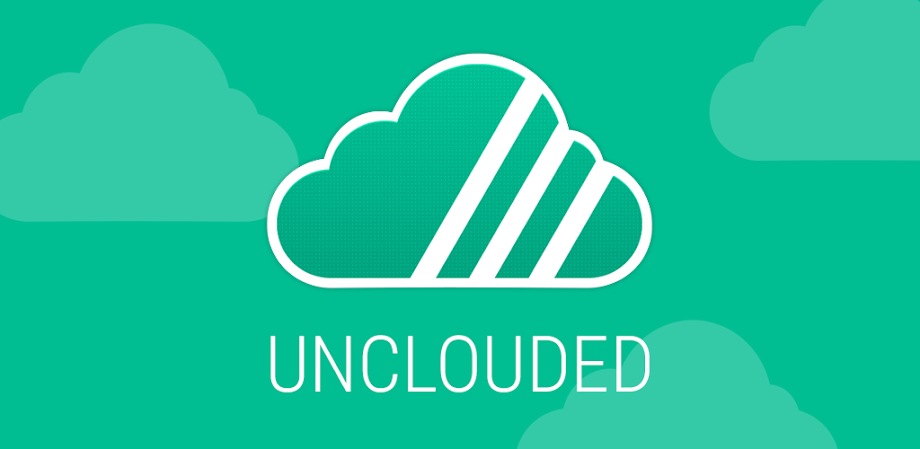
The Cloud with Three Slashes
![]() Naturally, we talked about more design details after making sure that the basic user goals are supported by the optimized app flow (here’s why it is important). We then looked into the app icon for Unclouded. My very first idea for the icon was a cloud containing particles with different sizes, representing the clearly shown files in your cloud storage – and obviously, both of us weren’t too happy about it because it isn’t iconic enough (it is still a cloud). After a few rounds of sketching on the idea that I wanted to present (the cloud get separated into pieces), the icon is finally shaping up well. But then we found out that the icon isn’t too visible on certain background color, therefore I decided to make it a sticker-like icon, heavily inspired by Dropbox app icon.
Naturally, we talked about more design details after making sure that the basic user goals are supported by the optimized app flow (here’s why it is important). We then looked into the app icon for Unclouded. My very first idea for the icon was a cloud containing particles with different sizes, representing the clearly shown files in your cloud storage – and obviously, both of us weren’t too happy about it because it isn’t iconic enough (it is still a cloud). After a few rounds of sketching on the idea that I wanted to present (the cloud get separated into pieces), the icon is finally shaping up well. But then we found out that the icon isn’t too visible on certain background color, therefore I decided to make it a sticker-like icon, heavily inspired by Dropbox app icon.
#1abc9c – The Unclouded Color
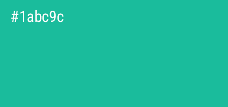
When Christian started working on the app, he have chosen the Holo Orange color as the base color. It wasn’t a bad choice, but it does resemble too much like Google Play Music, and we both agreed that this app need a unique color that is very easily recognizable and break away from the usual Holo color palette. It is not a secret that I loved the Turquoise color, and after some quick searches, I realize that there isn’t much apps are using this color as the base color, especially cloud-related app, thus it became the app base color, and we thought it was a perfect fit for this unique app.
Cards, Cards, and Cards
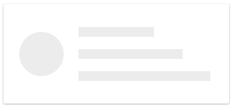 In Unclouded, we deliberately chose to use cards UI for all the items, but why you might ask?
Firstly, we wanted to display all the files and folders with a easy-to-hit target area with all the informations using big font size, and the clear visual separation between cards help to establish that required disconnection of spatial relationship between items, so the list can have more breathing space between item yet preserving an acceptable level of scanability.
Secondly, of course, cards UI is easier to scale and hence, better tablet optimization (not there yet but we are working on it).
The Big Folder Navigation
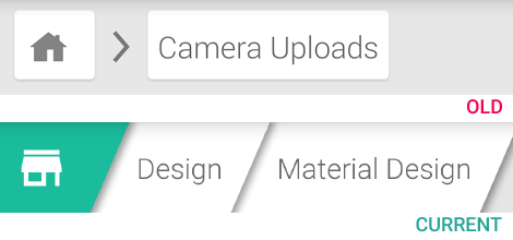
But of course, we do not want to simply use cards UI for everything, hence the earlier folder navigation design has to be changed. The current and finalized folder navigation is heavily inspired by the Unclouded icon itself (the slashes, the shadow, the sticker/paper like), and we couldn’t be happier. Some questioned about the height of the folder navigation bar – yes, it is deliberately to be like that because we want to make folder navigation as easy as possible, and we do not want to just save that few pixels height and sacrifice the ease of interaction.
Delightful Details
 This is probably one of the things that I always mentioned to anyone when we talk about design – “Every little detail counts”. To satisfy the user needs, your app must be able to assist the user to achieve their goal as fast as possible. To delight the user, you doesn’t only need to satisfy their needs, but you have to integrate some subtle details that (hopefully) enhance the user experience.
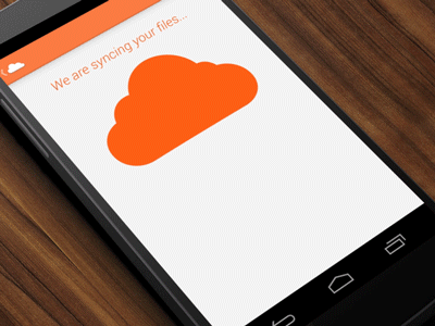
One example in Unclouded is definitely the sync animation shown when the app attempt to synchronize your files and folders from the cloud service. Even though this screen might probably just shown to the user only once or twice, but we doesn’t want to just show a blank screen with a loading indicator. Sure, it does take some time to implement it, but the time spent is definitely well worth it.
If you have just downloaded the app, try tap on the cloud multiple times when it is syncing, you will be able to make something else drop from the cloud 😉
The Unclouded Experience
I hope you enjoy this post and find it inspiring, and always tell yourself that
Every little detail counts, and they can make a difference.
We also hope you enjoy the app as much as we do, and don’t hesitate to let us know what you think about the app. We will definitely continue working on the app to provide the best ‘Unclouded’ experience to all the users. Until next time!

I really liked the big folder navigation.
Even in Google Drive, there is a horizontal scrollview that contains the folder structure of the parents. It is not useful at all.
“Every single detail counts, and they does make a difference.”
Is the error ironic or just a mistake? (they do, or that does)
It is only a detail 😉
I always like to read your ideas on design, and I also like this one again.
Hey Rene,
Thanks for pointing that out! 😛
Taylor
Amazing work. Thanks for the insights into the approach. The app is an absolute pleasure to use.
Awesome post, and you guys really did an amazing job with the UI and UX development of the Unclouded app