

The famous Mailbox app in iOS has finally arrived for Android users, and again it’s a very disappointing move from a company under Dropbox. It’s fine (actually not) to have the Android platform as the second thought of your app/services, but why some of these companies doesn’t just show some Android love by making things familiar and easy for Android users?
I am sure I will hear ‘Taylor, it’s about consistency. Our PdM requested to make it looks all the same across platform, so people gets familiar instantly! And it also provide consistency in the branding and marketing!’. My ass.
My Redesign Suggestions
- Go consistent with Android UI patterns and building blocks. You can keep some of the unique elements while not breaking the Android Design Guideline.
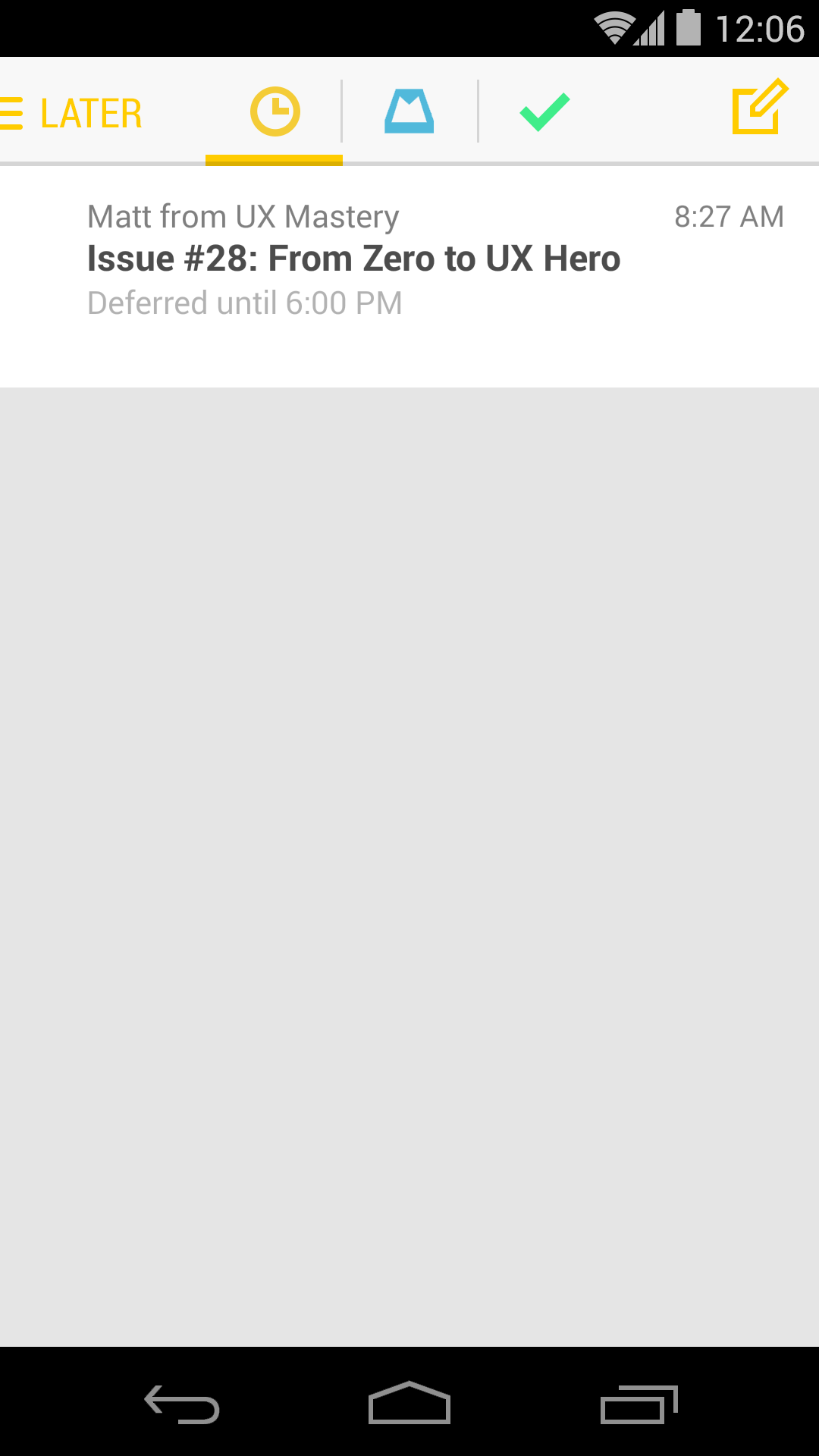
- The user of navigation drawer indicator (change color depending on the page)
- Use the tab style in Android
- DON’T block the notification bar by your syncing/refresh/whatever you call bar. Just use crouton to display the progress in-app.
- May be use path-tracing for the loading indicator?

- The color of the elements can be consistent to the different screens, so it keep that uniqueness in mailbox.
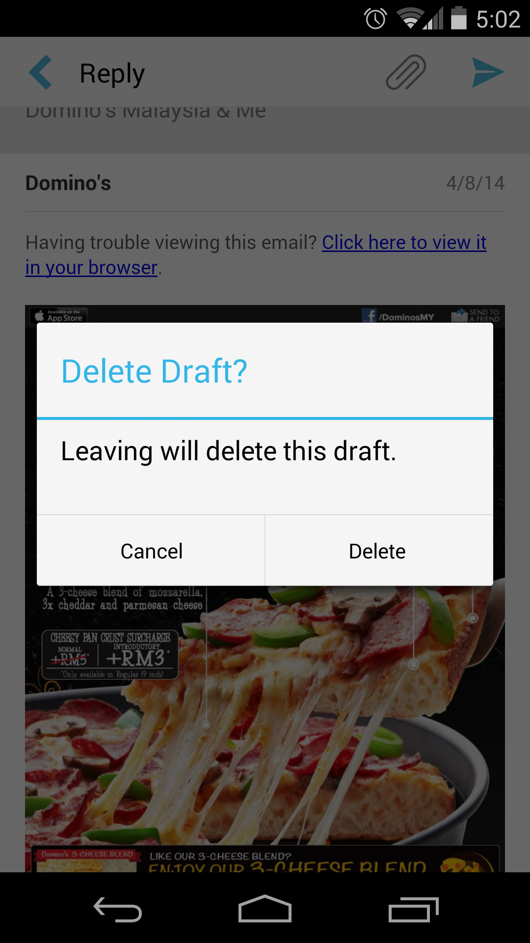
- Check Confirming and Acknowledgement page in Android Design Guideline. Positive (Delete in this case) action should be always on the right side.
- Why control the user behavior? So now I can’t write a draft when I have some free time? Why the force of deletion?
- Being a mailbox app that encourages users to organize their mails in different categories (read, dismiss, list, later), I find it really strange to place those actions on the top. Once you finish reading the mail (most of the time), you focus will be at the bottom part of the screen, and it’s way easier and natural for the user to reach the buttons at the bottom for organizing the mail.
Since they have hacked around to make certain things work differently from what Android has to offer (like the notification bar on top of your notification bar), why not spend a little bit more time to polish it up for Android users?
What do you think?

I agree with most of your comments, but fail to see how putting actions at the bottom makes sense. Stock Google apps seldom do this. The bottom tab bar is an iOS thing.
Hey Alexis,
Seldom do this doesn’t mean it’s a wrong UI pattern. There is a split Action Bar in Android to house Actions at the bottom, something like what you see in G+. Mind you it is not a Tab bar, it’s a split Action Bar in my case, so it is still stay true with the design guideline and doesn’t make it similar to any iOS UI pattern.
Taylor Ling
Bottom tab bar is not an iOS thing, bottom tab bar for navigation is an iOS thing.
I like your suggestions.
“I am sure I will hear ‘Taylor, it’s about consistency. Our PdM requested to make it looks all the same across platform, so people gets familiar instantly! And it also provide consistency in the branding and marketing!’.” – I work as android developer full time and it seems I’ll have to change my job because of that statement.
I won’t even use mailbox until they redesign it.
Hey Taylor,
inspiring words on an app that I dearly missed until its recent release on Android. I would totally agree to the cry for colour-consistency across tabs. Also great: you mentioning the rather stubborn feature of refreshing a page and showcasting that in the status bar – a refresh icon would be so much more stylish.
I do have a question however: I am running Mailbox on a HTC One M7 and somehow cannot access or edit the subject bar when answering a mail. I have seen the app work perfectly concerning this matter on a Nexus 5 though. Anyone having similar issues here?
Help would be appreciated 🙂 Cheers Phil