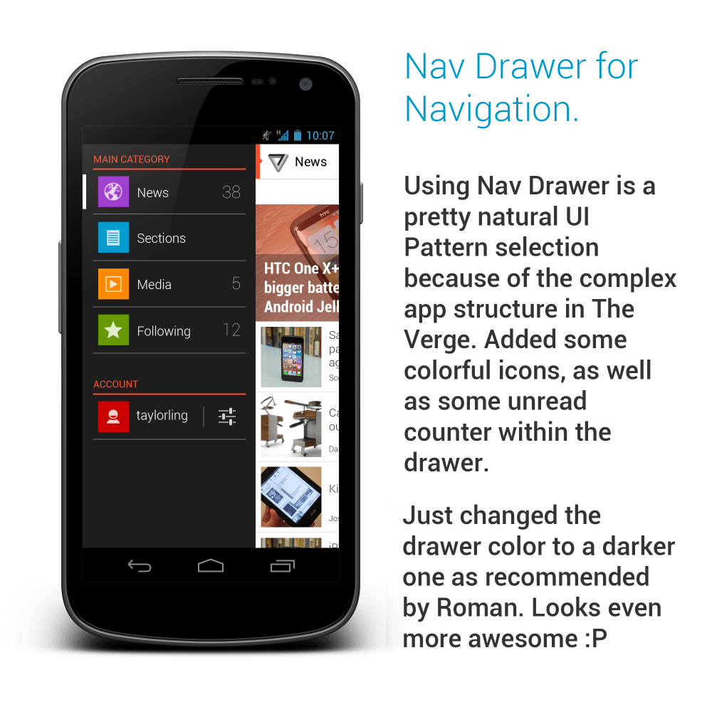
It has been quite some time I wanted to do a redesign on The Verge app due to their not-so-great UI/UX. Just to be fair, they have just pushed a new update which is a lot better than the previous version that I am referring (and I didn’t see that coming!). The new version is smoother, and it has Nav Drawer navigation (which coincide with my new redesign, but I am not surprised because it’s a natural choice) and scrollable tabs, which are definitely welcomed UI patterns. While my redesign might be slightly similar to their new update, I still want to publish them because I think there are still many room for improvement to achieve better user experience.
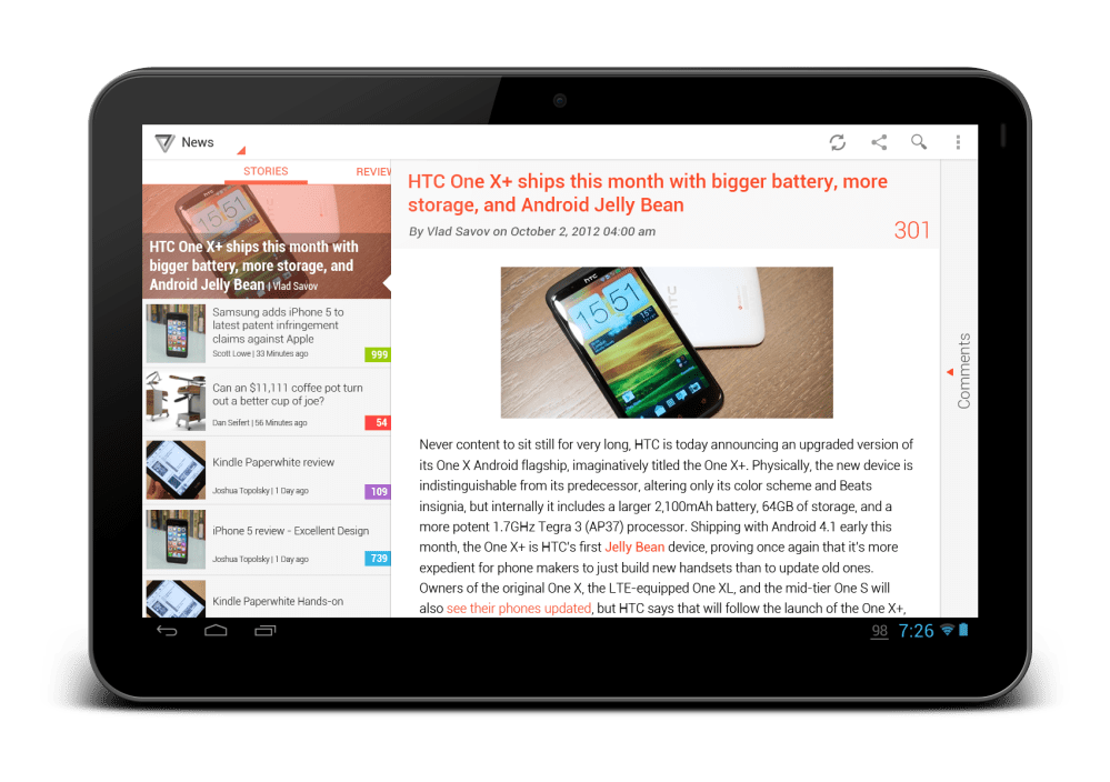
Below are all the mock ups that I have done (07/10/2012 – updated with tablet version), and I have included some comments for my choice of UI patterns:
What do you think? Don’t hesitate to hit me with your comments/suggestions/critiques!


Awesome!
Why you don’t email that to The Verge Staff?
Hey Karim,
Thanks! Will try to see what I can do 😉
Rgds,
Taylor
Hi. I’m the guy who made the app. Looks pretty neat. 🙂
Hi Eric,
It’s awesome to grab your attention! Thanks for the comment! The new update looks great as I said, but I definitely ask for more! 😛
Rgds,
Taylor Ling
Hi Taylor, just got your email update. I don’t know what the original or updated Verge app looks like, but I really like your work here. Do you know of any ‘crouton’ style notification that doesn’t need the Holo theme to be present on the device?
Hey James,
If I am not mistaken, the AppMsg (Crouton) API (http://johnkil.github.com/Android-AppMsg/) doesn’t need to have Holo theme since it is compatible from API 4 (or Android 1.6 which definitely no Holo theme there). Check it out! Thanks for the like!
Rgds,
Taylor Ling
Ah, so clean… awesome work! My only feedback is around the drawer (should be below the action bar and use the Up caret per our guidelines) and the background of the drawer (I think it should be a darker gray, for better contrast with the red headers). Overall, quite an elegant and clean look!
Hey Roman,
Awesome! Thank you for your comment! Yeah, I am well aware of the guideline for drawer, but I personally prefer the one in Google+, because I don’t find it elegant enough when the Up caret and the app title just become disappeared when the drawer is opened (eg. YouTube), therefore I decided to go for the full height drawer. As for the Up caret, similar to some other community folks, we think it is somehow inappropriate to use as the indicator for drawer, because it could add another layer of confusion to the user while using the app (pressing it will go up, go back or open drawer? The user will have no confidence for the outcome), thus I propose a new indicator for it to reduce the ambiguity.
Fully agreed on the darker drawer, will change it soon!
Thanks again!
Rgds,
Taylor Ling
Yeah, all the criticisms about re-using the Up caret are fair points. In case you’re interested in reigniting the discussion, I’m sure the action bar gurus (Adam and Rich) would be happy to leave their thoughts and thinking in a Google+ thread on the topic.
Anyway, awesome work!
That will be great! I will try to seek for a chance to reignite the discussion for the best Android UX.
Thank you! 😉
Rgds,
Taylor Ling
Our designers #1 goal when redesigning the Verge was to stay as close to the Holo guidelines as possible.
Makes for a both a much nicer look, and an easier development process, imo.
Awesome work 🙂
And what about a “pull-to-refresh” functionnality in addition to the refresh button?
Hey LegZ,
Sure, it is hidden. 😛
Rgds,
Taylor Ling
Wow, fantastic design Taylor. I especially like the crouton pattern. I haven’t seen that before. Do you know any other apps that use it effectively?
Hey Brandon,
Thanks! Hmm.. For Crouton, so far I have seen in Prixing (the one who initiate Crouton UI pattern) and Feedly are using it, not too sure if there is any other apps.
Rgds,
Taylor
Hi.
I am trying to understand well the concepts to apply for best android designs and I find your blog very useful. I would have some questions regarding this re-design.
I am a bit confused between the two tablet screenshots. For me it is the same screen (article screen) but the Top left corner in the action bar is different : one as a ‘spinner’ (where I guess you can select different categories) and the other a back button.
My second confusion is why do you use a different concept for doing the same thing : a spinner on the article screen (tablet version) a navigation drawer in other parts of the app.
Would it be bad design to use the navigation drawer in place of this spinner?
All the best,
Vincent.
Hey Vincent,
Thanks a lot for your questions!
1. The tablet version with spinner would be the main page. The one with up button would be the article + comment view where the user tap on the Comment area in main page (at the far right) – this signifies that the user are already in a deeper level and can go back to the main page, thus the up button.
2. This concept was designed back then in 2012, so things can get evolved and changed. Navigation drawer can be perfectly fine to be used in the tablet version to enhance the consistency across devices – but spinner isn’t all wrong as well. But for consistency in interaction, I would go for Navigation Drawer.
Hope this helps? 🙂
Taylor Ling
Thank you very much. You’ve perfectly answered my questions.