Designing for Android devices can be challenging sometimes due to the availability of the Android-powered devices with different screen sizes, however, it is certainly not an issue if adaptive design is considered during the design phase of the app. Some developer/company chose to complain about this, but this likely won’t change anything because it is a deliberate direction that Android meant to go and move forward. The way forward? It’s Adaptive Android Design1.
I think it’s no secret that my aim being a GDE is to help to close the gap between designer and developer in order to make awesome products, and as a designer, I always enjoy talking to Android Developer to get insights from them, especially indie developers since most of the time, they pretty much have to wear many different hats themselves in making their app a success in the Play Store.
Thus the idea making a series of interview with awesome Android Developers (especially indie developers) to peek inside their world, and their thoughts on design and designers (which is the insights that I truly appreciate), because I believe I will be able to learn something new from everyone of them with their unique experiences in Android development.
So for the first interview of the series, I proudly present Ryan Harter. I haven’t met Ryan until the recent GDE Summit (yes, he is an Android GDE!), and I definitely love talking to him and appreciate his passion towards Android development. Below is the quick and short email interview with him:
With the latest update in Material Design guideline, Google Design team has shared their design approaches on the product icon design – it’s a comprehensive and pretty complete icon design guideline (at least for me) and I believe many Android Designers are excited about it, that’s, of course, including me.
Explore
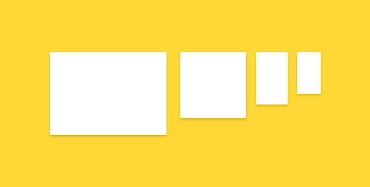
After reading through the guideline, I wanted to try something out of it, and Unclouded (a Cloud Storage Management app developed by Christian Gollner and partially designed by me) came into my mind. So I looked at the current icon, and start imagining how it will look like in Material-style. And of course, to make sure the icon is properly sized, I first looked into the 4 suggested keyline shapes and determined that the horizontal rectangle is the right keyline shape to go. This is important because it will help to standardise all the launcher icons at the right size to achieve consistency in terms of visual alignment for the platform, yet unique with their silhouette.
Disclaimer: This post is mainly about the author rant about bad mobile app design from the largest bank in Malaysia, but it is also a great example of don’ts in mobile app design.
It’s September 2014. Material Design was introduced few months ago during Google I/O 2014. The predecessor – Holo Design was introduced late 2011 together with the launch of Ice Cream Sandwich (Android 4.0), which is about 2-3 years ago, and it’s getting matured as time goes. It’s probably not wrong to expect any Android apps published in the year 2014 embraced with all the lessons that we have learnt in Holo Design and craft the best Android experiences for the user.
Last week, they have officially launched their revamped mobile banking app, claiming that it has the best mobile banking experience compared to the previous version. It does seems to have a refreshed design – except it’s probably one of the worst and most unacceptable mobile design that I ever seen. And it’s 2014.
I have been using Photoshop to make UI animations for my work and it works surprisingly well (at least for me). Of course, Adobe After Effect is still the best tool to create complex and awesome animations, but with Photoshop, you can still create some simple and high quality UI animations to preview the animation idea to others. With some combination of animation properties, you can definitely create some rich animations that is sufficient for discussion. There are certain limitations in Photoshop compared to After Effects (of course!), but for someone who wanted to just use one tool for UI Design + simple UI Animations, Photoshop is one of the best tool that you can get (even if it’s not really designed for UI design).
This tutorial #1 will cover some basic procedures to create simple animations using the Timeline feature in Photoshop CS6+ (no GIMP or older Photoshop), so if you are totally new to this, I hope you will find this tutorial helpful for your first step in making UI animation using Photoshop. Let’s begin!
Unclouded by Christian Göllner, an app that helps to analyse and clean your cloud storage (Dropbox and Google Drive, for now) has just recently out of beta, and I have the honor to work together with Christian on the design for this app. I was really impressed by the app quality when I first received the early build of the app – without hesitation, I told him that I wanted to work together to bring this app to the level of awesomeness. It is super amazing that the app has been featured by Android Police, TechCrunch, CNET, Lifehacker, and xda-developers, and these boosted our confidence about the design and development direction of the app.
In this post, I would love to talk about some design details that we have worked hard to fine tune in order to craft the ‘Unclouded’ experience that we have visioned.
It has been a few weeks since Material Design announced during Google I/O this year, and it’s great to see many developers and designers are excited about it – that’s including me, of course.
I have seen people started to release design resources for Material Design (slowly, but yeah), and it’s awesome! I have started to look into Material Design, and I thought it will be nice to have the new icons sit in my Photoshop Custom Shape drawer (for my usual design flow), but so far, none seems to convert the icons from SVG format to CSH format, so I’ve spent about half a day to do the conversion one by one (and removed the redundant ones), and here is it! Thanks to Shreyas Achar for his archive of extracted Material Design SVG icons!
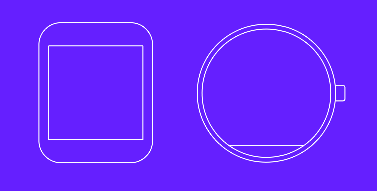
Besides Material Design, I am sure everyone is also pretty excited about the new Android product family, especially Android Wear – so here’s a simple PDF sketching kit for Android Wear in both LG G Watch and Moto 360. I have tried to have them as close as the real physical size of these watches, so when you print the PDF, please select A4 size and print at actual size.
While this blog post titled ‘How would I further improve TuneIn Radio app’, but I thought I would also like to take this opportunity to touch on the topic about consistency in visual design for mobile apps. No, this isn’t a fight between flat, skeuomorphism, gradient etc. – this is about embracing the consistency of visual design for better aesthetic integrity of a product regardless of the visual styling you opt for.
Visual Consistency is for better aesthetic integrity
One of the graphic design principles that I found here fit the context very well:
While creating rhythms and variations from page to page, one must also remember to maintain an overall aesthetic integrity. The purpose of graphic design is to communicate, not dazzle, and an inconsistent design will result in decreased user effectiveness. This means keeping individual visual and typographic elements simple and clear. It also means applying them uniformly, so that the connotations of a particular type style, or the results of interaction with a particular graphic element, are independent of their context. There should be an overall visual system to the text, carefully considered in the first stages of design, that brings together the elements into a coherent whole.
If you take this approach, make sure your (brand) styling is applied to every single icon in your app.
Keep it Consistent
Let’s have a look at the things that I would improve on this app (most of them are about visual consistency):
Remove the useless splash/loading screen
Need design consistency on Android UI elements (Nav Drawer indicator has inner shadow, overflow icon doesn’t have it, and both of them are in dark colors)
It is first started as a simple Google+ post after I saw the refreshed UI of Bank of America app which probably looks OK on the phone, but terribly on the tablet device, and I thought this topic actually worth a short blog post. Well, let’s first have a look on some screenshots of the refreshed UI of the mentioned app:
Navigation DrawerDetails Screen of an Account
There are obviously many UI/UX improvements that I can suggest, for example:
Misuse of available screen estate – Navigation drawer is not done right and taking away too much of the core experience of the app – navigation drawer is meant to be transient. Also everything looks stretched-out and blown-up which make readability and glanceability become really bad.
Lack of Pure Android Experience – It’s 100% iOS experience – Tabs at the bottom, right caret, iOS top bar etc. There are certain UI and interactions elements really unique to Android to provide the user the best and pure Android experience, and this shouldn’t be taken lightly if you care about the user.
Lack of attention to details – Even for an untrained eye, it’s pretty obvious that the icon and text wasn’t aligned in a proper way – Mind the gap.
Terrible tablet experience – Rather than a blown-up version, a multi-pane layout should be already considered if tablet is meant to be supported.
Unoptimized tablet experience is a missed opportunity
We are currently living in a multi-screen world that we are no longer performing daily activities only on the computer, but also on the smartphone, tablet and TV. Of course, this does not apply to every single activity, but most of your digital activities can be done on any devices, and thus, there is always a chance that your user will try to accomplish a task using your app/service with any screen at any time. Unoptimized tablet experience would mean a missed opportunity – for the brand, for the customer experience, and for the customer loyalty.
And with the huge market share by Android tablet, it is probably no-brainer to pour in a little bit more efforts to optimize the tablet experience (unless your app/service does not make sense on the tablet at all) because tablet has penetrated in many users’ live faster than you could imagined.
What’s make a good tablet experience?
Make full use of available screen estate
Gmail in Tablet
Gmail app is a great example showing that multi-pane layout works really well for tablet, especially for apps that have a list/grid view and a detail view. This will enable the content navigation for the user while still provide the full experience on the content details.
Optimize the content density
Google+ in Tablet (Optimized Content Density)Facebook in Tablet (not-optimized content density)
With the available screen estate, especially the horizontal screen estate in Landscape mode, it is crucial to optimize the content density to show the user more information on screen at one time. Of course, this doesn’t mean that you have to show the information as dense as possible – finding that balanced density is very important (and tricky) – and this optimization must be able to enhance the content consumption experience (the user consume more information with the same amount of effort compared to small screen devices), and if it’s not, it is probably mean that the content density optimization doesn’t work. It is important to design the app with great tablet experience for the user to appreciatethe screen estate available on the tablet, not just treating it as an enlarged phone. Compared to the Facebook app, Google+ able to show more information at the same time, fully utilize the available screen estate.
Cares about content consumption quality
Newsstand in Tablet
If you look at the screenshots of the Bank of America app, you will find that you will have some difficult time to connect the information on the left and the one on the right, because the readability is not optimized due to the stretched layout, causing the severe disconnection between the information on both sides. In the above screenshot, it is a good example showing why you should not fit the content (especially texts) as much as possible because you would also want to make sure that the readability is great (here, of course, we talk about the optimal line length), so the user can have great experience during the reading (or content consumption).
Tablet experience should not be an afterthought
If you app will be used by tablet users, always design the app with tablet experience in mind (as shown above) and make full use of responsive design. Besides that, Android team has written a nice checklist for tablet app quality, so you definitely need to go through it to ensure that you are providing the best quality and experience for both phone and tablet devices.
I hope this post is able to inspire and motivate Android developers and designers to optimize the tablet experience and it should not be an afterthought in app development. If you have any comment or question, feel free to leave it at the Comments section, and I should be able to respond accordingly.


 #androiduiux