
With the latest update in Material Design guideline, Google Design team has shared their design approaches on the product icon design – it’s a comprehensive and pretty complete icon design guideline (at least for me) and I believe many Android Designers are excited about it, that’s, of course, including me.
Explore
After reading through the guideline, I wanted to try something out of it, and Unclouded (a Cloud Storage Management app developed by Christian Gollner and partially designed by me) came into my mind. So I looked at the current icon, and start imagining how it will look like in Material-style. And of course, to make sure the icon is properly sized, I first looked into the 4 suggested keyline shapes and determined that the horizontal rectangle is the right keyline shape to go. This is important because it will help to standardise all the launcher icons at the right size to achieve consistency in terms of visual alignment for the platform, yet unique with their silhouette.

Analyse and Decide
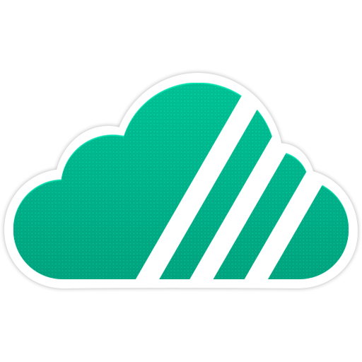
The next step is to analyse the current icon, and decide what to keep and what to remove. The current icon is not too far off from the paper material – it’s a sticker-like icon inspired by Dropbox. And there is the cloud, and the 3 strokes cutting the cloud into pieces (to signify ‘unclouded’). To keep it simple, I decided to remove the thick-outline to eliminate the sticker feel in it, removing the dot texture in the cloud but keep the cloud and the 3 strokes (which I think it’s the most recognisable pattern in the icon).
Papercraft
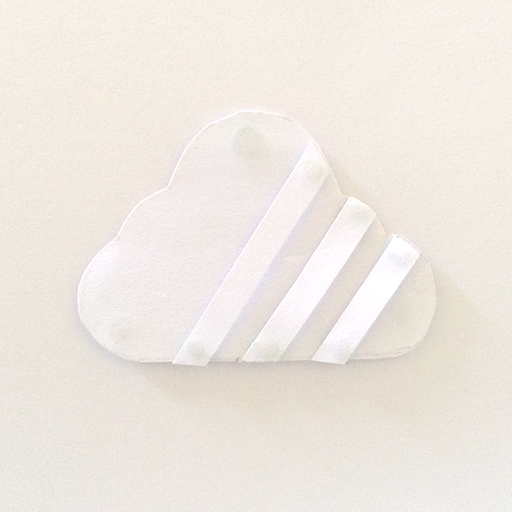
Since Material Design is inspired by the study of paper, ink and lighting, and I wanted to make the icon as close as possible to the real thing, so I did the papercraft for the Unclouded icon. It involved some drawing, cutting and pasting which took a little bit of time, but it’s really fun making it. And when you try to cast the light on the papercraft at different angle, you will appreciate the beauty of the shadow. Below is one of the light study shot of the icon:
Prototype, Tweak and Finish
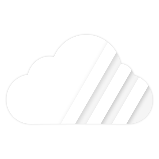
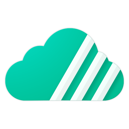
With all the pieces from the analyses, I put them all into one place in Photoshop and came up with the first prototype, and I was pretty happy about it. But obviously, you do not want to stop there as it can be better with some tweaking and finishing. So I started the tweak by adding a 45 degree light source at the left top, and adding a slight fold effect on the 3 strokes to make them even more prominent. I am pretty happy with the end result – and the icon will be pushed in the next update of Unclouded.
Final thought
I love Material Design. I love the fact that it brought together things that is familiar in physical world into the digital world like Shadow, Choreography (motion) etc. which I believe can help in crafting awesome user interaction with the interfaces crafted by the magical paper and ink in Material Design. Nevertheless, Material Design for multiple platform (Android, Web, Desktop) is still not something convincing for me, it doesn’t matter though – what’s matter is Material Design is a perfect fit for Android and everyone in the ecosystem should do their part pushing for the best Android experiences – until next time!
