

Floating Action Button, or, in short, FAB, is one of the unique UI element in Material Design for primary/promoted action for a particular screen. Since it is a frequently accessed UI element in a given screen, I think it’s important to make the FAB right in every details. However, there are a number of apps doesn’t have the right FAB as specced in the Material Design Guideline, which also included some of the Google apps (I know!).
Huge Inconsistency
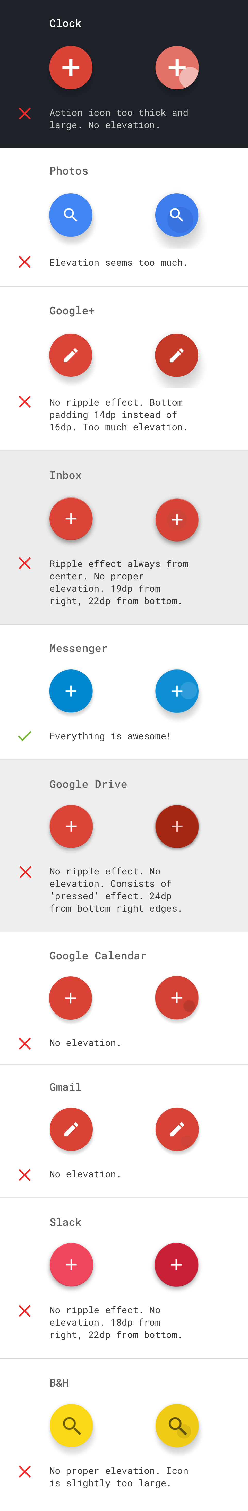
After some analysis on the FABs in some apps using the latest L release, I am surprised to find the huge inconsistence in the implementation of FAB. Sure, FAB is may be just a round button, but there is also a lot of specs meant for it like anchoring distance from screen edges, action icon size, ripple effect, elevation and shadow. Most of the time, it’s likely the third-party library doesn’t do the job correctly, but it shouldn’t be too tricky for those apps that only have a standalone FAB (which doesn’t expand for more options, for example).
Let’s see what I have here (there are too many apps to try and I only selected a handful of them which can be tested immediately):
The right FAB
So what’s the specifications for this distinctive button in Material Design? As you can see from the comparison sheet above, Messenger app seems to have the most accurate implementation of FAB.
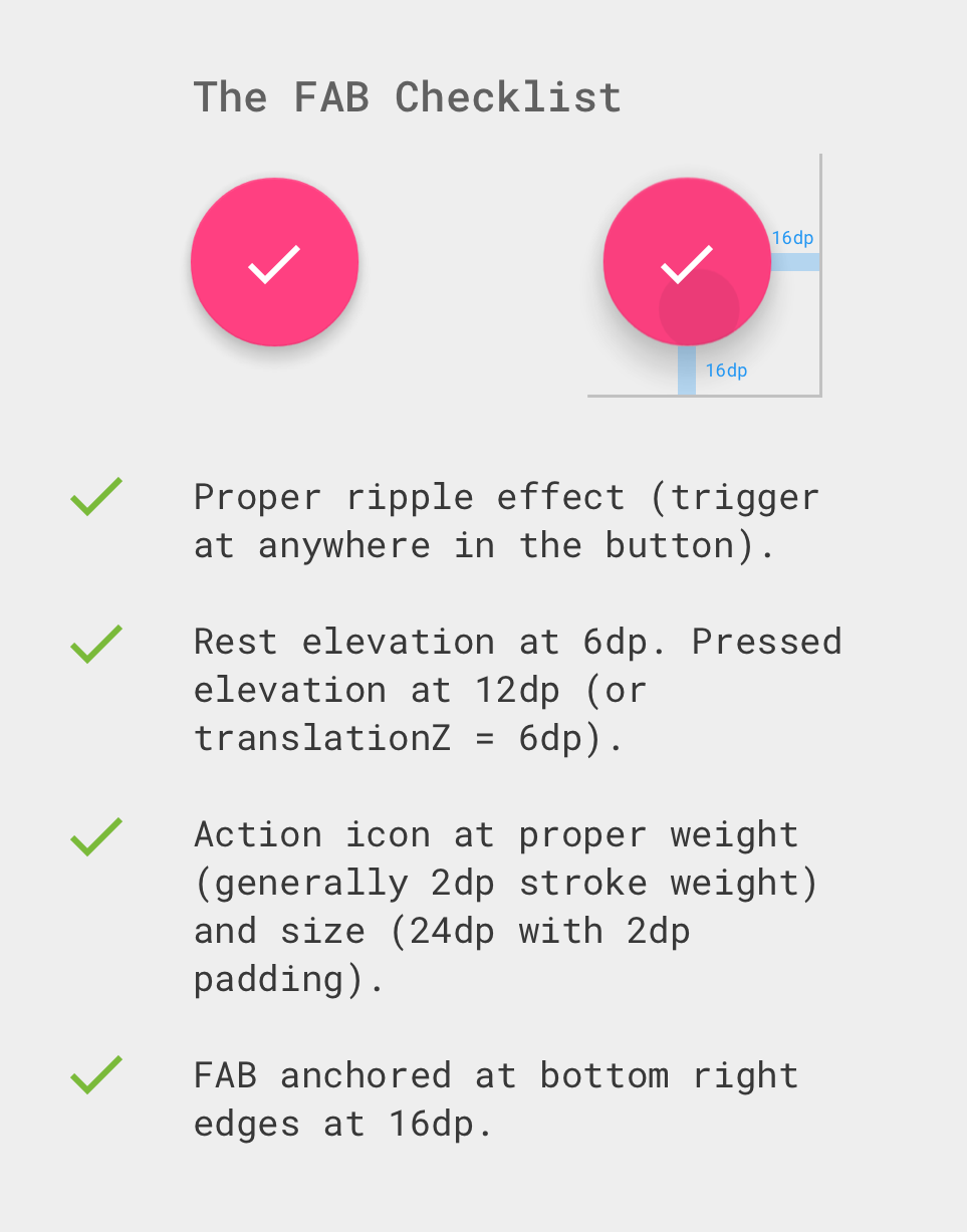
I strongly suggest to check if the FAB in your app is correctly implemented as the recommended specifications, otherwise the FAB will somewhat feel out of place due to the difference in material properties compared to the other material elements in your Material Design app.
Care about Design Details
Think this is too nitpicking or too small for the user to notice? I would like to use a quote from this Google Ventures article ‘Why you should move that button 3px to the left‘:
Getting design details right can create positive emotional states that actually make products easier to use.
After all, as someone (designer/developer or whoever in the product team) who craft the product to the end user, if you doesn’t care about the details, who else will do it for you? So, do the right choice FAB!
Special thanks to Andhie for making a sample app meant for screenshot purpose with the right implementation of FAB using the Material Design Support Library.
 #androiduiux
Where is the example app? I couldn’t find it. Thank you.
Hey,
It’s just a very simple example app made by my friend to make the screenshot of the proper elevation and shadow, it is not being published 🙂
Taylor
I have posted a gist for the example app that was created.
This file contains hidden or bidirectional Unicode text that may be interpreted or compiled differently than what appears below. To review, open the file in an editor that reveals hidden Unicode characters.
Learn more about bidirectional Unicode characters
activity_main.xml
hosted with ❤ by GitHub
This file contains hidden or bidirectional Unicode text that may be interpreted or compiled differently than what appears below. To review, open the file in an editor that reveals hidden Unicode characters.
Learn more about bidirectional Unicode characters
styles.xml
hosted with ❤ by GitHub
It would be interesting to see the source code of the project.
> FAB anchored at the bottom right edge at 16dp.
I am skeptical about the above point. I am using FAB as a divider between two sections of a screen. If I use bottom-right that FAB would cover significant area of one of the sections of the screen. 16dp from the right edge sounds more appropriate.
Hey there,
That is, if the FAB is used with the suggested placement, which is at the bottom right corner – if the FAB is used in between 2 vertical sections, of course the 16dp from the bottom edge doesn’t apply anymore.
Taylor
This is a great guide Taylor! Love how you’ve mentioned in-depth on how a FAB must be.
Personally, in the initial stages there were a lot of variations and inconsistency in its design. But hopefully with a native widget from the Design Support library, things should get ironed out now.
Thanks for sharing!