

Disclaimer: This post is mainly about the author rant about bad mobile app design from the largest bank in Malaysia, but it is also a great example of don’ts in mobile app design.
It’s September 2014. Material Design was introduced few months ago during Google I/O 2014. The predecessor – Holo Design was introduced late 2011 together with the launch of Ice Cream Sandwich (Android 4.0), which is about 2-3 years ago, and it’s getting matured as time goes. It’s probably not wrong to expect any Android apps published in the year 2014 embraced with all the lessons that we have learnt in Holo Design and craft the best Android experiences for the user.
Except it’s not for Maybank, the largest bank in Malaysia, and one of the world’s top 100 banks.
Last week, they have officially launched their revamped mobile banking app, claiming that it has the best mobile banking experience compared to the previous version. It does seems to have a refreshed design – except it’s probably one of the worst and most unacceptable mobile design that I ever seen. And it’s 2014.
What’s wrong?
Being the worst example, you can expect a list of things that have been gone wrong (Hint: pretty much everything):
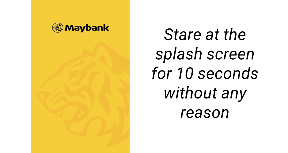
- The use of Splash Screen (and it took more than 5 seconds to dismiss). Here’s why not to use Splash Screen

- Stretched Images everywhere
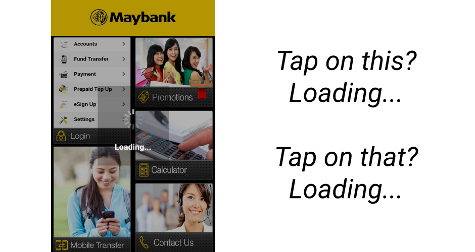
- Super laggy
- Dashboard Design (Really?)
- ‘Smart’ Scrolling Design (Left column not scrollable, only right column)
- No hint of scroll-ability on the right column
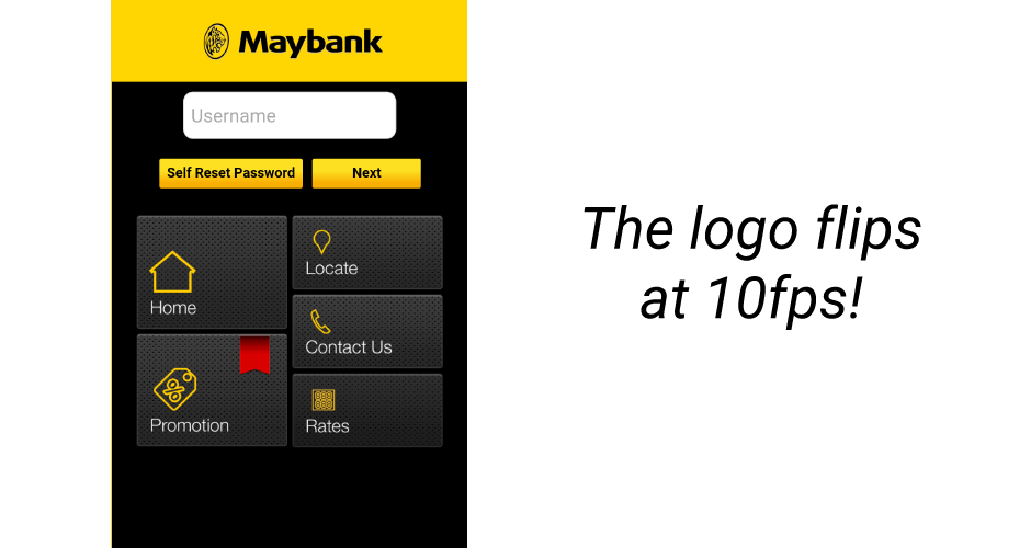
- Unnecessary flipping animation on the logo at the Dashboard screen
- Sub-standard choice of stock images (well, probably not necessary if a side panel is used)
- Super laggy (Did I mention this already?)
- iOS loading animation shown at every single interaction

- Complete iOS 6 Design (What, 2012?)
- Back button quit the app instead of going back to the previous screen Learn more about proper Back button behavior
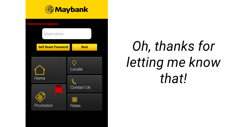
- Bad design everywhere – For example, Next button is shown and enabled before the username is entered, and when you tap on Next button, it says Username is required. I am pretty sure there is some better way to handle this.

- Different design for the same navigation element (lack of consistency)
- Unnecessary features that probably won’t work
- The worst embedded browser design ever
- Low resolution and inconsistent icon style
- What’s with that red ribbon?

- Smart Scrolling System! Look, scroll here!
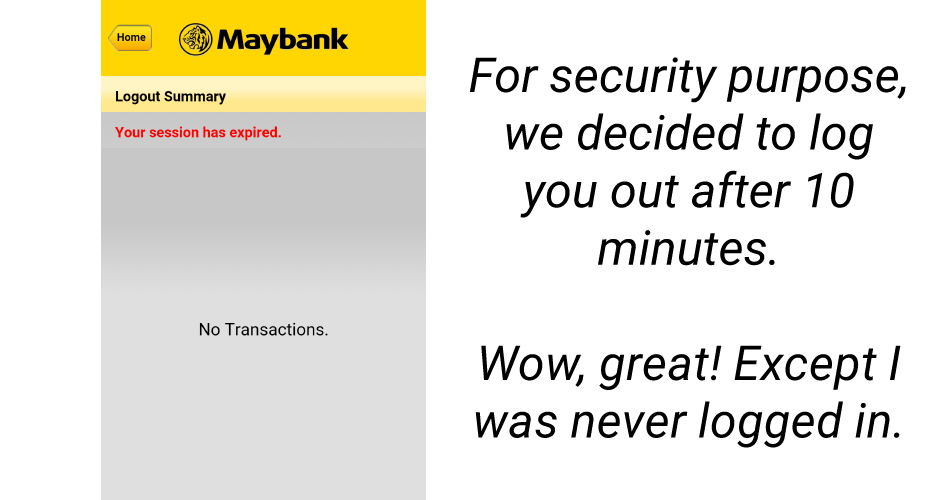
- The app logged me out without me logged in. What?
And there’s more! If you can download the app, you are definitely welcomed to play around with it, but I am not responsible for any damages done to your eyes.
A refresh should enhance the customer experience, not degrading it
This is a typical case that the company have totally ignored the basic user needs and consulted the wrong professionals for the design refresh. I have heard it took more than 8 months for this multi-platform refresh – that’s a lot of development time for such quality if it’s true.
A simple redesign that taking care of the platform-unique interaction and consistent design pattern would have probably make the app nicer to use with predictable experience, and that’s what a mobile banking app should provide to the user – simple, fast and secure. With this bad design, it doesn’t only delay the user while performing their banking tasks, the app security potentially become questionable. Understanding the mobile platform and design specifically for it would have yield a much better experience for the user, here’s some examples:
http://jennift.com/2013/08/30/redesigning-maybanks-m2u/
https://plus.google.com/103373726825448447741/posts/MpC2D5NGQaH
I couldn’t believe my eyes when I was playing around with the app – I was extremely upset and furious about it. Even a junior mobile designer would have done a better job than that – it was a pain in the eyes.
Users do have a certain level of expectation
Most of the mobile device users nowadays have a certain level of expectation on the mobile app quality, and with Android One officially launched today with the goal of next five billion users, the bar will be set to a higher level in the not so distant future because more people will likely rely on digital products to accomplish their daily tasks.
And of course, from the reviews for the app, you can clearly see that most of the users are expecting at least the basic banking features are working, except they are not:
Not working at all for viewing the balance in saving & current account…..just keep searching and searching never stop…please take note and resolve the problem immediately…
After recent update the app has become pointless. It always show service temporary not available?? it should be fast and simple. Now it’s too much images loading at the background. Taking too long to load. Pls rectify fast. TQ
Some simple services like checking savings account takes too much time to load. Try solving this problem before making the app any more fancier.
Great but the UI is not smooth, when i tried to check my account or any option given twice it goes blank,show nothing.
Why bother to add more unnecessary features and UI refresh when you can’t even fulfill and support the user goals? Here’s another example why it’s important to understand and support the user goal before talking about adding other features.
Bad user experience kills your product and your users
User base is always the precious for all kind of services, and to kill it is fairly simple – give them bad experiences and they will go for alternatives. Obviously you don’t want this to happen, so what you can do? Give them good product/design, and kill bad product/design if they are not good enough.
If you think good design is expensive, you should look at the cost of bad design. – Dr. Ralph Speth, CEO Jaguar

Well Done @Ling! I watched the m2u app introduction video by Maybank on youtube before I tried it, “http://www.youtube.com/watch?v=VobVV6MvzOA”, but I am again so disappointed with the UI and UX design. If I were given a single word to summarise the experience, it will be “Terrible”.
Hey Jarod,
Yeah, did that as well, and I am equally disappointed. ‘Terrible’ does match the experience 🙂
Taylor
Spot on. We were wondering what’s up with the red ribbon as well. Turns out this design borrows heavily from Maybank2u Singapore app in the worst possible way. If they have used the exact design, it would have been a better call.
Hey,
Could be better yeah – but the Maybank2U Singapore app is almost equally bad in terms of design at this moment of time. A little more effort in crafting the experience with good design will go a long way – unfortunately the vendor/Maybank doesn’t realize that.
Taylor Ling
I think the programmer had a hard time on making this app….lol
Really hate the loading animation. Urgh!
Feels like it was done by a fresh grad-wait. Even a fresh grad would have done better.
Hi Taylor Ling,
Thank you for the feedback. We have taken notes on some of the comments to further improve the app.
There are several initiatives related to mobile that are currently on-going. Please let us know if you would like to participate in our focus group.
Regards,
Kawthar.
Hey Kawthar,
Yes please, I would love to help in improving the Maybank mobile banking experience. You can email me at taylorling [at] outlook.com for further conversation 🙂
Taylor
Wow I am shocked when I see outlook.com above. 🙂 Do you think UX of outlook is good? I am waiting 5min for an email to arrive sometimes.
indeed…the previous and current maybank app sucks..
i wonder how Maybank QA allow that kind of design published to the store
good job reviewing the app
As i explore the APK of this app (Maybank2U). I’ve found that they are using Sencha Space. When i extract the files from the assets folder, and open the file RMBP_MY.html. Voila, the app opens in the browser (although not all are functioning). So this app is basically an html5 disgused as an android and iOS app…
Out of topic: i am also an android dev, im developing an app called Solat Alert… I heard that you came to GDG KK but i cant come (Im Sabahan…)
Hey Kiko,
Interesting find! That’s sounds reasonable for me – very bad decision from them I would say. Next week I will be joining their focus group for the mobile app, let see if they bring any changes/improvement on it.
Nah, I didn’t go to GDG KK event, so you didn’t miss out anything, hopefully next year 😉
Taylor
Super fail. I thought maybank are big enough to pay better android dev. If Android Dev Team would make the best anti-pattern, this app would be number 1. no doubt. Shame on u Maybank2u dev. You know who the dev is? The same developer who create the CIMBClicks?
No idea, but I heard it is made by a contract-based dev team rather than an in-house dev team, thus the bad quality.