Android UI/UX Tips #5

Another month, another UI/UX Tips article!  This time I looked into the swiping action between tabs, proper handling of multiple notifications, proper dialog actions, and some smart use of colors to indicate different states.

Swiping between Tabs, Please

Tab Swiping

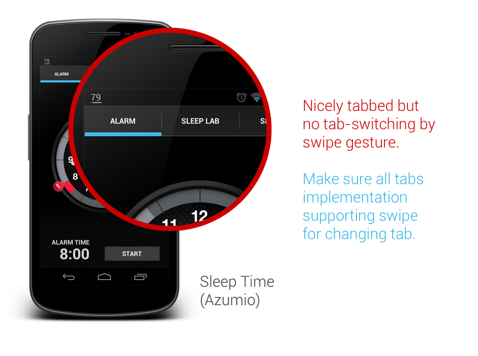
I think this has been mentioned many times by Android Developers Team, as well as some Android Designers. If you are using tabs in your app, please please please, make sure they support the swipe gesture. It is a system-level interaction pattern, and it is clearly mentioned in the Android Design Guideline. Your users won’t be happy to realize that they can’t swipe to change tabs, which is extremely useful when the device is used with one hand.

Properly Handle Multiple Notifications

Multiple Notification

In a previous version of Google Drive, when you try to upload multiple files in a session, you will get the notification spams (shown in above image), fortunately, it has been fixed in the latest update. If your app can create multiple notifications with some user actions, please make sure that they are handled properly – group them and show the relevant information.

Proper Dialog Actions

Dialog Actions

Sometimes developers/designers tend to overlook the actions available to the user in a dialog. In this shown example, when I was shown with this dialog, I have no way to confirm my selection of font unless I press the Cancel button. This is very confusing for the user,  and definitely not designed according to the Android Design Guideline. Ensure that whenever there is such selection dialog, dismissive and affirmative action buttons are there for the user.

Smart Use of Color for State Indication

Color 1
Color 4
Color 3

Above shows some great examples from recent updates for Google Current and Google+. These are very subtle, yet informative approaches to notify the user about the state, so do consider for such approaches whenever your app requires to give the user some information/feedback regarding the state of something in the app. I really like these!

That’s it for this Android UI/UX Tips! Feel free to share around if you find these information useful, and as always, hit me with comments if you have any.

Movie Ticketing App Redesigned

Last month Roman Nurik posted a wizards pattern for complex user inputs, and I have now used it for my redesign of a local (Malaysia) movie ticketing app, which is definitely a perfect match (I think). Hopefully this redesign can inspire any developers or designers that are looking to create/redesign movie ticketing app.

Why I am redesigning this app? I have placed a few shots below to briefly show the user interface of the app to explain that. Completely implemented with iOS look and feel, legacy menu button, badly-resized images, in-app advertisement (about themselves),  bad user interaction design – everything is so wrong. Give it a try if you want to understand my frustrations.

Old_Promotion Old_Cinema

I think many will agree with me – app that just work without proper UI/UX design is no longer enough to stand out and compete with thousands of other apps in the market.

Completely redesigned with Holo UI approach, the movie ticketing app is aimed to provide great and easy ticketing service with sufficient information about cinemas and movies. Here’s my take (It’s a long page!):

Promotion Cinema List

Cinema - Show Date

Cinema - MoviesCinema - Show Time

Cinema - Tickets

Cinema - Seat Selection

Cinema - Review

Cinema - Payment

Fast Ticket

Purchased Ticket

What do you think about my redesign? Shot me in the comments if you have any suggestions/feedback/critique!

Outlook.com App Redesign – Tablet Version

Last week I have published a redesign of outlook.com app after the disappointing official release, and since then I have also started to look into the tablet version. The redesigned phone version has been a shared around Android Google+ community during that day, and it was also mentioned in latest episode of Android Design in Action – big thanks to everyone who re-shared and commented on the redesign.

Below are my take on the tablet version, probably not much surprise for some (Before anyone say it, yes, it looks like Gmail/Email app, since it’s an Email client):

Sign In

Outlook Tablet First RunOutlook Tablet - Open EmailOutlook Tablet - Open Email - Full View

What do you think?

Outlook.com App Redesigned

Over 25 million active Outlook.com users and they said they are ready for Gmail user to switch – with this low quality app.

I really disappointed with this surprising move since they did a really great job in SkyDrive app in Android. Seriously, it’s not rocket science to craft a beautiful and usable email app with Microsoft identity. They invested heavily in UI/UX for their new product lines, but yet they failed to understand the importance of Aesthetic-Usability Effect.

What I really hope to see when I run the outlook.com app:

But what I see today with the current app (usually I don’t post these):

What do you think? Just feed me with any idea or suggestion you have!

Android UI/UX Tips #4

It has been a while since the last Android UI/UX Tips, but I still continue looking for things that can be improved whenever I have some time to find them or actually experiencing them myself.

I am not sure if I can say I am happy with the release of Android 4.2 in terms of UX, especially with the decision to include the Quick Settings panel that isn’t much useful, and a strange bug on the date picker for Contacts app which should be fairly simple to detect if the testing is done thoroughly.

In any case, let’s look at some UI/UX tips that I would like to share.

Tabs should be placed on top

In Android Design Guidelines, it has clearly suggested that tabs should not be placed at the bottom, since it is a very iOS UI element and doesn’t fit in too nicely in Android interaction behavior.

However, looking at the recently released Beta build of Echofon – there you can find the ignorance from the development team.

One of the main justification for placing the tabs at the top is that the user will have hard time to see which tabs he/she is currently in while swiping across the tabs (try it on a phone device). Juhani also written a great article few months back to justify the placement of the tabs should be at the top.

So my advice, try not to ignore the guideline and do not invent new UI element that doesn’t help in enhancing the UX.

Use Simple but Precise Words

Sometimes it is unavoidable for developers/designers to add some words to explain certain things in the app, like instructional guides or options in Settings page. However, it is not hard to find some bad examples in the apps world, either they used long but unclear explanations, or some simple words that simply can’t explain clearly for certain options/features in the app.

One example that I would like to show here is the new Gmail app that comes together with Android 4.2. If you are an early adopter of Gmail app version 4.2, most probably you are aware that it finally has a pinch-to-zoom feature for the email content. However, it is not turned on by default. And what’s really surprising here is that even the option to activate that feature is in the Settings page, many (including myself) have overlooked the existence of this option. Some might blame themselves for the overlook, but really this is actually an UX related issue.

The words that they used to explain the option isn’t something really straight to the point – especially the word ‘auto-fit’, I am not really sure if there is anyone familiar with it. The further explanation might clear the confusion a little bit, but definitely it can be improved. I am sure if it change to Pinch-to-Zoom Content with the explanation Automatically fit the message to the screen and allow zooming, 90% of the people who overlooked this will be able to turn on this feature without having a doubt, and it is also clearer to any new users, I supposed.

Therefore, simple but precise wordings/messages to the user is the key to avoid miscommunication or feature overlooks.

Ensure proper UI presentation

It’s a pity that the stock Email app doesn’t get any updates ever since ICS (at least I am not aware any of them). In Android UI/UX Tips #1, I have questioned on the navigation buttons in the app, and now I have found more things that can be improved during my daily usage.

If you need a borderless button in the middle of UI (in this case the Email app), please make sure that the user should be able to press it anywhere along the entire button area, otherwise if you would like to make it work only on a specific area, remember to use a vertical separator. Gmail app is doing this absolutely right.


Ensure Action Hints are working properly

While it doesn’t seems to be a crucial feature, but I would really make sure that the Action Hints are always working correctly, showing the helpful hint to the user about the iconized buttons.

In Email app, when you long press on the navigation button, it actually show the Action Hint toast box without any text in it. This should be avoided – it doesn’t provide any helpful hint to the user and it doesn’t give any good impression on the app quality either.

That’s all for this Android UI/UX Tips! As usual, hit me with comments if you have any.

Google Finance Redesigned

I have been thinking to redesign Google Finance app for a quite some time since I think all Google apps should have at least adapted to Holo Style UI, and I think there are still quite some number of users for the app (unfortunately not me because it doesn’t support share market of Malaysia), but I didn’t quite find the time for it. However, last Android Design in Action episode has put up a challenge to all Android developers/designers for some redesigned screens of any current apps, and that motivated me to continue working on this redesign despite of the really packed schedule.

The current Google Finance app is really ugly, which looks like a web-app rather than a native app. The graph is not loaded at the proper size, old Android UI elements are still there, and the ugly legacy action overflow. Therefore a redesign is definitely required.  And the objective is pretty straight forward: Make it a clean and nice app to be used by every user levels. Therefore I tried to preserve the familiarity so the existing user will not have to re-learn the new UI while still providing a refreshed UI compliant to Android Design Guideline. Here’s my take:

What do you think? Shot me in the comment box 🙂

If you want to see some comparison shots between the current version and my redesigned version, I have posted them in my G+, feel free to comment there as well!

Holo Planning Poker

Planning poker (not sure if it’s still commonly used now?) shouldn’t be a stranger for you if you work in agile software development environment. During the estimation practice today, I suddenly have the idea to make a really simple concept app that simulating the planning poker cards for use during the estimation.

The concept app is really simple – I used the card UI for the poker cards, so in order to change the card, you just need to swipe left or right. The card will just show the number in sequence and nothing else. It comes with light and dark themes.

I have a feeling that this app is really simple to develop, any taker?

After 48 hours, the concept app become a reality thanks to Mark Mooibroek! You can download it now in the Play Store.

Password Manager Redesigned

During the 25 billion app downloads celebration at Google Play Store, I noticed mSecure – Password Manager was in the 25 cents list, and after I reviewed the screenshots, I immediately buy it – not to use it (at this moment), but to redesign it. It really surprised me when I found out the app is actually selling at $9.99 with this pretty dated and ugly user interface (and possibly bad user experience).

So I started to play around with the app, and as expected, I got really frustrated using the app even though I am just trying to do some simple stuffs – a redesign is definitely required. I start sketching using my GUI Sketching Kit and transfer my sketching to the digital version, and it was pretty fun! It turns out to be pretty inspiring, and I am actually thinking to work with some great developers to make this design a real working app (Any taker? Let me know if there is such possibility!).

Anyway, below are all the mock ups for the redesign:

What do you think? Do you like this redesign? Hit me with your comments/suggestions/critiques!

The Verge Redesigned

It has been quite some time I wanted to do a redesign on The Verge app due to their not-so-great UI/UX. Just to be fair, they have just pushed a new update which is a lot better than the previous version that I am referring (and I didn’t see that coming!). The new version is smoother, and it has Nav Drawer navigation (which coincide with my new redesign, but I am not surprised because it’s a natural choice) and scrollable tabs, which are definitely welcomed UI patterns. While my redesign might be slightly similar to their new update, I still want to publish them because I think there are still many room for improvement to achieve better user experience.

Below are all the mock ups that I have done (07/10/2012 – updated with tablet version), and I have included some comments for my choice of UI patterns:

What do you think? Don’t hesitate to hit me with your comments/suggestions/critiques!

Android UI/UX Tips #3

In Android UI/UX tips #3, I have looked into some apps with the following UI/UX problems:

  • Hidden Status Bar (UX)
  • Outdated Action Bar and low-res icons (UI/UX)
  • Bad offline handling (UX)
  • Obstructive UI elements (UI/UX)

Hiding Status Bar? Do it Properly!

Some of the app designers/developers didn’t realize that the Status Bar is actually part of the System Bars, therefore if you decided to play around with it to get the maximum screen estate for your app, you have to do it right.

Let’s take RepliGo Reader as the first example. The app is actually pretty good in terms of features and UI, but I didn’t quite like the way it handles the Status Bar. It only allows the user to choose between Always Hide or Always Show option during Reading Mode, which is kind of limited. If they can also include a Show/Hide Together with Other Controls option, then it will be a pretty great user experience, and this should be the default behavior. Look at Google Play Books app, it handles the Status Bar nicely.

Another app that worth mentioning for this issue (which actually bothers me since Jelly Bean) is the stock Gallery app in Jelly Bean. This app has two issues with the Status Bar:

  • In Landscape mode, Status Bar disappeared and there is no way to bring it back.

This is one bad UX example in stock app. Given the importance of the Status Bar in Android device, my suggestion is don’t hide it in any screen mode unless the user is well aware of some method to call it (tap anywhere to show it, for example).

  • In Portrait mode, the black bar of the Status Bar permanently stays on the screen in Viewing Mode (only in Jelly Bean).

I am not too sure if there is anyone noticing this but this is pretty frustrating for me. I have been using Gallery app to view my app mock up in full screen (which I just need to trim off the bottom Navigation Bar), and it doesn’t work anymore because the black bar of the Status Bar is now taking up the Viewing Mode space as well. Thus, if you are going to hide the Status Bar in your app, hide it completely!

Use the new Action Bar and High Resolution Icons

With the release of the awesome ActionBarSherlock library that allows the developer to implement the ICS/JB Action Bar with full compatibility from Android 2.x, personally I am not too sure why there are tons of great apps still decided to stick with the older (and less aesthetic) Action Bar design and/or low resolution icons. Besides making your app feel aged, it doesn’t give any good impression to your user if your app using lower resolution icons – remember, Action Bar is one important UI element in Android Design which is always visible to the user. Some examples below (I am sure you can find more):

So, forget about the old Action Bar and start designing/redesigning/developing Android app using new Android Design!

Properly Handle Offline Situation

It’s true that most of the apps nowadays require internet for their full capability, either to get new information or for syncing purpose, however, we cannot expect our user are always connected to the internet, therefore you have to properly handle the situation when the device goes to offline.

I had this issue with The Verge app which actually crashes when I try to play around with the app offline. Definitely not a user experience that you would like to introduce into your app. Handle it with a simple toast or a warning message regarding the offline status would have solve the issue.

Obstructive UI elements is a no-no

It is so awesome that Android developers have numerous of great libraries for certain UI elements implementation, but once you have used those libraries; you are basically responsible for everything that you decided to show to the user.

One bad example of this is, again, The Verge app, which shows the Pull-to-Refresh indicator and overlapped with certain UI elements in the app (one of the examples shown above). I am not too sure the complexity in technical terms, but I assume it won’t take months to remove it? Publishing your app in such condition will only give bad impression for your app overall quality.

Hope these UI/UX tips help! As usual, don’t hesitate to leave your comment!