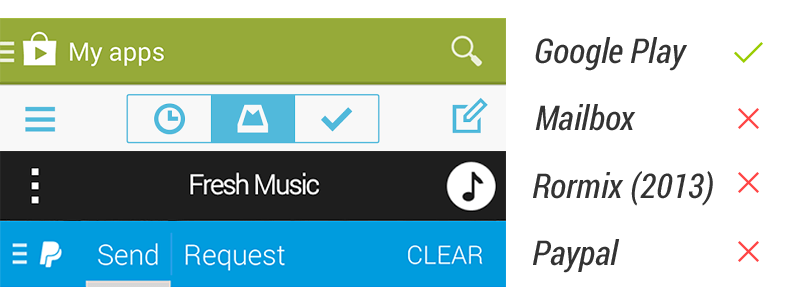
Floating Action Button, or, in short, FAB, is one of the unique UI element in Material Design for primary/promoted action for a particular screen. Since it is a frequently accessed UI element in a given screen, I think it’s important to make the FAB right in every details. However, there are a number of apps doesn’t have the right FAB as specced in the Material Design Guideline, which also included some of the Google apps (I know!).
Category: UI Pattern
Navigation Drawer Done Right
With Google+ on Android just updated with new navigation menu and ditched navigation drawer, this article might not be applicable anymore in the near future for Android Design, though I don’t think navigation drawer will be phased out very soon.
Finally, Gmail on Android has been recently updated with the proper Navigation Drawer interaction pattern (the lower-level edge-swipe drawer access, as well as the Settings/Help/Feedback placement), and I am pretty happy about it because we can finally talk about consistency for this design pattern (I am aware that Google+ and YouTube on Android have yet to change).
I am sure you have (if you always look around for UI/UX articles) come across this article about how navigation drawer reduces half of the user engagements or why or how to avoid hamburger menu – if you are not, I would suggest you to read them – these are some interest reads. Although for the Zeebox case, I couldn’t fully understand the decision to go for navigation drawer – it was pretty obvious that navigation drawer is not needed, and I would probably go for the QuickReturnTabs (in the current Twitter app) to regain some of the screen estate – though it’s appreciable that their A/B testing indicates that obvious helps.
These articles (and I think there are more in the wild) suggest that side menu is a bad design pattern and avoid it at all cost, but I say – in Android Design, you can absolutely use it, but only if it’s really necessary and it’s an informed design decision.
Understand Navigation Drawer in Android
In iOS, particularly iOS7, the side menu does clashed with the navigation element (back button) at the top left, as well as the edge-swipe that will act as back (which is not consistently implemented in all Apple apps if I am not mistaken, correct me if I am wrong), however, this is not the case with Android. The navigation drawer for Android is much more sophisticated where the edge-swipe is reserved for accessing the navigation drawer at any lower-level screens (discoverability could a problem here I know), making the top level navigations slightly easier and more accessible even though you are at the deeper level in the app structure. This potentially eliminates the Platform Navigation Pattern Clash mentioned in Luis Abreu’s post (of course he meant in the iOS7).
Information Architecture (IA) optimization
I do agree with Luis Abreu about Information Architecture optimization when you are tempted to use Navigation Drawer for your app – Navigation Drawer isn’t simply an answer for every navigation need. It is always good to rethink from a high level perspective about the app structure to find out whether the navigation can be made a little bit shallower by removing any unnecessary level/information that doesn’t help exposing the important content to the user – in Android Design Guideline, there is a pretty nicely written recommendations for app structure.
Do it right
However, if it’s really necessary to use the navigation drawer as the top-level navigation pattern after careful consideration, just do it, and do it right. It’s not that I do not encourage variations (which is great for a platform), but for UI elements that involved heavily with interactions, it will be always good to stick with the one that is recommended in the design guideline for consistency, familiarity and predictability. We always want the user to ‘learn once, applied everywhere’, especially from an Operating System point of view – I hate to say this but it’s part of the responsibility of the Android developers and designers to help pushing this established* consistency so the user will have less interaction friction when they are shown with a specific UI element. The faster the user able to operate the app and achieve what they want to do = happy user.
*I know some of the Google apps are still yet to be consistent with the latest changes in navigation drawer, but I am sure they are working on it. Mind you that navigation drawer has come a long way and it takes time to get things right (I wrote about this back in 2012)!
“What’s out of sight, is out of mind.”
In Anthony Rose’s article about Navigation Drawer and a tweet by Luke Wroblewski below shows that when the navigation pattern is less obvious, the user engagements reduced (although I am not sure what’s the parameters in Luke’s chart).
Sure, for some, these statistics seem worrying – but I don’t think we have yet to see the whole picture in these examples. What does the reduced user engagement means? Does it mean they don’t explore the app anymore or it simply means the first screen (home screen) is already sufficient? Does it mean that the user accomplished what they want to do with the app much faster (with lesser distractions) and thus less engagements? I would probably see this as an achievement if my app is meant to help in productivity because it might means that my app helps the user achieve thing faster.
While I fully agree that we should keep “what’s out of sight, is out of mind” as one of the design principle, but it doesn’t mean that we have to show everything as long as we can, because every UI elements play different role during the user interactions and each of them have it’s own unique importance.
So next time when you come across the use of navigation drawer, make sure it is really necessary to do that – and the new Google+ app just show that Navigation Drawer is not really needed sometimes.
Side Navigation UI Pattern in Android, Part 2
Well, this topic might be a little bit old since the last bunch of discussions, but I still have a little bit more to talk about this UI pattern that I have missed in my last writing and also some new idea popping-up since last month.
I personally still think the Side Navigation (a.k.a Fly-in menu, Sliding Menu, Nav Drawer etc.) in Android is pretty interesting even though it is not a relatively new UI pattern – it allows a fresh (and better?) navigation style on small screen mobile devices, and it helps in efficient use of screen estate for content. A number of apps are already using it (each app has slightly different kind of behavior and interaction though) even though it is not (yet) an official Android UI Pattern, which is always great for Android development scene because innovation doesn’t stop at stock design/pattern. However, I really think it’s time to have some consistency and guideline for this UI pattern for better user experience because I can foresee more apps will be using this, only with different kind of behavior. Some of the official Google apps like Google+ and YouTube are using it mainly for navigation purpose, but unfortunately they are not good example since the Side Navigation implemented has different interactive behavior.
More tips and suggestions
Some extra suggestions from me since the last one if you are looking into Side Navigation for your app:
Don’t confuse the user
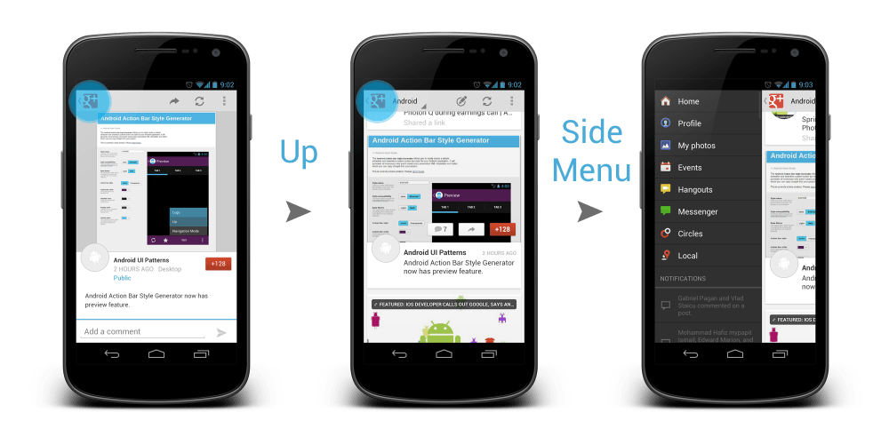
This is like the #1 UX rule if you really care about the user. The latest update of Google+ app during the launch of Jelly Bean is pretty awesome, and I think most of the Android user will agree with me. The Card Style pattern (which is another interesting UI pattern) offers some fresh experience into social networking app, and the redesigned Side Navigation menu since the last one is great – but not the visual indicator for it. The Up affordance are still used for it, and it will further confuse the user with the Up affordance when there is already user confusion in Up and Back affordance in Android 4.0+. My suggestion: If you really have no better idea on the visual indicator, use an icon for it (eg. Facebook and Prixing), or just the app icon (eg. Evernote), but please do not use the Up affordance to confuse the user.
Bezel Swipe, please
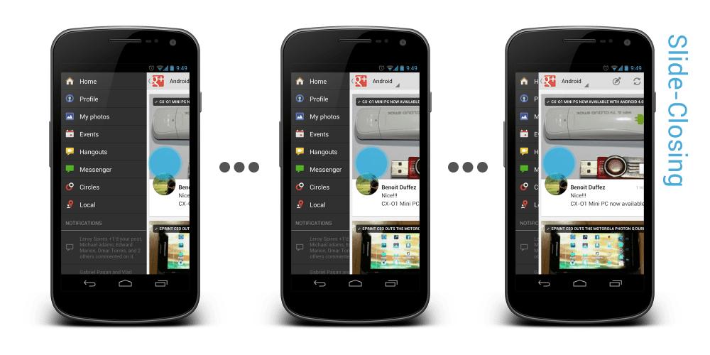
As mentioned previously, I still think Bezel Swipe is a great match with Side Navigation. It is very easy to understand, and bezel swipe isn’t something hard to perform on a mobile device, though I would have to agree that discoverability might be an issue for it. Another reason that I think Bezel Swipe should be there – most of the apps that have Side Navigation, for example Google+ and YouTube, allow the user to touch and hold the main activity and swipe-closing the Side Navigation (try to hold the main activity and swipe to left side), and this user-perceived closing animation can introduce the user expectation of swipe-right-to-reveal gesture for Side Navigation. Try Dolphin Browser HD and Prixing, I think it is completely make sense.
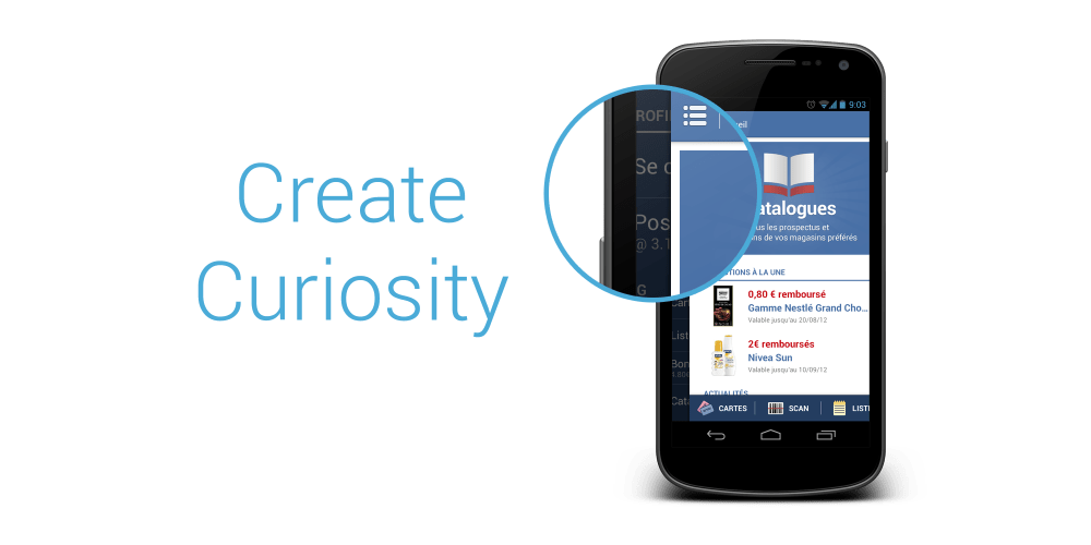
Improve Discoverability (and create curiosity)
Well, this isn’t something new. Every now and then, there are new UI patterns and new user interaction invented in mobile apps. To make the user aware of your new UI patterns and/or user interactions, what you can really do is improve the discoverability of those new patterns. As I said, Bezel Swipe/Side Navigation might have issue in discoverability, so just don’t stop there after the implementation.
- Introduce it in the first run tutorial and let the user play around with it.
- Make the Side Navigation a little bit more obvious when the user first running the app – a great example for this is the Prixing app which make the Side Navigation panel ‘jump’ when the user first entering the app, creating user curiosity.
- Use a good indicator to represent the Side Navigation.
They are not perfect solution for the discoverability issue, but those are some possible improvements.
New indicator?
After some suggestions in the previous post, I am still actively thinking for new indicator that can be used for the Side Navigation. Below are some of my new idea, what do you think?
Conclusion
I really like Side Navigation pattern and I think it is especially useful in mobile devices with small screen, but it’s pretty important that the user experience that comes with it has to be carefully crafted so it doesn’t cause user frustration and confusion. If you are looking for some reference while implementing, I strongly suggest you to look into Prixing.
For developers, if you are looking for library for this UI pattern, you must check out the SlidingMenu library by Jeremy Feinstein. It uses Bezel Swipe which I prefers a lot and generally it has quite some good reviews.
New UI Stuffs in Jelly Bean (Android 4.1)
Just got my Galaxy Nexus flashed with the new Android 4.1 (Jelly Bean) Build JRN84D, and I am pretty impressed so far. Most, if not all, of the features showcase during the Google I/O 2012 Day 1 Keynote work just fine, and the Project Butter isn’t just a project name – Jelly Bean is really butter smooth. As I try to explore this new Android, I’ve found some new and interesting changes in terms of UI (definitely not everything, but those are what I managed to find), so I decided to put them all in one post to share my findings.
Roboto Light font in Setup Wizard
Correct me if I am wrong, but I don’t recall that the Setup Wizard for ICS using the Roboto Light font, so for me it’s a surprise.
New On/Off Toggle Button
Open up the Settings, and you can immediately see the new On/Off Toggle Button. I am not too sure what’s wrong with the one in ICS, but I like the old one more.
New Search Bar Design
In the Homescreen, the new design of Search Bar (which has been leaked from Google I/O app screenshots) catch your eyes. Compared to the one in ICS, I personally think that it improves the perceived affordance, making the user more likely to press it.
New Notification Center
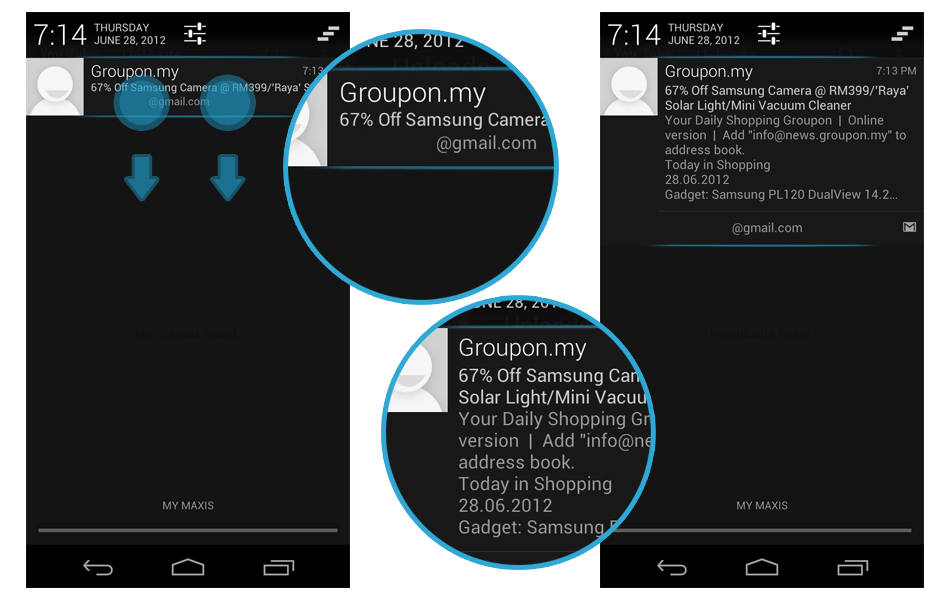
An improved Notification Centre in Jelly Bean. Date and Time and now slightly more emphasized. Title texts in the notification used Roboto light font, and font size has been pushing up a little bit. There is also a new Dismiss All button at the Right Upper corner. For the notification that you can interact, you can immediately do the interaction within the Notification Centre. Also, at the notification centre, you can long press an item and access the App info immediately, very useful to turn off the notification.
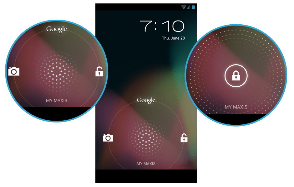
New Wave Animation in Lock Screen
Turn on the screen after it’s locked, and you can see the new wave pattern and animation from the unlock button. The pattern follows your finger when you slide the unlock button around, very fun to play with. The pattern feels like a microphone.
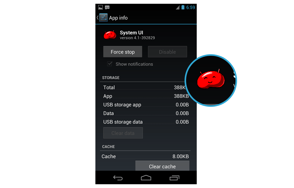
Jelly Bean!
Jelly Bean spotted!
Expandable Notification
Some of the notifications are expandable, for example Gmail notification. Discoverability might be an issue since no hint is given for such functionality, but those who have been following the Keynote should already aware of this feature.
New Menu Style for Share Intent and App Chooser
If you use the Share Intent, or open up a link that allows you to choose which app to complete the action, you will find that the menu style is changed. Coincidentally in Apple iOS 6, the sharing option have the same menu style tweak. Looks good, but if the user have a long list of app in the chooser list, perhaps a little bit more scrolling is required? There is also options to complete the action with certain app only once or always, different from checkbox option in ICS.
New Quick Control in Browser app
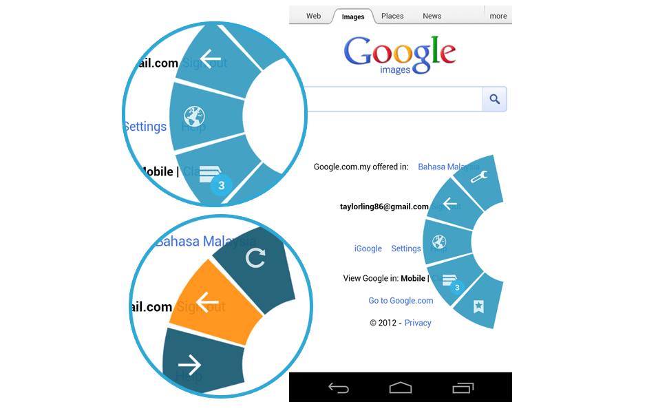
I am always the fan of the Quick Control in the Browser app in ICS, and in Jelly Bean, the Quick Control has been upgraded. It now has a beautiful animation, and each of the option will have sub-option. I think it will be very useful for any app that is focus more on the content, for example Book Reading app.
Neat Widget Catalog
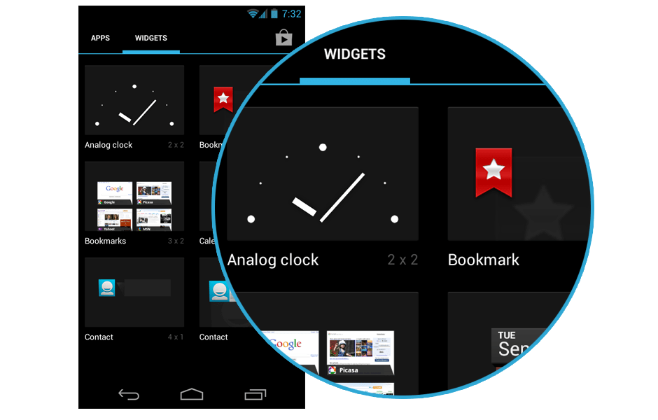
Widgets are now arranged in a neat and clean arrangement, each of everyone have the same size in the catalog.
Down Button
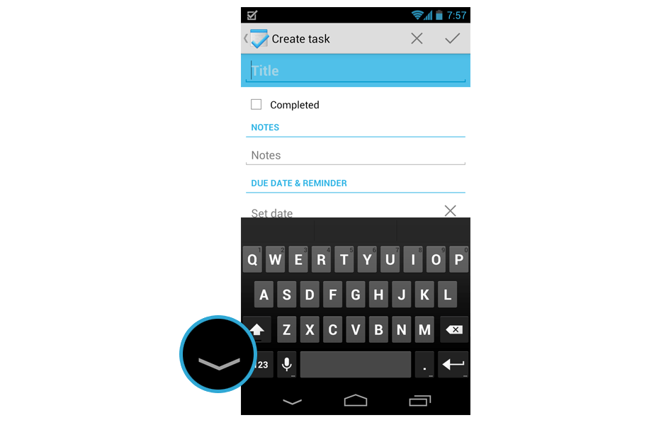
Instead of Back button, now when the keyboard pop up, it changed to Down button to indicate that you can use it to hide the keyboard. This change is really welcomed.
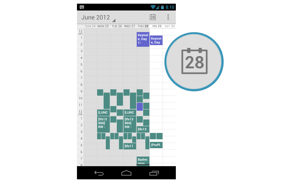
Today button with Current Day
Very minor detail but I am very pleased with it. The Today button in the Calendar app show the current day.
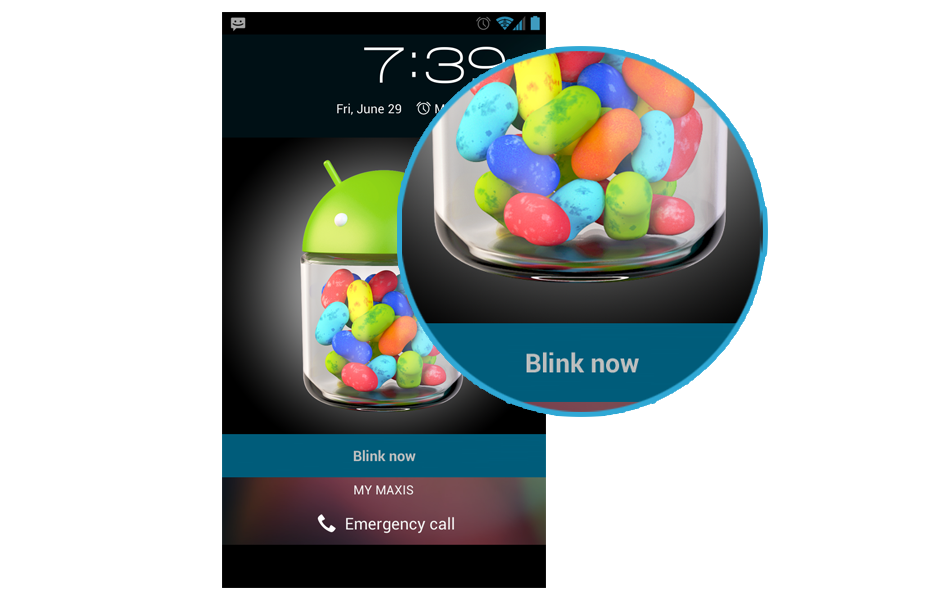
Blink Now feature in Lockscreen
If you use Face Unlock for your lockscreen and activated Liveness check (basically you have to blink while unlocking), once the phone detected your face, it will ask you to blink.
Access Google Now from Soft Keys
If you swipe from soft keys to the main screen, you can have a quick access to Google Now. Very similar to the pattern in lockscreen.
Soft Keys Pressed State Color Changed
Press the soft keys and you will find out that the pressed state changed to grey color. I like the old blue color though.
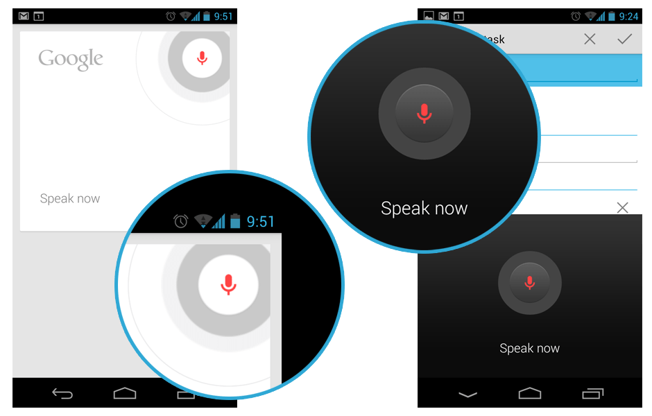
New Voice Actions UI
Voice Actions become so important in Jelly Bean, therefore they have some new UI.
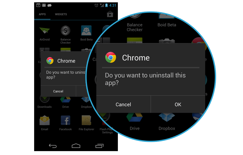
New Uninstallation Dialog
In Jelly Bean, when you uninstall the app, a pop up dialog will be shown rather than a full screen uninstallation dialog. If you used ICS and uninstall apps extensively, you will notice this change. Not too sure how does it enhance the user experience, but my guess is this change is meant for Nexus 7.
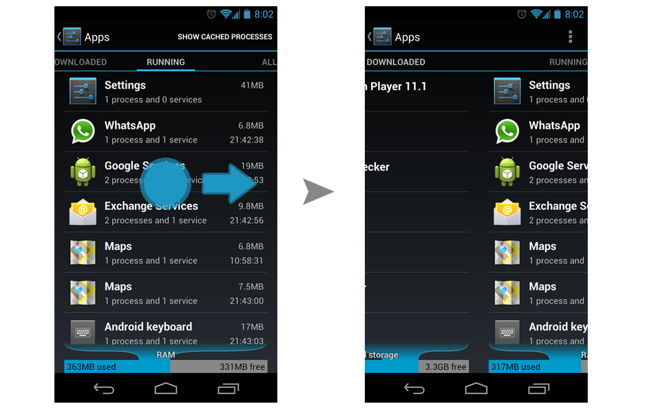
Tab Swiping in Apps
They finally fixed this in Jelly Bean. In ICS, there are similar tabs in Apps, but swiping will not work for changing the tab. Glad to see they are making everything more consistent in the system level.
Found anything else? Do let me know so I can show it here. 🙂
Side Navigation UI Pattern in Android
Few days back, I read an article on Android UI Patterns by Juhani discussing about the emerging Side Navigation UI Pattern on Android, and it is a pretty interesting topic. This new unofficial (yet?) building block for Android starting to make its way into more apps in the market, including Google+ official Android app. This Side Navigation (I will just stick with this term used by Juhani since there isn’t any official term for it yet) UI Pattern is an interesting design, especially on the phone that has smaller screen estate compared to tablet, but it can end up confuses, or even frustrates the user if it doesn’t get implemented in an elegant way, resulting in bad user experience for the entire app.
Inspired by iOS?
 The official Facebook Android app has been using the Side Navigation pattern for quite some time, and that was my first experience with this new UI pattern. Well, I never been a fan of this app because it brought over too much iOS designs and patterns into it (it’s a direct porting), and this Side Navigation pattern is actually part of the bad porting. I always think that it’ll be great for all Android users if Facebook can re-design the app with Android ICS UI/UX, so I went ahead and made a very simple mockup of new design without the Side Navigation and personally I think it’s looking good with better Android experience. Continue reading
