
Feedly is such an app that I love and hate at the same time. I love the way they deliver my news feed when I need them every morning, and the ‘Swipe to mark as read’ and ‘Pull to close’ gestures almost built into my thumb. But I hated them as well. They always look into new idea and fresh design in their app — which isn’t a bad thing at all — but it’s really disappointing to see that they are still ignoring to adhere (or may be should I say, refer) to the Android Design Guideline, that can potentially enhance the user experience even more for Android users.
Sure, there was an seemingly awesome update from their Android team, but this is the one that get on my nerves and I feel the need to rant about it. So how I would further improve Feedly?
Android Design, may be?
Navigation Drawer Indicator

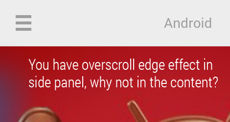
Overscroll Edge Effect
Edge Swiping

Consistent Overflow Placement and Color

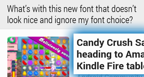
Where is my Roboto Regular?
Gingerbread? KitKat is coming out soon.

Attention to Design Details, may be?
Incomplete Hint

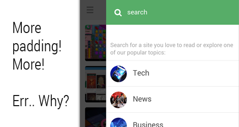
Spacing…
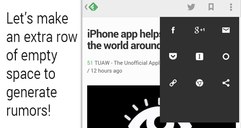
More spacing…
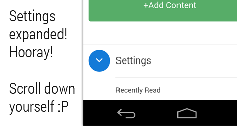
Not-so-smart menu expansion
Better QA, may be?
Bug!

Sure, you can call these nitpicking over small details, but every details are design, and every details count. This is what can make your app great or break. And to me, as a user, I have a feeling that Feedly app is always in the beta stage that never complete, pretty much like Siri in iOS.
Perhaps it’s time to look for a better news feed reader that uses Feedly API. Suggestion?

Press is absolutely a good choice!
Suggestion: http://www.feedly.com/apps.html#android-phone
Agreed, these for some if many tiny reasons I wouldn’t enjoy using the Feedly app. But Press supports Feedly API and is currently my favorite RSS Reader app. Its simple, comes with widgets and dashclock extension and is frequently updated.
https://play.google.com/store/apps/details?id=com.twentyfivesquares.press
Press, Press, Press. I switched to Press Reader from Feedly, no turning back: https://play.google.com/store/apps/details?id=com.twentyfivesquares.press
Many texts in spanish are wrongs. Look at this image: http://i.imgur.com/IUN97JG.png
Hello. This is Edwin from feedly. Thanks for the feedback. We integrated some of it in the 17.1 patch we just pushed out. More in the next releases. And yes, press is a great alternative feedly experience. We love our developer community.
As always, totally agree! And it’s great that @feedly is listening!