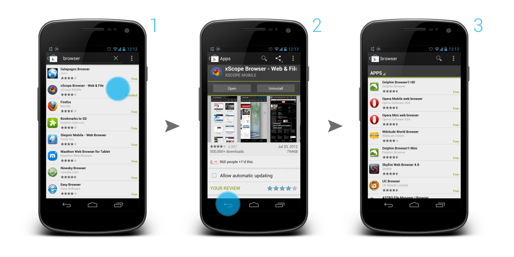
After a rant about the app screenshots in Play Store, another not-so-great UX in Play Store that I experienced for quite some time is a pretty frustrating one, and I thought this is something Android Designer/Developer should avoid at all costs.
Last Position or Top of the List?
Imagine this scenario: You are scrolling through a long list, and found something interesting in the middle of the list, so you click on that item to get more information. After that, you want to go back to the list and continue the search.
Question: When you go back to the list, do you expect to go back to the position in the list where you left off, or to the top of the list?
My answer: Definitely the position in the list where I left off.
Back to Top of the List Shouldn’t Be Automatic
But Play Store app developers don’t think so. In My Apps section, both INSTALLED and ALL tabs are having this UX mistake. Want to try yourself? Grab you device, go to Play Store > Overflow button > My Apps. Go to ALL tab, scroll down a little bit deeper, click on any app. Once you enter the details page of the app, click Back button or Up button. Now, see check the list. You are on top of your list. Frustrating, no? You can find the same UX mistake when you are searching for apps in Play Store app too.
I don’t recall any of the official Google apps giving me such frustration. I am not too sure if there is any specific reason from them to design/implement it in such a way, but I don’t see any value or advantage except causing user frustration and confusion.
Back to Top shouldn’t be automatically done until the user requested it, or at least the user should be aware of it. So, please, Android Designer/Developer, avoid this UX mistake at all costs.


This is such an annoyance that has been bothering me. Good thing you brought it up.
Hi Juhani,
Exactly! This is one very annoying mistake and it’s been there for quite some time. By the way, looking forward to your new book! 🙂
Rgds,
Taylor
You answer “Definitely the last position in the list.” is weird, don’t you mean “go back to the position in the list where you left off” ?
Hey,
You are right, I have change it to better reflect my choice. Thanks! 🙂
Rgds,
Taylor
Kirill Grouchnikov (https://plus.google.com/108761828584265913206) has admitted that this is a bug, that Google is aware of.
He has just mentioned this in a comment to my G+-share of this post:
https://plus.google.com/101948439228765005787/posts/BggYuD315m8
Hey Wolfram Rittmeyer,
Thanks for letting us know! Good to know that it’s a bug rather than a intended design (even though it’s been there for quite some time which I think they should have fix earlier). Hope to see some fix real soon.
This, however, still can be one example that something designer/developer must avoid. 😛
Rgds,
Taylor
Of course, Taylor. The core message of your post is still valid. The play store is just a sample – and probably not the only one (well, given Gyuri’s comment – definitely not the only one).
Incredibly annoying. I find that the Google+ Android app does it once in a while as well: I drill into a post, go back and either a) It says there are no posts, or b) it refreshes and jumps to the top.
Hey Gyuri Grell,
Definitely. Especially when you have a long list and you are deep at the bottom of the list. Looks like Google+ app developers still have work to do. 😛
Rgds,
Taylor
I am sick of this. I have recently factory reset my phone. I want to install some of the usefull apps I had on my phone. I go to this my apps section. Install an app go back, scroll down, install another, go back, scroll again. Did they even test it? I guess not.
I so agree! Google needs to fix the back to the Damn top, I won’t even waste my time going through my apps unless I looking for one certain app. I would’ve have done that if I was the developer.