Avoid This UX Mistake in Play Store App at All Costs

After a rant about the app screenshots in Play Store, another not-so-great UX in Play Store that I experienced for quite some time is a pretty frustrating one, and I thought this is something Android Designer/Developer should avoid at all costs.

Last Position or Top of the List?

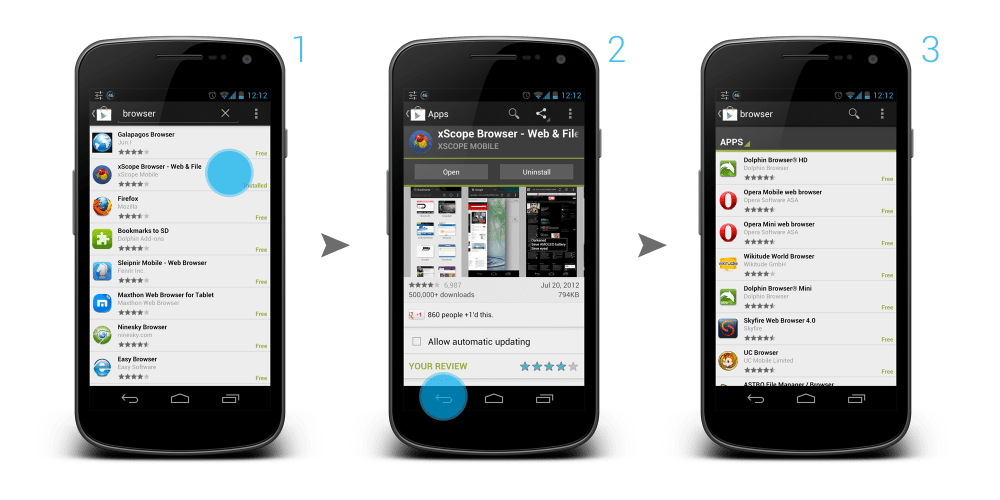
Imagine this scenario: You are scrolling through a long list, and found something interesting in the middle of the list, so you click on that item to get more information. After that, you want to go back to the list and continue the search.

Question: When you go back to the list, do you expect to go back to the position in the list where you left off, or to the top of the list?

My answer: Definitely the position in the list where I left off.

Back to Top of the List Shouldn’t Be Automatic

But Play Store app developers don’t think so. In My Apps section, both INSTALLED and ALL tabs are having this UX mistake. Want to try yourself? Grab you device, go to Play Store > Overflow button > My Apps. Go to ALL tab, scroll down a little bit deeper, click on any app. Once you enter the details page of the app, click Back button or Up button. Now, see check the list. You are on top of your list. Frustrating, no? You can find the same UX mistake when you are searching for apps in Play Store app too.

I don’t recall any of the official Google apps giving me such frustration. I am not too sure if there is any specific reason from them to design/implement it in such a way, but I don’t see any value or advantage except causing user frustration and confusion.

Back to Top shouldn’t be automatically done until the user requested it, or at least the user should be aware of it. So, please, Android Designer/Developer, avoid this UX mistake at all costs.

App Screenshots Without Navigation Bar, Please?

This is just a minor entry for the blog about something that has been bothered me for quite some times (call me a nitpicker). Ever since the release of Galaxy Nexus with the Navigation Bar (the black bar with Back, Home and Recent apps buttons), there are more and more apps in the Google Play Store actually have it included in the screenshots. I fully understand that it’s not the developers fault – Google Developer Console actually asking for the screenshot with some standard resolution, which means that the Navigation Bar has to be included in the app screenshot without a choice.

Navigation Bar in Screenshots is Redundant

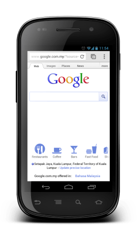
App screenshots are the most direct and quickest preview to the users for your app, therefore ideally they have to be shown on the user device which looks like it is in action. However, most of the screenshots nowadays include the Navigation Bar, which is completely redundant in my opinion. Why? Let’s have a look for some examples when I view those screenshots from Galaxy Nexus and Nexus S:

Not sure if you have the same opinion, but I don’t see the value of including that Navigation Bar in the screenshots. If the screenshot is meant for Galaxy Nexus, the Navigation Bar obviously is redundant since the device already has the Navigation Bar, and the screenshots have to resize due to the larger size. Plus it just feels awkward to view the screenshots that include Navigation Bar on devices that already have them in hardware form (e.g. Nexus S).

Workaround?

I don’t really have a solution for this since the Google Developer Console requires the screenshots to be uploaded at certain allowed sizes (320 x 480, 480 x 800, 480 x 854, 1280 x 720, 1280 x 800), which I really hope they will consider including resolution without the Navigation Bar/Combined Bar.

The only workaround that I would suggest for now is: Upload the screenshots at 480 x 800 (without the navigation bar, of course), which view perfectly on hdpi devices like Nexus S, and still looks quite OK on xhdpi devices like Galaxy Nexus.

What do you think?

Printable A4 GUI Sketching Kit 3.0 – Nexus S, Galaxy Nexus, Nexus 4, Nexus 7, Nexus 10 and Xoom

UPDATE 13/11/2012: To celebrate the release of the new Nexus 4 and Nexus 10, Android GUI Sketching Kit is now updated to version 3.0! It has been added with Nexus 4 and Nexus 10 sketching templates, as well as added the guide for Split Action Bar for Galaxy Nexus and Nexus 4.

UPDATE 27/09/2012: The Android GUI Sketching Kit is mentioned in the 3rd episode of Android Design in Action! To thanks Roman Nurik and Nick Butcher for the shout-out, I have spent some time updating the sketching template to version 2.0, which also includes the Xoom template! I have removed the title and description fields in the templates, and introduce the guide for Status Bar, Action Bar, Navigation Bar, and Combined Bar (for Xoom). Hope you will find it useful!

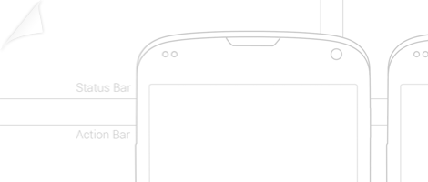
Besides making the Android ICS GUI Design Kit that can be used in Adobe Photoshop, I also think (and love!) that sketching is a big part of UI/UX designing, while it can be messy, but it definitely help in quick idea visualization and aid in brainstorming.

So here I come up with a few sketch templates for Android App, using the Samsung Nexus S, Samsung Galaxy Nexus and Asus Nexus 7 as the sample devices, and put them on an A4-sized PDF with almost real-life size so designers can sketch the app with the size as close as the real device (don’t blame me if there is one or two pixels off! /jk/).

Android app designer, go create some awesome apps with the GUI Design Kit and GUI Sketching Kit!

Download

Download Android GUI Sketching Kit 3.0

New UI Stuffs in Jelly Bean (Android 4.1)

Just got my Galaxy Nexus flashed with the new Android 4.1 (Jelly Bean) Build JRN84D, and I am pretty impressed so far. Most, if not all, of the features showcase during the Google I/O 2012 Day 1 Keynote work just fine, and the Project Butter isn’t just a project name – Jelly Bean is really butter smooth. As I try to explore this new Android, I’ve found some new and interesting changes in terms of UI (definitely not everything, but those are what I managed to find), so I decided to put them all in one post to share my findings.

Roboto Light font in Setup Wizard

Correct me if I am wrong, but I don’t recall that the Setup Wizard for ICS using the Roboto Light font, so for me it’s a surprise.

New On/Off Toggle Button

Open up the Settings, and you can immediately see the new On/Off Toggle Button. I am not too sure what’s wrong with the one in ICS, but I like the old one more.

New Search Bar Design

In the Homescreen, the new design of Search Bar (which has been leaked from Google I/O app screenshots) catch your eyes. Compared to the one in ICS, I personally think that it improves the perceived affordance, making the user more likely to press it.

New Notification Center

An improved Notification Centre in Jelly Bean. Date and Time and now slightly more emphasized. Title texts in the notification used Roboto light font, and font size has been pushing up a little bit. There is also a new Dismiss All button at the Right Upper corner. For the notification that you can interact, you can immediately do the interaction within the Notification Centre. Also, at the notification centre, you can long press an item and access the App info immediately, very useful to turn off the notification.

New Wave Animation in Lock Screen
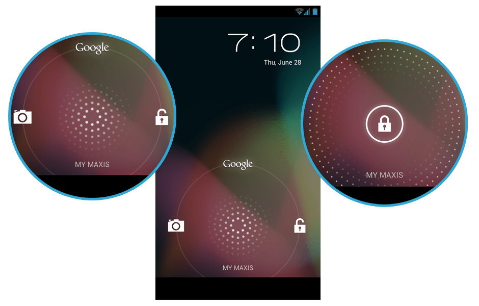
Turn on the screen after it’s locked, and you can see the new wave pattern and animation from the unlock button. The pattern follows your finger when you slide the unlock button around, very fun to play with. The pattern feels like a microphone.

Jelly Bean!
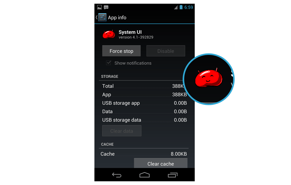
Jelly Bean spotted!

Expandable Notification
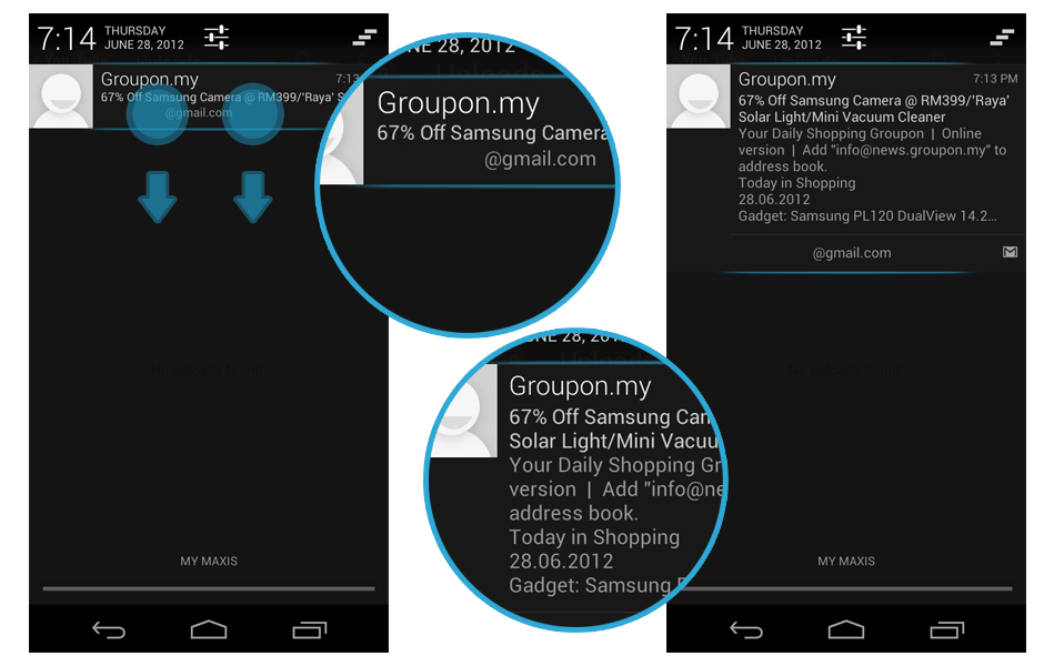
Some of the notifications are expandable, for example Gmail notification. Discoverability might be an issue since no hint is given for such functionality, but those who have been following the Keynote should already aware of this feature.

New Menu Style for Share Intent and App Chooser

If you use the Share Intent, or open up a link that allows you to choose which app to complete the action, you will find that the menu style is changed. Coincidentally in Apple iOS 6, the sharing option have the same menu style tweak. Looks good, but if the user have a long list of app in the chooser list, perhaps a little bit more scrolling is required? There is also options to complete the action with certain app only once or always, different from checkbox option in ICS.

New Quick Control in Browser app
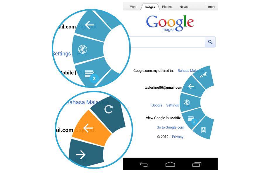
I am always the fan of the Quick Control in the Browser app in ICS, and in Jelly Bean, the Quick Control has been upgraded. It now has a beautiful animation, and each of the option will have sub-option. I think it will be very useful for any app that is focus more on the content, for example Book Reading app.

Neat Widget Catalog
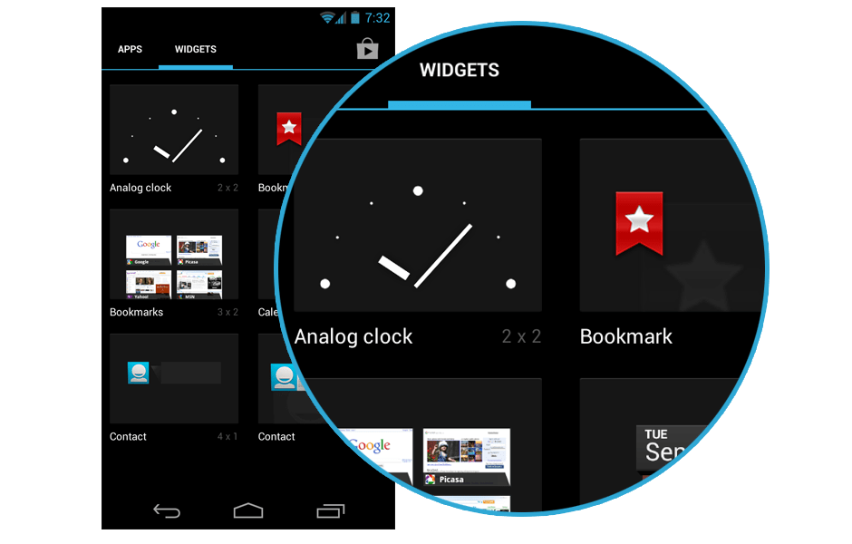
Widgets are now arranged in a neat and clean arrangement, each of everyone have the same size in the catalog.

Down Button
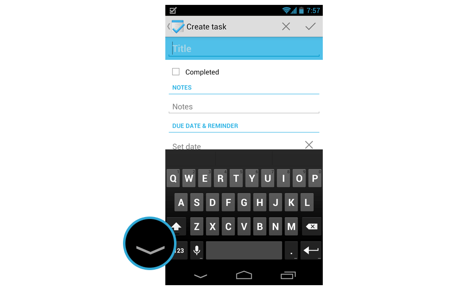
Instead of Back button, now when the keyboard pop up, it changed to Down button to indicate that you can use it to hide the keyboard. This change is really welcomed.

Today button with Current Day
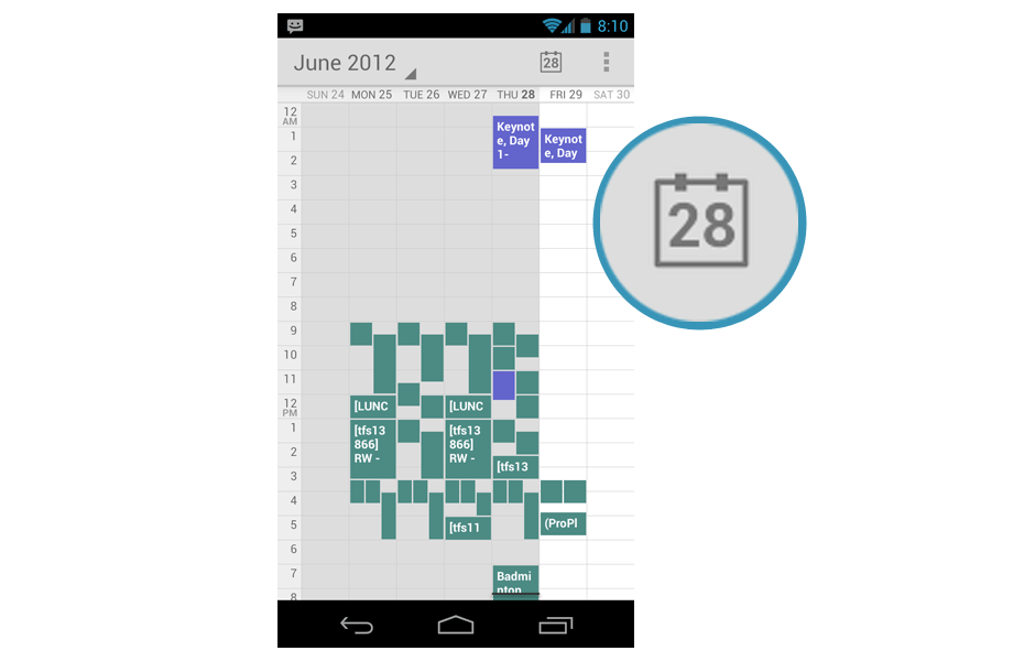
Very minor detail but I am very pleased with it. The Today button in the Calendar app show the current day.

Blink Now feature in Lockscreen
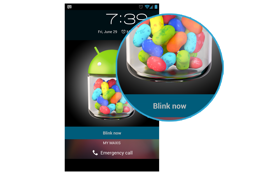
If you use Face Unlock for your lockscreen and activated Liveness check (basically you have to blink while unlocking), once the phone detected your face, it will ask you to blink.

Access Google Now from Soft Keys

If you swipe from soft keys to the main screen, you can have a quick access to Google Now. Very similar to the pattern in lockscreen.

Soft Keys Pressed State Color Changed

Press the soft keys and you will find out that the pressed state changed to grey color. I like the old blue color though.

New Voice Actions UI
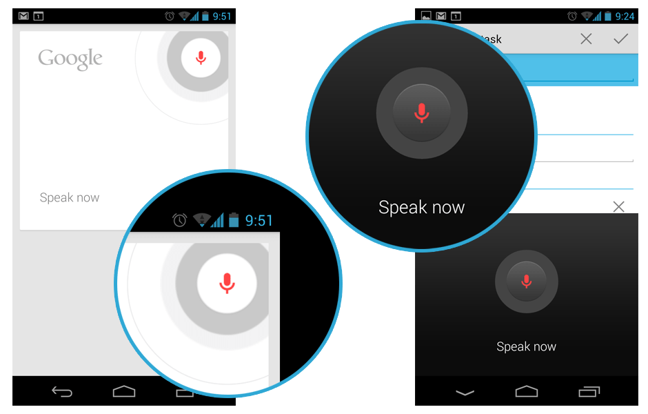
Voice Actions become so important in Jelly Bean, therefore they have some new UI.

New Uninstallation Dialog
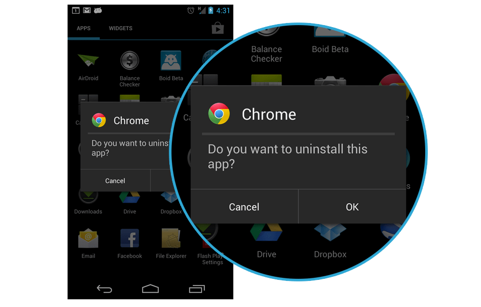
In Jelly Bean, when you uninstall the app, a pop up dialog will be shown rather than a full screen uninstallation dialog. If you used ICS and uninstall apps extensively, you will notice this change. Not too sure how does it enhance the user experience, but my guess is this change is meant for Nexus 7.

Tab Swiping in Apps
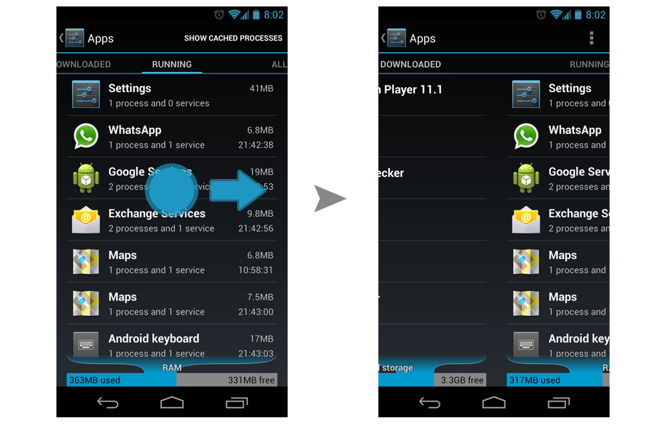
They finally fixed this in Jelly Bean. In ICS, there are similar tabs in Apps, but swiping will not work for changing the tab. Glad to see they are making everything more consistent in the system level.

Found anything else? Do let me know so I can show it here. 🙂

New to Android Design/Development? Here’s a list of great resources and references available

Android Development Tutorial and Reference

Android Design Guideline and Design Resources

Android Design Patterns, UI, Layout

Android Apps Showcase and Collections

Android Newsletter

Feel free to drop me some link for any awesome resources for Android Designers and Android Developers!

Side Navigation UI Pattern in Android

Few days back, I read an article on Android UI Patterns by Juhani discussing about the emerging Side Navigation UI Pattern on Android, and it is a pretty interesting topic. This new unofficial (yet?) building block for Android starting to make its way into more apps in the market, including Google+ official Android app. This Side Navigation (I will just stick with this term used by Juhani since there isn’t any official term for it yet) UI Pattern is an interesting design, especially on the phone that has smaller screen estate compared to tablet, but it can end up confuses, or even frustrates the user if it doesn’t get implemented in an elegant way, resulting in bad user experience for the entire app.

Inspired by iOS?

The official Facebook Android app has been using the Side Navigation pattern for quite some time, and that was my first experience with this new UI pattern. Well, I never been a fan of this app because it brought over too much iOS designs and patterns into it (it’s a direct porting), and this Side Navigation pattern is actually part of the bad porting. I always think that it’ll be great for all Android users if Facebook can re-design the app with Android ICS UI/UX, so I went ahead and made a very simple mockup of new design without the Side Navigation and personally I think it’s looking good with better Android experience. Continue reading