

It is still pretty surprising that with the Material Design guidelines available for quite some time (close to 2 years!), there are still many Android apps ignoring the basics of Material Design. Sure, the guideline isn’t meant as a complete design checklist, but many basic design details (keylines, elevation, UI elements etc.) and common interaction patterns (Nav Drawer, Bottom Sheet etc.) shouldn’t be ignored if the app is using Material Design as the design language.
Today the victim is the new (?) IMDb app, which I will show what’s wrong with the app in terms of design (they need to work on performance as well, by the way) and which part of the design guideline is meant to address the mentioned issue.
Navigation Drawer
The navigation drawer in IMDb app is designed well according to the design spec, but the behavior of the content is wrong and unnecessary when the drawer is opened.
In the guideline for navigation drawer, it is stated that
… Closed by default, the drawer opens temporarily above all other content until a section is selected.
Because the elevation of navigation drawer is 16dp in the Material environment, when it is opened, it will appear on top of most of the UI elements in the app, so there is nothing below it should be pushed/pulled.
Toolbar
IMDb app developer team did put in some efforts into implementing scrolling technique involving the toolbar, unfortunately, the toolbar transition doesn’t have the correct visual continuity. It feels right when the toolbar grows (expanding towards status bar) as the user scroll down, but when the user scroll up again, it actually make more sense to have the extended toolbar moving back to the toolbar (the source), rather than collapsing into the status bar, which just doesn’t feel right.

Also as you scroll down even more, you will noticed that the movie title bar are overlapped by ‘another’ layer of toolbar, but there is really just 1 toolbar. To correct it, the movie title bar can have a fade out transition as soon as they are going to merge into a normal toolbar, giving the impression that every UI elements there are on a single layer of material. As a bonus, the bookmark icon can appear at the toolbar as soon as it fade out from the title bar to allow the user to use that functionality even though the user is at the end of the page.

Iconography
For the first time, Google Design team provided us all the commonly used icons in multiple formats, so the iconography used in every app design can achieve a certain level of consistency.
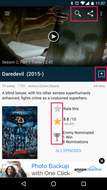
While the navigation drawer seems to use the proper icons, many other icons in the content are not consistent with them. Icons like share, search, bookmark, star are all available for free from Google.
Keylines
Most of the components in the Material world are aligned to an 8dp square baseline grid, and with that there is some specific keylines established to ensure all of the content and components have some breathing space from the edges, as well as achieving overall visual balance/harmony.

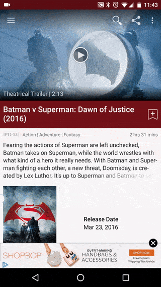
In IMDb app, they ignored the most common keylines – the 16dp keylines from the left/right edges, hence the contents can be seen getting too close to the edges, causing an imbalance layout.
There is one thing they did it right though – the trailer section is using the suggested ratio keyline of 16:9.
Loading Activity
Loading is always one of the most uninteresting interaction patterns in apps, but yet it has to be there due to numerous factor e.g. connection speed, content size, processor performance etc., however in any case, if content loading is going to happen, it should be happen in a simple way, and elegantly. Below is a quote from the design guideline that sum it all:
Minimize visual changes that occur while your app loads content by representing each operation with a single activity indicator.

In IMDb app, the content loading is pretty badly done in a way that it feels broken before everything is loaded. The above screenshots are what I saw when I try to access the details view for this movie – components are moving around as the content is loaded (look at that movie poster) with tons of empty white spaces, and when everything is loaded, they just appear instantly pushing other components away – which feels slow and broken.
I am not sure if this is some kind of technical limitation/issue, but if most of the components are not ready to be displayed, they can simply use the activity circle as the loading indicator, and when everything is ready, show them to the user with some simple transitional effects.
Typography
Typography is often one of the most ignored design details in many app design, but yet words are one of the most important components in UI design for communication purposes.
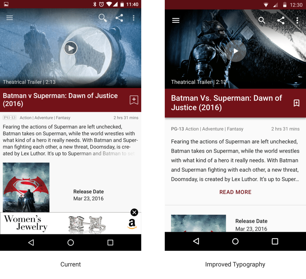
In the current IMDb app, there isn’t any deadly mistake in terms of typography, but if we tweak the text style and line height for some of the content, they can help improving the overall impression of the content, allowing the important content to be emphasized (movie title), and better readability (movie description).
This is what I did – tweaked the movie title to Title style (Medium, 20sp) and the line height of the movie description to 24dp.
No detail is too small
Every little detail counts in design, and all of them collectively help to differentiate between good and bad design. It’s important to be aware that sometimes a little design details can make or break a user experience using your product.
To complete the rant, I have spent some time to mock things up on the design issues that I mentioned above:

 #androiduiux
This is what I call proper evaluation of an app! It is the little details that make an app stand up from the crowd. The guidelines exist for a reason and following them (but not having them as the holy grail of design) can be amazingly useful.
Keep posting such articles about details of well-known apps, it makes us developers more aware of the things that we should have in mind 🙂
Thanks a lot for your comment!
Here, I found a true designer.
Great job! Love the work you’ve done with the redesign 😀. Out of curiosity, what tool did you use for the animation mockup? Pixate?
Hey Mathieu,
Thanks! I am using Principle for it, my go-to interaction and animation mockup nowadays 🙂
Taylor
Hi Taylor, nice in depth view.
But one question: What’s wrong with the share icon? The material one is still the same as it used be; as the one used here. I don’t get it.
Hey Danny,
Thanks!
As for the share icon, it’s mainly the icon size itself that is not consistent with the recommended metric – in Material Design, the system icon content is limited to the 20dpx20dp live area to ensure there is enough breathing space from the borders, as well as achieving visual balance when it is placing together with other icons. The one used in the current IMDb app is the icon from the Holo Design era, which doesn’t conform to the 20dp live area guideline.
http://www.google.com/design/spec/style/icons.html#icons-system-icons
Taylor
Hi Taylor,
That’s always a pleasure to read your articles. I just have a small remark regarding your mock of the interface.
You told on the “Toolbar” paragraph that they should show a bookmark icon into the toolbar when it is disappearing and I don’t see it on your wonderful GIF animation. Can you at least explain how you would see it appearing on the toolbar?
Cheers
Hey Eyal,
Thanks! Actually it is just a simple appear of the bookmark icon on the top toolbar when the bookmark icon at the title bar disappear. So it just a simple fade out of the bookmark at title bar (together with the title) as per the animated mock up, and fade in/instant appear of the bookmark icon at the toolbar.
Hope it’s clear 😛
Taylor