
Yahoo! Weather app just got updated and I must say it is a very nice and well done app, visually. However, if you really care about your Android users, you would have iron out some fundamental design issue (menu button of shame, anyone?) before publishing it – I would not go into more details about all the design issues, Juhani’s article has already highlighted all the design issues we saw as an Android Designer, and even offers fixes for them.
So in this rather short post, I would like to share how I would further improve Yahoo! Weather app with better Android UX:
- Use Fading Action Bar
- Use Official Navigation Drawer
- Place Refresh button on the Action Bar (Refresh is far more important action than Add Location. Pull-to-Refresh? Very bad discoverability)
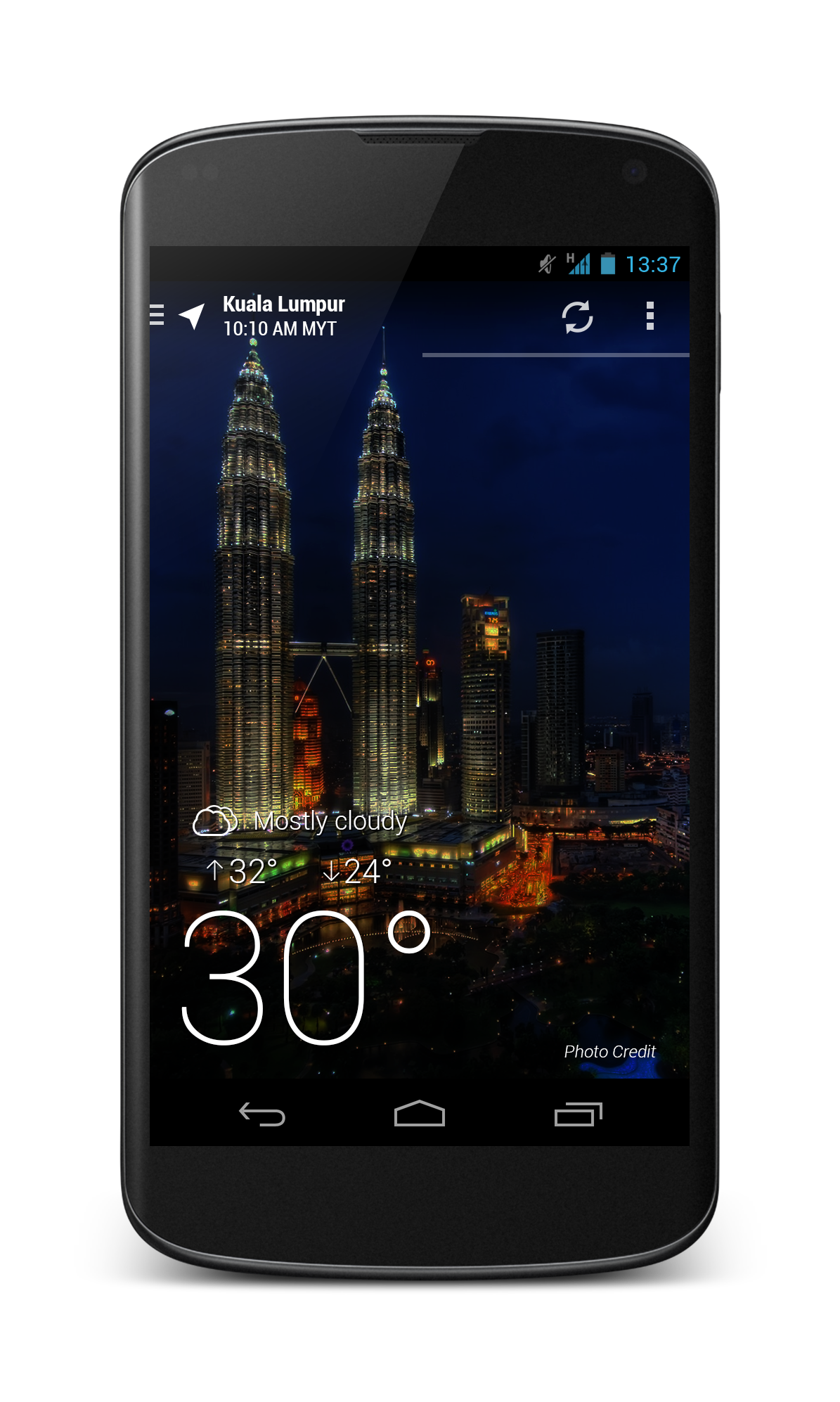
- Visual cue for pages (You can see that below the fading action bar – it indicates that there are 2 locations/pages)
- Removed the Menu Button of Shame
- Notification Bar always shown
- Settings, Rating etc – All placed in Overflow Menu
- Locations come first in Navigation Drawer (It’s a weather app, who want to sign in to use it?)
- Highlight the current selected location
- Removed all advertisement about other Yahoo! app (Is it really needed? I don’t believe I have ever see the advertisement about Google Keep app in Gmail app.)

What do you think? Better UX or simply nitpicking?

Better. The nitpicking is important. The papercuts determine if it is a well or badly done app, major issues just lead to users not using it at all; the polish is an important distinction criterion today.
So I agree with everything – except for the removal of the advertisement for other Yahoo apps. This is not an UX issue, it is a business decision. Of course I want ad free apps for free, and I am also not sure that this kind of advertisement works. But the product policy is completely a business decision; design, UX, programming have to follow this decision, work with it, make the best of it, or communicate early in the development process that some ideas are not feasible. But when the decision for cross marketing is done (and it could easily be the sole reason for the existence of the app at all) then a UX designer can not and should not try to work around or against it.
Far better UX !
And there’s also a lack for a Dashclock extension.
I’m just a regular user, not a designer or developer, and I hate the “uncanny valley” effect that happens when apps are badly ported to a new platform. I’m *glad* to see that Holo is finally starting to become entrenched enough that even beautiful apps that work well are getting flak for not conforming to the UI guidelines.
Sometimes, standard is better than “better”.
Do we need a refresh button at all? We are in 2013 right? Yahoo should be able to update it automatically when there is a whether update. They should not send every whether update instantly to the phone because that would be battery inefficient. But instead, they can register and send the updates immediately when the app is open.