Android UI Design Kit for Google Slides 1.0 [Free Template]

Google Slides UI Design Kit 1.0

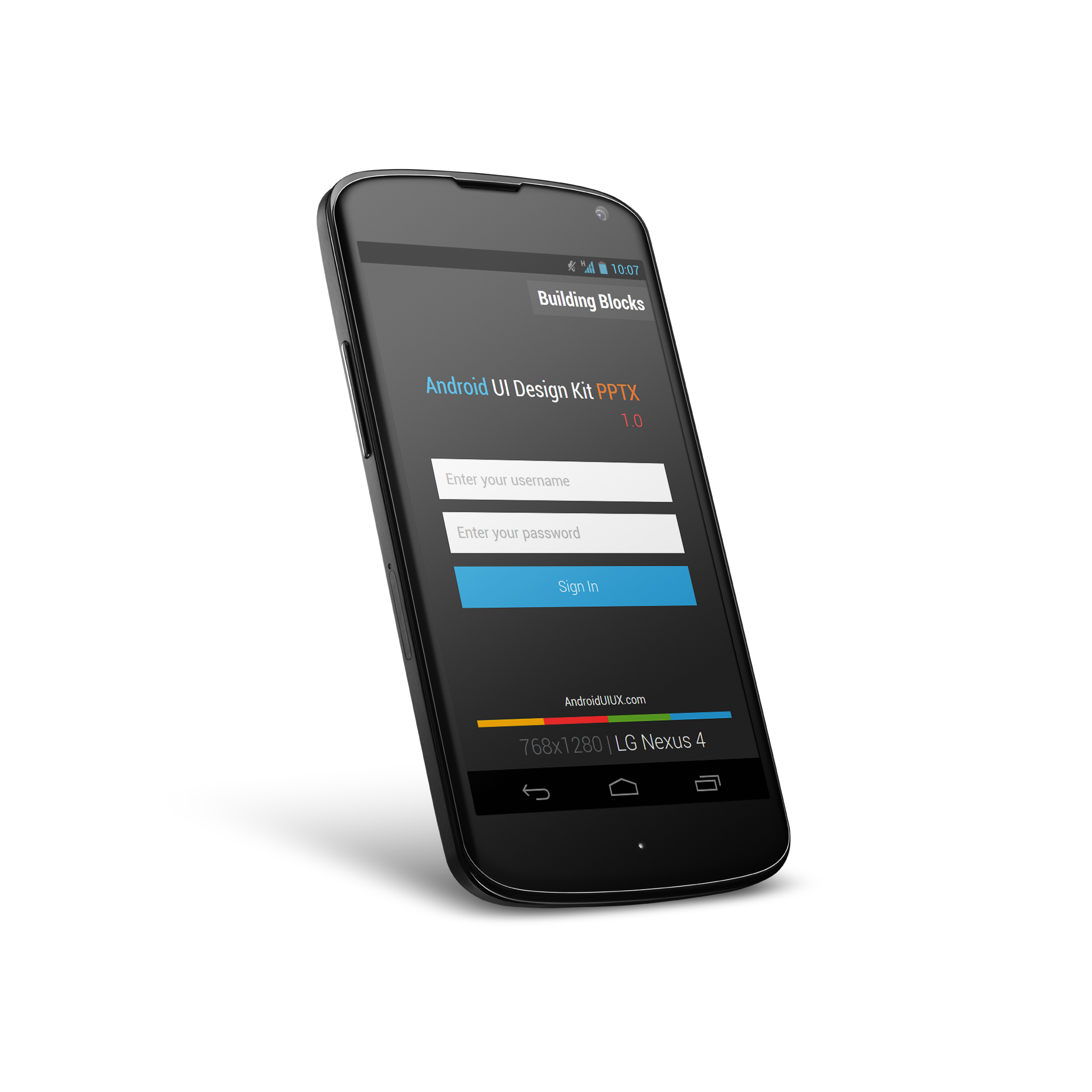
After I published Android UI Design Kit for Microsoft Powerpoint last month, I have gotten some really nice feedback about the usefulness of the design kit in a tool that they are easily familiar with, and some of them show interest in a Google Slides version. I had a look into Google Slides back then, and I was decided not to do a Slides version due to the lack of Roboto font available in Google Slides (perhaps I missed it back then, but I didn’t see any other extra fonts).

After the Google I/O, I discovered that it is possible to use Roboto font (only Regular and Condensed, but they are already sufficient for mock up purpose) in Google Slides, therefore I went ahead and try to convert my PPTX Design Kit to Google Slides, thinking that it will be just a 10 minutes work – turn out it wasn’t that trivial.

Apart from missing UI elements and text misalignment which can be easily fixed, the main issue is about the output. When I export a mock up screen from Google Slides to PNG format, it always seems to be slightly off from the ideal resolution (768×1280), and in Google Slides, there is no option for the user to change the slide size. So I ended up spending the whole morning doing micro-adjustment on the slide size in Microsoft Office, then upload to Google Drive and convert it to Slides, in order to find the best fit size that can export the screen at perfect resolution.

What’s inside?

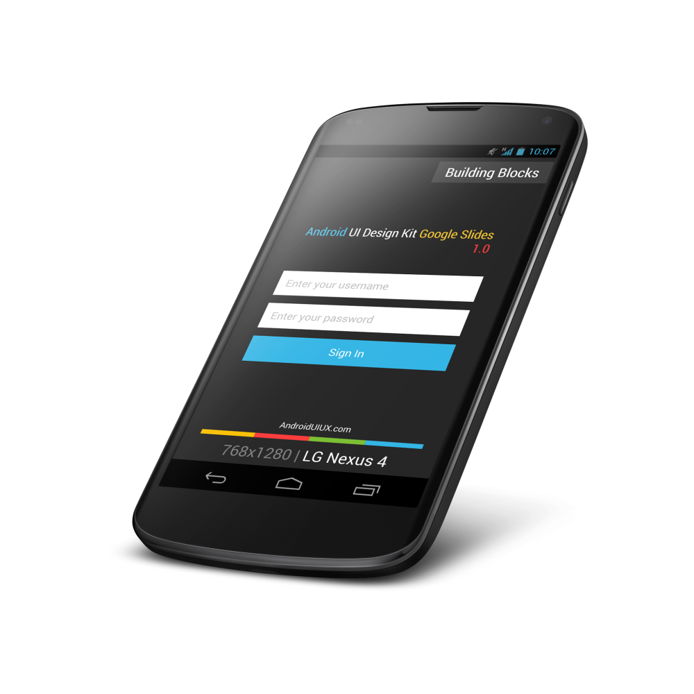
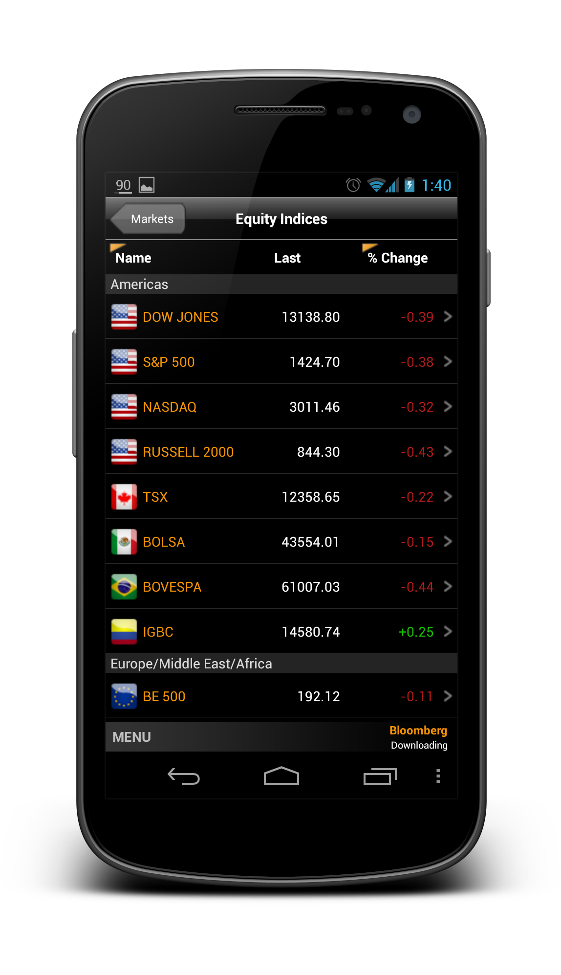
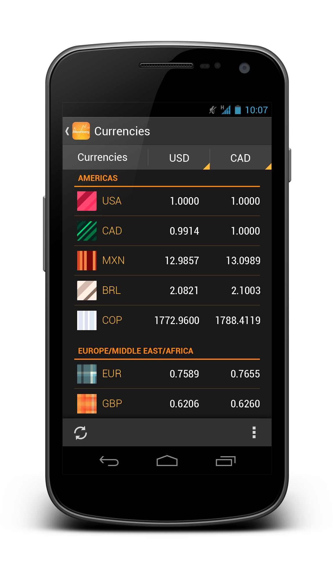
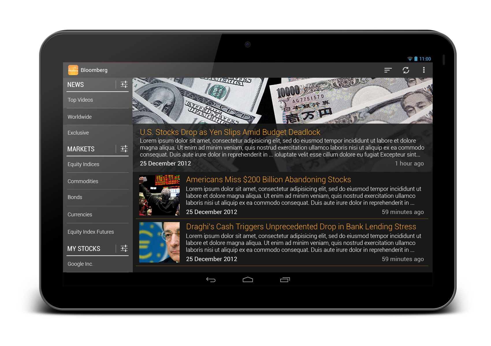
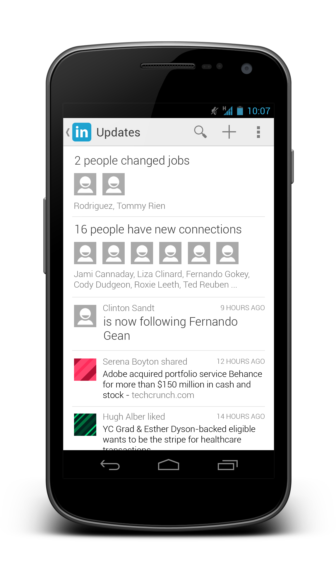
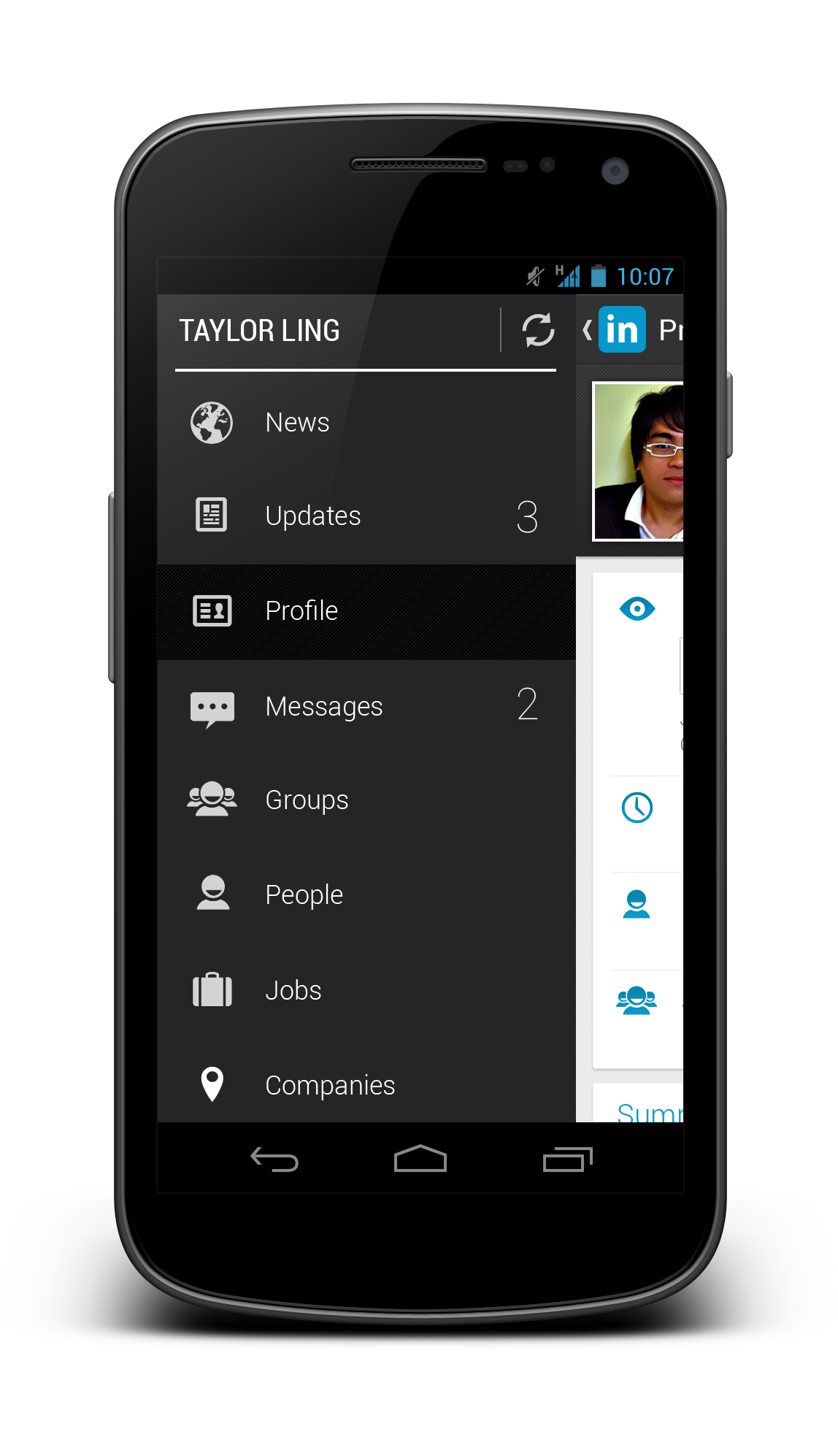
Similar to the Powerpoint version, most of the building blocks (Action Bar, Buttons, Radio Buttons, Progress Bar etc.) are inside this Design Kit, including the new Navigation Drawer indicator. This Design Kit is highly optimized for Google Slides in order to have a proper output of image resolution. It has been tested with offline mode, so you can work on some app design mock ups whenever you want!

Download

I have uploaded it to Google Docs Template so you can immediately use the template in Google Slides (Please access the template on desktop browser, or if you are on mobile, request a desktop site. Apparently Google Docs Template page doesn’t work with Mobile Browser Agent): Android UI Design Kit for Google Slides. Don’t forget to rate and share it if you find it useful!

Alternative link without Sign In: Android UI Design Kit for Google Slides Preview

Android UI Design Kit PPTX 1.0 [Free Download]

Last month I published Android UI Design Kit PSD 4.2 that can be used as a base for Android Designers/Developers to design Android app in Photoshop, and since then it has been accumulated a total of 8,100+ downloads within a month. It shows that there are more and more people interested in Android Design, which is something that I am really excited to see.

Nexus 4

Nevertheless, for quite some time, I have been thinking to have an alternative to allow even more people to experience Android Design, and today, I am happy to announce an Android UI Design Kit in Powerpoint format has been released, which is created using Microsoft Powerpoint 2013 (Windows).

Why Microsoft Powerpoint?

Microsoft Powerpoint, of course, doesn’t meant to be an UI design tool, but surprisingly there are many people using it to create nice UI mock up (and they can be interactive too), due to the fact that it supports layering and grouping, plus it has vector shapes, which are sufficient to create some nice mock up. Obviously, it is still pretty limited comparing to Adobe Photoshop (or any other advanced design applications), but heck, I am pretty sure there are more people owning Microsoft Powerpoint compared to Adobe Photoshop, so designing Android app is probably just a click away.

I understand that the Apple Keynote seems to be a better tool for such UI design task, but due to the fact that I am using Windows primarily, so I created the design kit in Microsoft Powerpoint.

Layers

What’s inside?

Most of the building blocks (Action Bar, Buttons, Radio Buttons, Progress Bar etc.) should have been included in this PPTX Design Kit. Do let me know if you notice otherwise.

I have also included a slide of Google Now made (almost) entirely with Microsoft Powerpoint to show some awesome things that can be done without needing any advanced tools.

How to use it?

Really simple. Just extract the downloaded archive, then open the .pptx file, and you can start designing right away. It might take some time to see how’s the layering and grouping works, but they should be pretty simple to learn.  Don’t hesitate to leave a comment if you need some help in achieving some elements that you saw in the design template.

Remember to install the Roboto Font before using this design template. Almost all of the texts in the design template used fonts in Roboto Family.

This PPTX Design Kit is made with the specific dimension at 96dpi, when you export the screens to a .png file, it will be exported at the resolution of 768×1280 – the resolution of Nexus 4 screen. You can then frame the exported png file at the Device Art Generator and you are ready to impress people with your design!

Note: It is meant to be used with Windows version of Microsoft Powerpoint. Nevertheless, it is usable on Powerpoint for Mac, although the font type used have to be replaced with the proper one (due to the different font naming system). It can also be used in Apple Keynote, however, you need to change the slide size to 768×1280 manually before the design and export the screen.

Download

As always, it can be downloaded from my MediaFire account: Android UI Design Kit PPTX 1.0. If you need some Action Bar icons during the design, download Action Bar Icon Pack #1, the xhdpi icon fits perfectly with this Design Kit.

Now (almost) anyone can experience Android Design. Happy Android Designing!

Android UI Design Kit PSD 4.2 [Free Download]

In August 2012, Android ICS/JB Photoshop GUI Design Kit 3.0 was published with some new Jelly Bean UI elements, and until today, the Design Kit has been downloaded over 21,000 times since the very first version back in December 2011 – not a huge number, but it is putting a smile on my face. It’s really nice to see there are many designers interested in Android Design and used the Design Kit to kick-start their design work in Android app. A big thank you to everyone that is using the design kit and I really hope it helps in your Android app design workflow in some way.

Design Kit 4.2 Preview

And today, I have finally updated the Android UI Design Kit PSD to version 4.2, with the size of Nexus 4 screen resolution (768×1280), as requested by many supporters. Besides the resolution update, I have also added a few new UI elements into the Design Kit:

  • Cards (Google Now)
  • Crouton
  • Drawer Menu
  • Quick Return
  • Undo Bar
  • Gestures

Other than that, all the UI elements in the Design Kit are now made pixel-perfect (I hope I didn’t miss any of them), along with some corrections on the font size and UI element. I have removed the Application Design Templates (ADT) PSD file that is included in 3.0 because I think it might not as useful as I think, but do let me know if you are using it and you wish to see an update for that as well.

Download

Android UI Design Kit 4.3 for Photoshop and GIMP is here!

Yes Life for Android Redesigned

It’s been a long time since my last blog entry, but definitely I am still working on tons of Android Design (in private) and they are often very inspiring, which I hope I can share them in the near future if it’s possible.

Today I would just like to share some redesigns for an app that is local to my home country. The app called Yes Life, which basically an app that allows the user to call and send SMS to any local number from anywhere around the world with internet connection. Below are some screens from the current app:

Yes_Old_Dialer

Yes_Old_SMS

There are few things in the app motivated the redesign:

  • Almost 90% iOS UI Style (and ugly)
  • (Very) Bad navigation system
  • Usability issue (For example, online/offline status only in the Dialer page)
  • Buggy (which unfortunately cannot be solved by a redesign)
  • Missed the opportunity to enhance the branding 

To address these few issues that I see, I did some redesign on some screens with Holo UI approach (of course!) with the following changes:

  • Designed with Holo UI approach
  • Used (swipe-able) tab navigation
  • Used Action Bar (for better context actions and navigation)
  • Show connection status in every screens (which is important for such app)
  • Used light/white theme (for branding enhancement)

Below shows a few redesigned screens:

DialerSMSsSMS Detail

What do you think?

I hope this gives some idea on the importance of the app design in branding enhancement. If you have excellent solutions and branding, but decided to give your user bad products, it doesn’t do good on anything except getting rejected by the users.

Design is not just what it looks like and feels like. Design is how it works.

Bloomberg Redesigned

Bloomberg – another app that I wanted to redesign so long, because the app is pretty badly designed ever since day one. It is almost an exact port of the iOS version, with a really strange ‘MENU’ button at the bottom of the app,  and the deadly legacy menu button. Below show some shots from the current version for comparison:

Old_News

Old_Equity

Old_Stock Details

So what if the app is redesigned with the Holo UI approaches and full Android experience? Below are some shots that I have redesigned:

Worldwide News

framed_Slide In Menu

Equity Indices

Currencies

Bonds

My Stocks

Stock Details

And also some redesigns for tablet version:

Tablet - News

Tablet - MarketsWhat do you think? Do you like the redesigns? Don’t hesitate to shot in the comment box!

Printable A4 Screen Flow Sketch Template [Free Download]

Featured

Update 07 January 2013: Added Screen Flow Sketch Template for Tablet (Nexus 10). Download link below.

During the new year of 2013, I have released a PSD template for wireframe/mock up screen flow, which I hope can help a little bit in creating an app screen flow easily in digital format. And today, considering there are still many people love to do sketching for wireframe/mock up, I have created a Printable A4 Screen Flow Sketch Template in PDF Format, so you can easily sketch the screen flow on the paper, and because each screen is considerably small, you only need to focus on the main interaction area for the flow, so details are not needed.

I strongly recommended to use this one to sketch out your app idea before going into details since the navigation/screen flow will be there when you are expanding your idea, eliminating some confused/undetermined navigation between screen.

Printing Tips

  • Use Fit option to print (Don’t use exact size)
  • Print in Black and White
  • Use High Quality (This won’t use much ink)

Download

I have placed it in my Mediafire account and it’s free to download:

If you have any issue downloading it, let me know and I will send you a copy.

Wireframe Screen Flow Template [Free Download]

Update: I’ve updated the template to 1.0.1 to fix an issue that all screens will be using the same content. Have to blame myself for the lazy duplication. At the same time, Wireframe Screen Flow Template using Nexus 4 is also available now.

Inspired by a question from the group member within a private G+ community – Android Designers, I decided to spend some time to create a Wireframe Screen Flow Template for Adobe Photoshop that can help Android Developers/Designers to create a complete screen flow for wireframes or mockups. Below is the preview of the template that I have made:

Wireframe Screen Flow Template 1.0

What’s inside

  • 12 mock up screens (They are smart objects so it’s very easy to drag-and-drop your mock ups)
  • Gestures
  • Screen flow arrows (One level down/up and two levels down/up)

How to use

  1. Create all your mock ups or wireframes in 1280×720 or 1280×768 (Photoshop GUI Design Kit recommended) including the Nav Bar and Status Bar. Save them as png.
  2. In the template, select one of the mock up screen folder. Look for Mock Up Screen (EDIT CONTENT). Right click on it then select Edit Contents.
  3. In the new screen, drag-and-drop your mock up. It should fit nicely. Ctrl+S to save, then close it. You should see the mock up appears in the screen flow template.
  4. Select your preferred gestures and screen flow arrows within those folders for a complete screen flow mock up.

Download

I have placed it to Mediafire and it is free to download:

If you have any issue downloading it, let me know and I will send you a copy.

This work is licensed under the Creative Commons Attribution-ShareAlike 3.0 Unported License. To view a copy of this license, visit http://creativecommons.org/licenses/by-sa/3.0/ or send a letter to Creative Commons, 444 Castro Street, Suite 900, Mountain View, California, 94041, USA.

LinkedIn Redesigned

LinkedIn app is one of the app that I wanted to redesign so badly that I hate it when I am using it (only for accepting request and replying message). It might looks good 2-3 years back, but not anymore today.

There are a few reasons that I think this app deserve a complete redesign:

  • Resemble iOS version almost completely 
  • Lack of navigation in the app
  • Unnecessary skeuomorphism
  • Legacy menu button
  • Badly designed UI (for example, the dashboard give really limited information)

Below I included some screenshots from the current app:

Old_Profile Old_Updates Old_Dashboard

Using the Holo UI approaches, I have redesigned a few screens that fit nicely in today’s Android devices. I have replaced the dashboard UI with the Sliding Menu due to the huge number of sections available in the app. Check them out below:

Linked In - Slide Menu

Linked In - Updates

Linked In - Profile

Linked In - Profile 2

Linked In - Shared Item

Linked In - Other Profile

Update 28/12/2012: After taking some feedback from my G+ post, I have decided to give it another revision for better LinkedIn branding, and below are some updated shots. What’s changed:

  • Action Bar is in dark grey color to give a distinct UI layers
  • Added frame for photos
  • Used Card UI for details
  • Added some iconography
  • Increase the size of the sliding menu and smaller icons
  • Added Share button besides Invite to Connect button

Linked In - Profile

Linked In - Slide Menu

Linked In - Other Profile

What do you think about my redesign? Do you like them? Shot me your comments or suggestions!

Android UI/UX Tips #5

Another month, another UI/UX Tips article!  This time I looked into the swiping action between tabs, proper handling of multiple notifications, proper dialog actions, and some smart use of colors to indicate different states.

Swiping between Tabs, Please

Tab Swiping

I think this has been mentioned many times by Android Developers Team, as well as some Android Designers. If you are using tabs in your app, please please please, make sure they support the swipe gesture. It is a system-level interaction pattern, and it is clearly mentioned in the Android Design Guideline. Your users won’t be happy to realize that they can’t swipe to change tabs, which is extremely useful when the device is used with one hand.

Properly Handle Multiple Notifications

Multiple Notification

In a previous version of Google Drive, when you try to upload multiple files in a session, you will get the notification spams (shown in above image), fortunately, it has been fixed in the latest update. If your app can create multiple notifications with some user actions, please make sure that they are handled properly – group them and show the relevant information.

Proper Dialog Actions

Dialog Actions

Sometimes developers/designers tend to overlook the actions available to the user in a dialog. In this shown example, when I was shown with this dialog, I have no way to confirm my selection of font unless I press the Cancel button. This is very confusing for the user,  and definitely not designed according to the Android Design Guideline. Ensure that whenever there is such selection dialog, dismissive and affirmative action buttons are there for the user.

Smart Use of Color for State Indication

Color 1
Color 4
Color 3

Above shows some great examples from recent updates for Google Current and Google+. These are very subtle, yet informative approaches to notify the user about the state, so do consider for such approaches whenever your app requires to give the user some information/feedback regarding the state of something in the app. I really like these!

That’s it for this Android UI/UX Tips! Feel free to share around if you find these information useful, and as always, hit me with comments if you have any.

Movie Ticketing App Redesigned

Last month Roman Nurik posted a wizards pattern for complex user inputs, and I have now used it for my redesign of a local (Malaysia) movie ticketing app, which is definitely a perfect match (I think). Hopefully this redesign can inspire any developers or designers that are looking to create/redesign movie ticketing app.

Why I am redesigning this app? I have placed a few shots below to briefly show the user interface of the app to explain that. Completely implemented with iOS look and feel, legacy menu button, badly-resized images, in-app advertisement (about themselves),  bad user interaction design – everything is so wrong. Give it a try if you want to understand my frustrations.

Old_Promotion Old_Cinema

I think many will agree with me – app that just work without proper UI/UX design is no longer enough to stand out and compete with thousands of other apps in the market.

Completely redesigned with Holo UI approach, the movie ticketing app is aimed to provide great and easy ticketing service with sufficient information about cinemas and movies. Here’s my take (It’s a long page!):

Promotion Cinema List

Cinema - Show Date

Cinema - MoviesCinema - Show Time

Cinema - Tickets

Cinema - Seat Selection

Cinema - Review

Cinema - Payment

Fast Ticket

Purchased Ticket

What do you think about my redesign? Shot me in the comments if you have any suggestions/feedback/critique!