Preview Your iOS/Android App Icon Design with Iconpreview.com

iconpreview.com

Most of the time, besides UI design, most designers will be tasked to design the launcher icon to go with the app, and I think there is no better way to preview the design than having them shown at the real device home screen (at least for me).

Which is why I have been working with my friend, Henry Lim (a talented web tech GDE) to create a simple web app – iconpreview.com, which works for both iOS and Android (only Android 7.1 and below, adaptive icon not supported).

It’s really simple – just navigate to iconpreview.com, select your launcher icon design with appropriate format and size (PNG, 192px×192px), give it a name, upload, and it will generate a link and QR code for your uploaded icon. Browse to the page with Safari/Chrome, then ‘Add to Home Screen’. Voila!

Quick words on how it works

iOS

For iOS, it’s rather simple. It is simply a web shortcut, so it works just like the usual web shortcut in iOS. So you just need to upload a complete square icon (just like how you provide them to Apple), and the masking will be done by the system.

Android

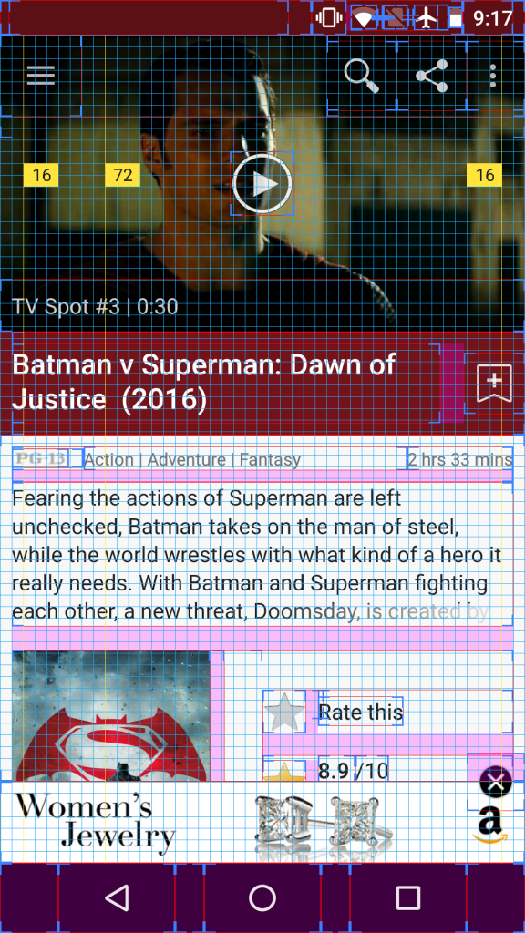
Android is a little bit tricky. Initially, it was meant to be a web shortcut as well, but if we simply add it to the home screen via Chrome, there will be a chrome shortcut icon added to the bottom right corner, which is obviously less than ideal for icon design preview.

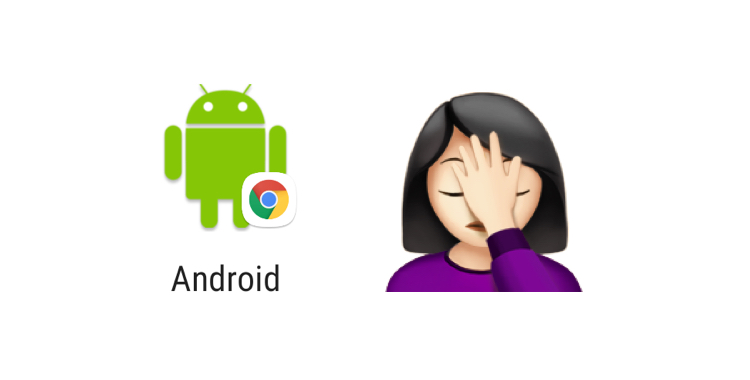
We then look for other ways that can fix this issue, and Henry came up with a brilliant thought of having it added as a simple Progressive Web App (PWA), and through this way, the icon design can be previewed nicely at the home screen. The only caveat is that each time you add the new icon to the home screen, it is treated as an app so to remove it, you will need to uninstall it, as opposed to remove the shortcut from the home screen. We are satisfied with the solution though 🙂

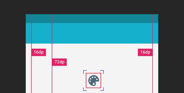
Note on Adaptive Icon: The icon preview, unfortunately, doesn’t work on Android 8.0+ that uses adaptive icon because PWA doesn’t use the Adaptive Icon system (at least from what I tried, if you know how to do it better, let us know!), so the icon will just be placed in the center of a white icon base. If you want to preview how the adaptive app icon will feel at the home screen, you need to have a device running 7.1 or below, then upload the icon with the mask already applied.

It’s currently in Beta as we aren’t sure if there will be any more issue, but feel free to share it out! iconpreview.com

#DesignProtip – Keyline Pushing app + Layout Bound

Designprotip.png

I often got asked how do I inspect an app from design perspective, especially on the layout, alignment, keylines etc., so I thought to share this in my blog. Sometimes we are able to spot some issues by just looking at it, but with some nifty tools, the design inspection can be done much easier.

Below screenshot is what I usually see when I do a design pass on the static design implementation. It’s an IMDb app screenshot with keyline grid + layout bound shown, which is very useful to spot misaligned elements and incorrect paddings.

IMDb in Keyline Pushing and Layout Bound

Tools

  1. Keyline Pushing app by Faiz Malkani – This awesome free app will print the 8dp gridlines on your screen which have the proper keylines recommended in Material Design. It also has some other gridlines like 4dp typographic grid which can be very useful sometimes. (Update: Another new app called Material Cue can do the same thing as well)
  2. Show Layout Bound option in Developer Options –  This will show the bound of each element in blue lines (clip bounds), red lines (optical bounds) and pink area (margins). This helps a lot to spot unnecessary padding or misaligned bound. To access this option, turn on developer mode in Android. Then Settings > Developer options > Show layout bounds.

How this can help Android developers?

Few months back I introduced these 2 tools to my developer friends, and below are their comments on this tip:

It is useful to see the view paddings and margins, and immediately understand which view is causing the keyline misalignment. However, for standard views, paddings and margins have an expected behaviour so you can fix the issues without the layout bounds. Layout bound option can be really useful for custom views and custom groupviews. For these views, you can do whatever you want with the paddings, so having the layout bounds visible helps understand how your view occupy the space, which is useful to have the correct keylines.

It helped me mostly to check that clip to children works to prevent shadow, animation, and ripple effect cut-off. Also I am able to quickly check that all cards/pictures are correctly aligned based on the key line and the left/right edge of the layout bound. For layout bound, it helps to check that the touch target of images has been extended and is not only limited to the image edges. It also helps ensuring that some views ‘visibility’ are gone and not just set to invisible. With keyline pushing app, it is mainly to ensure that the Material Design spec has been fulfilled.

Happy designing and developing!


No Detail Is Too Small

Design Details

It is still pretty surprising that with the Material Design guidelines available for quite some time (close to 2 years!), there are still many Android apps ignoring the basics of Material Design. Sure, the guideline isn’t meant as a complete design checklist, but many basic design details (keylines, elevation, UI elements etc.) and common interaction patterns (Nav Drawer, Bottom Sheet etc.) shouldn’t be ignored if the app is using Material Design as the design language.

Today the victim is the new (?) IMDb app, which I will show what’s wrong with the app in terms of design (they need to work on performance as well, by the way) and which part of the design guideline is meant to address the mentioned issue. Continue reading

Beware of Hidden Rules


hidden_rules

Just a quick post to rant about an usability issue I experienced today.

In software development, there are always tons of hidden rules and logics that we made internally for better usability (or may be worse?) and minimizing potential information overload for the user, but if it’s something involved with certain level of user expectation (e.g. user reasonably expecting things should work a certain way), it is always a good idea to ensure that the hidden rules of ours are sufficiently communicated to the user through feedforward or feedback, depending on the situation.

Out of Sight, Out of Mind (and Out of Reach)

Case in point – the funny (may be not so funny) logic in Dashlane that no user can understand (or realize). Continue reading

The Fabulous Goes Material

After 264 emails with tons of exchanges, 200+ mock screens, 30+ interaction prototypes, 9 months+, 17156 times of revisions (OK, I made this up) – we finally have The Fabulous app with Material Design pushed to the public on the early September, and we are happy that we reaches our first milestone for the redesign – an honourable feature in Google Play Store under New + Updated Apps category.

Feature in Play Store

You probably have not heard about The Fabulous – It’s a Health and Fitness app uses scientific-based approaches to help people in reaching their health goal through a carefully crafted step-by-step program. We purposefully crafted the journey based on the user goal by slowly showing them relevant information and motivates them during the process, and hopefully get them to form some healthy habits at the end of the journey.

Continue reading

Make the right FAB

Make the right FAB

Floating Action Button, or, in short, FAB, is one of the unique UI element in Material Design for primary/promoted action for a particular screen. Since it is a frequently accessed UI element in a given screen, I think it’s important to make the FAB right in every details. However, there are a number of apps doesn’t have the right FAB as specced in the Material Design Guideline, which also included some of the Google apps (I know!).

Continue reading

#AndroidDev Interview Series – Jack Underwood

Interview-No-2It’s been a while since the first interview with Ryan Harter, and today let’s continue the series with Jack Underwood.

Jack is a young indie developer that never say no to challenges – how do I know it? I previously worked with Jack for a couple of projects like Now Playing, Reverse Dictionary, and Today Calendar and Widget (pre-Material Design era), and we are really liking that push-and-pull interaction between us during the development.

Without further ado, let’s start with the interview!

Continue reading

UI Animation in Photoshop – Tutorial #2

Blog-Pic

In the first UI Animation in Photoshop tutorial, I have shown the way to do simple animations in Photoshop like moving, scaling and style changing – if you are new to this and haven’t check that out yet, I recommend you to look into Tutorial #1 before this.

In this second tutorial, I will share my experiences in applying easing into the animation made with Photoshop. Special thanks to Jovie Brett Bardoles for sharing his manual way of applying easing in his animations, which inspire me to explore and dig into the Timeline feature in Photoshop.

Continue reading