
LinkedIn app is one of the app that I wanted to redesign so badly that I hate it when I am using it (only for accepting request and replying message). It might looks good 2-3 years back, but not anymore today.
There are a few reasons that I think this app deserve a complete redesign:
- Resemble iOS version almost completely
- Lack of navigation in the app
- Unnecessary skeuomorphism
- Legacy menu button
- Badly designed UI (for example, the dashboard give really limited information)
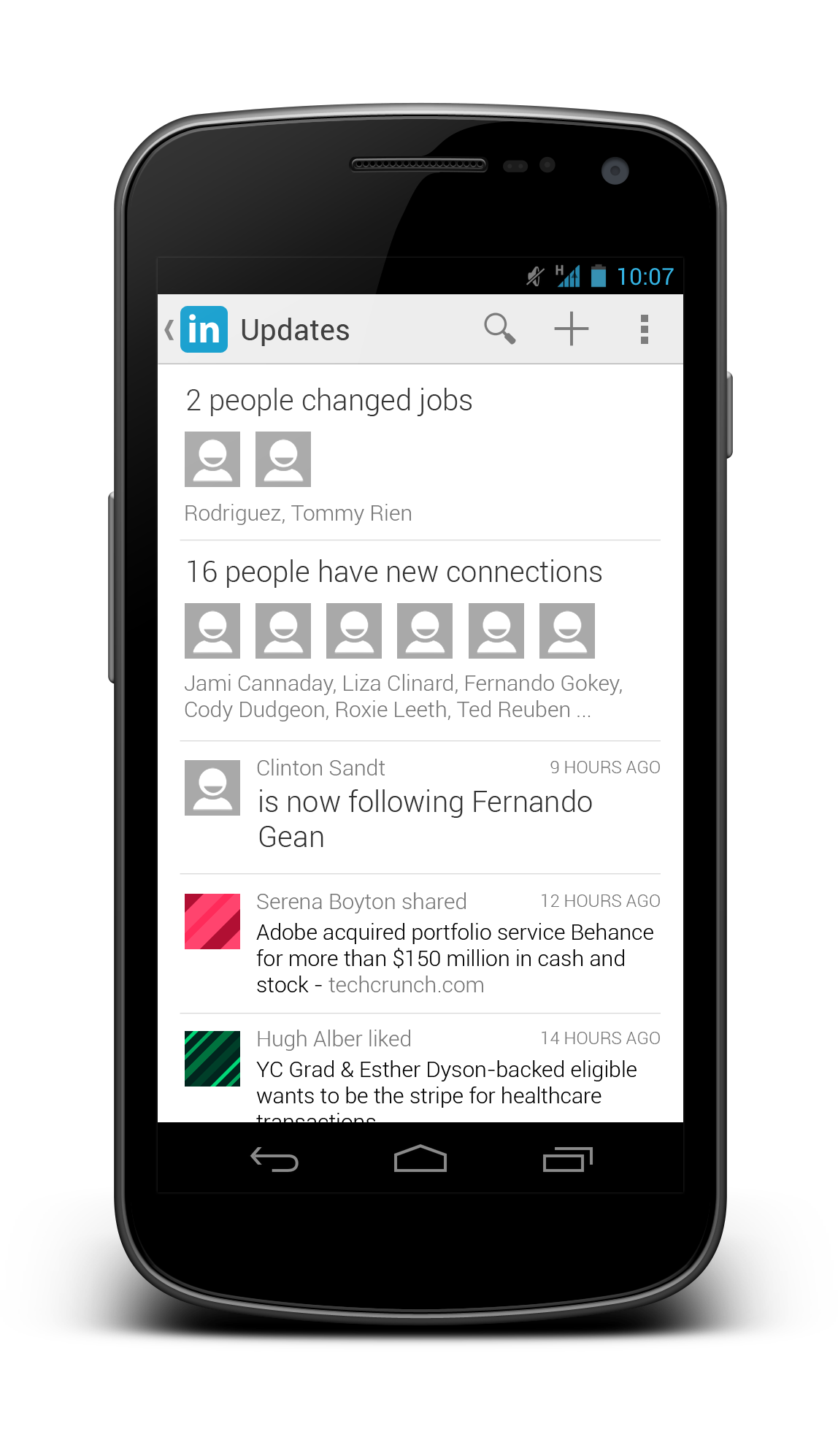
Below I included some screenshots from the current app:


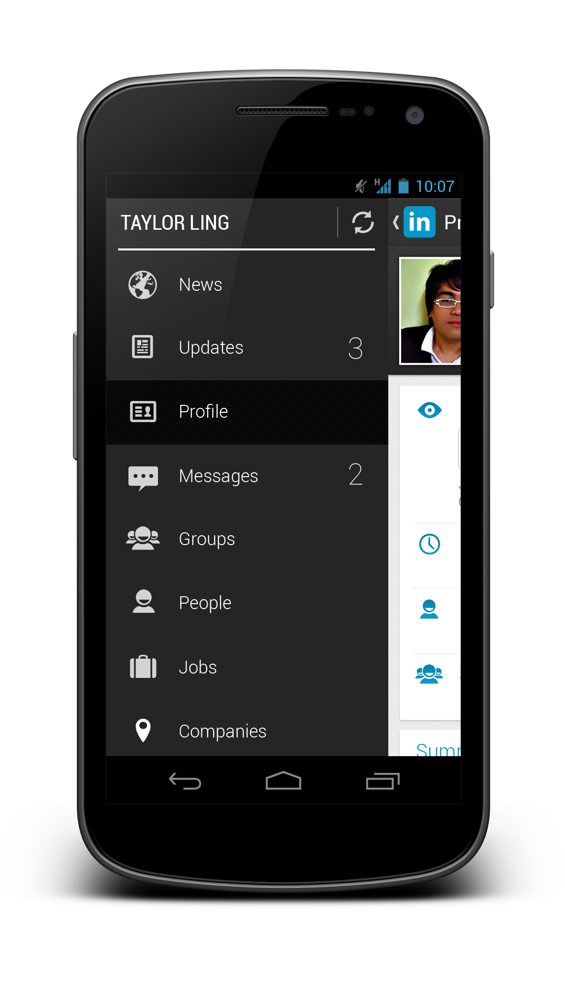
Using the Holo UI approaches, I have redesigned a few screens that fit nicely in today’s Android devices. I have replaced the dashboard UI with the Sliding Menu due to the huge number of sections available in the app. Check them out below:


Update 28/12/2012: After taking some feedback from my G+ post, I have decided to give it another revision for better LinkedIn branding, and below are some updated shots. What’s changed:
- Action Bar is in dark grey color to give a distinct UI layers
- Added frame for photos
- Used Card UI for details
- Added some iconography
- Increase the size of the sliding menu and smaller icons
- Added Share button besides Invite to Connect button


What do you think about my redesign? Do you like them? Shot me your comments or suggestions!
