
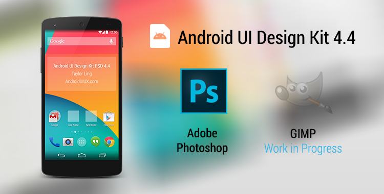
Happy New Year folks! In the past few weeks, I have worked slowly on the new Android UI Design Kit for Photoshop 4.4, which is a Nexus 5 version, and today I am happy to announce that it is ready! This time it only comes with Photoshop version though, I am still working on the GIMP version, mainly on replacing the text layers (which I just found out recently the text layers from Photoshop won’t work in GIMP!). If there is any GIMP gurus would like to help out replacing the text layers, do let me know in the Comments section.
This update the Design Kit to Nexus 5 resolution (Portrait Mode – 1080×1920), with several new building blocks added in it.
What’s new in 4.4?
- Action Bar – PullToRefresh
- Action Bar – NotBoring
- HoloGraphLibrary
- Scroll Bar
- Search Action Bar
- Contextual Action Bar
Other than that, every building blocks from the previous version are included, making it the most complete Design Kit to date.
Tips
- You must first install both Roboto and Roboto Slab fonts before using the Design Kit. It’s a must. If you doesn’t want to install them, you won’t be able to use the Design Kit at full potential.
- The recommended way to start designing is to use the Quick Start file, then Shift+Drag the required UI elements from the Building Block file
- Nexus 4 and Nexus 7 Design Kit is available in the previous version
Price
Free. As I mentioned previously, getting every designers to use this and create awesome high fidelity mock ups will already be a very good motivating factor.
However, if you think I deserve to have a cup of coffee from the work that I have done, you can always support me via Paypal, so that I can maintain the chakra to produce awesome stuffs for the community.

Download
As usual, the Design Kit is made available in my MediaFire account. Go get it and be awesome!
Android UI Design Kit for Photoshop 4.4 [Nexus 5] ~14MB
If you are using GIMP and wanted to use the WIP version, feel free!
 #androiduiux
Hey Taylor,
As always, your professionalism, consistency and sharing is much appreciated.
Quick question, it might have been asked already but Do you have any quick video tutorials on How-to use these .psd mock-ups for Photoshop newbies like me? May be quick work-flow by example of creating a sample mock-up will help as well.
Thank you and Happy new year!
Hey,
Sorry for the late reply. I will probably look into that in the future, but once you open up the .psd file in Photoshop, you should be able to get an idea how it can be used in the mock up flow 🙂
But don’t hesitate if you have any question.
Taylor Ling
thanx for sharing. your 4.3 has been very useful. and now, 4.4.
Did someone say GIMP ? 😉
Hey Ravi,
Yeap, I did mentioned that and there is a link to download it – though it’s not a full version that I hoped to release, but there are many other things for me to focused on, therefore I decided to postpone the optimization on the GIMP version, but it should still work without issue, just that you have to replace the text/shape layers yourself to ensure the editability.
Sorry about that.
Taylor Ling
Superb work. Thanks for sharing
I must say, apart from google you have the best resource on Android. I am new to mobile app design so still struggling a bit to understand. At first i couldnt find any wireframe templates for axure then i cannot comprehend the sizes and setting them up in photoshop from dp to pixels. I hope you can help me get started. Thanks.
Looking at google screen sizes: we have LDPI, MDPI, HDPI
320dp: a typical phone screen (240×320 ldpi, 320×480 mdpi, 480×800 hdpi, etc)
I thought i’d be setting up 3 versions in the following pixels:
ldpi = 180px x 240px
mdpi = 320 x 480px
hdpi = 720 x 1200px
Looking at your psd it is 1080 x 1920 which is Nexus 5 screen resolution in pixels but is that beyond a normal screen phone as mentioned by google or am i doing something wrong here.
Are we still keeping 48dp minimum for touch and 18dp side gap.
Your 16dp side gap translate to 48px in photoshop is it a different calculation than what i have been doing so far,
Thank you for your help
Murad
Hey Murad,
The template that I have now is meant for xxhdpi, which means 3 times of mdpi, which is the base dpi for Android devices. We probably won’t cover ldpi anymore and the assets will rescale itself for ldpi if the app is running on it.
Fairly simple, any measurement you do using this template is a 3x version of mdpi, so if a box size is 60px x 30px, that would mean 20dp x 10dp in development. Same goes for the type size, if it’s 66px, it means 22sp in development.
Do get yourself understand the concept around dp though, it will be beneficial for you in the long run.
Taylor Ling
Thank you for clearing it for me. Do you suggest to start with xxhdpi and scale it down for mdpi and hdpi. So we’ll end up with versions mdpi, hdpi, xhdpi and xxhdpi. I have seen a script that does it.
Is that how you would do it?
Thanks
Hey Murad,
That’s definitely how I do it 🙂
Taylor Ling
thanks.
Hi Taylor,
Great work I hope you will make a material version available soon.
I have a question about the Nexus5 psd. You wrote it’s meant for xxhdpi. When I look at the PSD is it 1080px x 1920px with a photoshop resolution of 72ppi.
On another website I read that 72 dpi can be related to an mdpi screen in Photoshop. Is it correct that xxhdpi should have a Photoshop ppi resolution of 3 x 72ppi = 216ppi or has the Photoshop ppi nothing to with a correct export of the different assets?
At the moment I am designing my 1st app, Can you explain your workflow when you have to design an app for both IOS and Android?
Thank you in advance,
Judi
Hey Judi,
You are right, I didn’t mention it specifically but if you would like to design in proper metrics (point = dp, pt = sp), then you should change the image size to 216ppi with 360×640 points. However, this should not affect the assets export. For the assets export, it still go by pixel at 72 dpi, so let say if you design an icon at 10dp x 10dp, so at mdpi is 10px x 10px, then hdpi is 15px x 15px, xhdpi is 20px x 20px, xxhdpi is 40px x 40px.
iOS is slightly different, but depends on your initial design size, you will need to make for 3 different size, 1x, 2x and 3x.
Taylor
Hi Taylor,
Thank you for your reply.
Do you mean the Photoshop ppi will always stay at 72 ppi when exporting assets even though you increased the Photoshop ppi to 144ppi when working in DP on a xhdpi design?
When you design an app you wrote that you start at the maximum density and scale down your assets. What do you recommend regarding the workflow when the app must be compatible for both low res and high resolutions? Starting low res and scale up to highres?
For high fidelity prototypes, what screen resolution and density do you recommend?
Thank you for advice 😉
Judi
Hey,
I think this article can help you 🙂
http://sebastien-gabriel.com/designers-guide-to-dpi/
It really depends the tool you used. Previously I was using Photoshop and thus, designing it at higher resolution make sense since sometimes I am using bitmap, but if you use Sketch, for example, designing at 1x is not a problem since most likely you will be using vectors, which can export to different sizes.
Taylor
Thanks for such a great UI kit. We have featured it here at http://www.byteswire.com/android-gui-kits-wireframes-templates/
Thanks. Looking forward to more GIMP versions.
Thanks. Hope to see an update, a material version ?
Hey Benjamin,
Unlikely I will update this since I no longer using Photoshop as my main design tool (Sketch took it over).
I think Geoffrey updated the Design Kit to Material Design recently, although at the Nexus 4 frame.
https://plus.google.com/+GeoffreyRHsu/posts/PbSRjp7pcjC
Taylor