
LinkedIn app is one of the app that I wanted to redesign so badly that I hate it when I am using it (only for accepting request and replying message). It might looks good 2-3 years back, but not anymore today.
There are a few reasons that I think this app deserve a complete redesign:
- Resemble iOS version almost completely
- Lack of navigation in the app
- Unnecessary skeuomorphism
- Legacy menu button
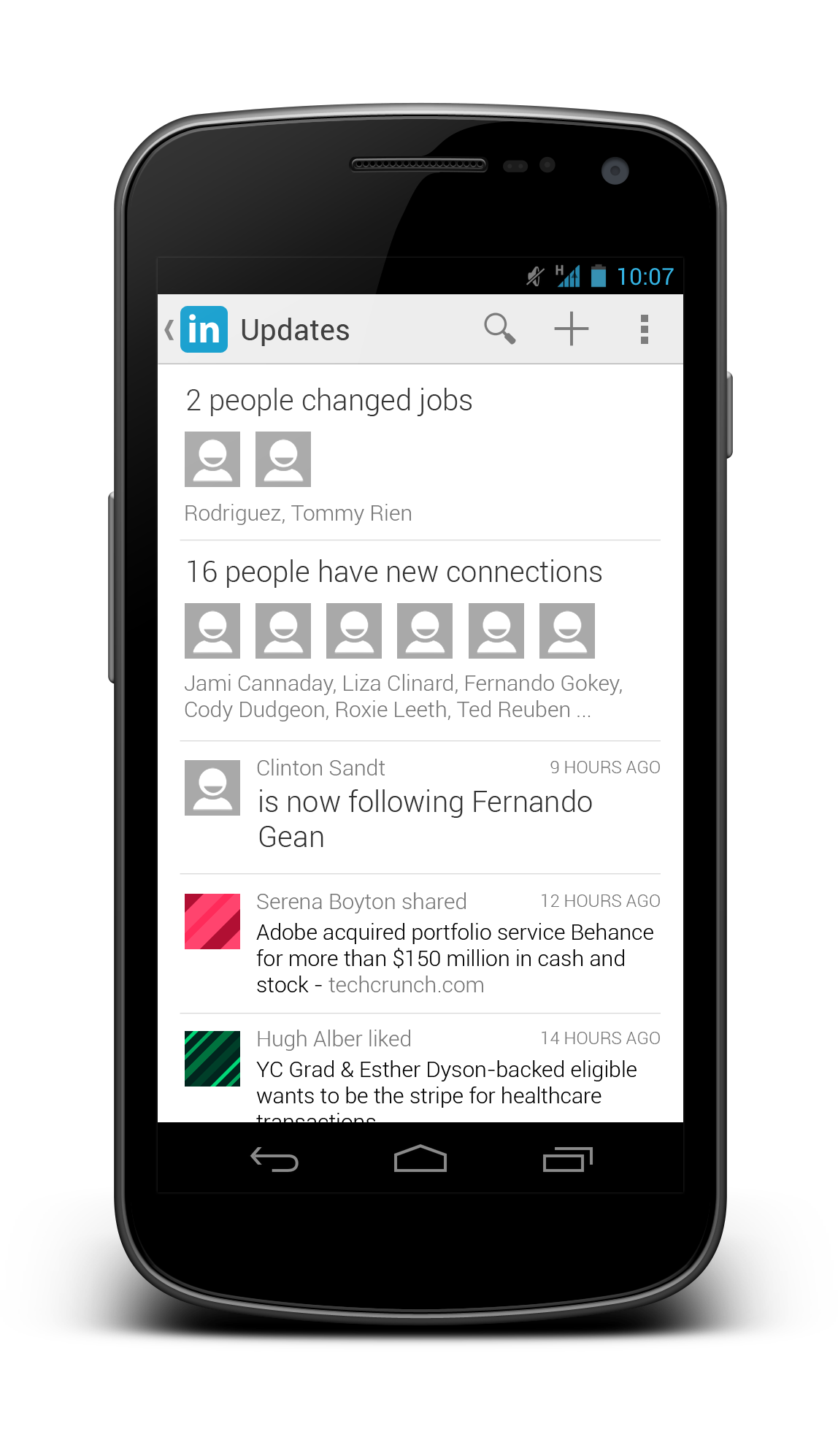
- Badly designed UI (for example, the dashboard give really limited information)
Below I included some screenshots from the current app:


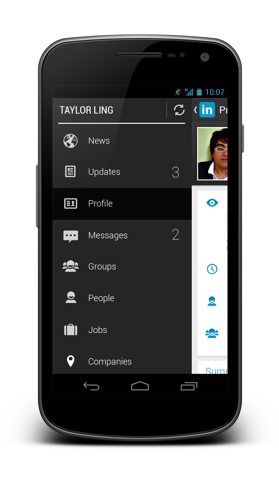
Using the Holo UI approaches, I have redesigned a few screens that fit nicely in today’s Android devices. I have replaced the dashboard UI with the Sliding Menu due to the huge number of sections available in the app. Check them out below:


Update 28/12/2012: After taking some feedback from my G+ post, I have decided to give it another revision for better LinkedIn branding, and below are some updated shots. What’s changed:
- Action Bar is in dark grey color to give a distinct UI layers
- Added frame for photos
- Used Card UI for details
- Added some iconography
- Increase the size of the sliding menu and smaller icons
- Added Share button besides Invite to Connect button


What do you think about my redesign? Do you like them? Shot me your comments or suggestions!

Great redesign. Personally i don’t like when action bar moves with sliding menu.
I think moving the ActionBar actually makes a lot of sense, since its actions & title apply to the content that is being moved.
Interesting! Good work!
Simply awesome. Maybe I’d use its blue color a little bit more, some screens are too greyish. But navigation and cleanliness are obviously far better from the original design.
I love the redesign! Unfortunately LinkedIn is an HTML5 app with a native wrapper around it; at least the Android version is. I think their goal is keep their mobile site and Android app codebase the same.
Hey,
Thanks! Ya, I can understand their goal, but if they really care about their mobile users, they should really do something about it. Look at Facebook, eventually they have to turn to native code because HTML5 just won’t cut it.
Rgds,
Taylor Ling
Well, facebook’s dev team never actually said why their HTML5 version was bad. Tech blogs simply reported that the app had problems and that it was html5. There was no technical explanation as to why it was bad. It could be bad coding too. Bad coding practices in JS will easily show on user experiences, especially on mobile devices. Android’s WebView does have problems but have you used the mobile version of google.com or even facebook.com lately? You’d be surprised how well they work. When ICS and JellyBean become the top platform version in the platform distribution graph, I’ll think about HTML5 for Android again. For the iOS however, I strongly believe HTML5 meets standard user experience expectations easily.
HTML5 arguments aside. For Android, I love doing native apps just because it has gotten so much easier to develop neat looking UIs with the myriad of open-source frameworks out there for the platform and implementing your design (or re-design) would be lovely!
Its a nice redesign.
I have only one suggestion. Use smaller font for the numbers next to updates and messaging. I think its better to use bold to emphasize them.
Great redesign…..I have the Original app on my phone…and i think they should change to your design